Newydd
Creating a bright, new brand and illustration style for charitable housing association Newydd.
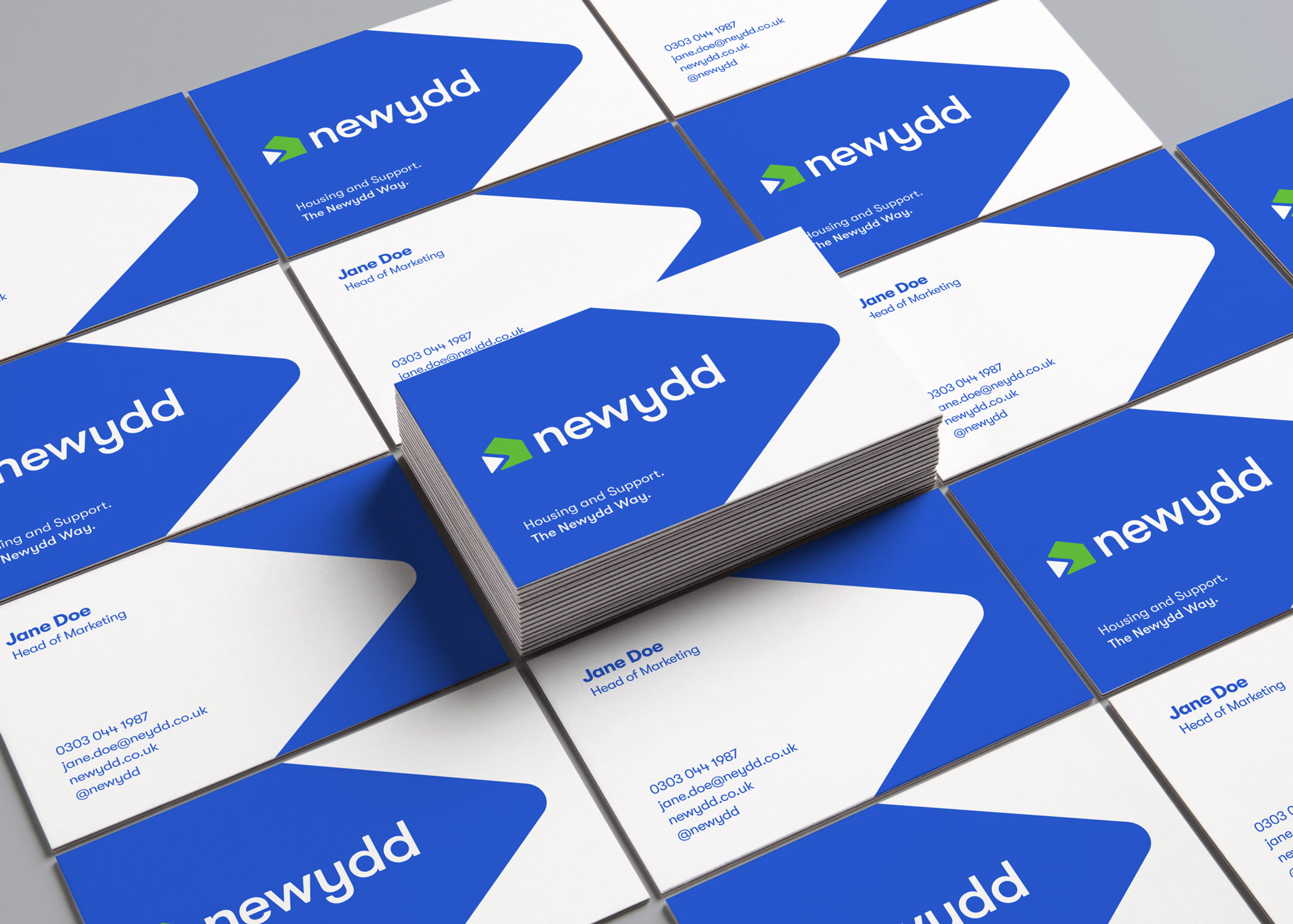
Over the last year or so we have been working with Newydd, one of Wales’ biggest charitable housing associations offering almost 3,000 affordable homes for sale or rent. We’ve developed Newydd inspired sub-brands for social campaigns, events and even helped produce their new podcast. Whilst also developing new styles for internal and tenant documents, guides and producing a video to help communicate the MyNewydd offering.
Character development
Our first job was to learn about Newydd as a business. To find out what their objectives are and what their internal culture is like. The internal team is creative and always looking to push things forward using the latest technology, as well as traditional methods, to communicate with their audience.
We wanted to develop a design style that represented the people behind the brand and to tell stories that would help tenants navigate their way through the housing process smoothly but without being patronising. We decided to develop characters in a friendly and approachable style that could be used to simplify complex processes or brighten up content.
Procreate-ing
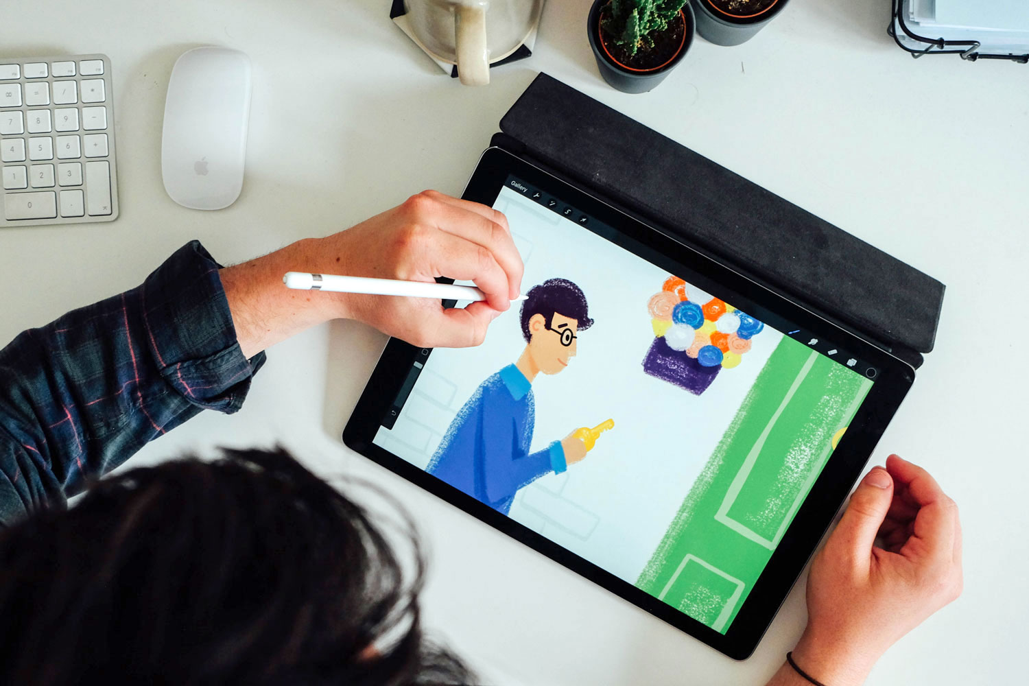
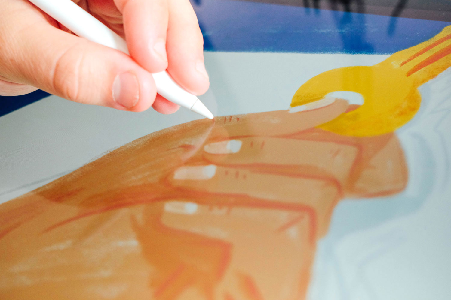
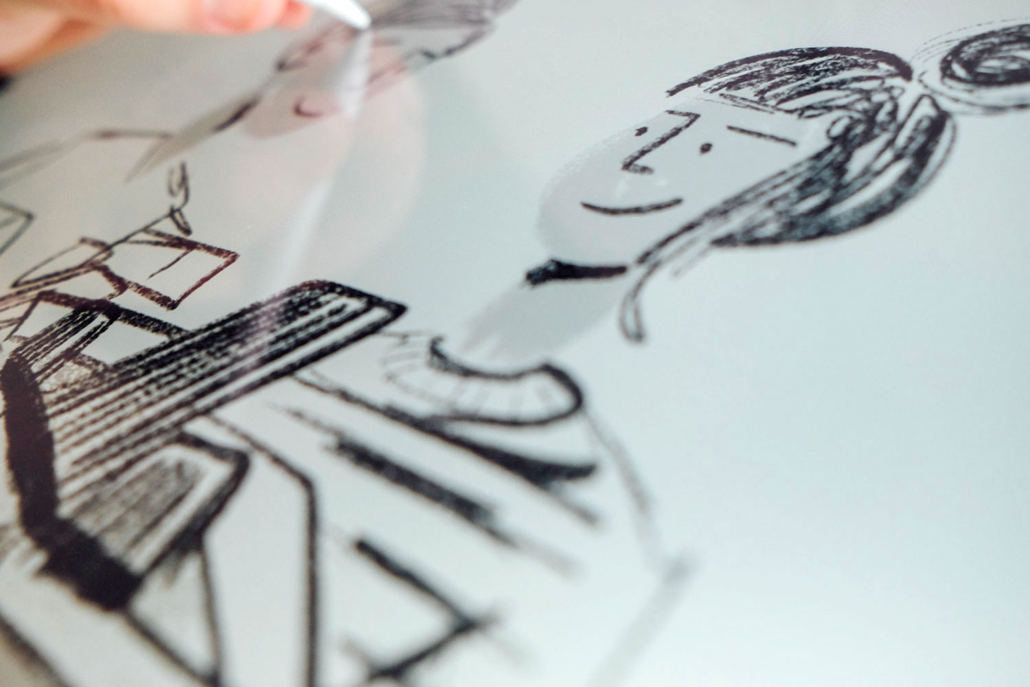
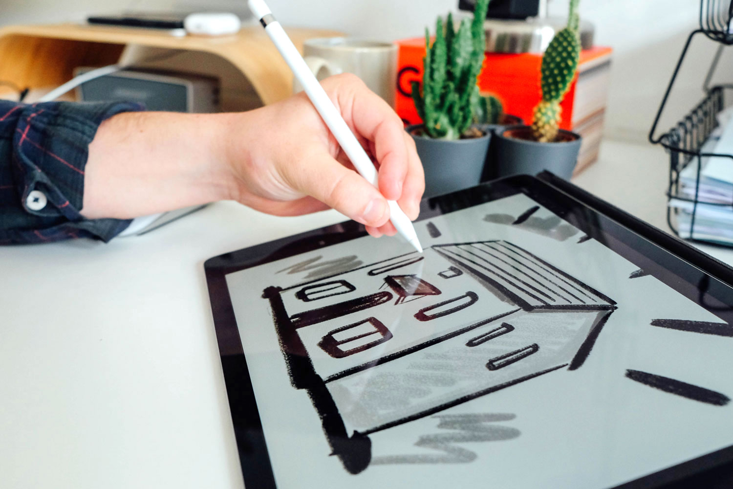
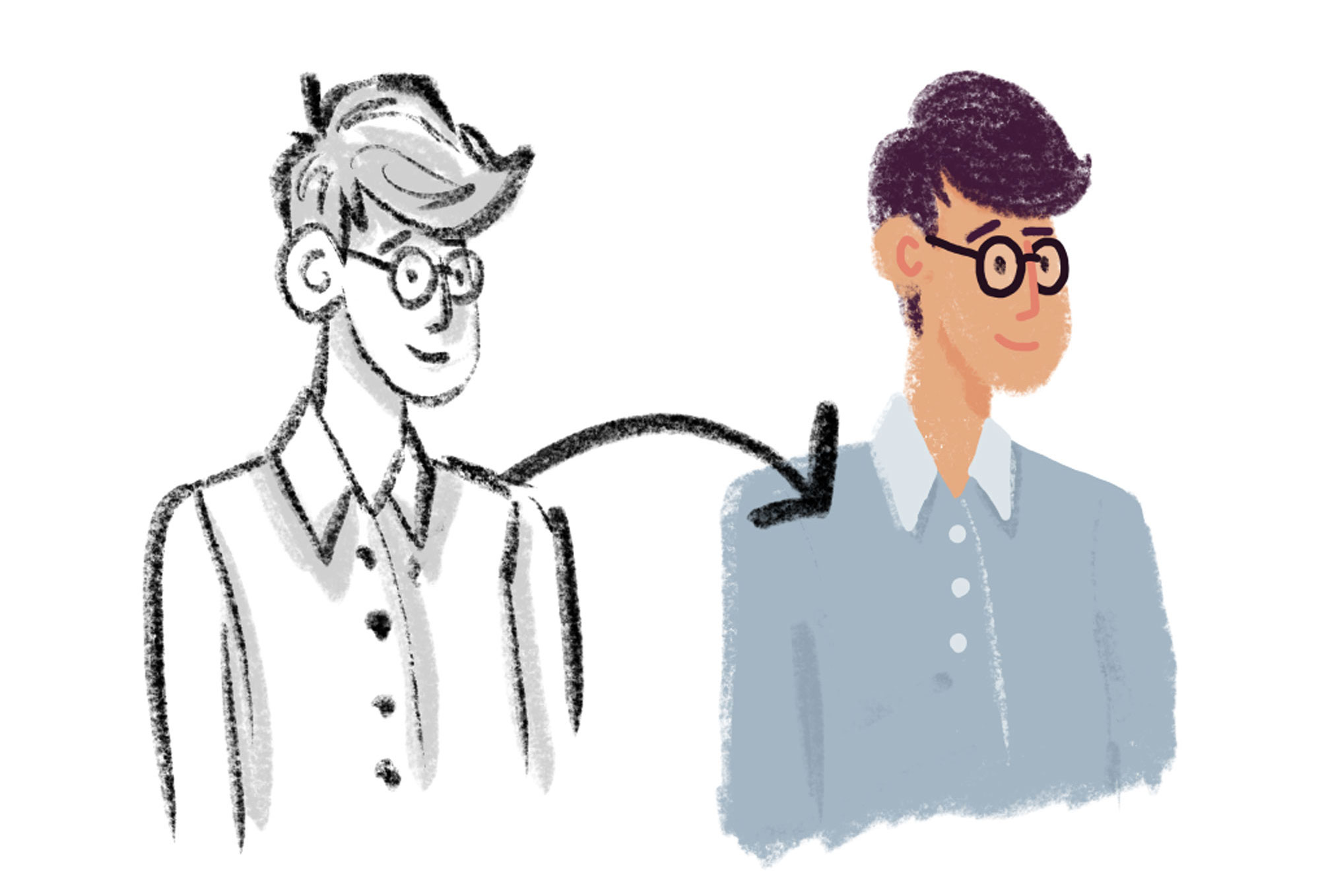
Using Procreate on the iPad, we scamped up concepts and illustrated the final visuals using a new style, colour palette and range of textures. The textures allowed us to soften the illustrations and help them look and feel more unique.
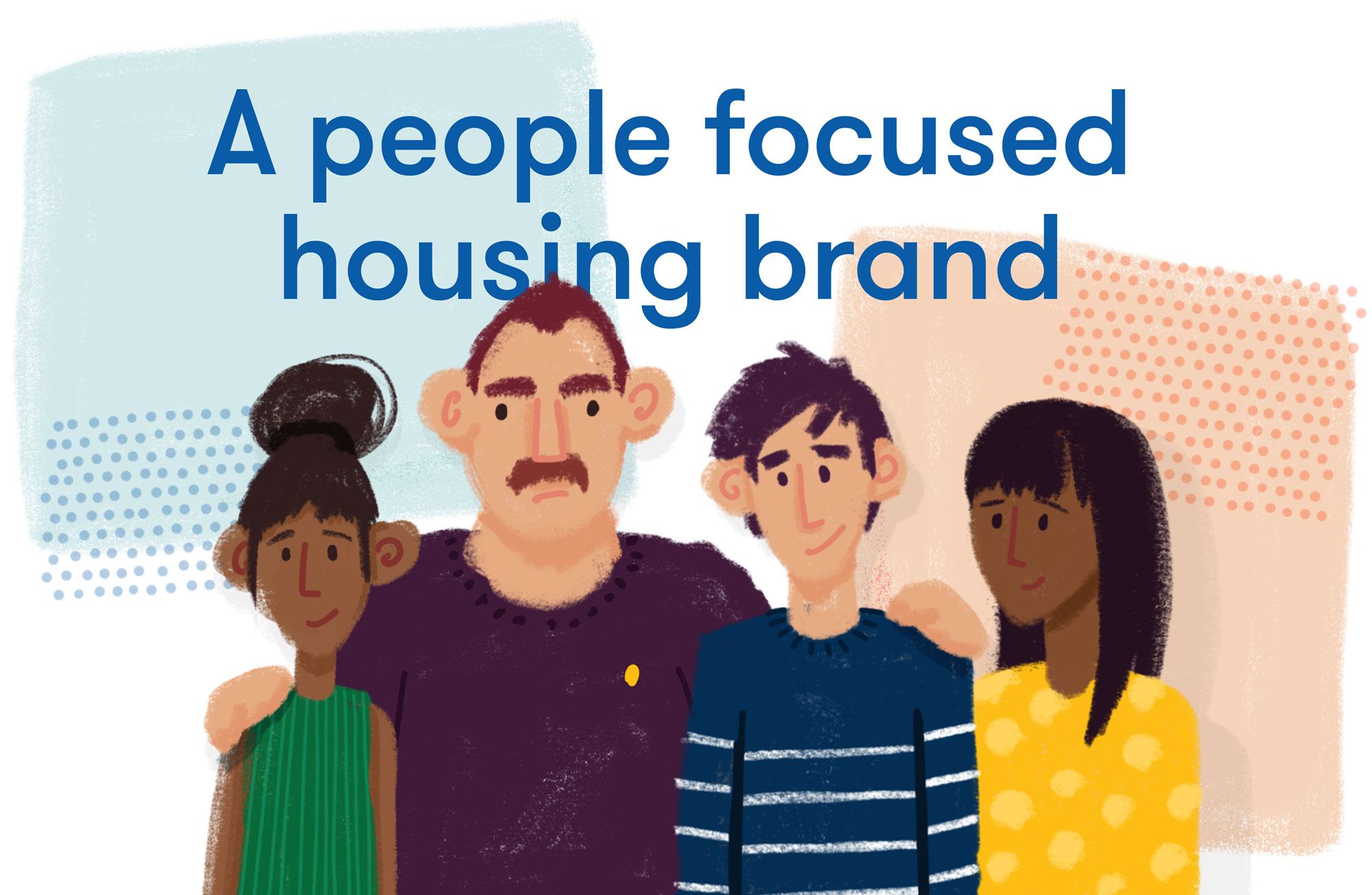
Newydd are all about housing, but for the association and for us, our thoughts are focused on the people who live in these homes, therefore we felt it was right that the main focus of these illustrations should be them. We felt image after image of houses might become a little boring so we wanted to shift the focus to the staff and the tenants – the people. Bringing in a range of relatable interior bits and pieces such as stylised clocks or plants also helped each illustration stand out and feel more individual and homely.

Colourful and confident
We’ve developed a number of design assets with a refreshing, colourful and confident illustration style that works to communicate what Newydd need from their tenants and in turn what they are doing for those in need of social housing.

Creating homely and accessible communications
Newydd is committed to creating sustainable communities, providing affordable homes and excellent services to their tenants and customers. Portraying tenants living in their Newydd homes provides the branded communications with a homely and accessible feel. Whilst offering a sense of place and community the new style also provides a coherent and consistent version of the Newydd brand. Helping to build trust amongst their customers and tenants.
Design for print and digital
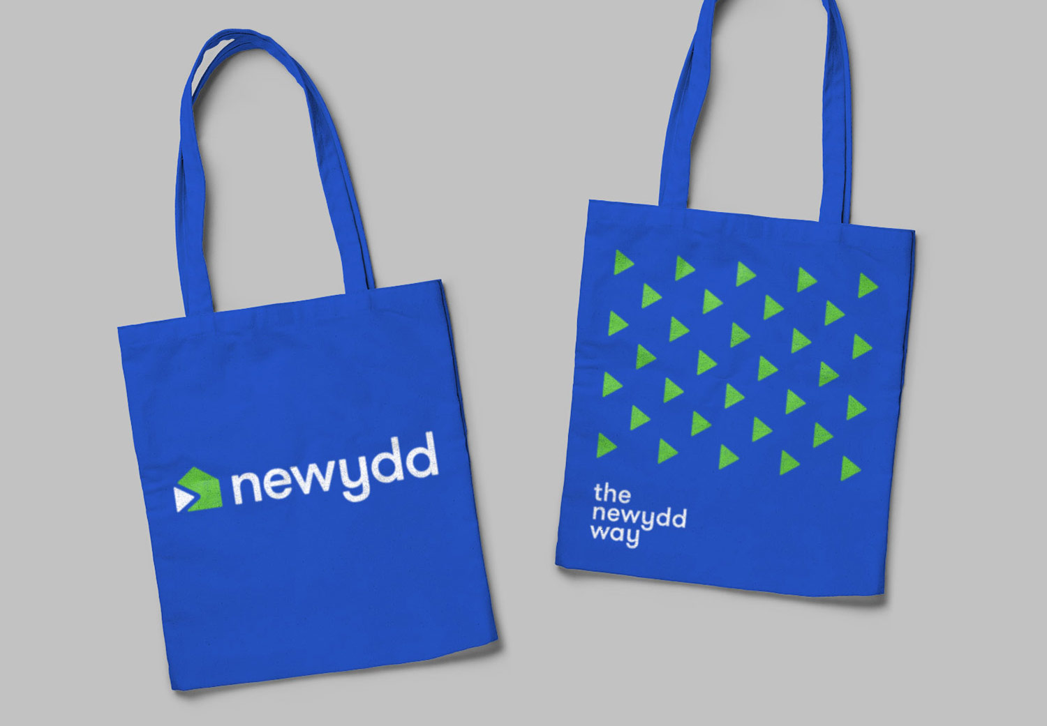
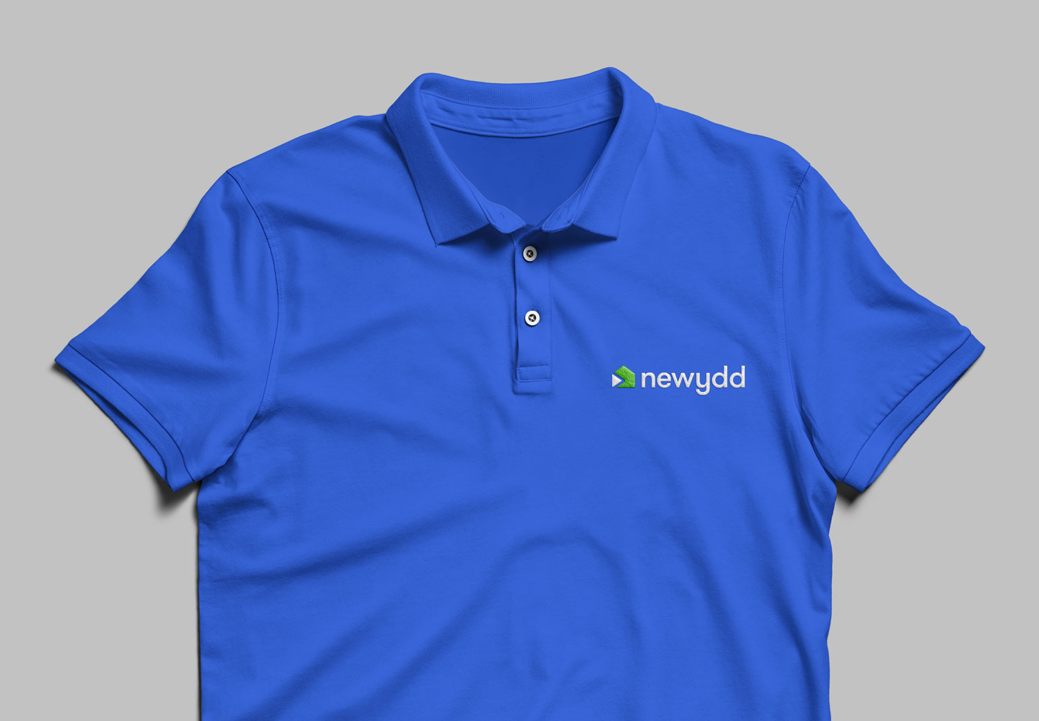
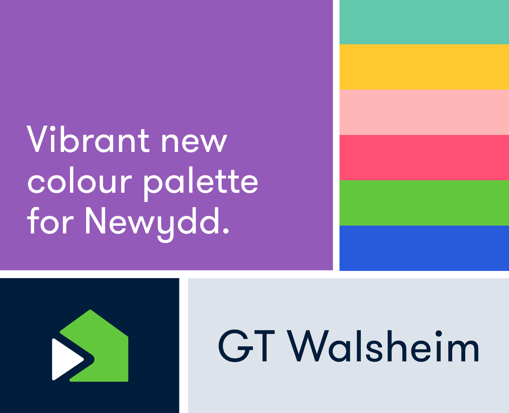
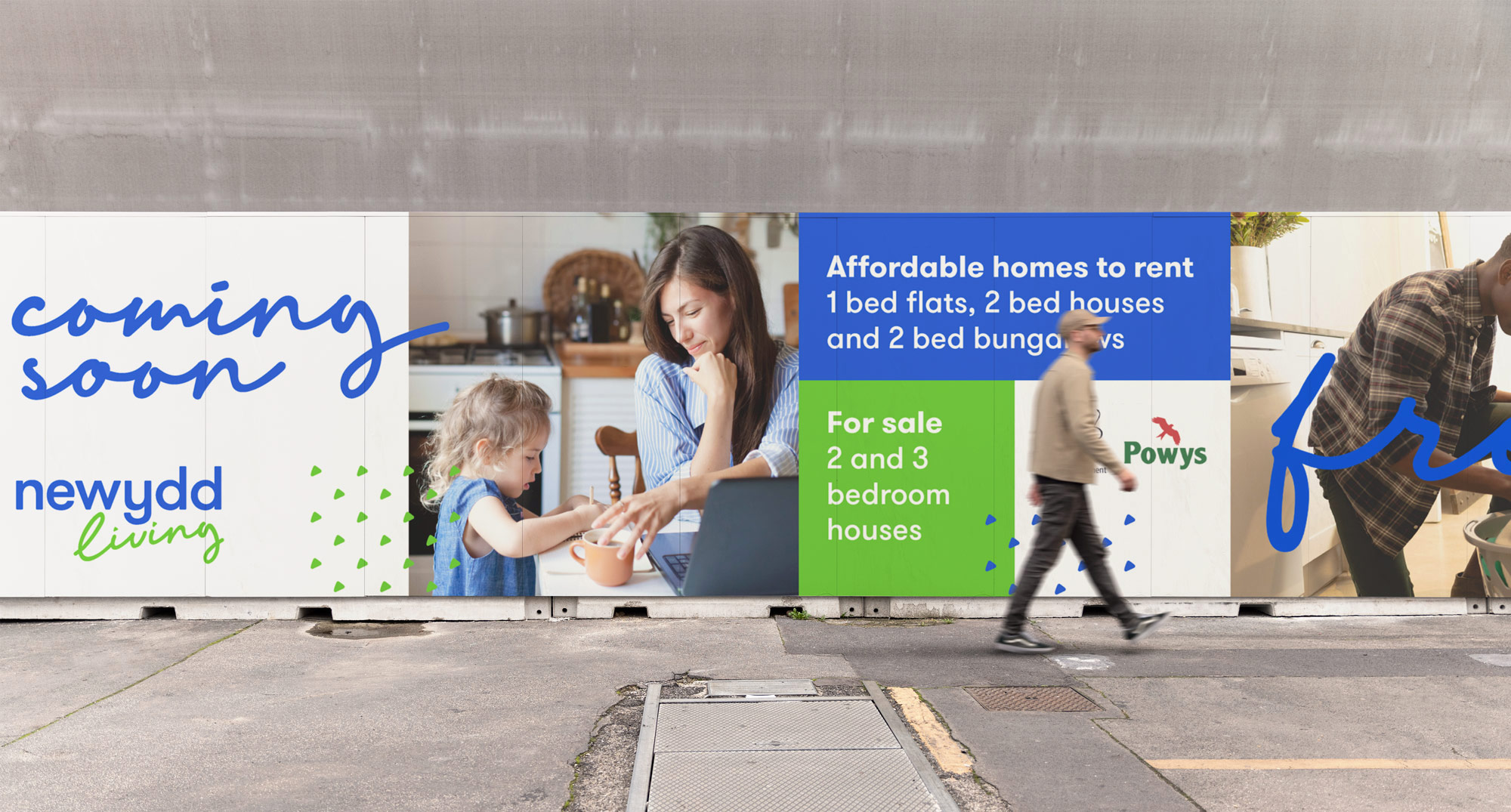
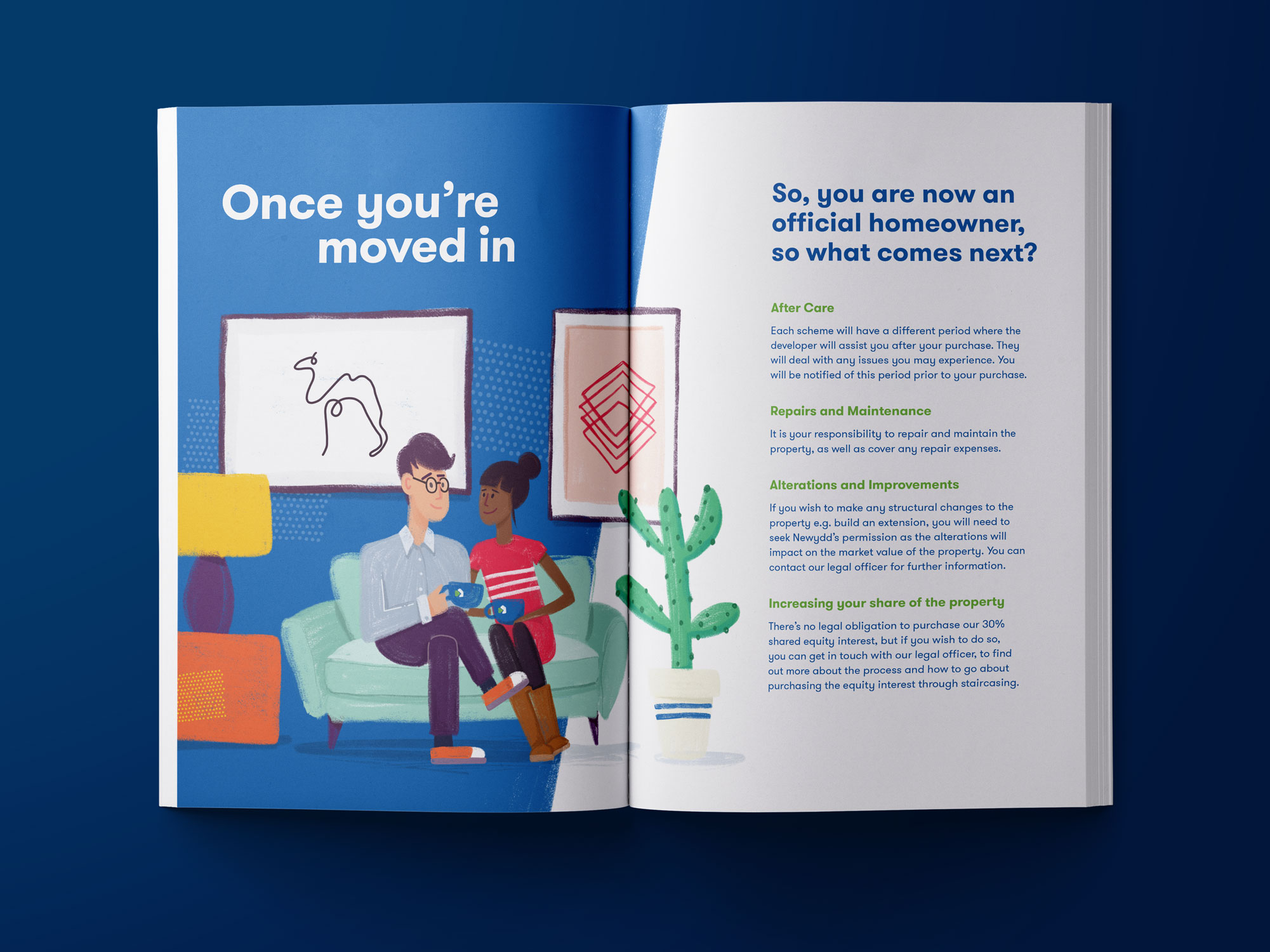
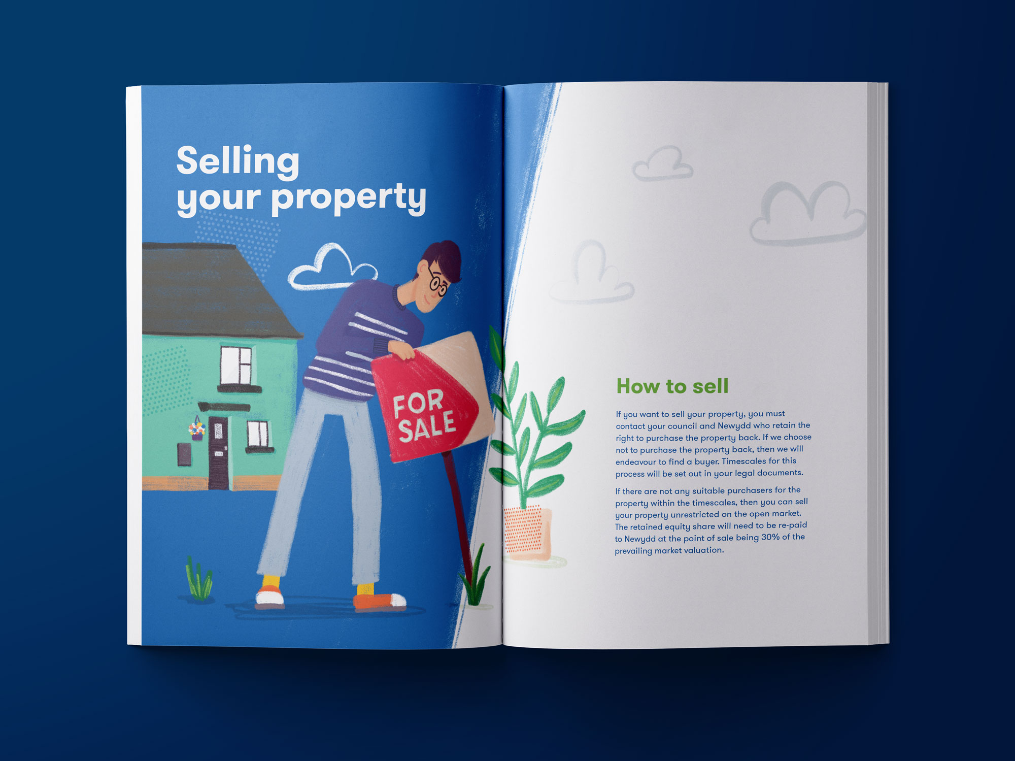
With the new typography, colour palette and illustration style in place, the range of brand collateral we designed came together in a more focused and coherent way. The Newydd brand is communicated as confident, approachable and professional.
Instilling pride and ownership
Another benefit of using illustration in these new communications is that it helps to remind tenants of the practical services offered by Newydd, and gently reminds tenants of their responsibilities helping foster a sense of ownership and pride in the property.
Look and feel for a new Newydd podcast
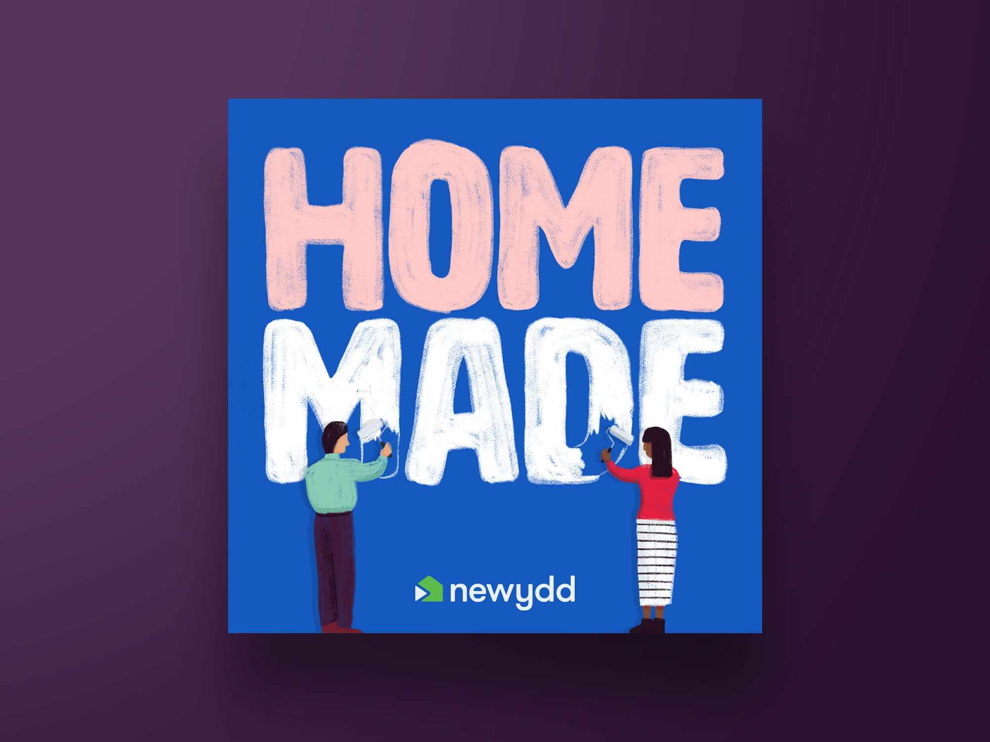
The team love trying out new ways to reach out to tenants and communicate about services available and also to enable real time feedback. Their latest project was to create a new podcast to engage with and grow the Newydd community. Aptly named Homemade, the podcast needed an identity that was attractive and distinctive enough to encourage listeners to choose it above others. We settled on the concept of depicting tenants painting their homes as this is a common way of making a home feel like your own. The first episode is available now and is a fun listen all about communication technology, including reminiscing about Tamagochis!
