Princes Gate Natural Mineral Water from West Wales
Working with the team at Princes Gate on a brand refresh with a new website and a revised content strategy.
100% committed to doing better
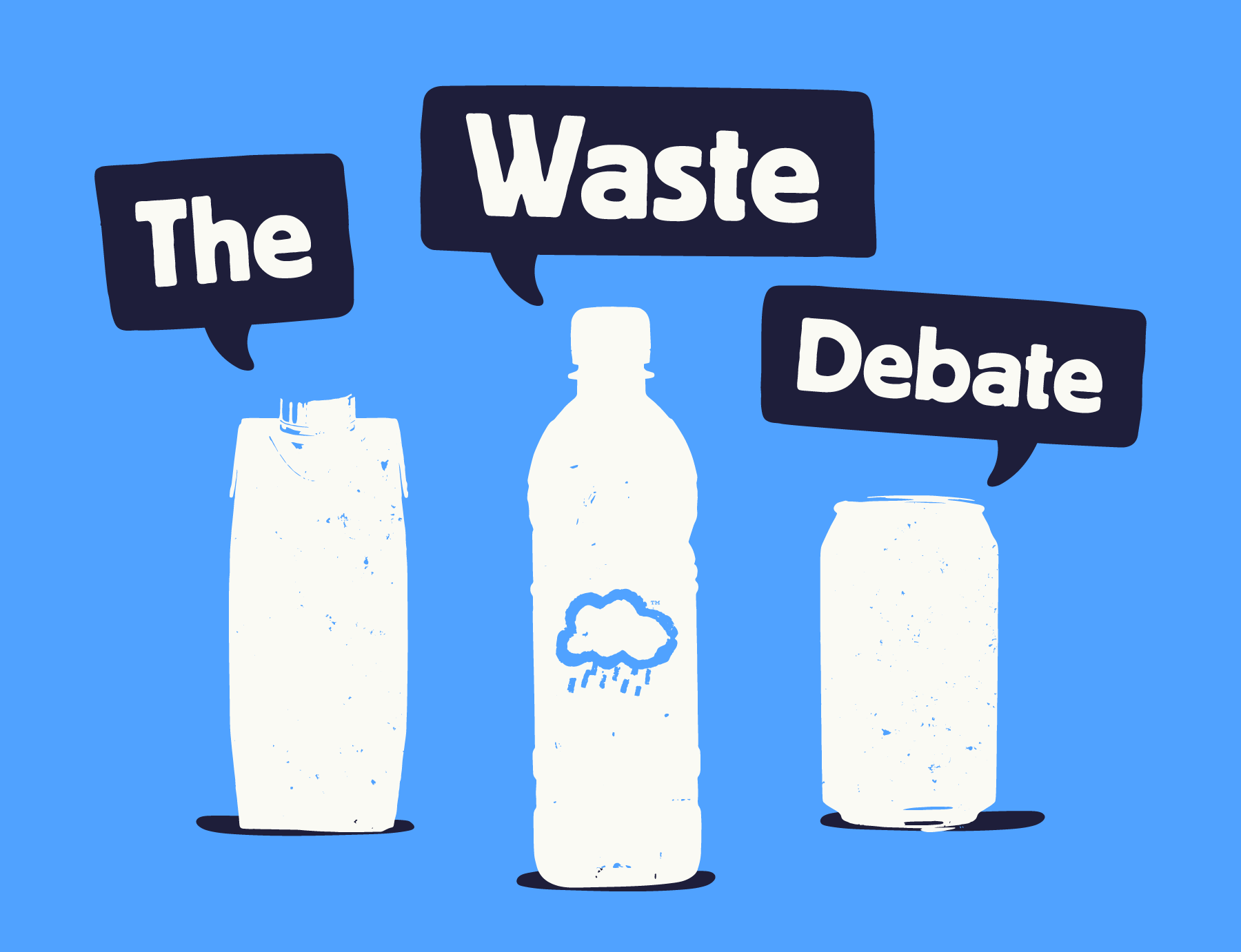
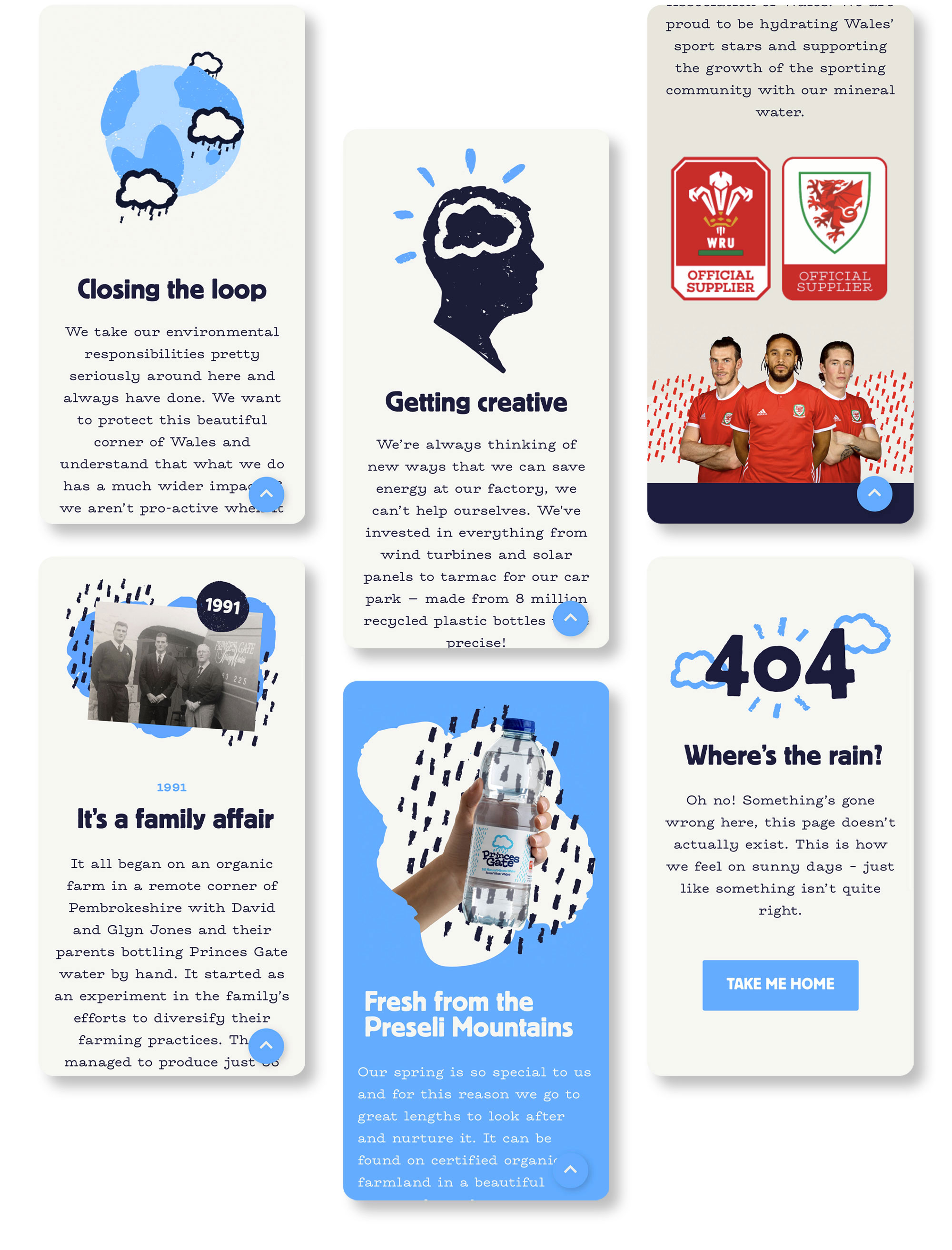
We first met with Princes Gate a year ago and straight away it was clear that they had a great deal to offer, with a good range of mineral water products and the ability to lead the way on environmental debate and responsibilities as producers of bottled water. Through trial and error and sheer determination the team have made their factory in Pembrokeshire as green as it possibly can be whilst maintaining their no nonsense approach. Their frustration was that their brand wasn’t helping to tell this story as effectively as it could be. There was so much good, very proactive news from the team to share and also a lot to communicate about the reality of recycling. This is a topical and important issue and we jumped at the chance to help Princes Gate share what they had discovered along the way to provide as much information as possible to their customers and community.
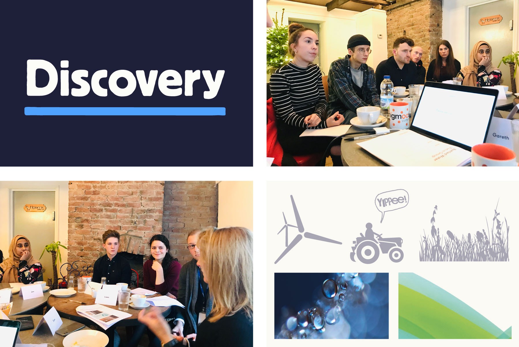
Before we got started on any design or communication strategy we reached out to customers and the wider public. We did this through focus groups, workshops and questionnaires. We found that people loved the product and approachable feel of the current brand, as well as the fact it was from the Welsh mountains. Feedback was pretty unanimous about one thing, recycling and environmental concerns are high up on the list when it comes to people’s considerations when buying water. But we also found that there is a lot of confusion about what production processes, materials and recycling practices are better for the environment. We learned that the answer isn’t always as straight-forward as we might think, this meant that there was an opportunity to use the new brand to help communicate the choices Princes Gate have made and explain the reasoning behind them.
No nonsense
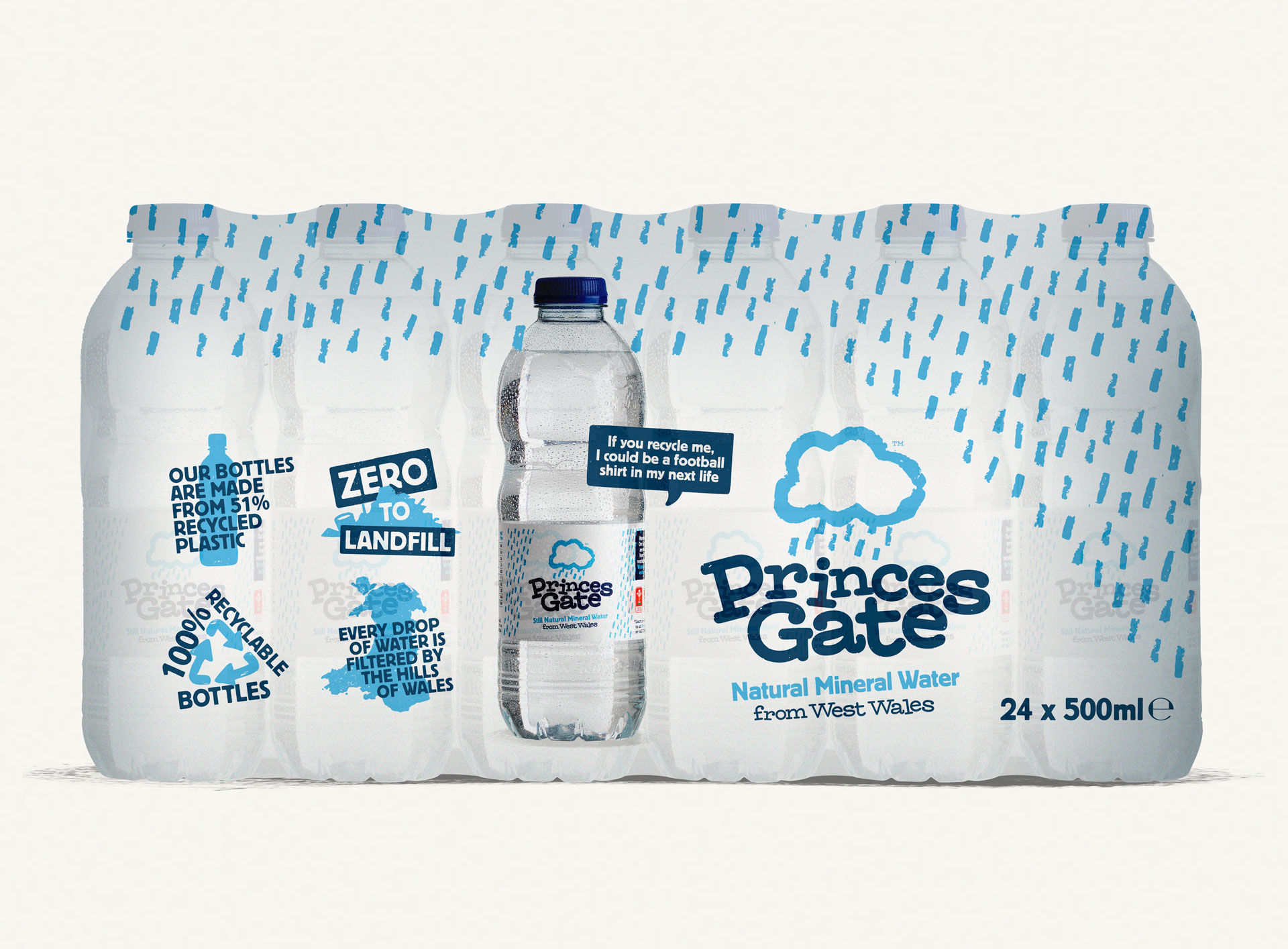
The previous labelling and brand aimed to share Princes Gate's environmental credentials by using multiple illustration and design styles but when tested with customers we found that the messaging was getting lost as there was just too much to take in. Also they pointed out that just because a company has environmentally friendly iconography on their labels, for example wind turbines, this doesn’t mean that the company actually uses them (which Princes Gate actually do). Consumers are very aware of companies portraying themselves as environmentally friendly and making false claims, so much so that it’s sometimes hard to know who to trust. This gave us a clear task with the new branding and messaging, no nonsense and based on facts whilst still conveying the outstanding quality of the Welsh mineral water and the friendly team behind it all.

Evolution not revolution
Our recommendations included a brand refresh with a new website and a revised content strategy. Reflecting the findings in our discovery, we suggested that the label be stripped back and that the wider brand and website be used to communicate key messages. The label can’t tell a customer everything about your product, practices and approach but what it can do is help your product to stand out by being unique and giving buyers a feel of your company values. We helped to achieve this by updating the typography to be more open and distinctive.
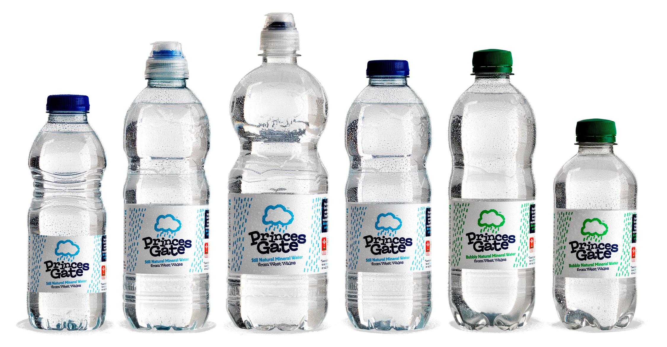
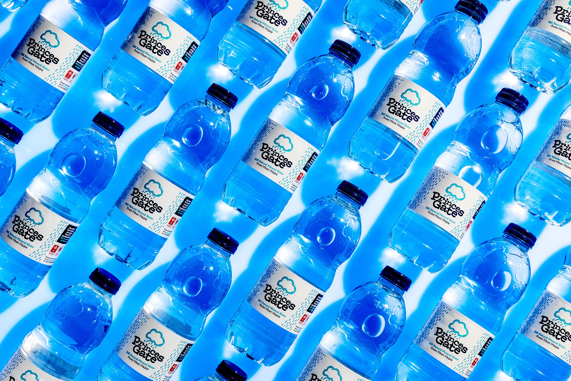
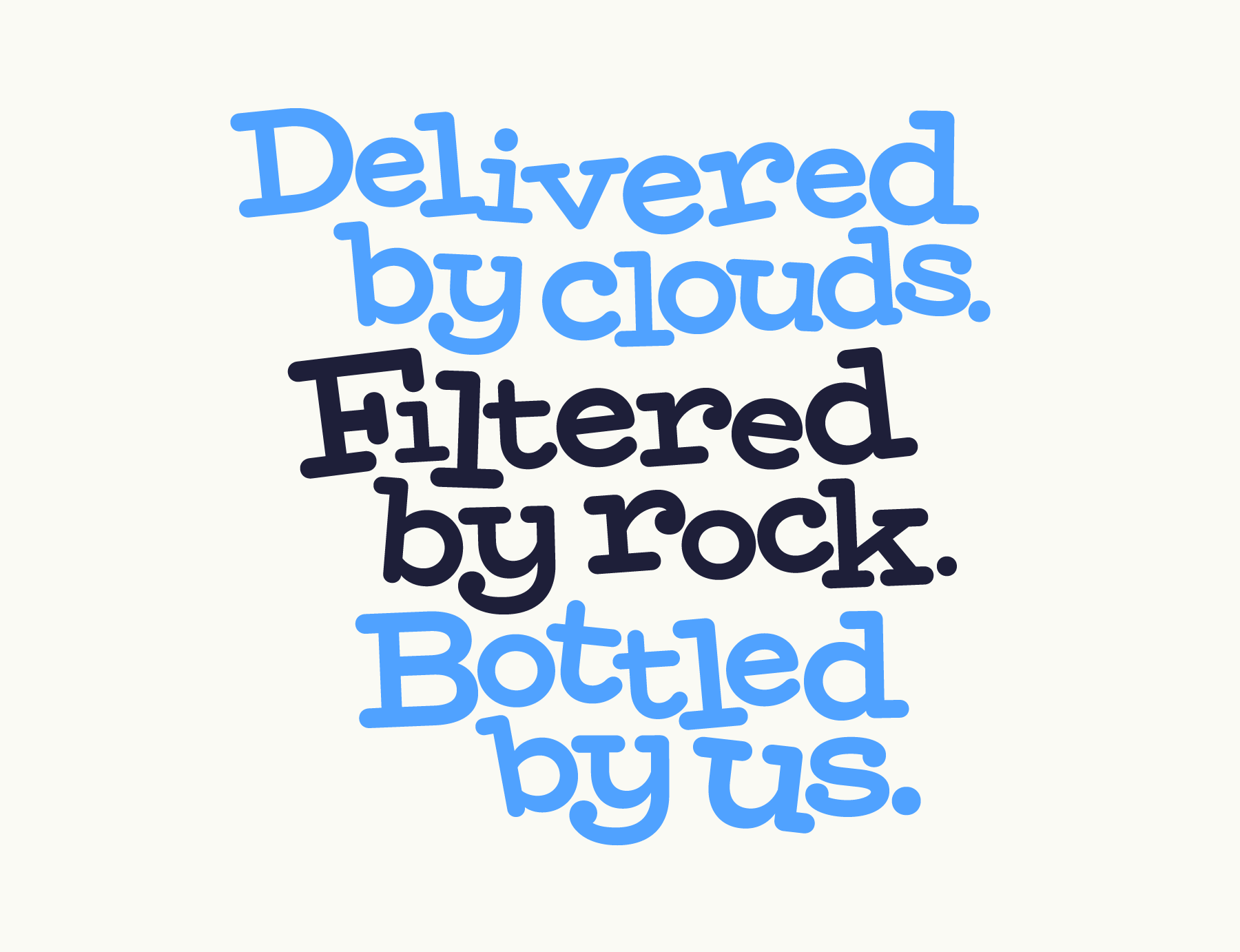
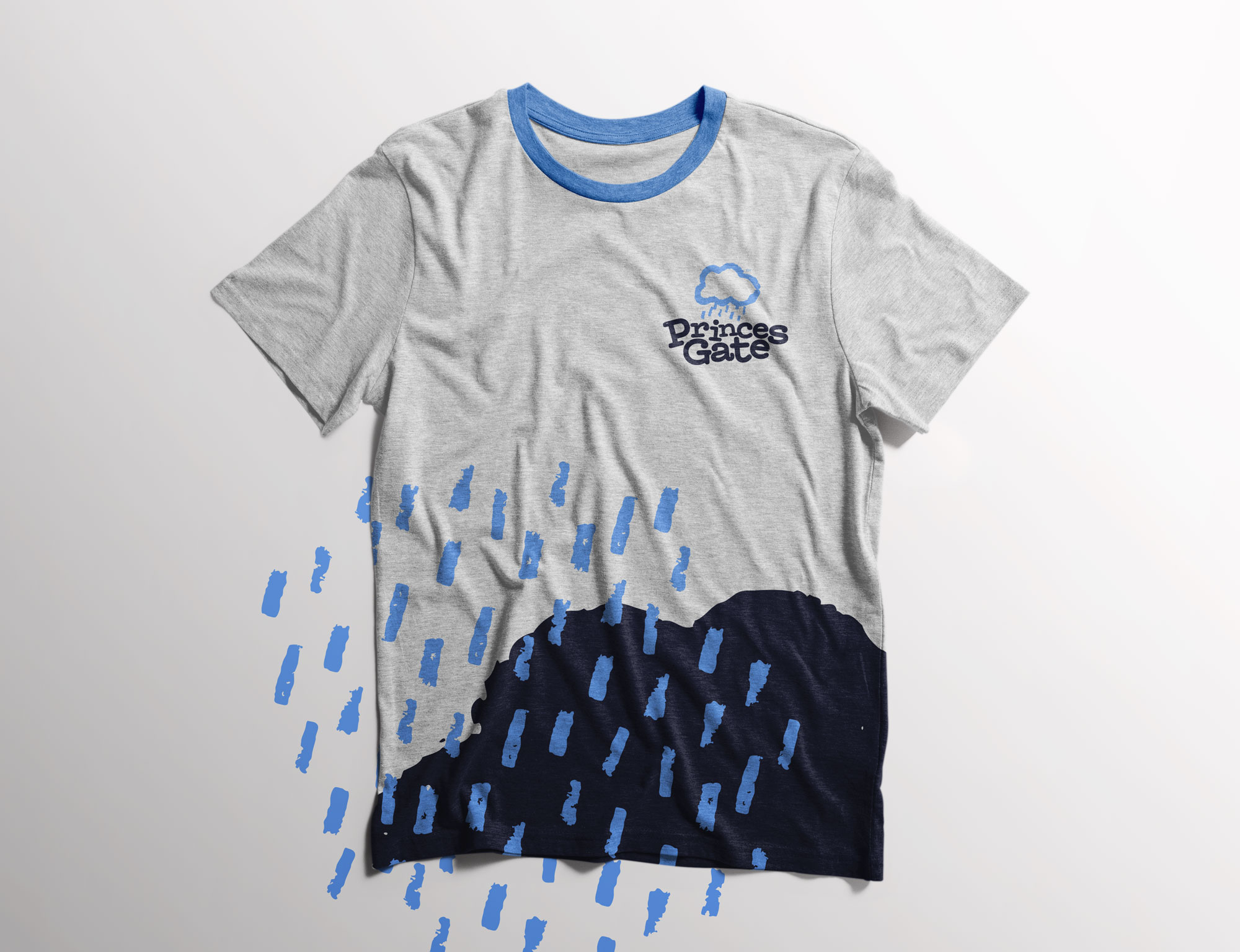
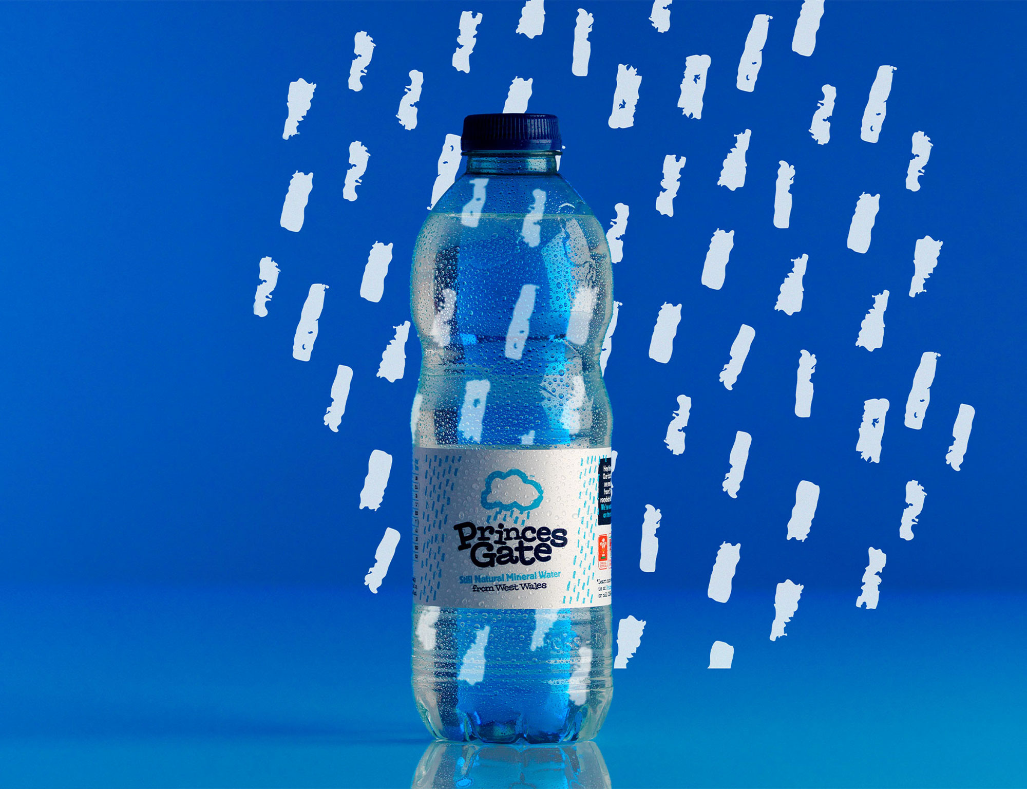
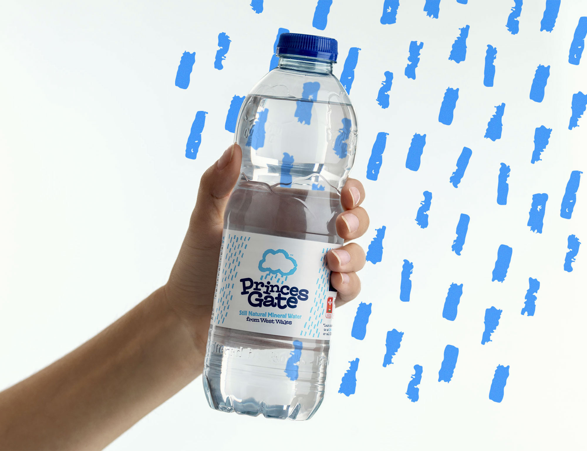
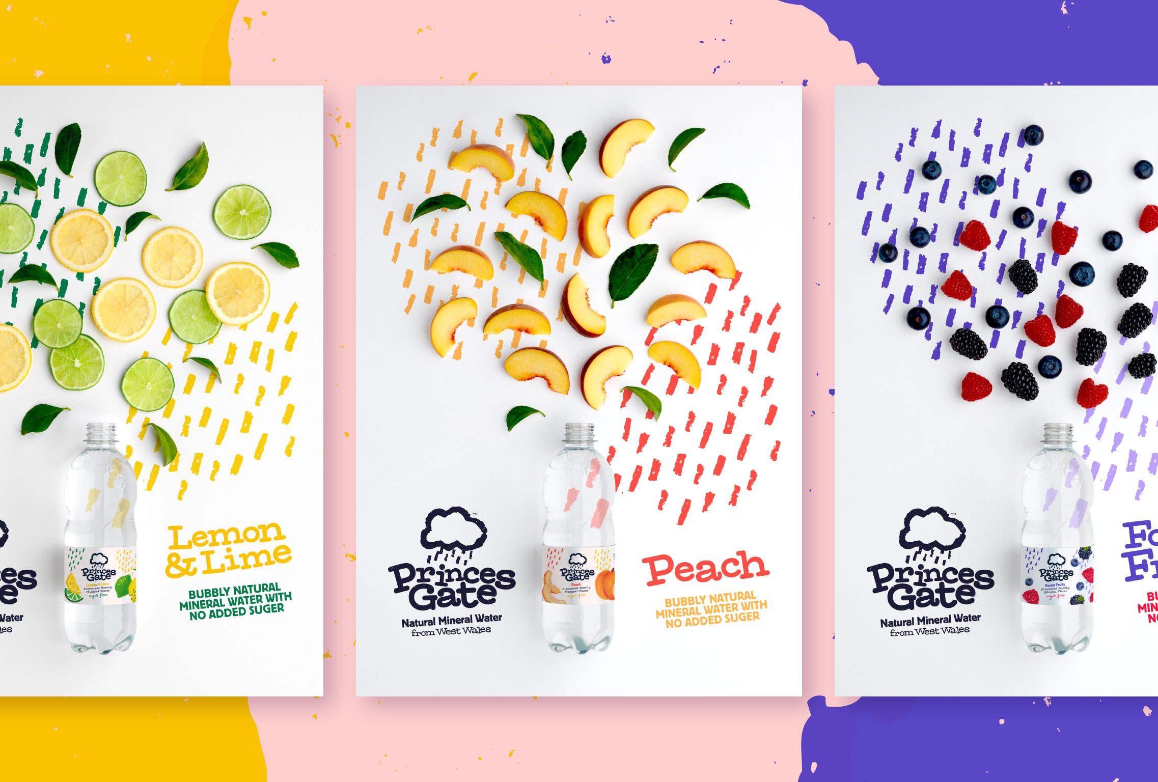
We narrowed down the five previous design styles being used into one, which fed from the original identity, creating a more genuine and fitting style. We discovered that the cloud from the original branding was very popular with customers and a big differentiator, so we focussed on this believing it to be the most iconic visual element. Inspired by this we created the rain pattern which became a cohesive visual asset allowing us to connect messaging and content in a meaningful way. In terms of the colours we worked with the strong existing brand style and chose to boost the blue and navy across the range, creating a more vibrant colour palette.
Approachable and knowledgable
When producing the content for the website and promotional materials we wanted to maintain the authentic and fun tone of voice that has always worked well for Princes Gate. But we also wanted to introduce a more educational, authoritative element to the copy to reflect the years of hard earned knowledge acquired by the team about good environmental practices and production methods. This helps to stand them apart from the many companies attempting to appear environmentally friendly with a fun, care-free and natural style of brand whilst perhaps not having the credentials to back it up. We focussed on the topics that customers told us were important to them, tackling the plastic issue head on and communicating the real story of the company.
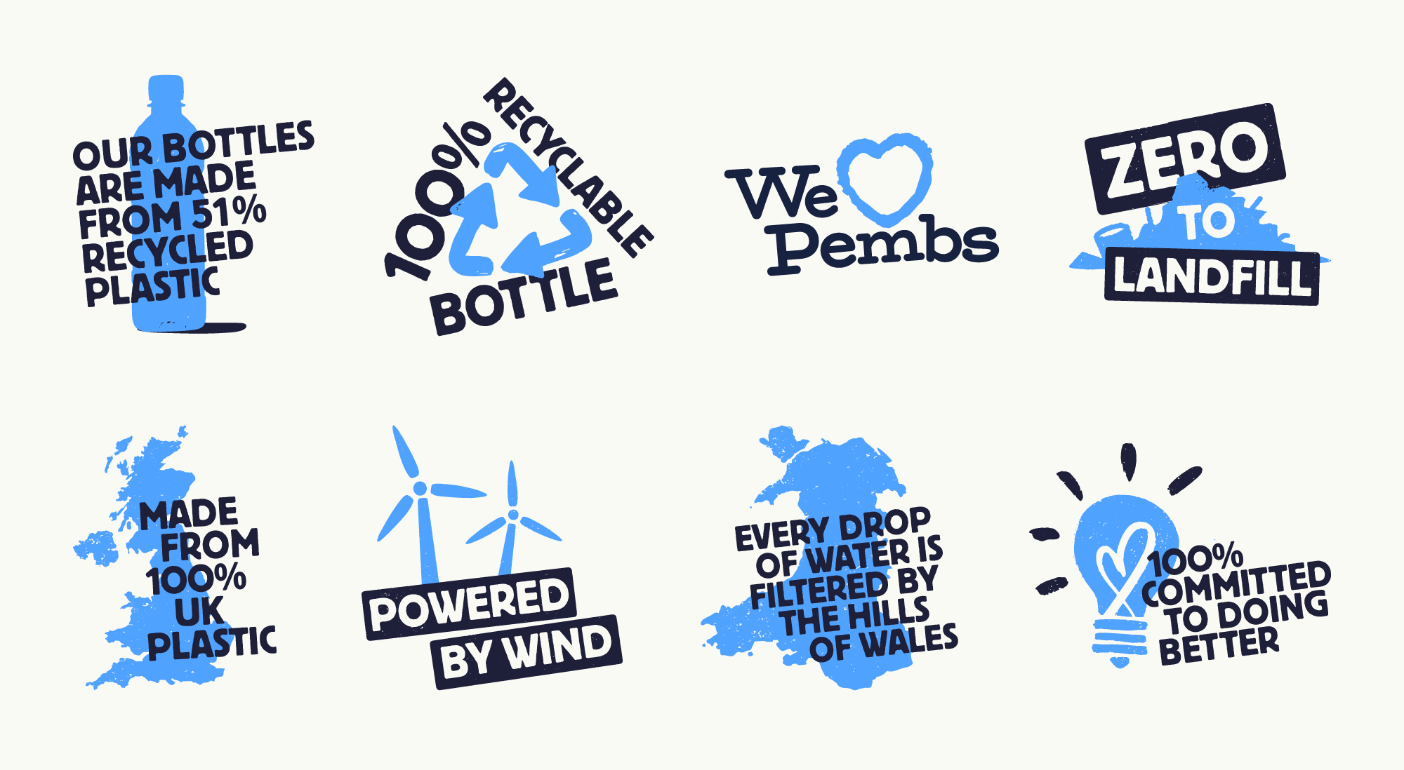
Given the breadth and complexity of the messages we needed to convey we looked to introduce hand illustrated icons to communicate key information in an immediate and accessible way. These are very useful for use on the website and in the wider advertising, social campaigns.
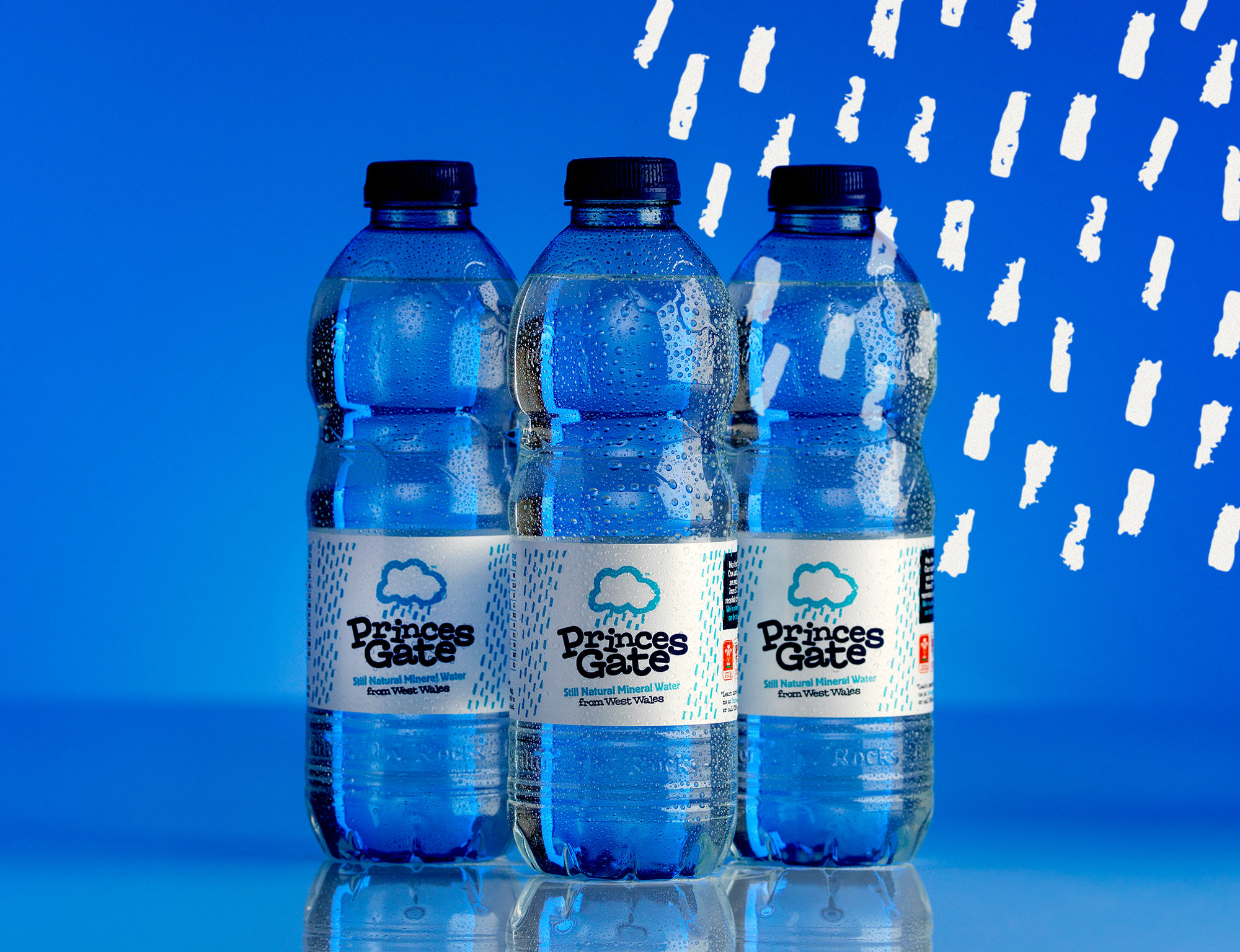
Stand out photography
We worked with the brilliant Keith Davies on getting the product photography just right. Art directing to ensure that we got all the shots we needed to showcase the range and the new brand style.
Welsh and proud
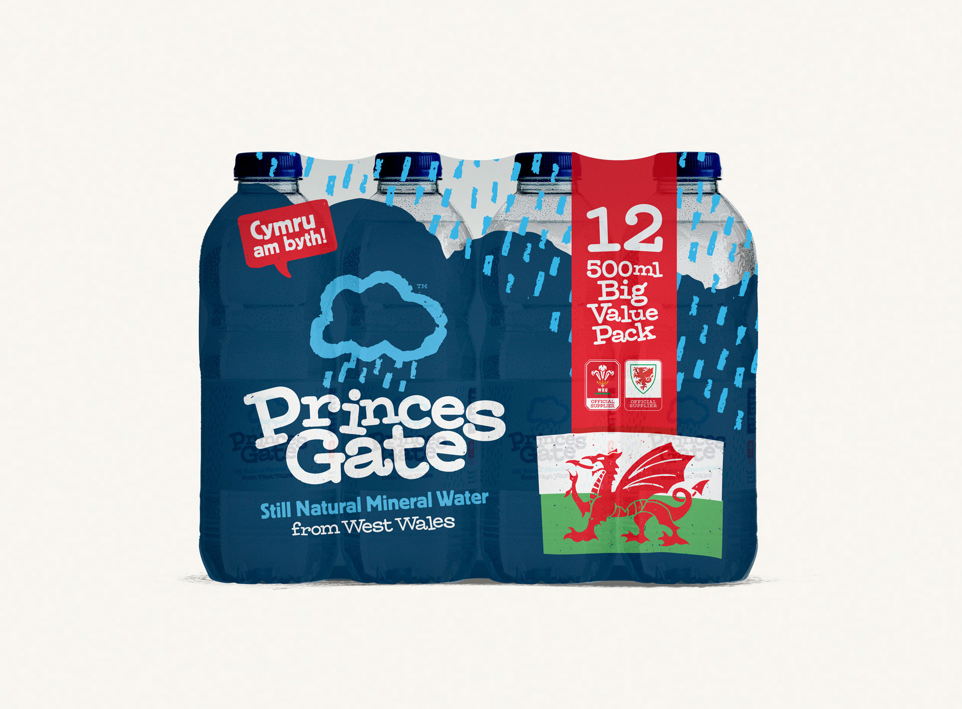
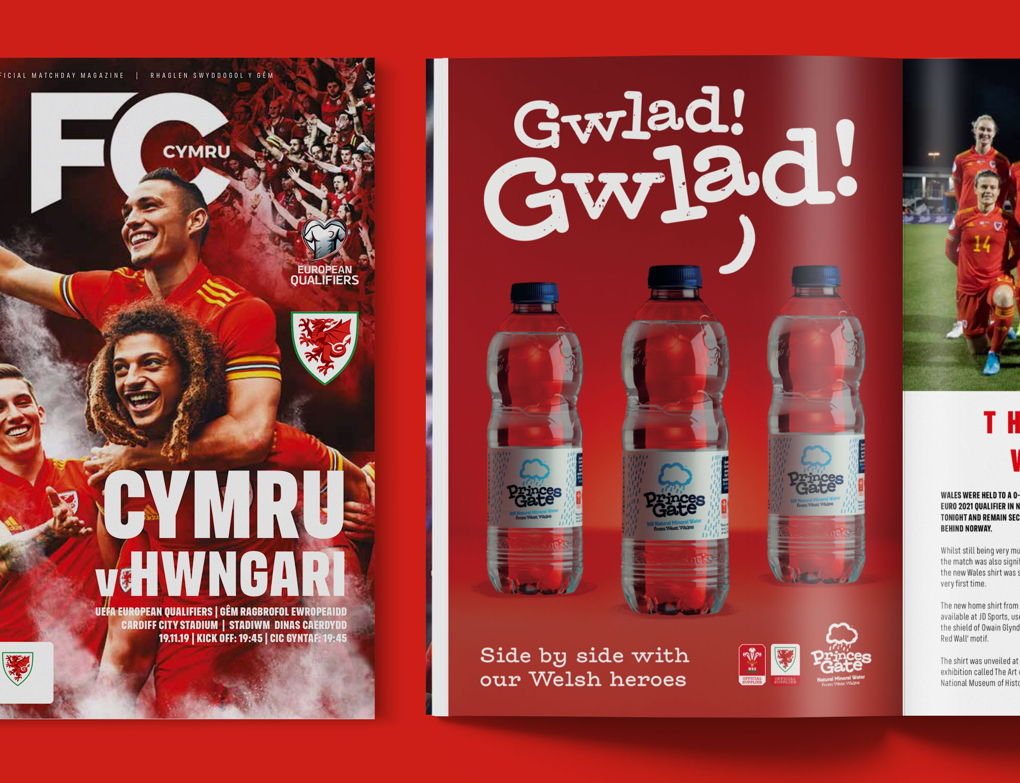
Not only is Princes Gate filtered by the rocks and bottled in Wales, it's also the official supplier to the Welsh Rugby Union and Football Association of Wales. These partnerships are something to be truly proud of and needed to be celebrated and shared more. In an effort to push these partnerships and general Welshness, especially in Wales, we created designs and messaging to be used across a wide range of packaging and campaigns.
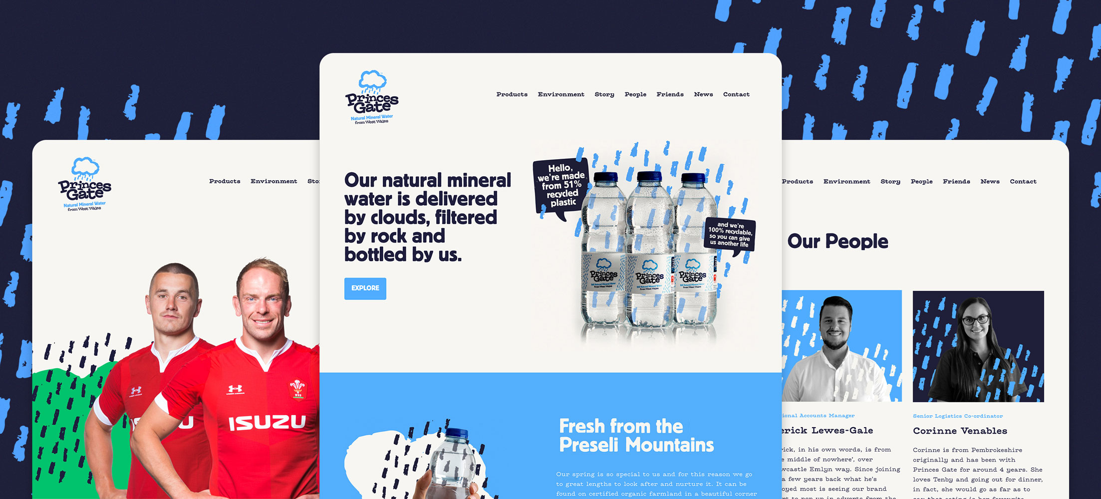
An engaging website
We designed, developed and created the content for the new Princes Gate website. The brand strategy, photography and illustrations fed into each page to help ensure the messages engage with the audience.
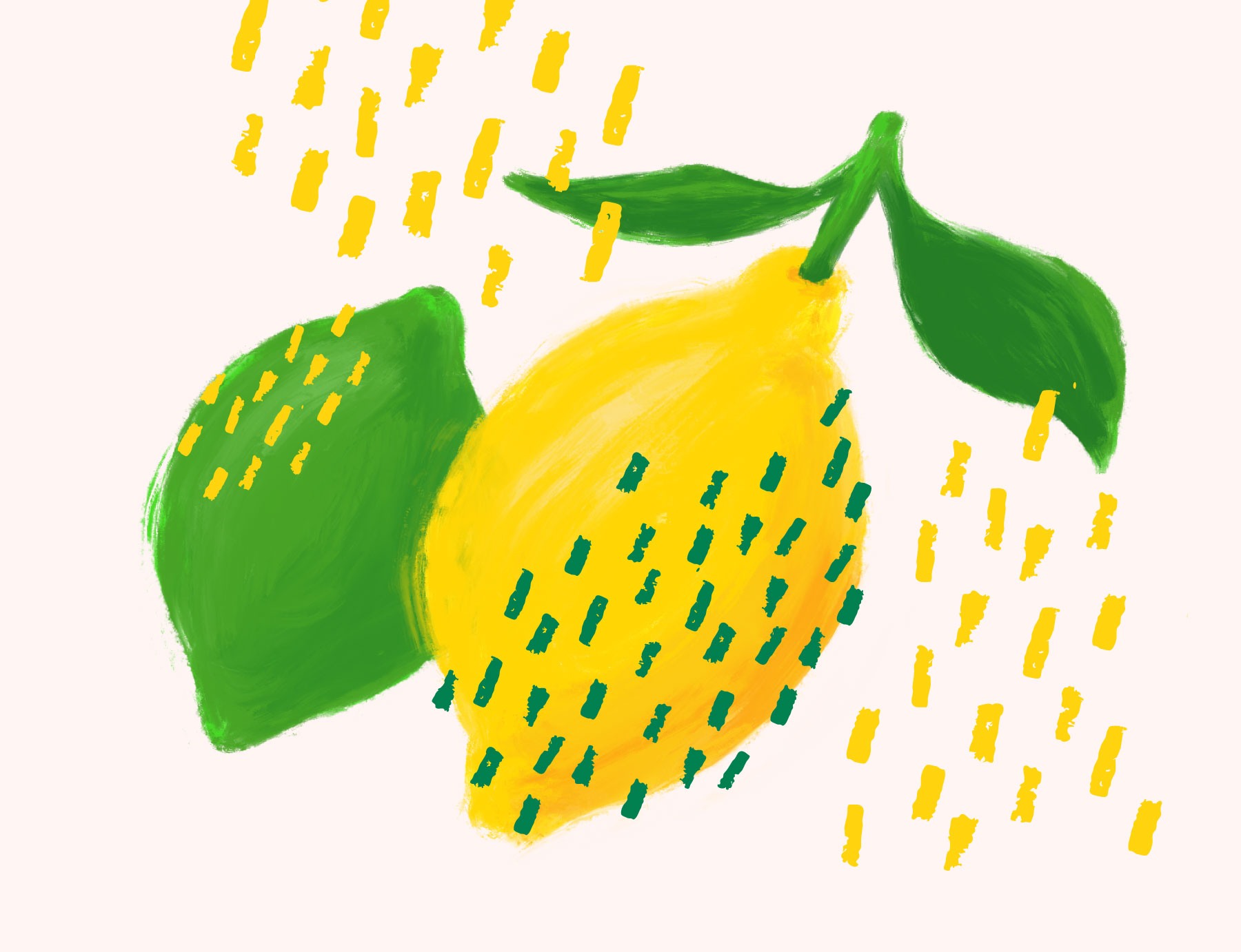
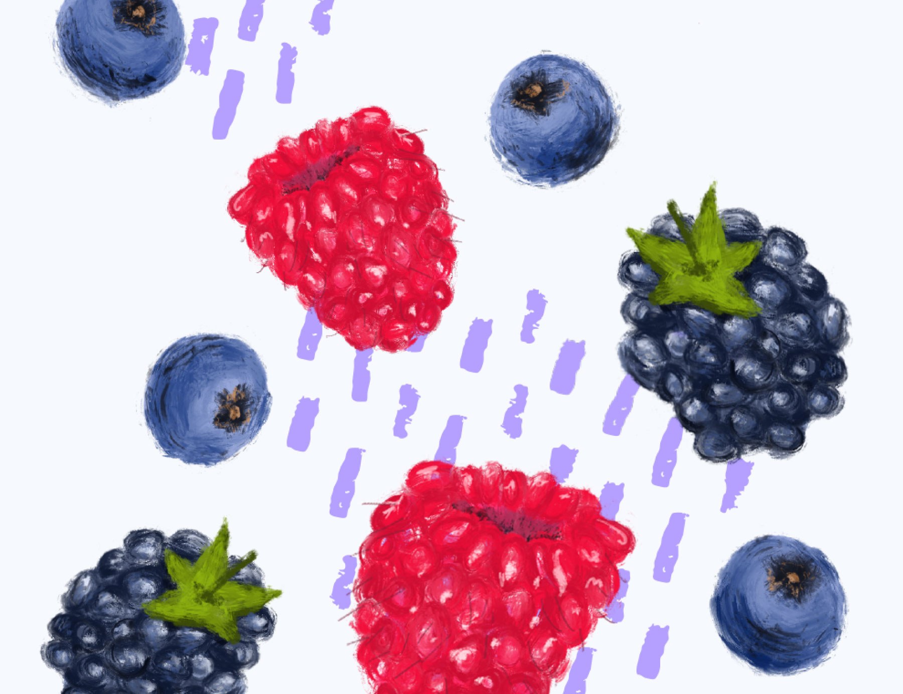
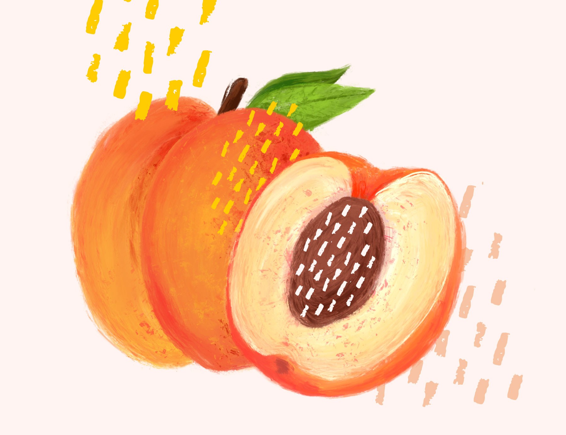
Fruity illustration for the flavoured range
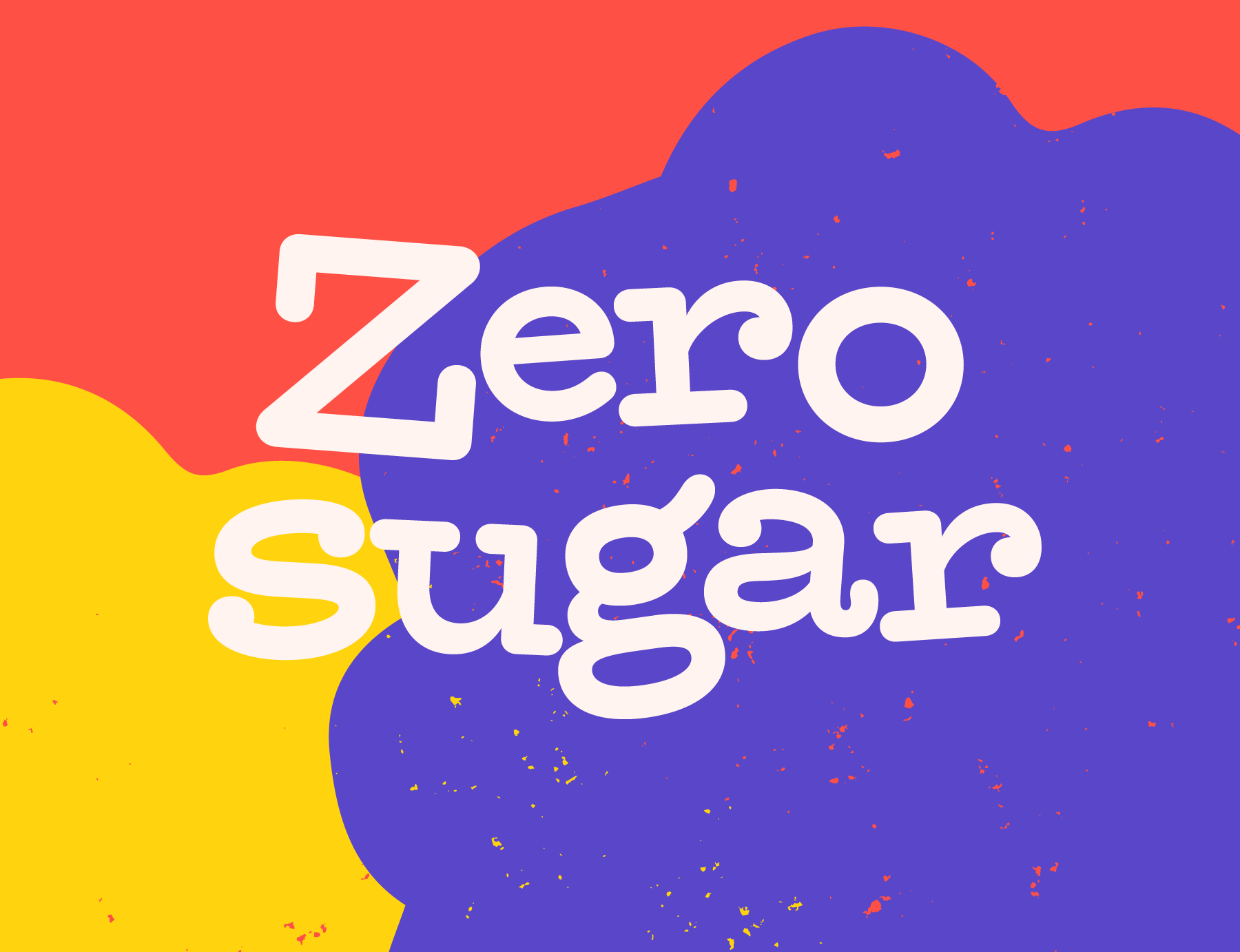
This is where we felt we could have a lot of fun with the new brand style and wanted to introduce an explosion of colour and expression reflecting the fun flavours of the water. We combined the rain pattern and wordmark with vibrant colours and hand drawn illustrations along with no nonsense copy to create the finished labels and design style.
Bringing the new brand to life
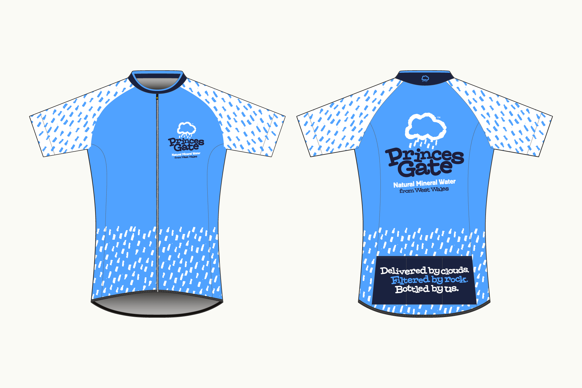
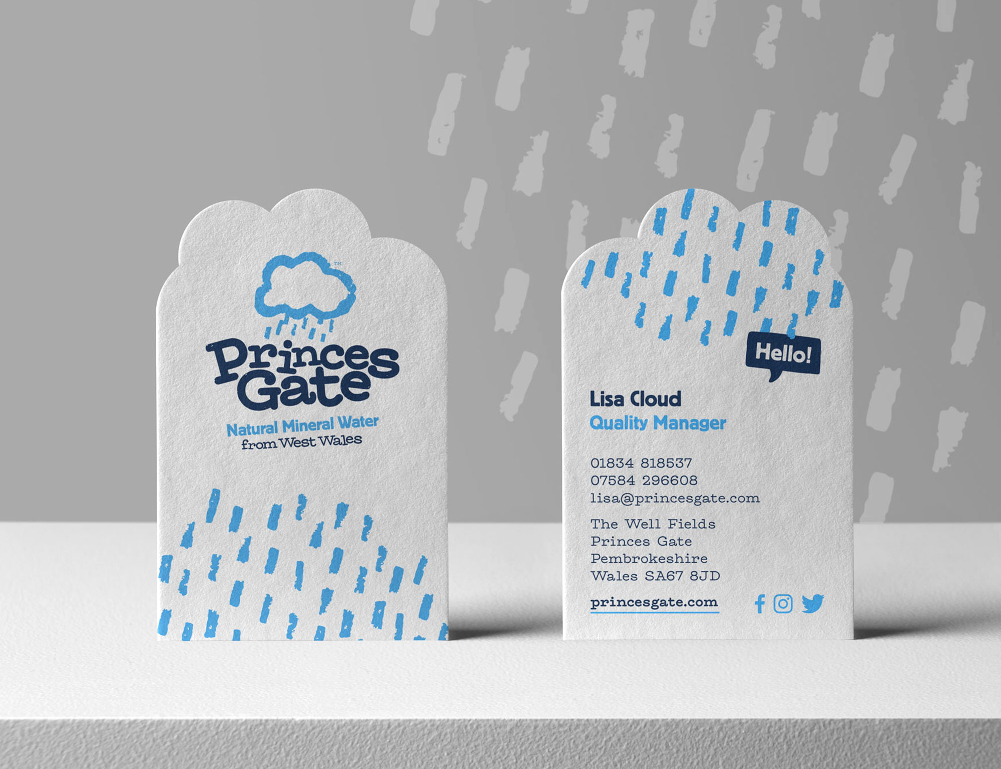
We have enjoyed working on a wide variety of brand collateral since the creation of the new branding and design style including brochures, multi packs, point of sale signage and even a cycling kit ahead of the Ironman triathlon!