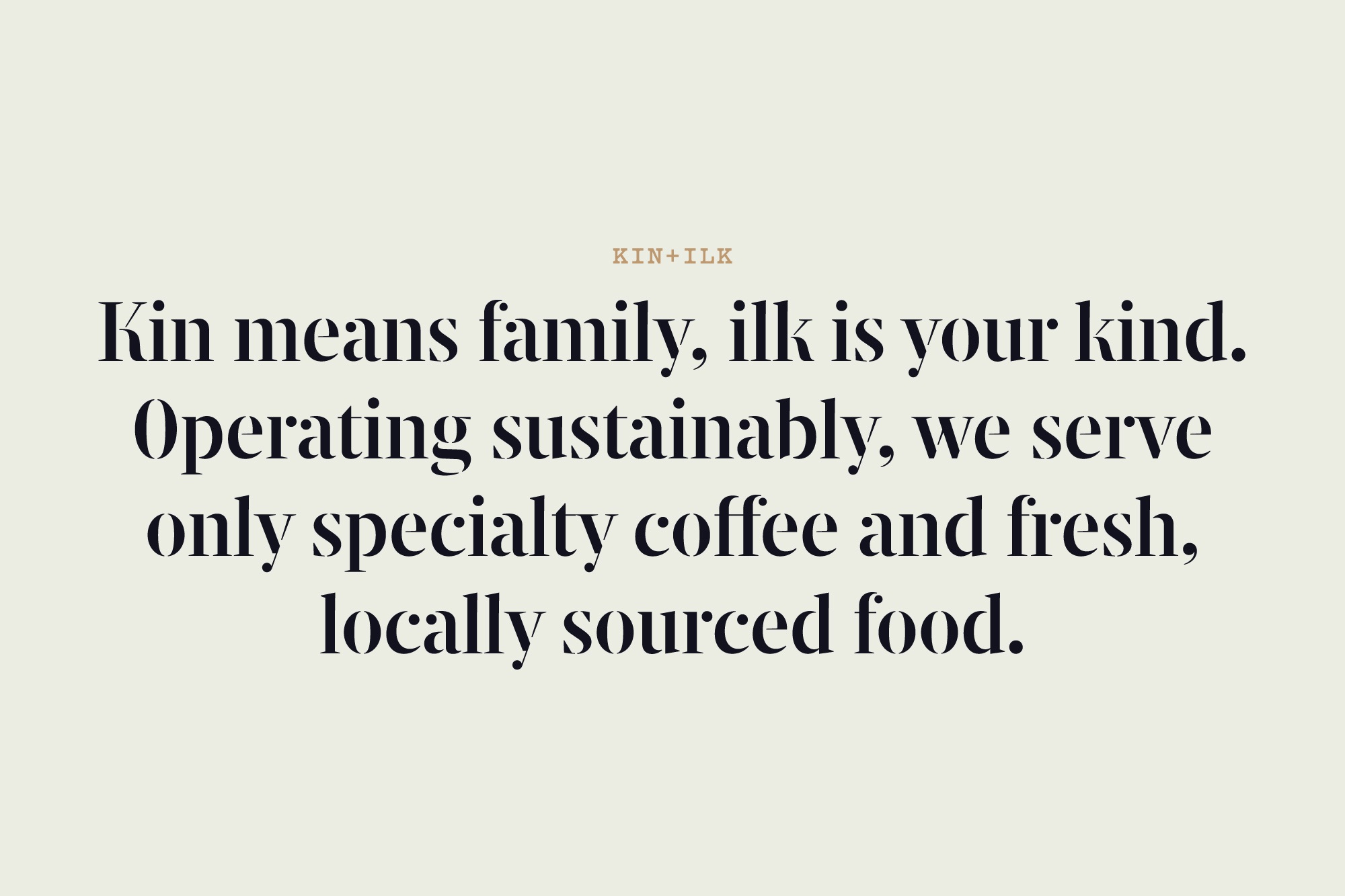
KIN+ILK
A chain of Cardiff-based, independent coffee shops looking to grow their community and provide beautifully designed spaces and carefully sourced produce.
Keeping things fresh
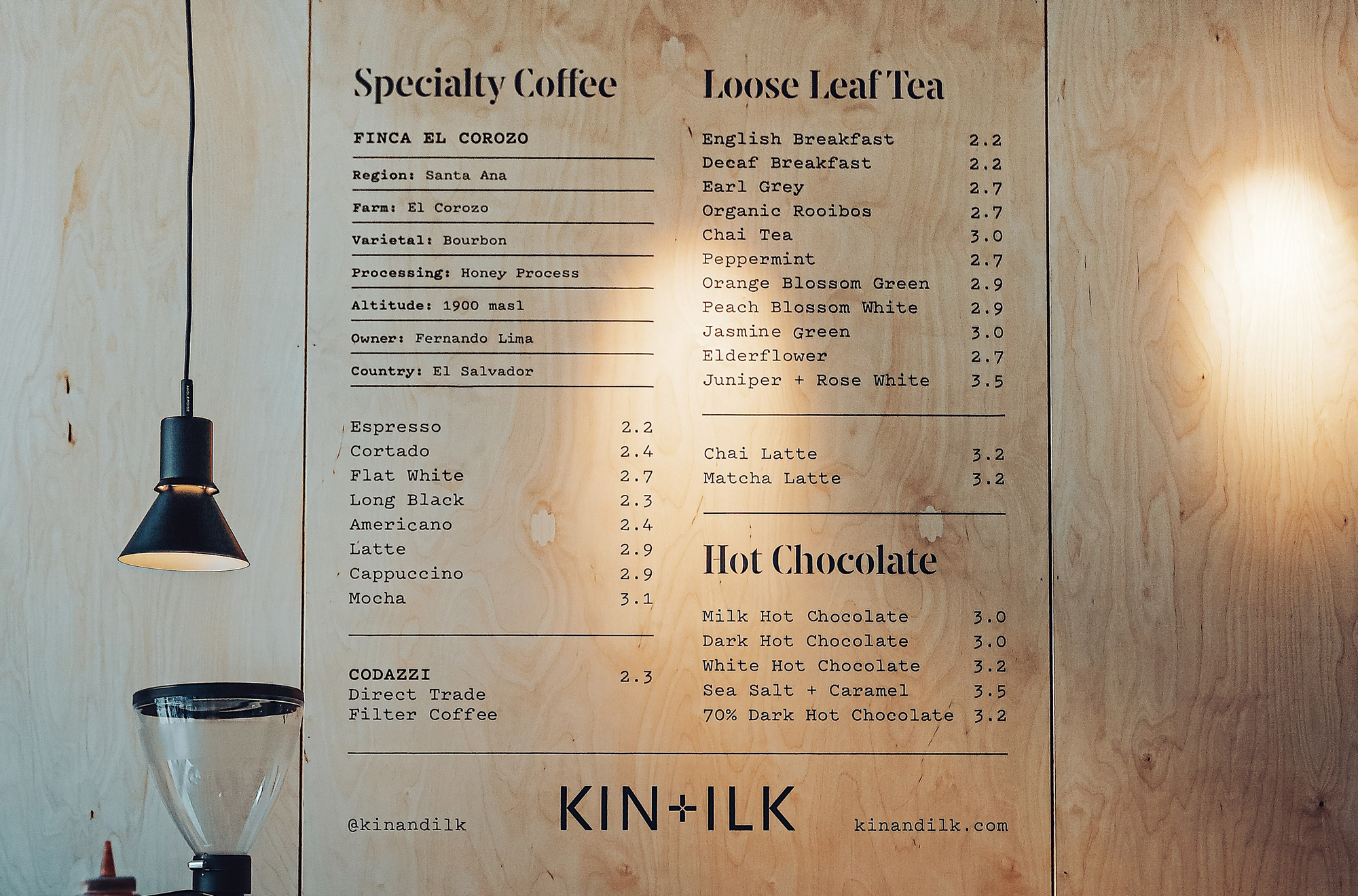
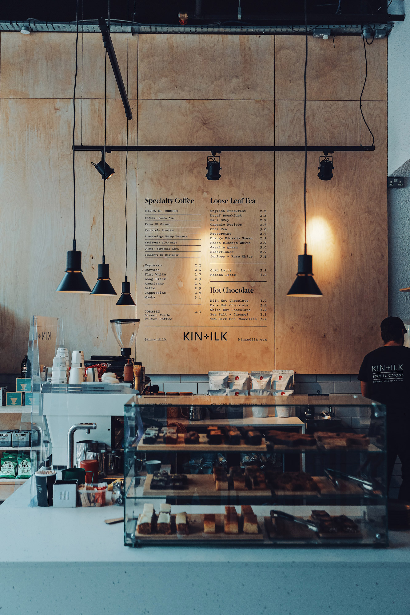
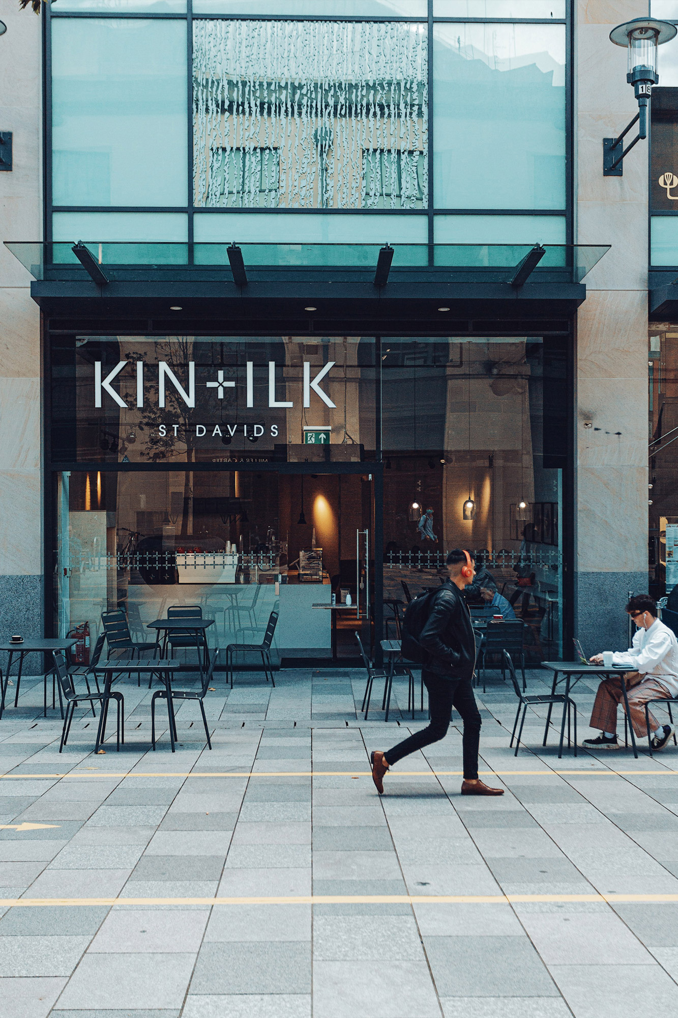
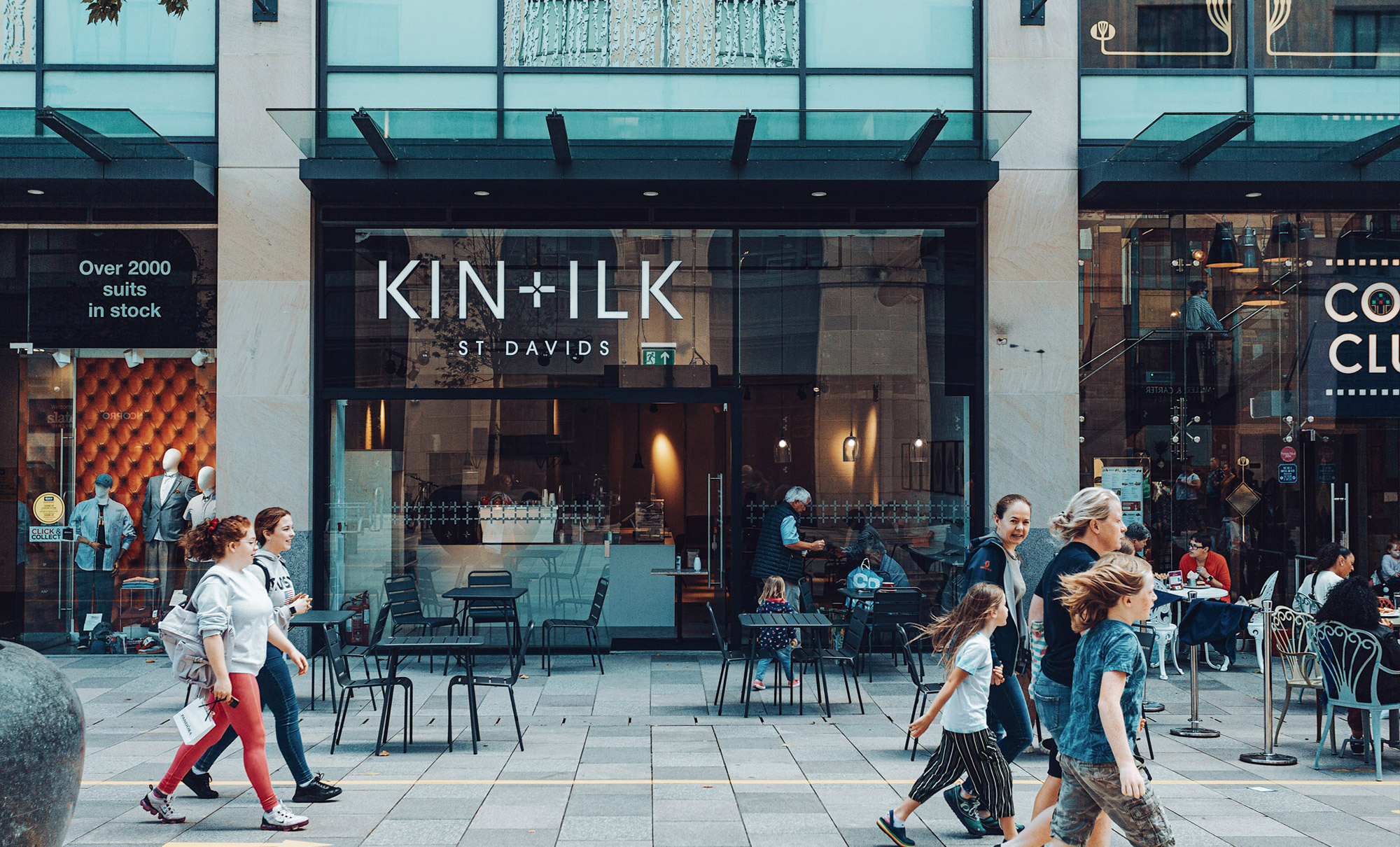
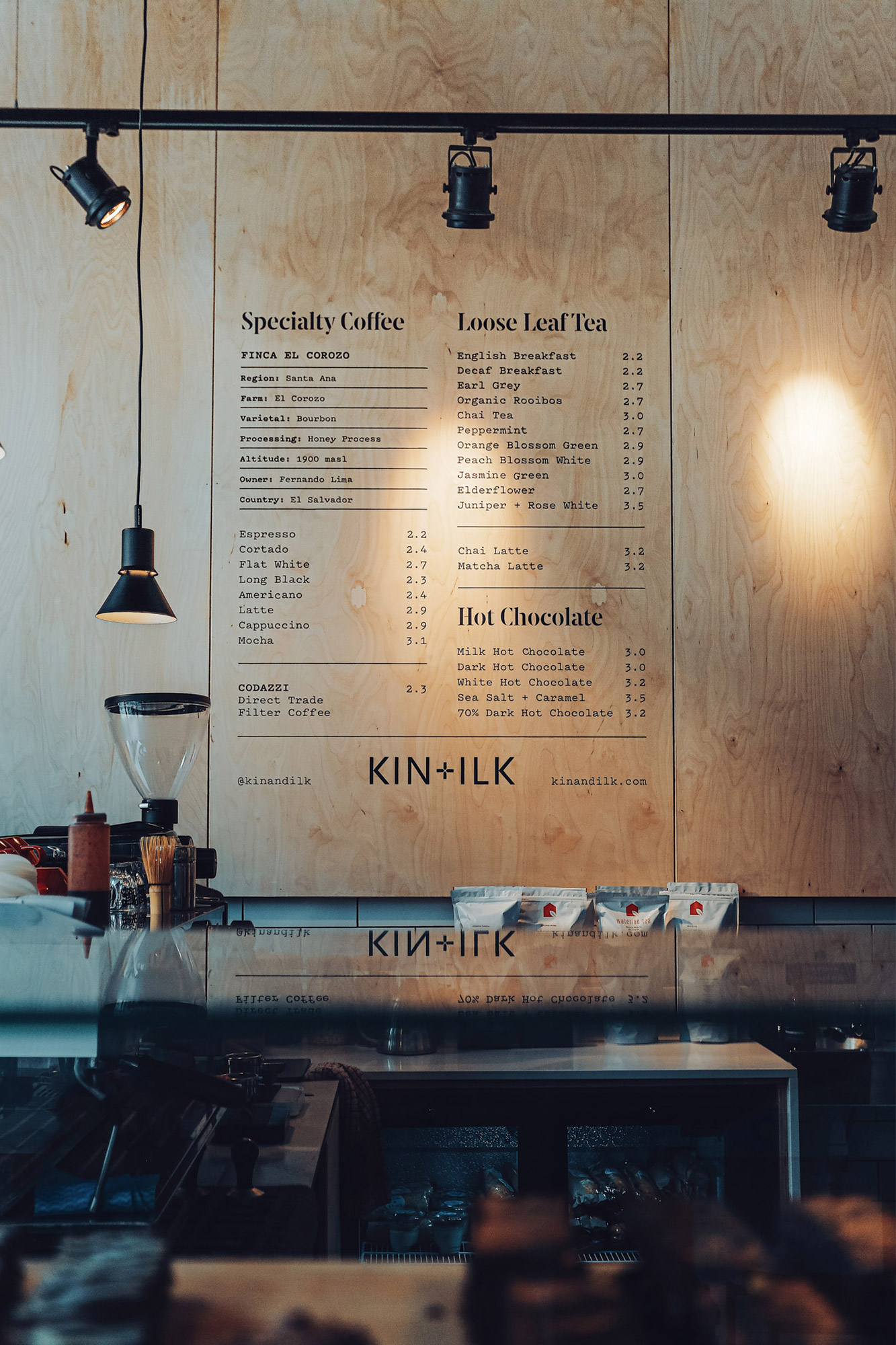
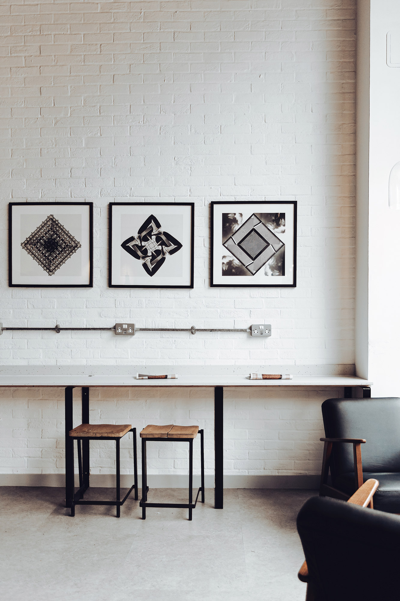
KIN+ILK opened their first shop in 2015 and has grown to become an integral part of Cardiff’s coffee community. The original brand identity was created and established by the talented Alex Jenkins and, as with any brand, evolution is key to keeping things fresh and ensuring it reflects an ever changing business. With this in mind, the team recently asked us to update their signage, menus and marketing assets to keep everything coherent and in line with the current offering.
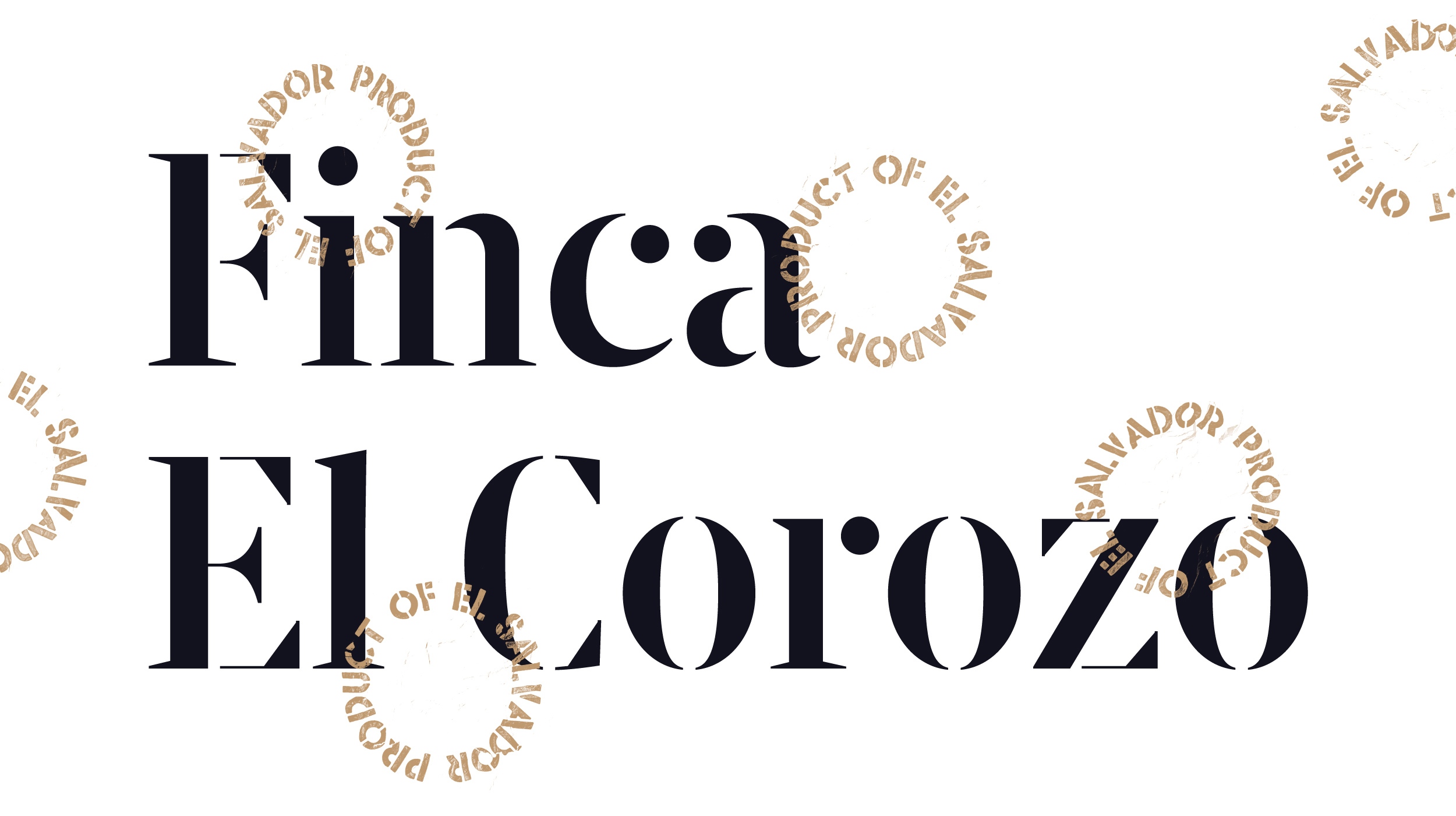
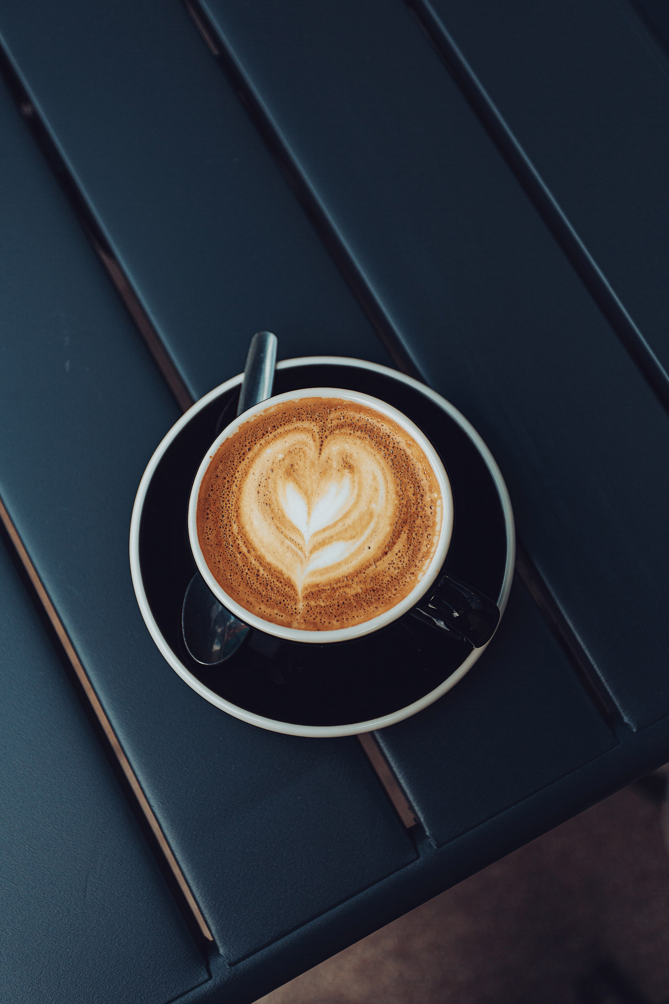
This is a loved brand, with an eye on the bigger mission of the company – to create inclusive, sustainable and creative spaces that support the wider community, whilst also serving top notch coffee and food. The newspaper we worked on together recently highlights some of the ways in which they work to do this. In terms of design, the existing identity made easy work of creating updated assets and complimentary layouts as well as new illustrations that showcase what KIN+ILK are all about.
Identity by Alex Jenkins
Photography by Steff Mitchell
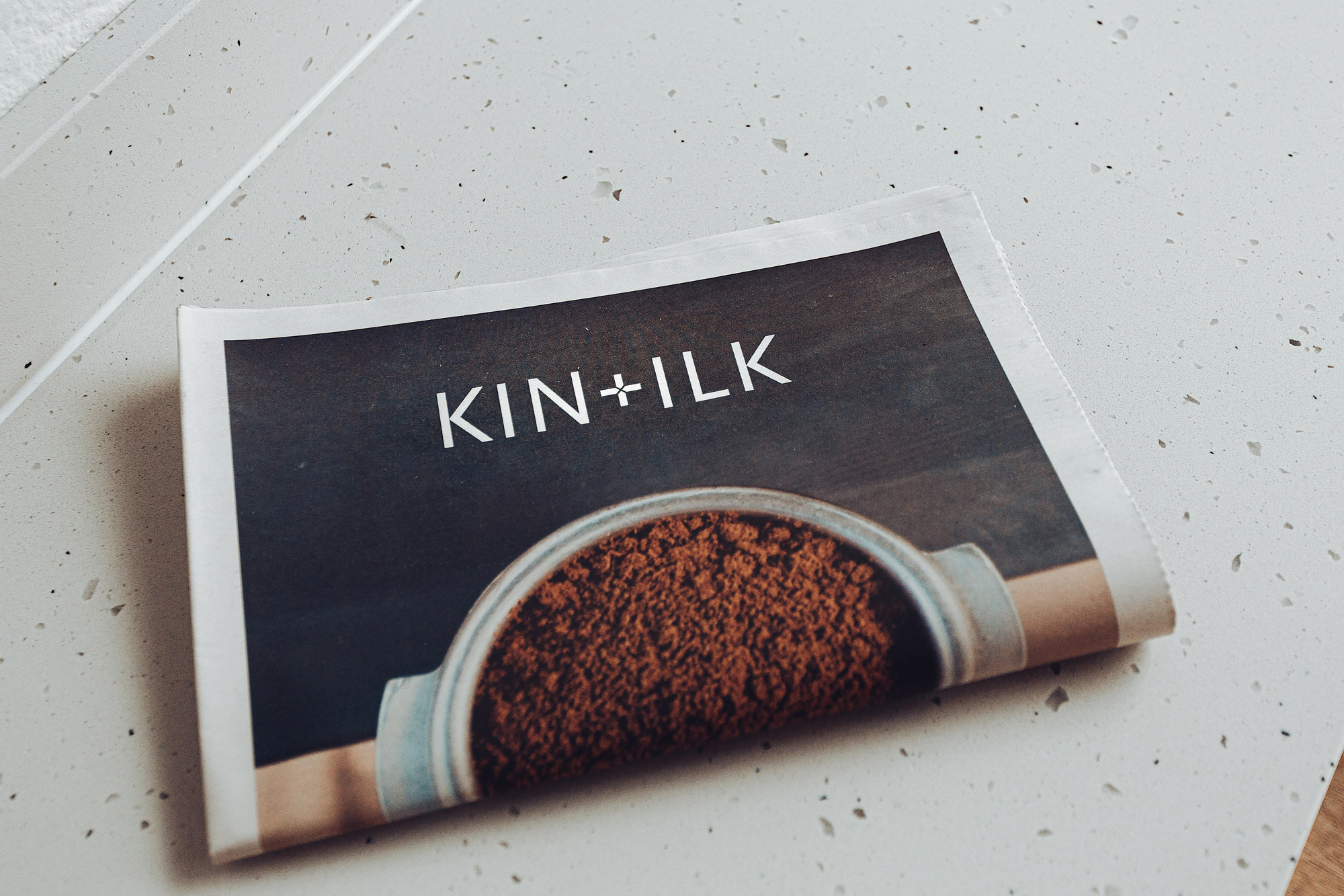
Read about the design of the KIN+ILK Newspaper.
Learn more about the Grid Forty Five exhibition.