Skeepers
Repositioning Skeepers as the industry leader of user generated content for shopper engagement with a bold new brand.
Creative collaboration
When a long-term collaborator of ours, Angélica, joined Skeepers as their Chief Marketing Officer and invited us to jump into a full rebrand, we knew we were in for a fun challenge! Skeepers is the European leader in shopper engagement solutions and provides an integrated user generated content suite to more than 8,000 clients globally. This industry, more than most, needs a brand that is flexible enough to keep up with the sheer speed of change in current consumer habits.
A brand strategy to create cohesion and direction
Skeepers was built from a number of smaller, acquired companies, all experts in their own areas of UGC. This meant there was little unity or coherence across the 450+ team or within their current brand presence. Strategically, we needed to clarify what current clients really value about the service Skeepers provides, what the company wants to be known for and how they want to communicate. We kicked off with a week of workshops in France with staff from across the whole organisation, as well as Skeepers customers, and followed with an online survey to ensure that everybody had the opportunity to feed into the branding process, fostering inclusivity from the word go.
The feedback helped us clarify Skeepers value proposition, their main challenges and how a rebrand can help to address these, as well as their tone of voice and purpose. This left us in a great position to tackle the rebrand and think about how best to communicate Skeepers USP.
Don’t just advertise, advocate
To kick-start our branding process we often write a manifesto, something that distills everything we’ve learned. Ideally, it should reflect the new vision, mission, and values, as well as keeping us focussed on the company’s core purpose whilst we work.
Meaningful brand identity
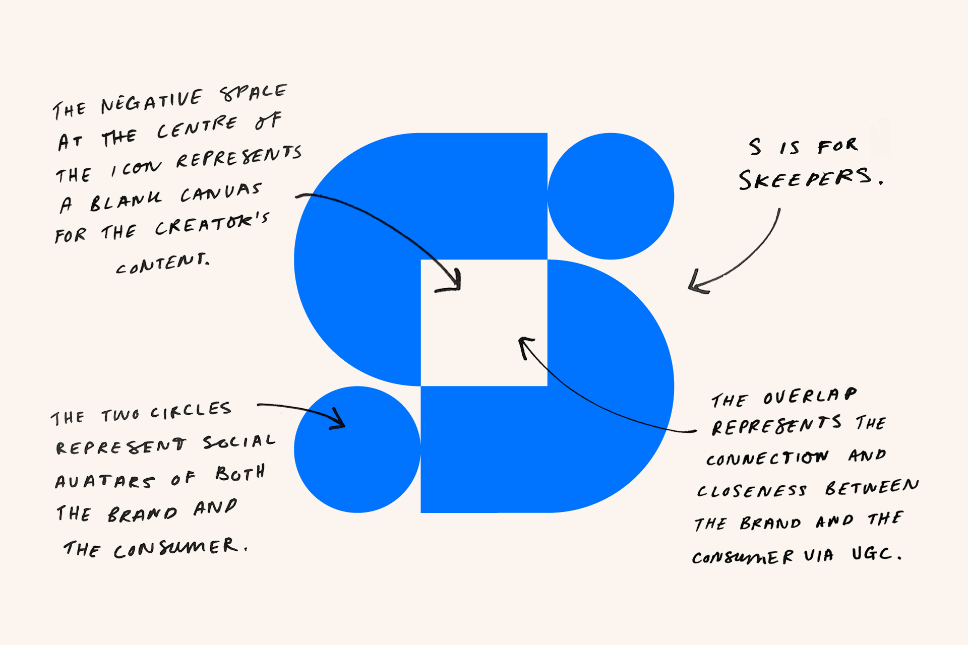
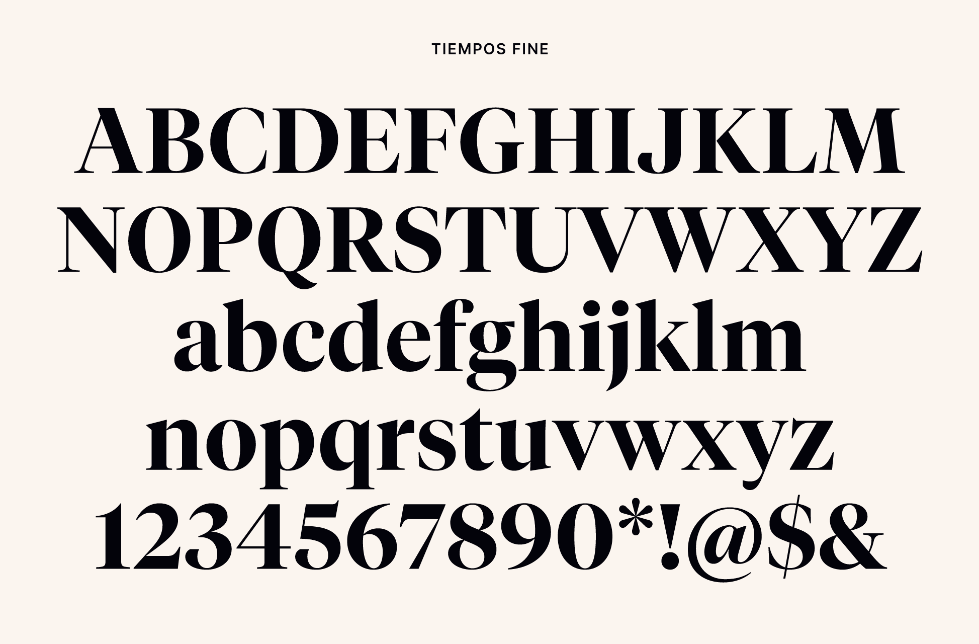
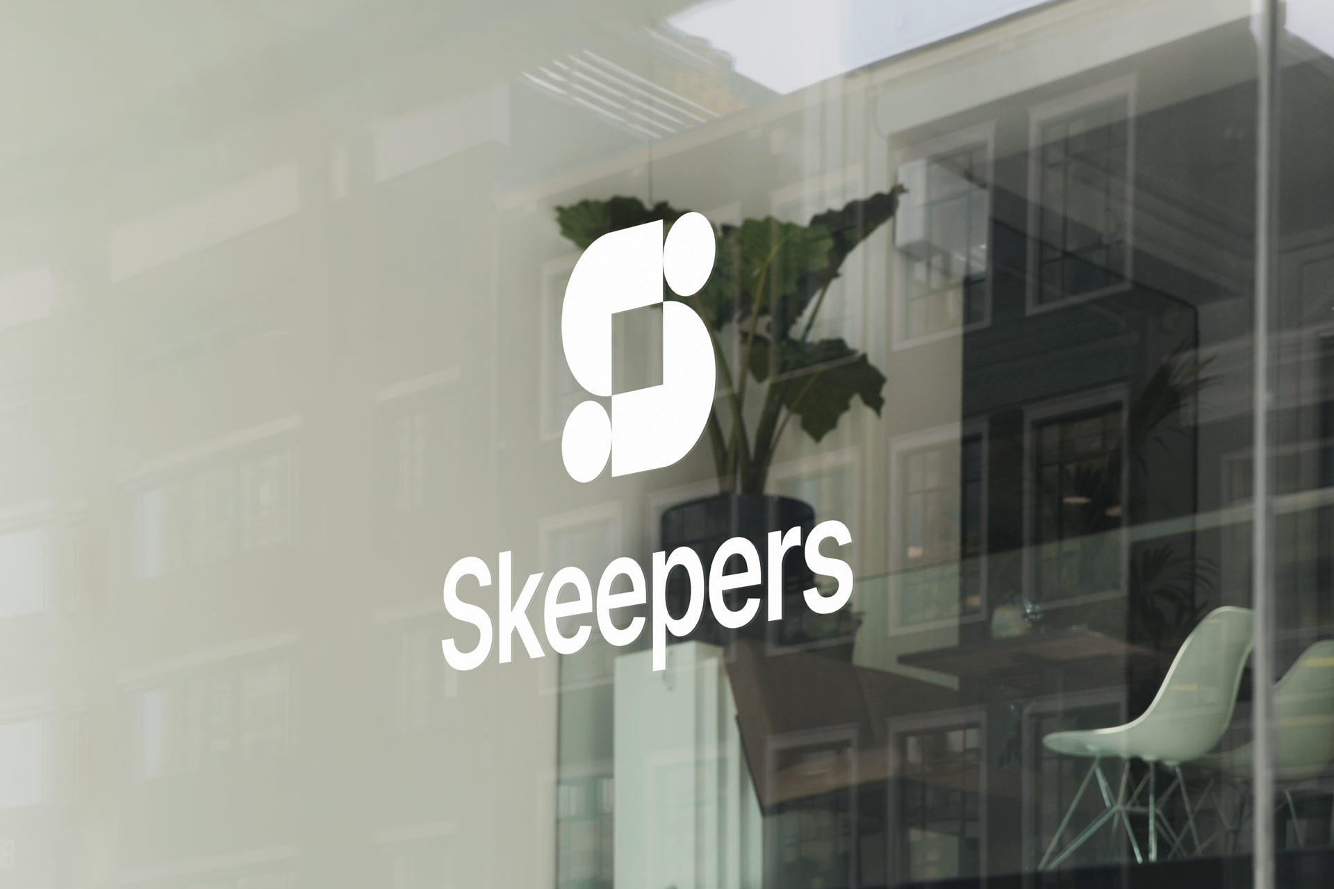
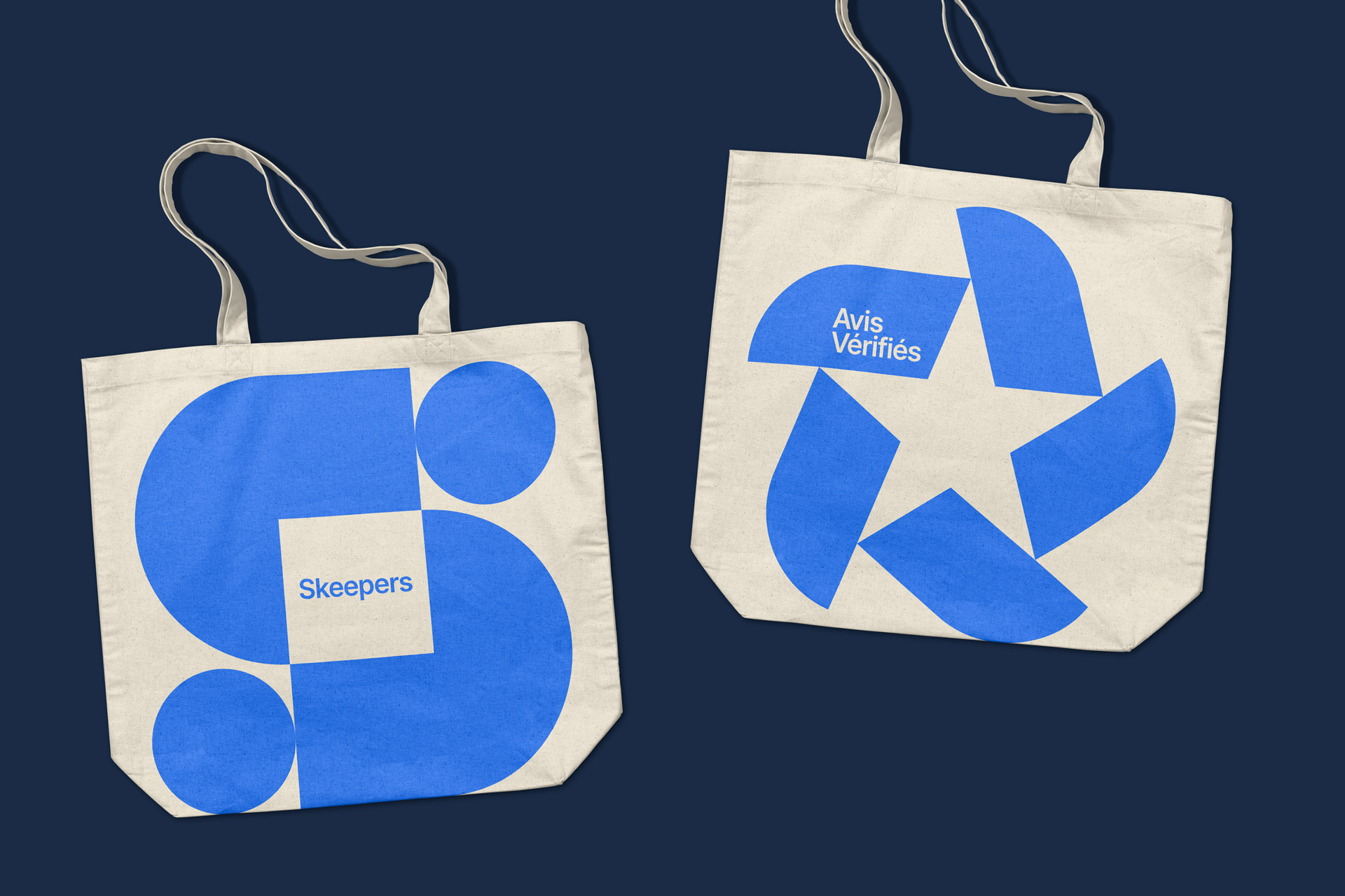
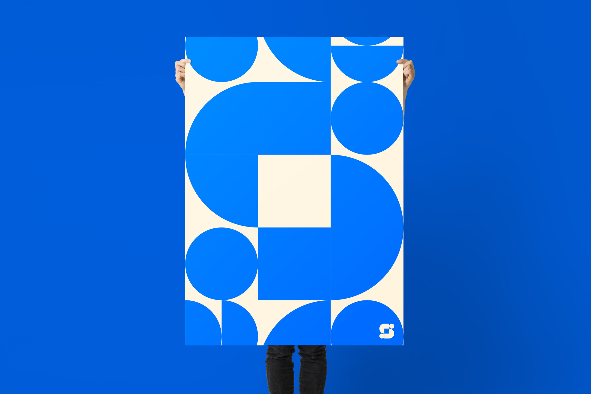
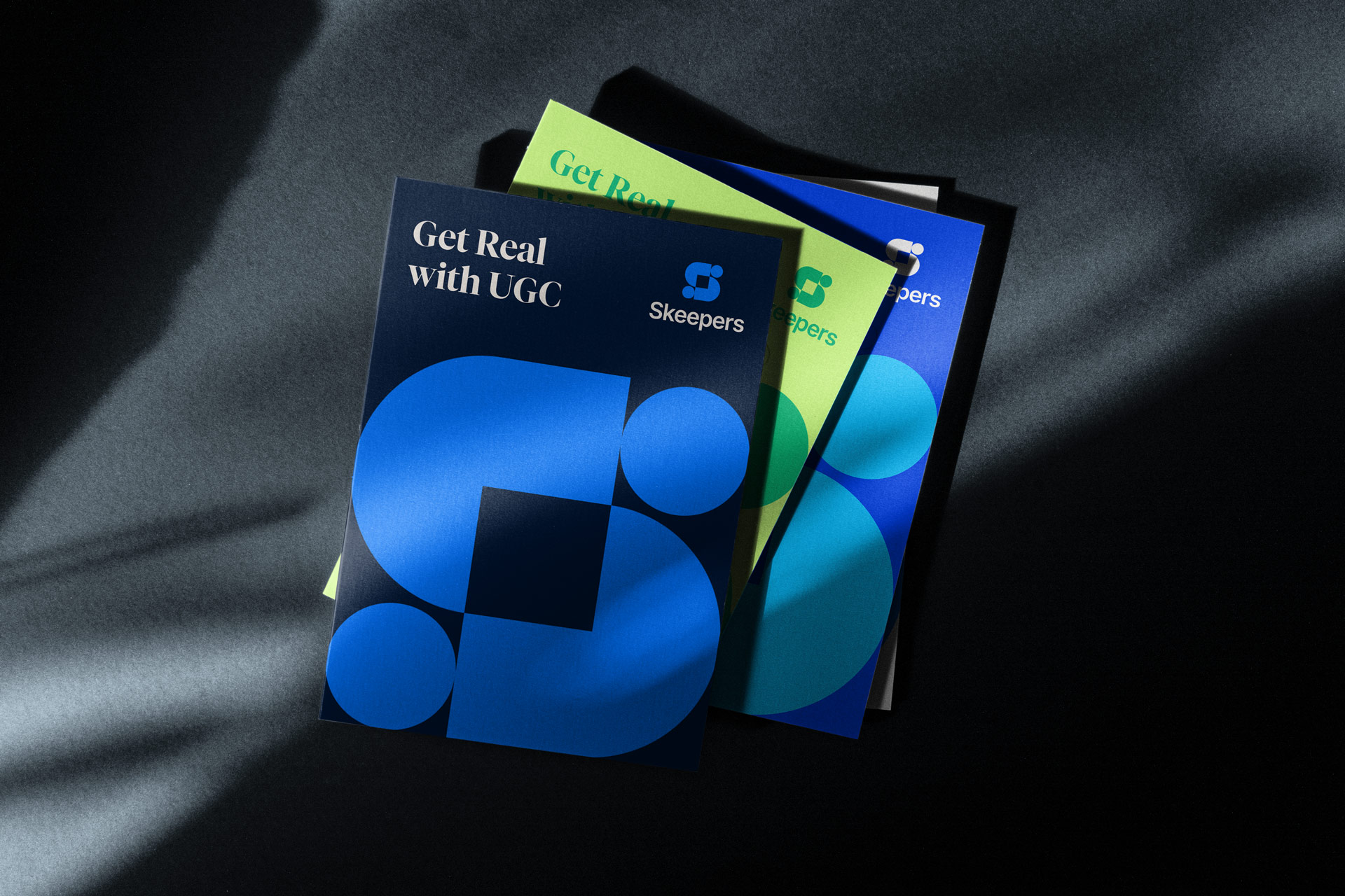
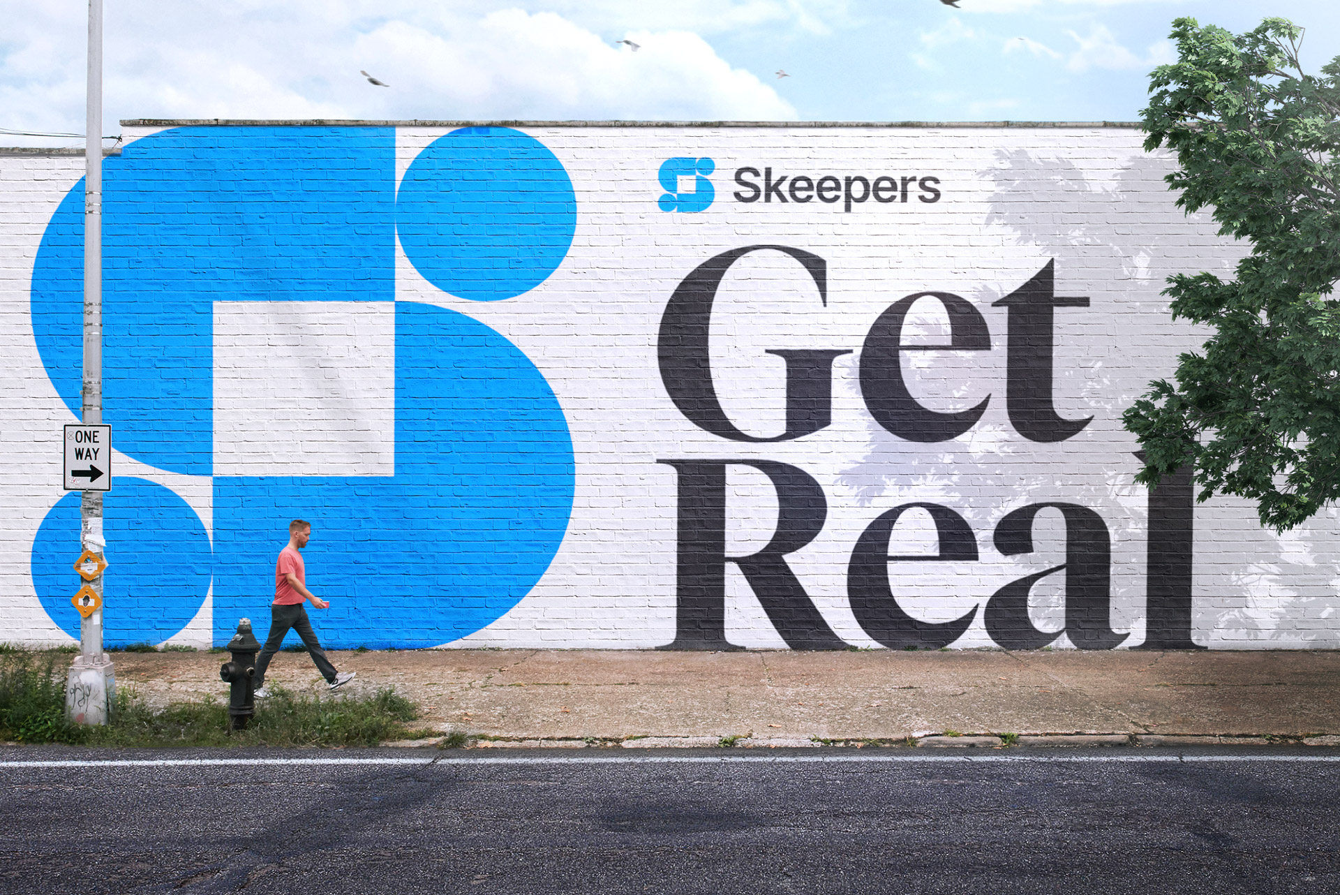
For the main Skeepers identity, we created a logo that works to represent both the brand, the creator, and the canvas to showcase this creative collaboration. The icon also features two user icons, these can each represent a creator, a reviewer, or a brand. The logo breaks up nicely to represent the many parts of Skeepers and the collaborations that are key to the successful creation of effective UGC. The logo is completed with Skeepers written in a modern, clean, and confident typeface.

Avis Vérifiés
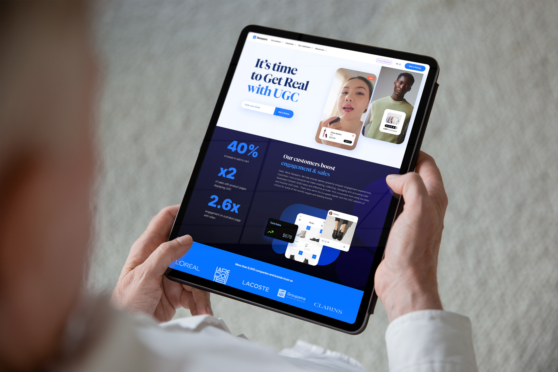
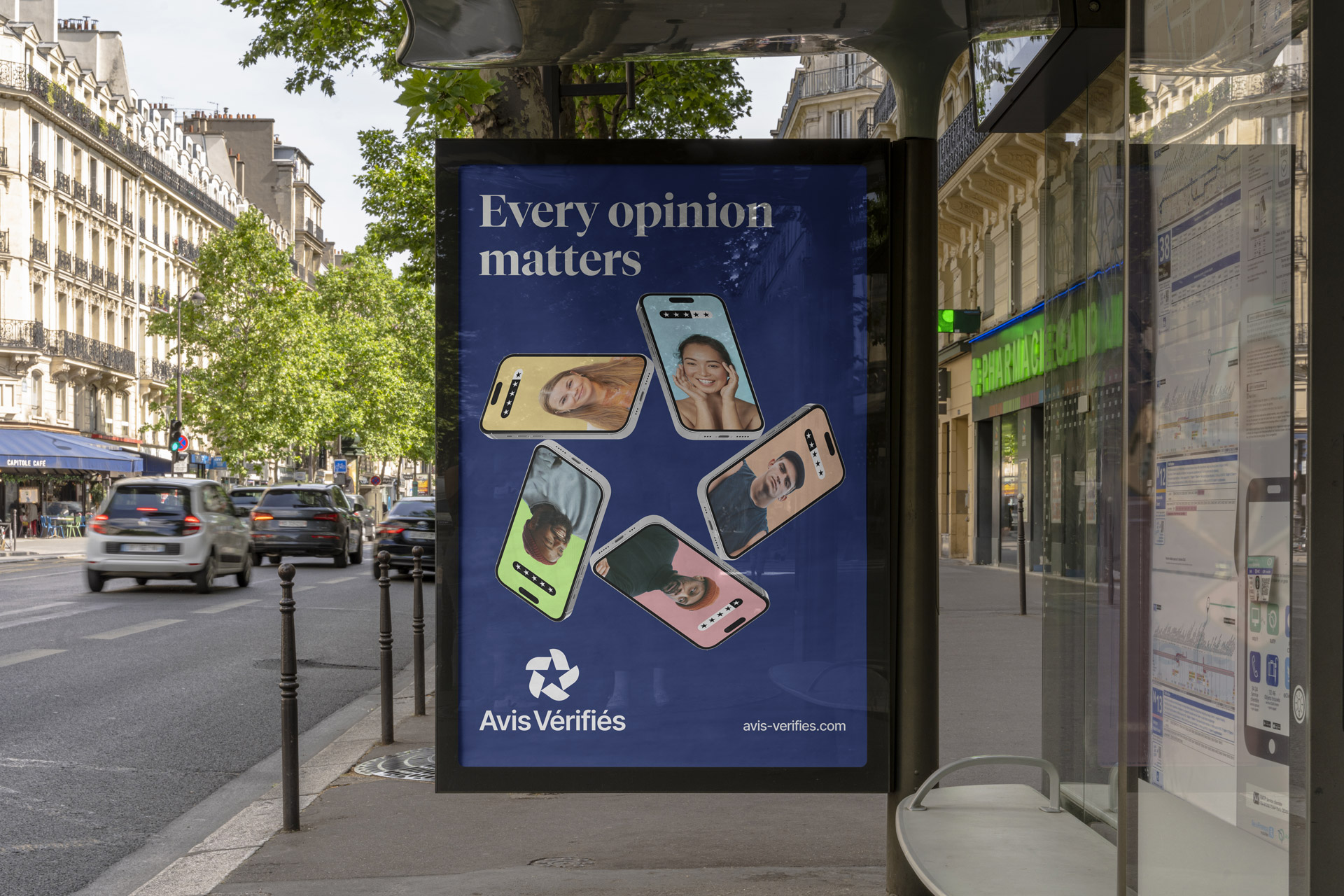
The long-standing reviewing platform Avis Vérifiés is part of the Skeepers suite, it has a great reputation and has become an established and trusted brand over the last ten years. The decision was made to create a new, separate identity to leverage this brand awareness whilst ensuring it’s still in keeping with the wider Skeepers family brand.
Product icon suite
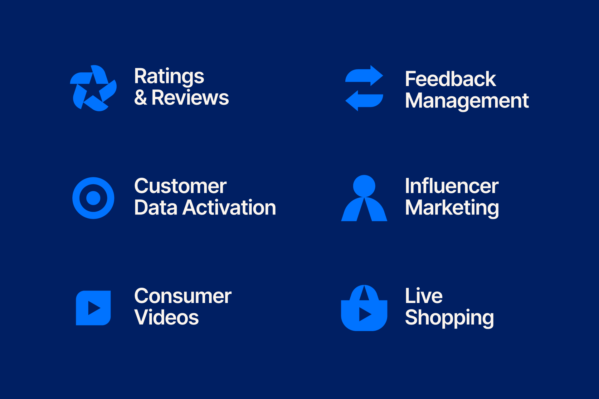
A big part of this rebrand has been working towards simplifying and distilling the Skeepers offering. This process included the creation of a new range of product icons which work to quickly represent the suite of Skeepers services, from Ratings and Reviews, Influencer Marketing, and Live Shopping.
An inclusive and flexible design style
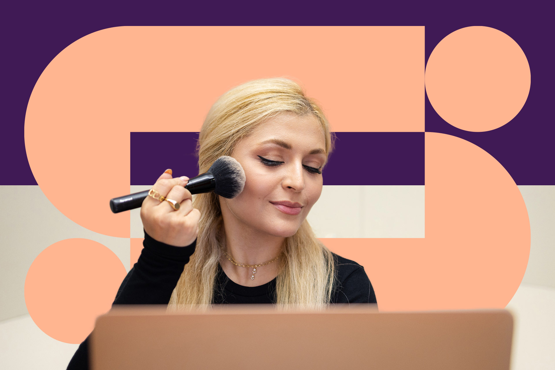
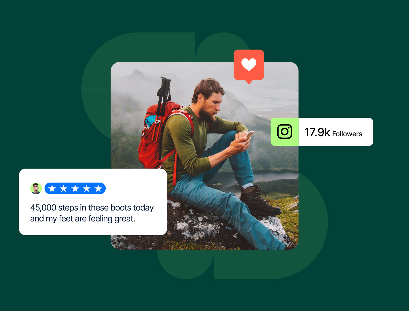
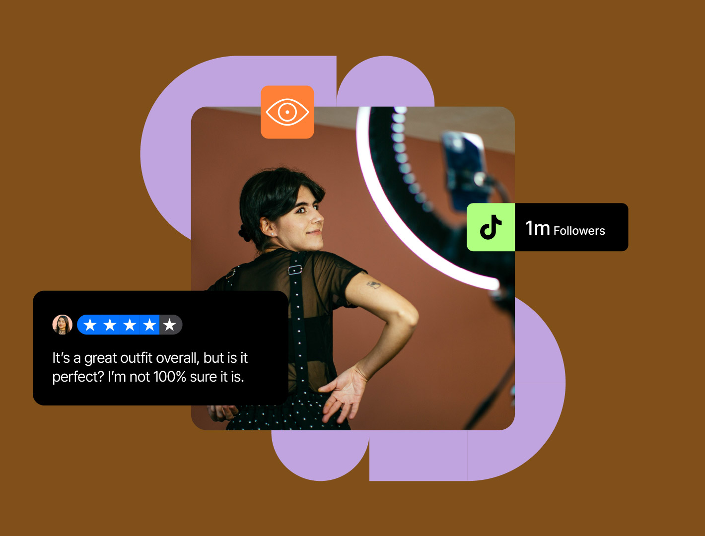
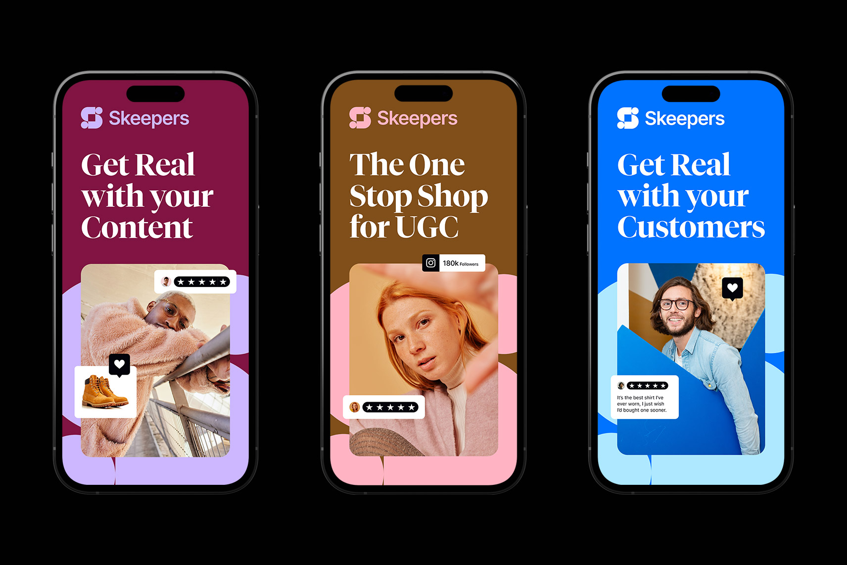
The design style we developed had to have all the vibrancy, uniqueness, and individuality of the community that it serves, which potentially includes literally everybody! Whether you are a brand looking to showcase your new beauty product, a creator looking to share content about an outdoors brand you love or a shopper looking for the latest cookware.
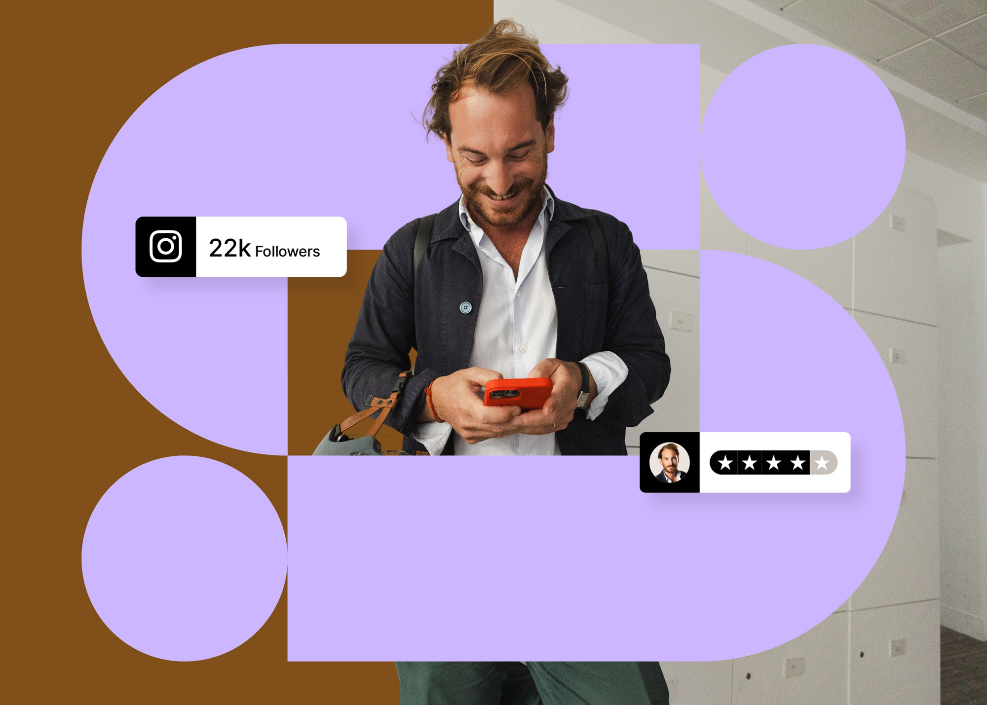
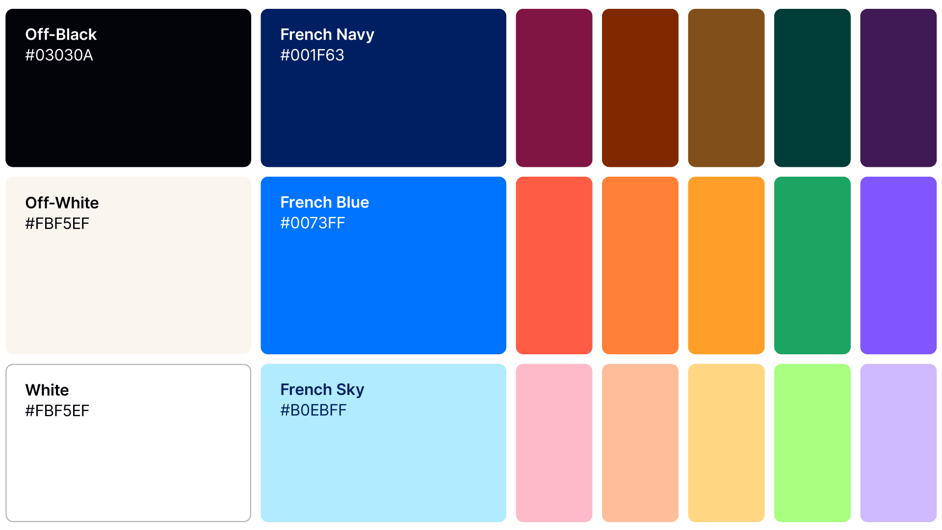
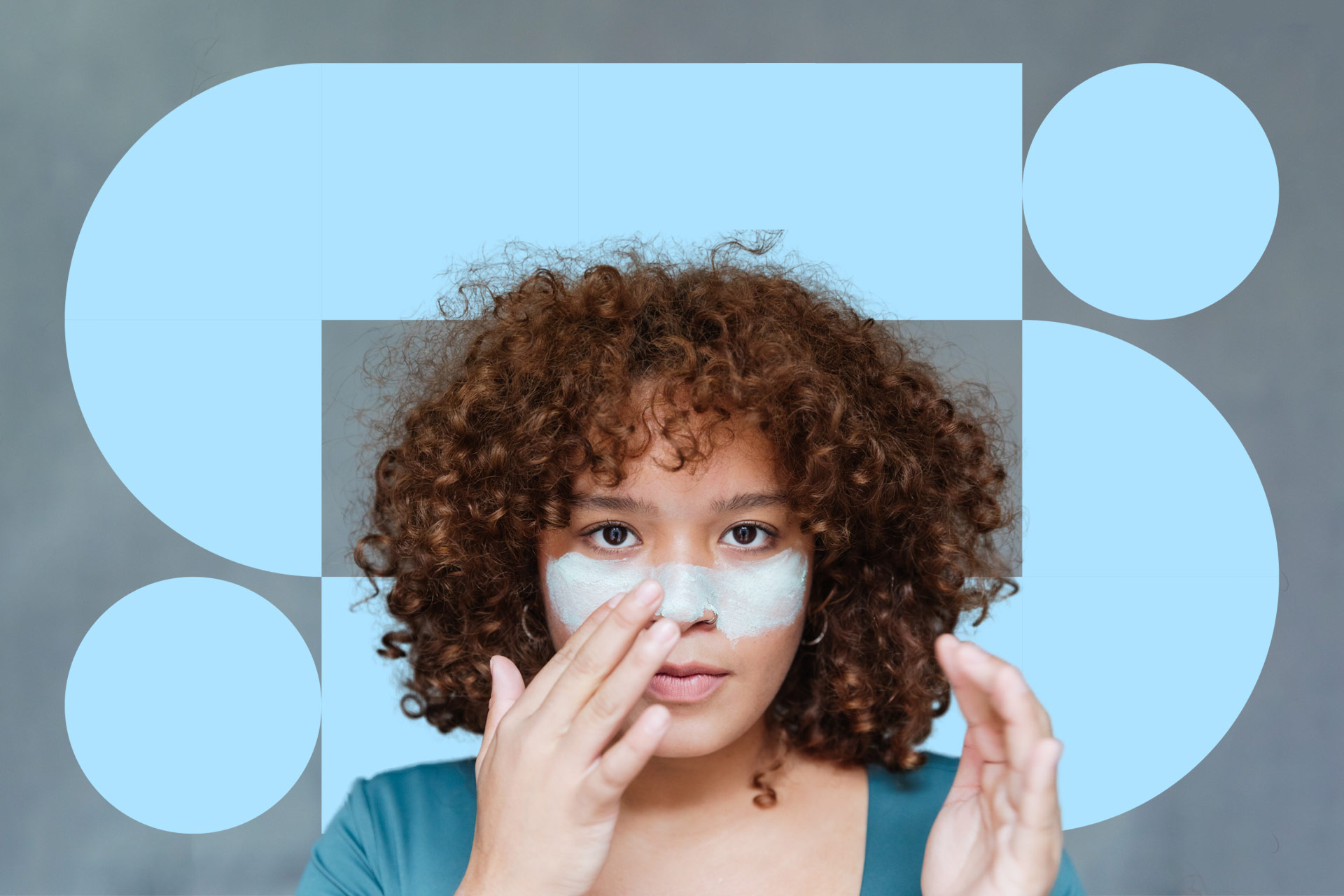
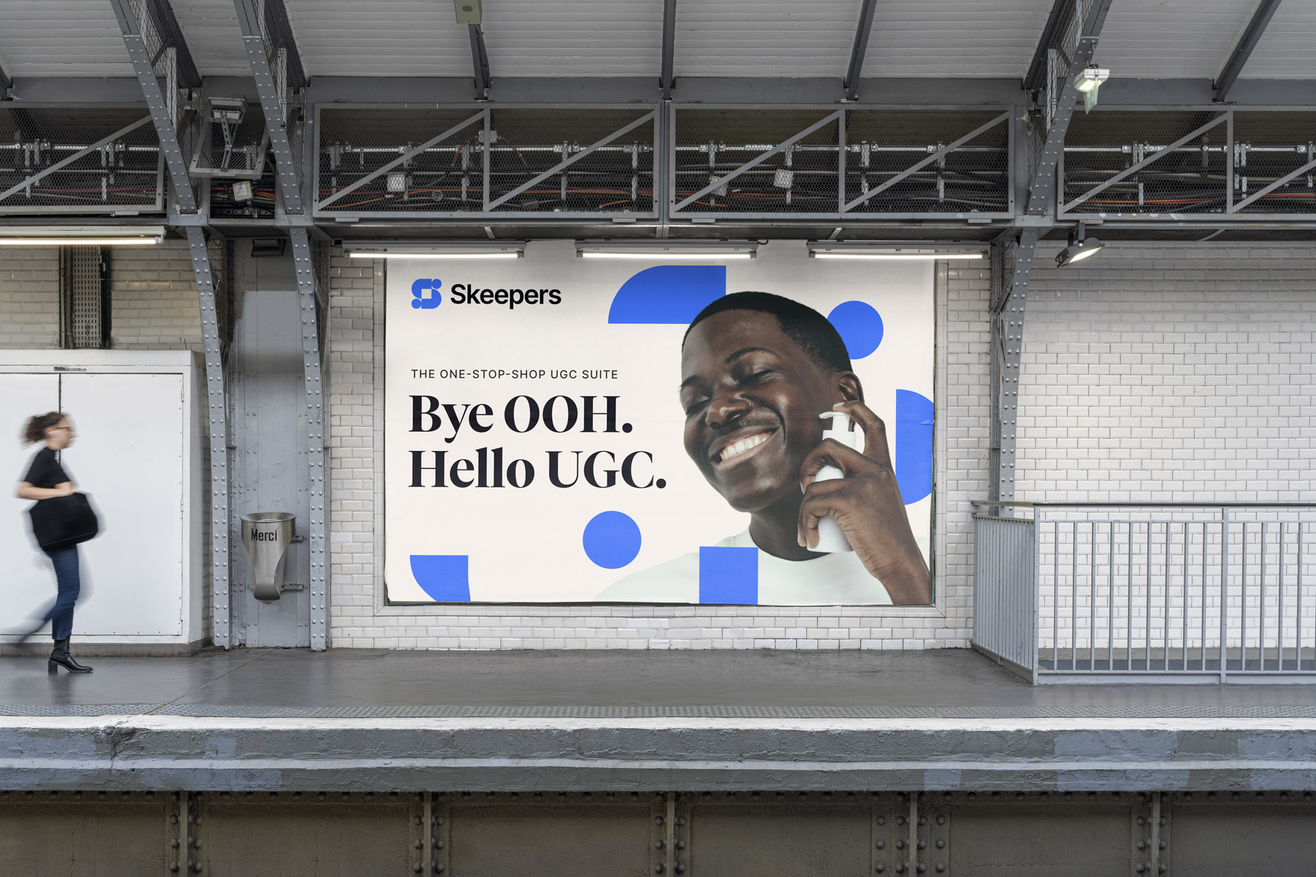
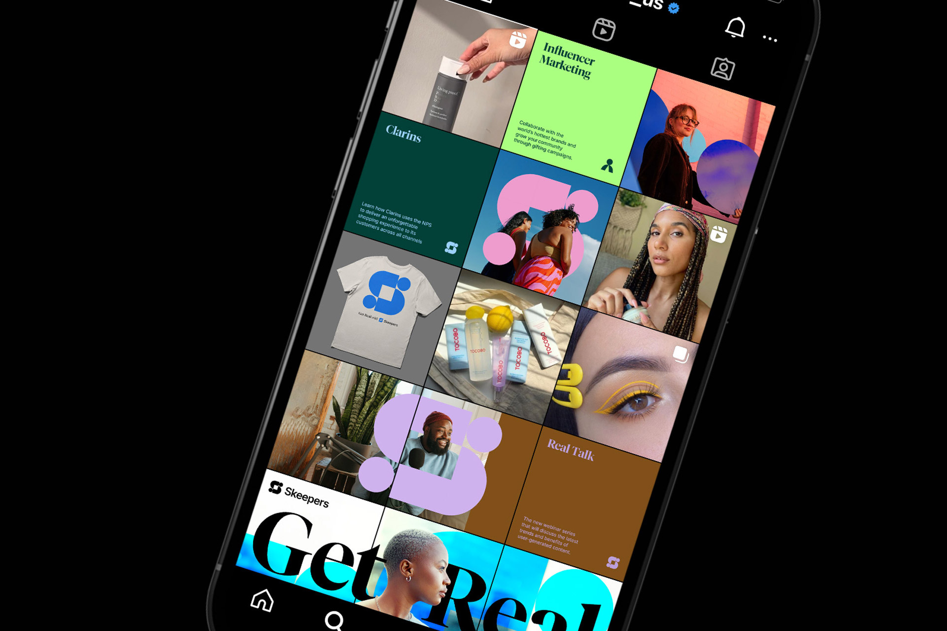
This design style can be used to showcase you or your product with its varied colour palette and adaptable canvas. The logo works well as an individual set of shapes that can interact with photography of people and products, working as a visual representation of the partnership. We also worked on a UI kit to include in the brand toolkit to ensure that we can effectively communicate the specific benefits and features of each Skeepers product.



An authentic photography style
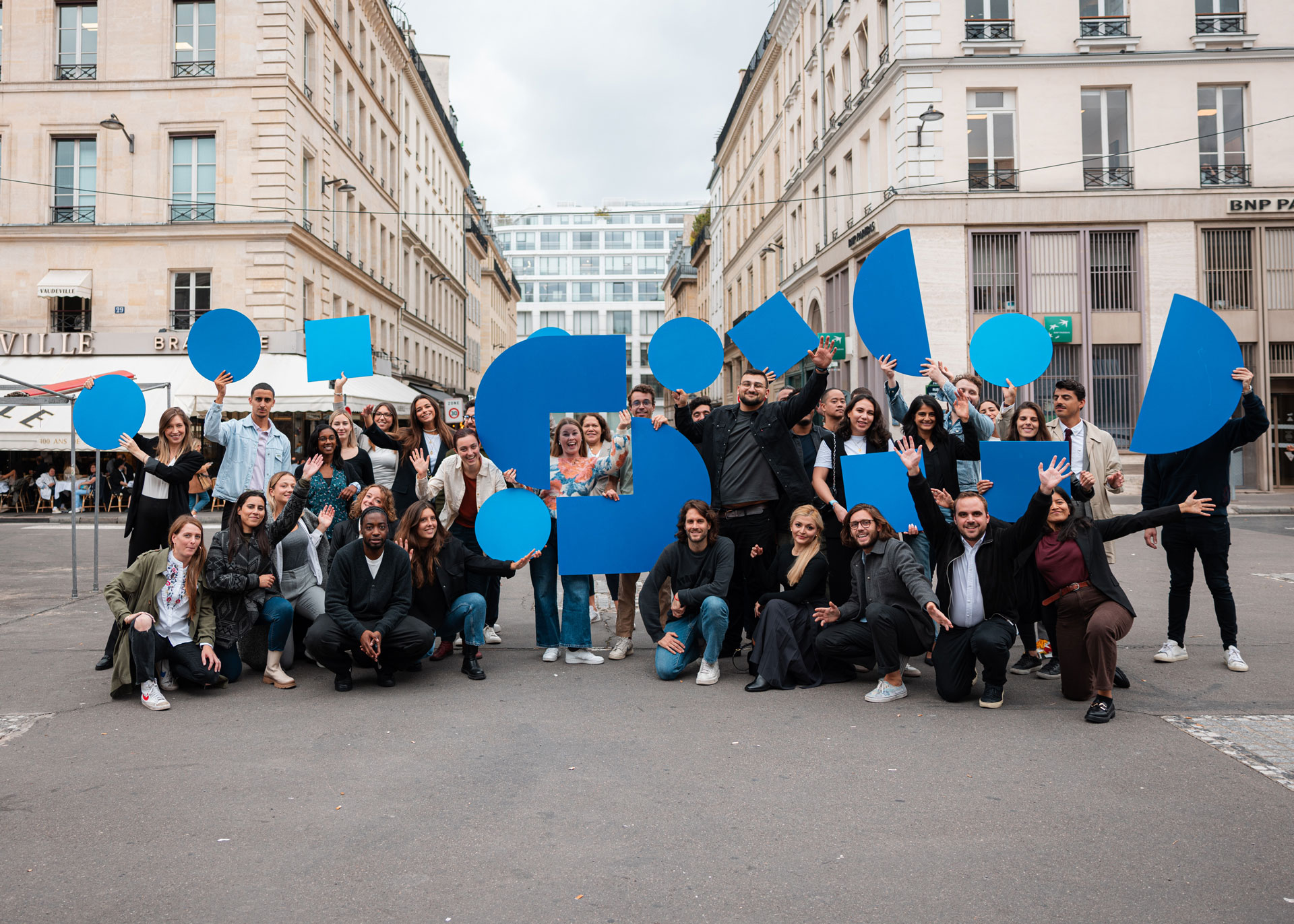
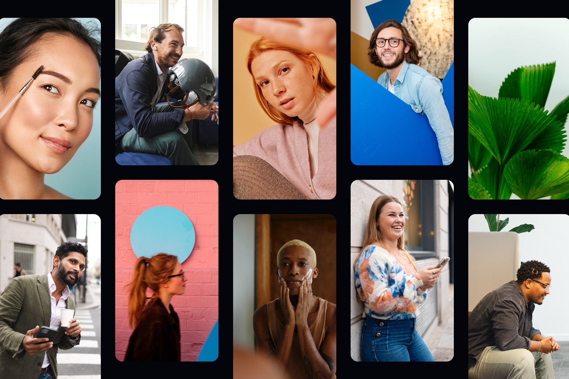
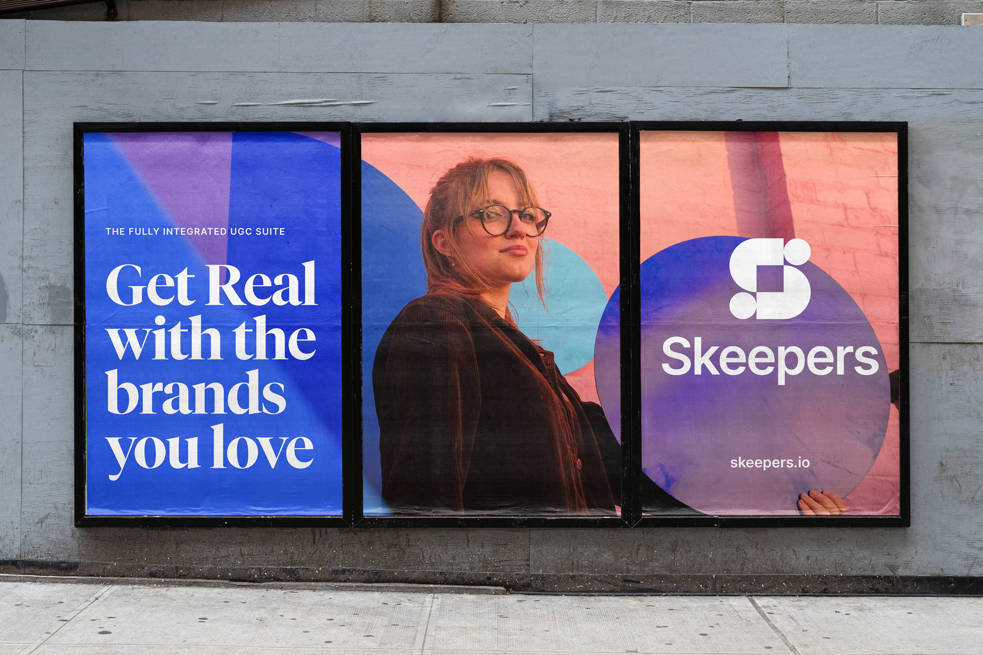
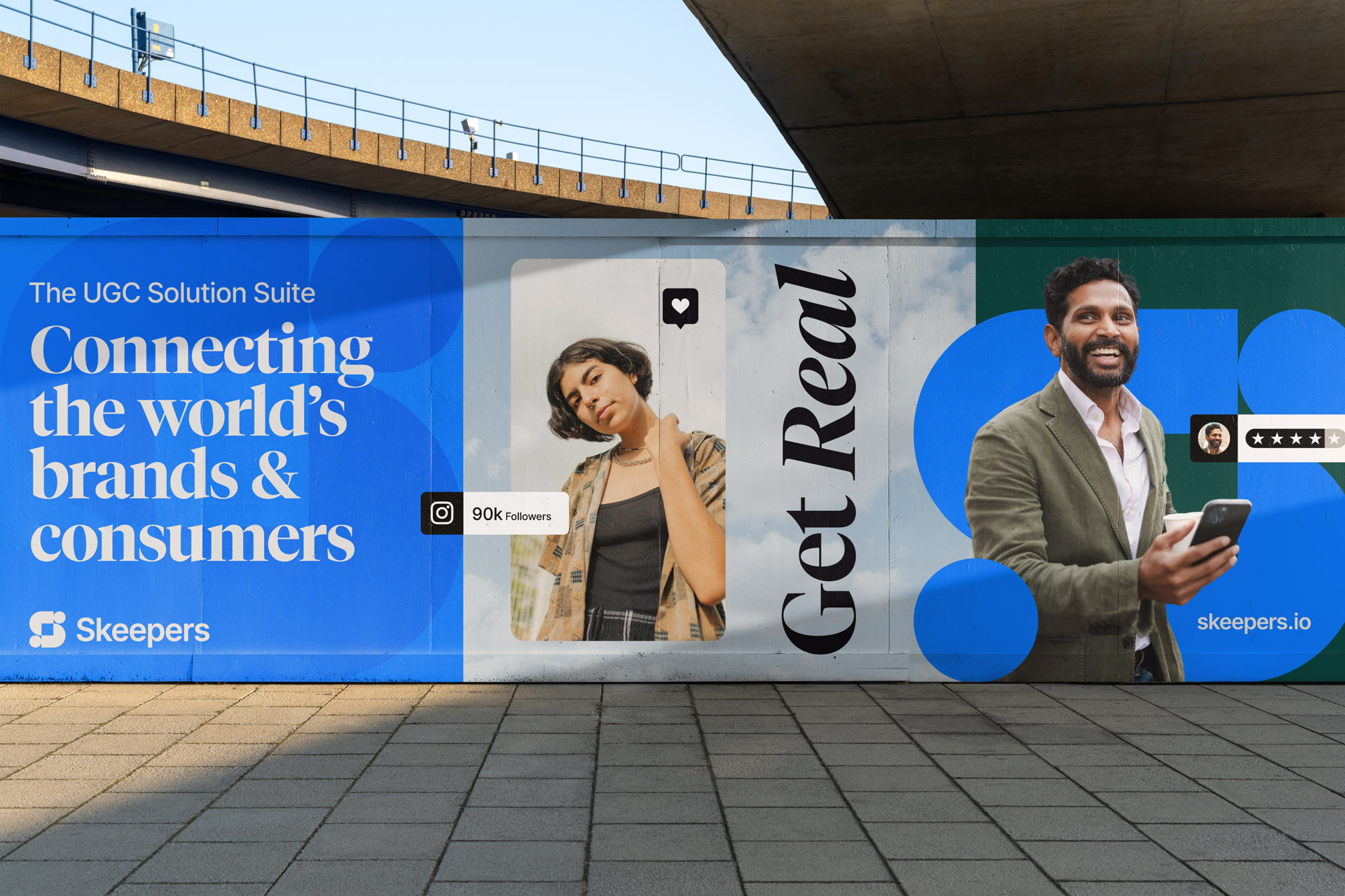
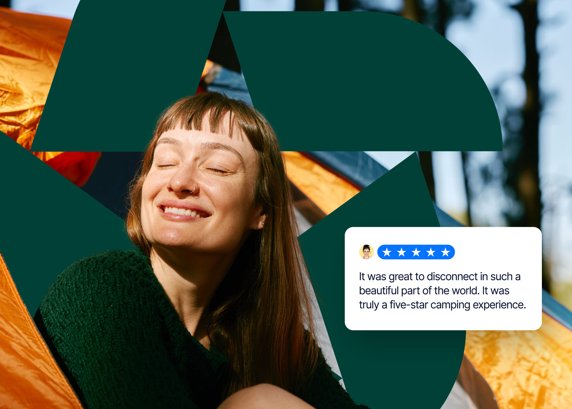
In terms of an approach to the brand photography, we focussed on authenticity. During our discovery we heard loud and clear that Skeepers needed to ‘practice what we preach’ as UGC industry leaders. Skeepers photography and video content needs to feel fresh and authentic featuring real people, real scenarios and locations. We brought this vision to life with a photoshoot featuring the Skeepers logo produced as large shapes to be held and positioned around the set. Having the models interact physically with the logo represents the wider Skeepers vision, to connect the world’s brands and consumers.

Image Framing
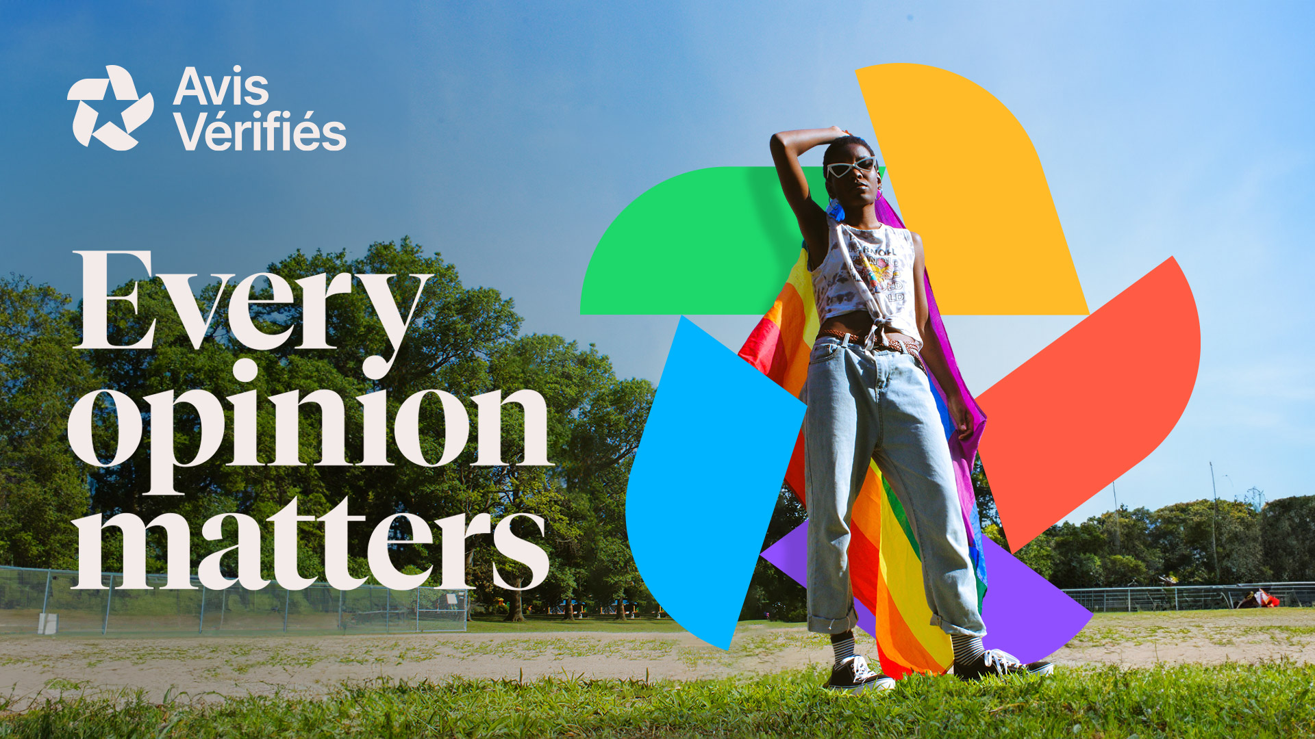
A key element of the design style is that it works to showcase consumers. Both, the Skeepers and Avis Vérifiés logos can be used to place the consumer front and centre, providing a frame that can be easily adapted to any new content. Alongside the varied colour palette this allows the brand to be as inclusive as possible.


Every opinion matters
It's important that the new brand feels open to all and makes everybody feel as though their opinion matters. This is what inspired and informed each element of the new design style, we want to help support Skeepers ambition to grow in an inclusive and socially responsible way.
Sharing the Skeepers vision
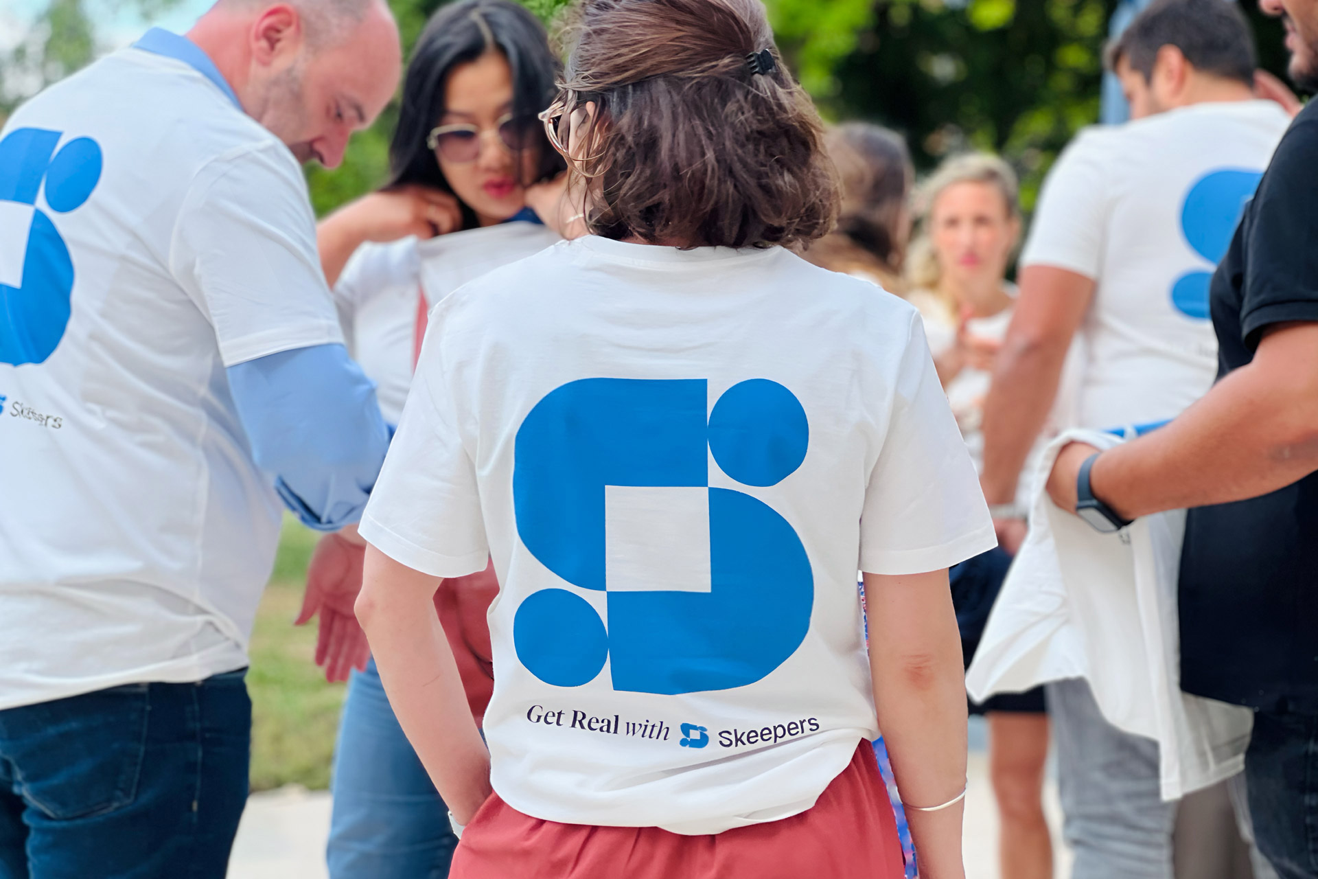
Today sees the launch of Skeepers’ new brand with parties happening across the globe, from Marseille to New York, we might even have a small one in the studio in Wales. We’ve worked with numerous teams on everything from office signage, launch videos, social posts to photoshoots and much more. As always, we are grateful to Angélica and Skeepers for trusting us with their vision for the company and feel excited for their next chapter.
Photography by Devil Boy Productions and Natalia Blauth.