Unite 23 by Unily
A London themed event brand for Unily's annual employee experience conference.
Community building
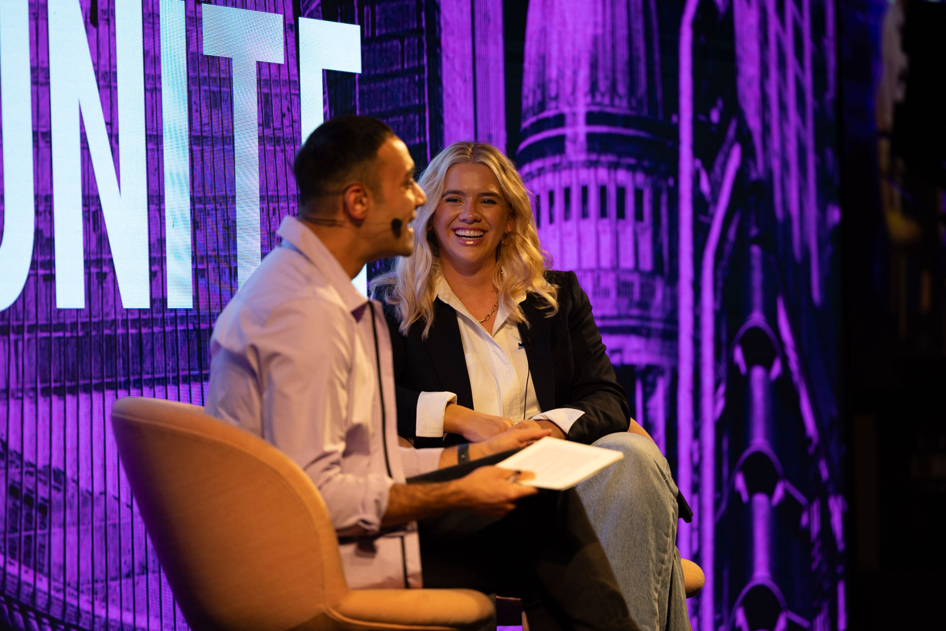
We’ve been in touch with Unily, the folks behind the industry-leading employee experience platform, for the last few years and have enjoyed following their awesome annual conference, Unite. It’s an event where attendees get together to learn, network, and get inspired with a focus on the employee experience. The speaker lineup is always incredible, with the likes of Stephen Fry, Louis Theroux, Fearne Cotton, and Stephen Bartlett to name just a few. This year, we were lucky enough to be invited to work on the event branding for Unite 23 by the Unily team.
Avoiding the cliches
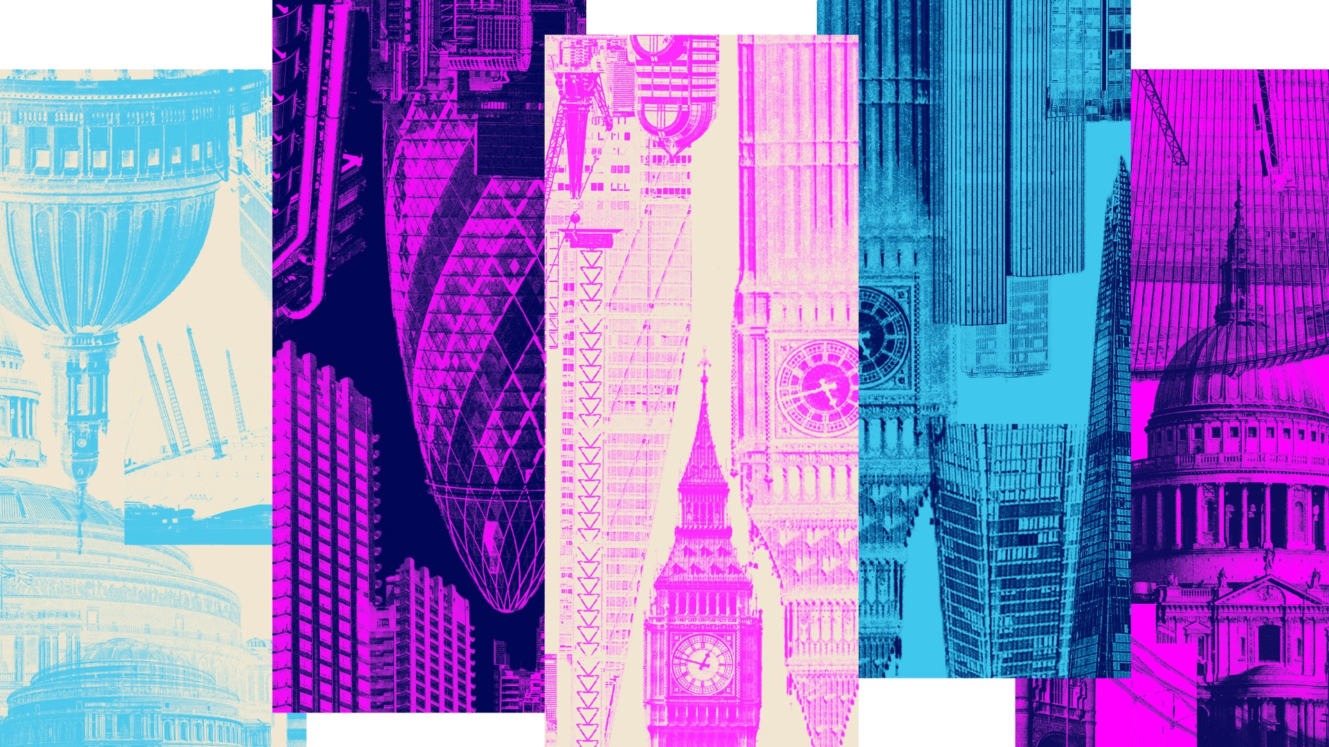
The 2 days of keynotes, breakouts and panels were all to be held in London at the beautiful Convene at 22 Bishopsgate, and the challenge from a design perspective was to give a sense of place without relying on the old cliches like black taxis and pictures of the Royal Guard! A skyline can be used to good effect to portray a particular location or city, featuring key architecture and landmarks. The only drawback with this approach is that this shorthand is commonly used and our brief for this brand was to ensure it stood out and reflected the energy and innovation of the event and of Unily as a company. The design style also needed to translate well online to promote and effectively share on-demand content following the event.
Showcasing incredible speakers
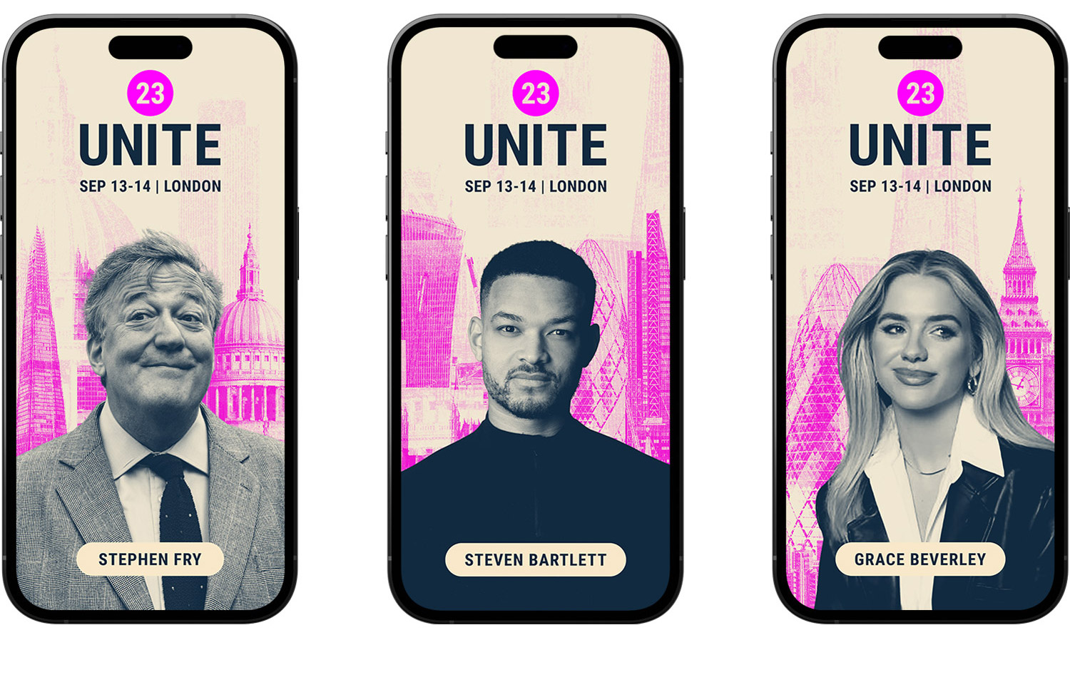
We also needed to create a design system that helped showcase speakers in an inspiring but functional way to help with promotion and at the event itself. We settled on a bold style using the circle shape found in the Unite 23 logo to frame the speakers.

Bold and contemporary style
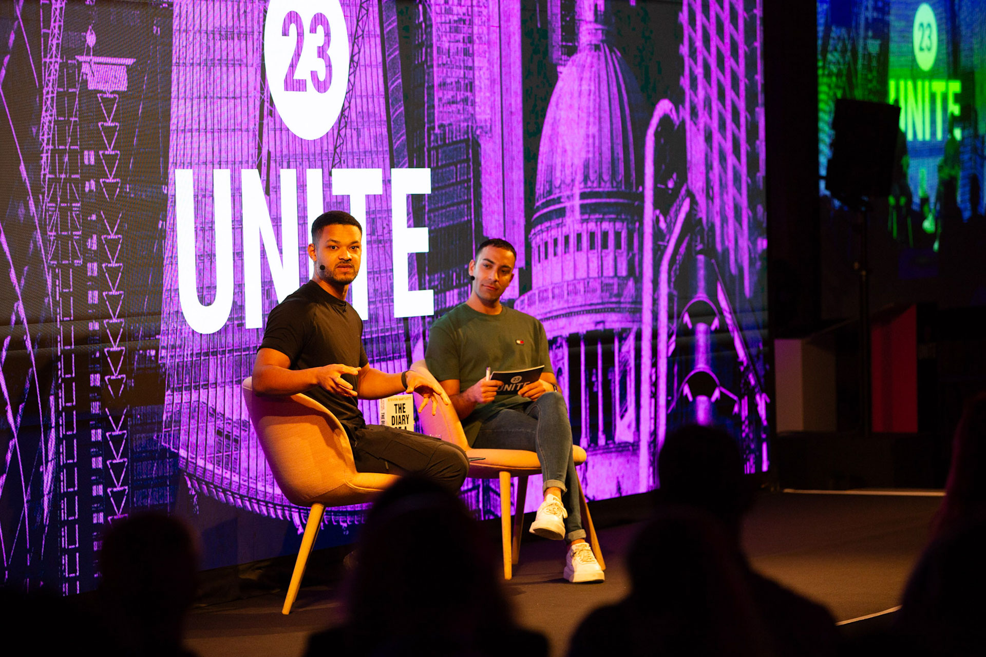
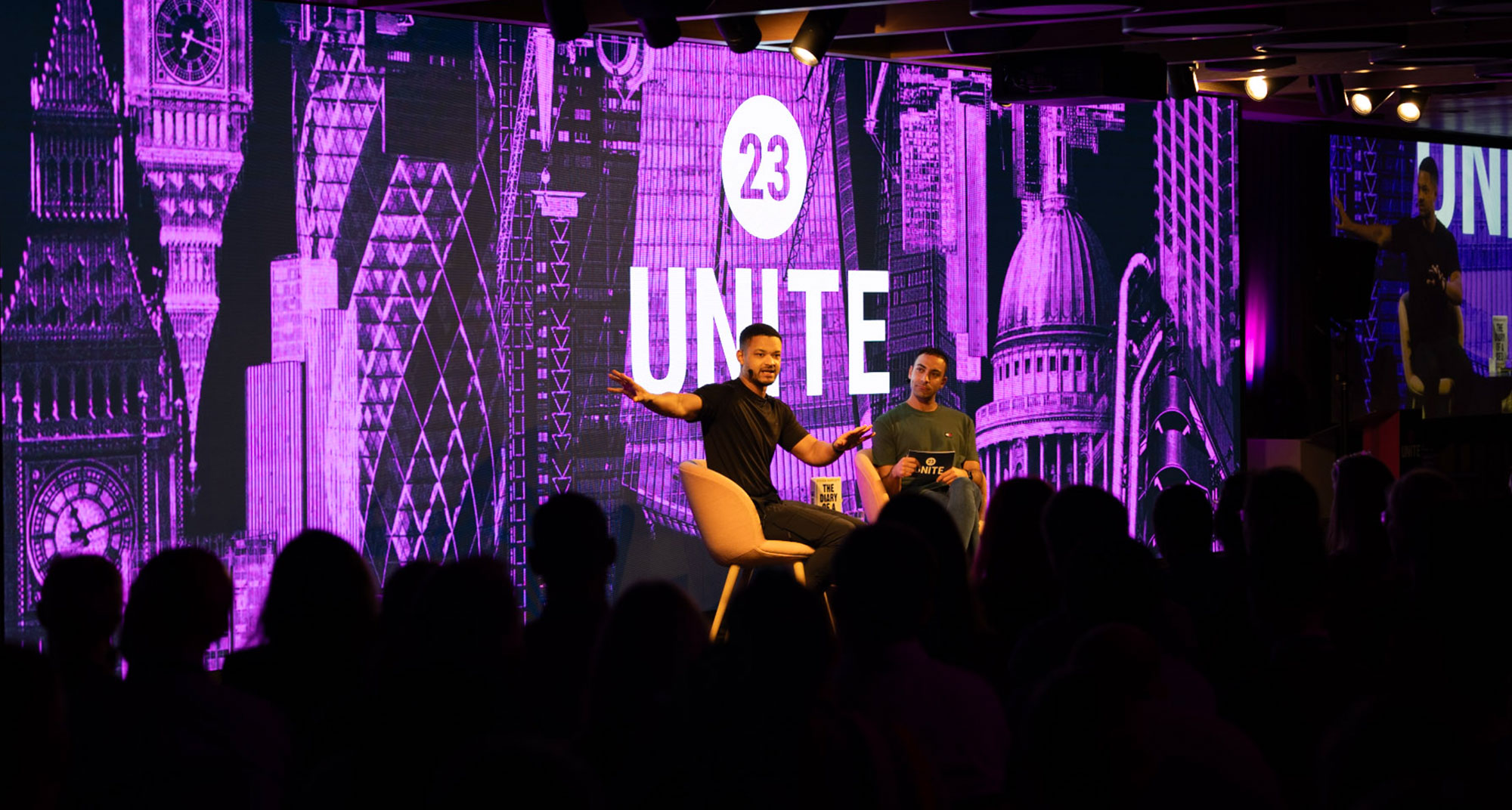
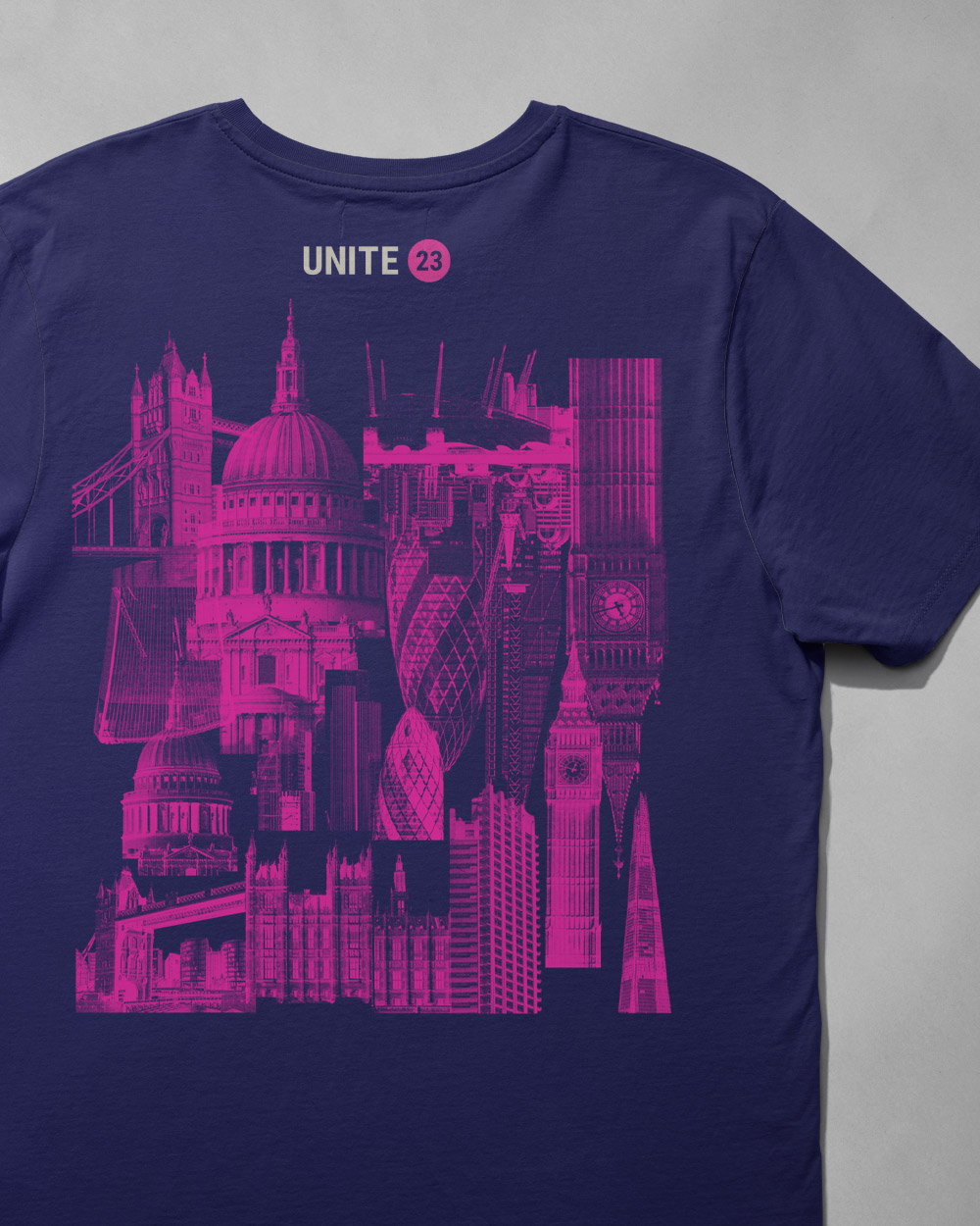
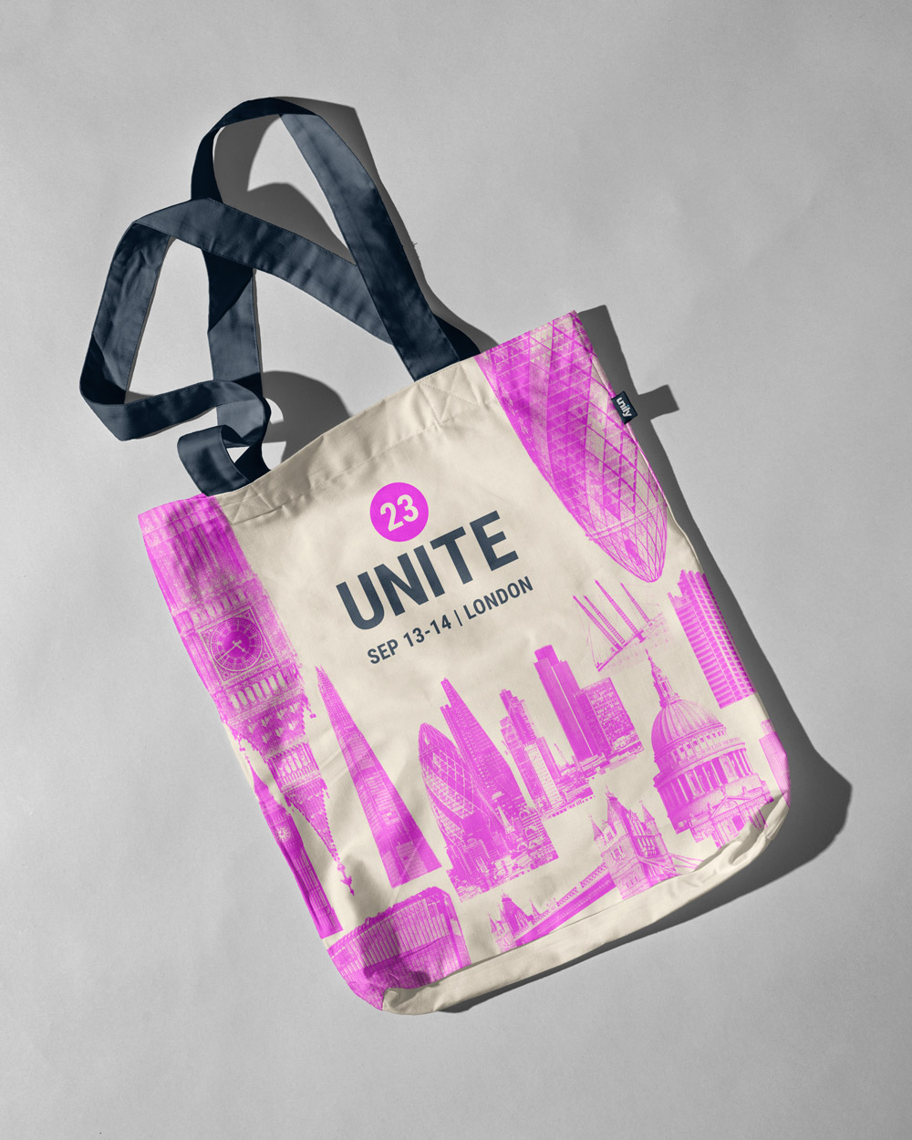
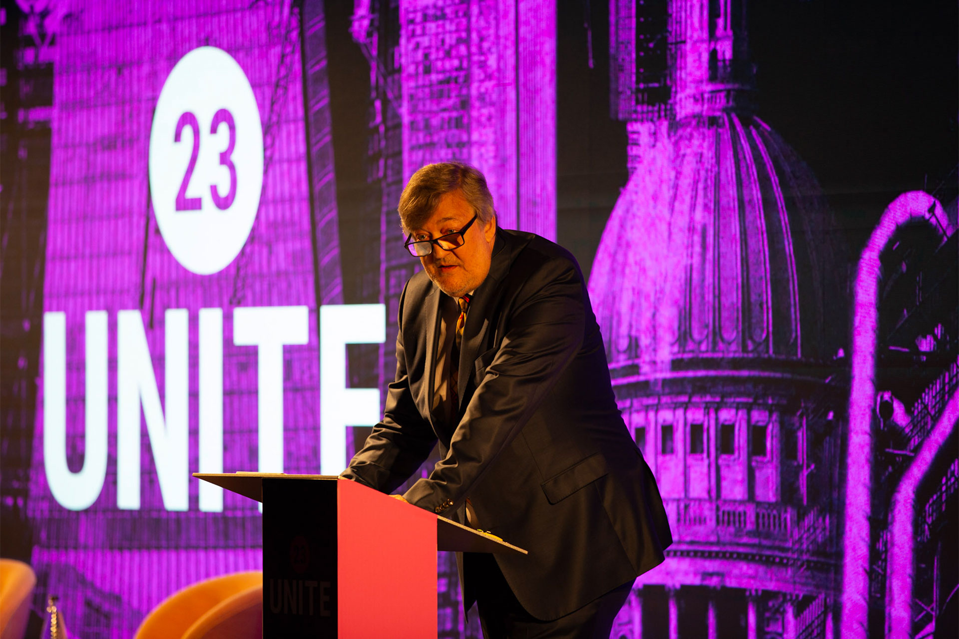
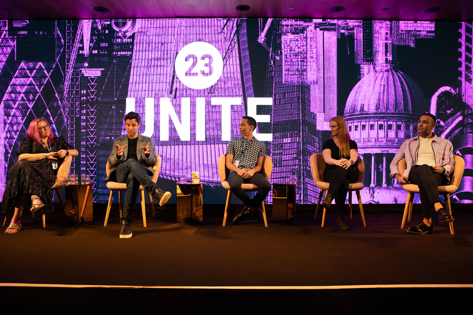
After completing our competitor research and discovery we started work, eventually opting for a graphical, abstract take on the London skyline, where the buildings almost start to form a pattern. When you look closely you can see some of the traditional landmarks like Big Ben and St Pauls, but we were also careful to include many of the new key buildings in London such as the Walkie-Talkie and the Gherkin to help the collage feel more contemporary. This was helped by the vibrant hot pink, cyan, and cream colour palette.
Bringing Unite to the venue
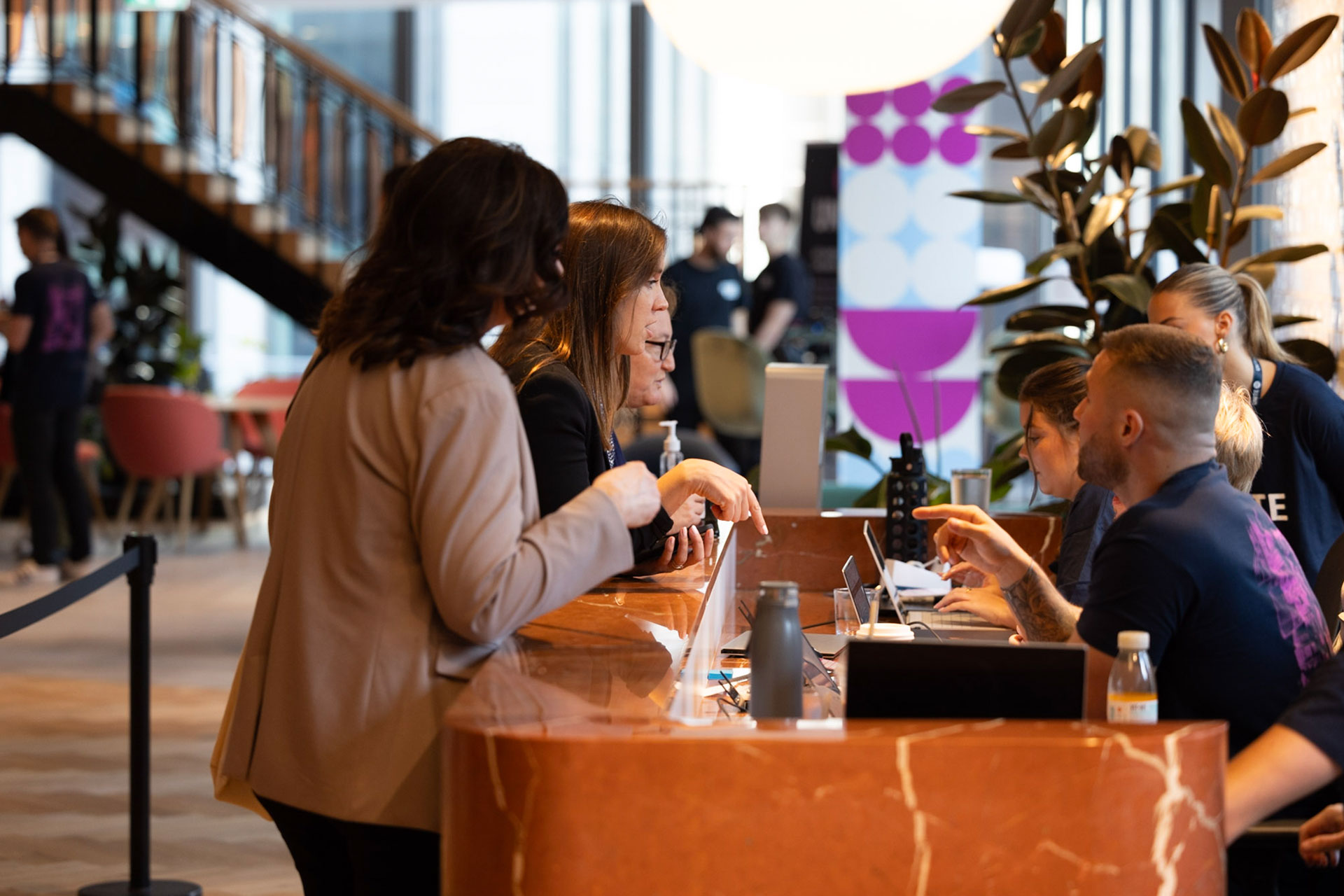
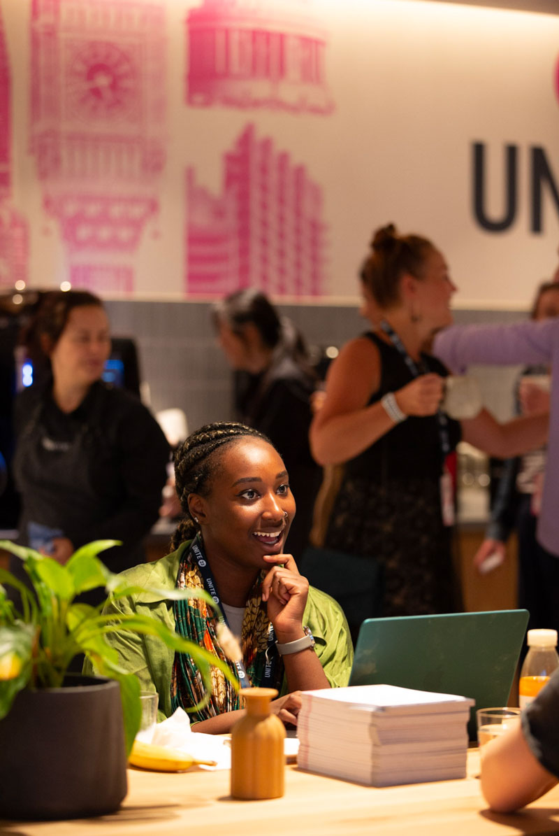
Convene at 22 Bishopsgate is a spacious venue with lots of potential for really striking signage to showcase the brand. We also needed to think through the usage of the space, providing some fun wayfinding signage where necessary.
A memorable experience
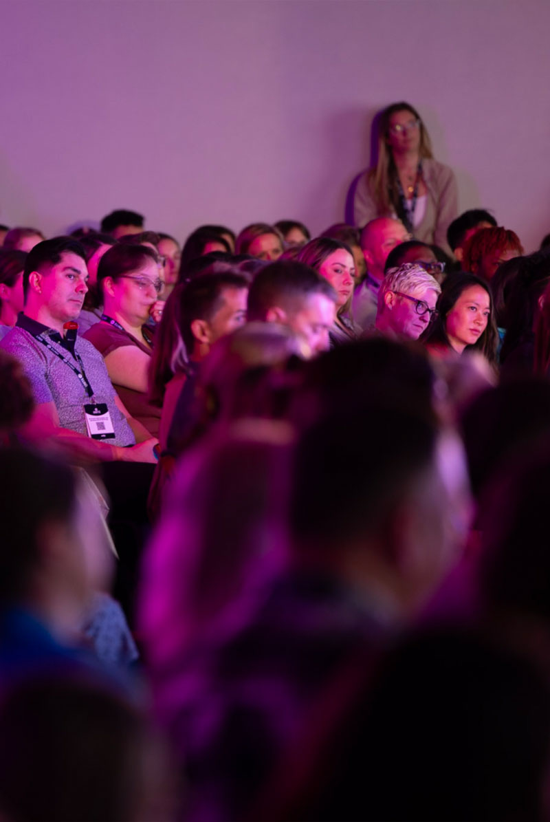
The event was a great success and was hailed as ‘The biggest employee experience conference ever.’ The highlights are nicely summed up in this blog post from the team. The new branding helped to elevate the event and reflect the high-quality speakers, meticulous organisation and valuable experiences for the attendees. Bring on Unite 24!
