The Grazing Shed
We've created a range of Super Tidy Designs for the best burger joint in Wales.
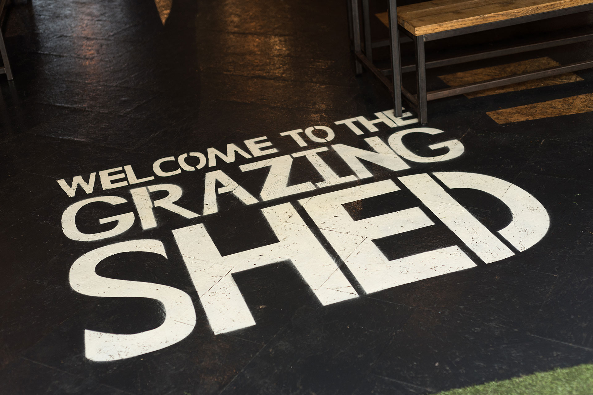
Welcome to The Grazing Shed
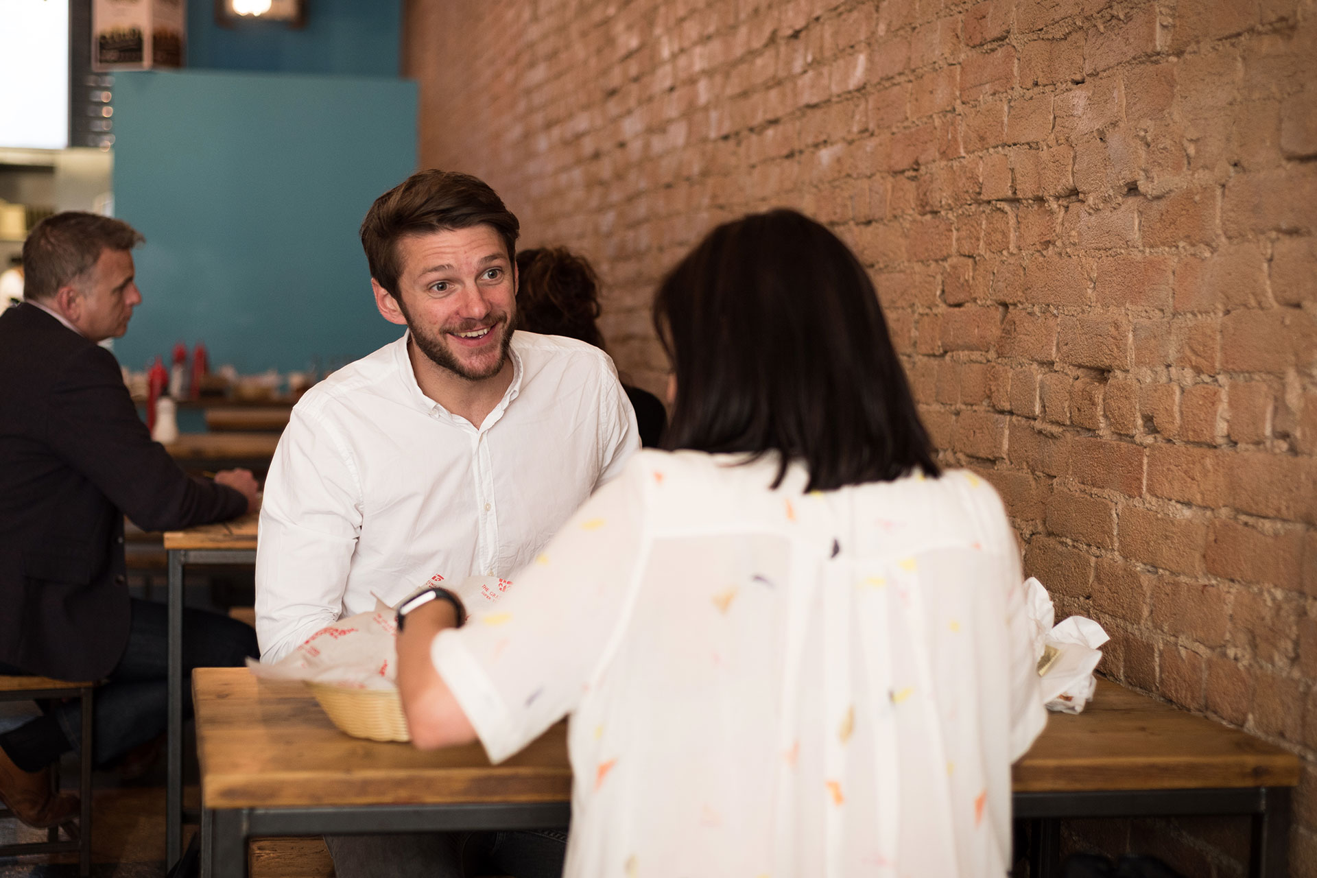
Established in 2013, The Grazing Shed have always had a passion for doing things right, putting their energy and focus into creating the best burger in Wales. Their burgers include only the finest quality, locally sourced ingredients – priding themselves on this fact, you'll see photos of their farmer and greengrocer on the walls of their restaurants. Over the last seven years, The Grazing Shed has become a focal point of the city's food scene as well as the large range of events they attend such as Green Man and Glastonbury Festivals, amongst others. Wherever they go, they proudly fly the Welsh flag and their strapline; Super Tidy Burgers!
Cardiff's most loved burgers
Since we started working with the Grazing Shed over three years ago, we've experienced just how much the place means to people. More than restaurant-goers, The Grazing Shed have a herd of passionate fans, which is very powerful for a brand. However, with growing competition in a rapidly-developing city, we knew there was absolutely no room for resting on laurels. The chefs are always innovative in the kitchen, creating new burgers and collaborating with other passionate locals, such as Matthew Pritchard. We've seen it as our duty to push the brand forward and do each burger, event or campaign justice, using great design that represents The Grazing Shed in an honest way.
Testimonial
"We love working with the John&Jane team. They understand our business, our objectives and most importantly our brand. They've created some absolutely brilliant work for us, really helping to push our brand forward and our business to grow. We're looking forward to collaborating more in the future and excited to see where it takes us."
Duncan Black
Director at The Grazing Shed
Super Tidy Burgers with personality
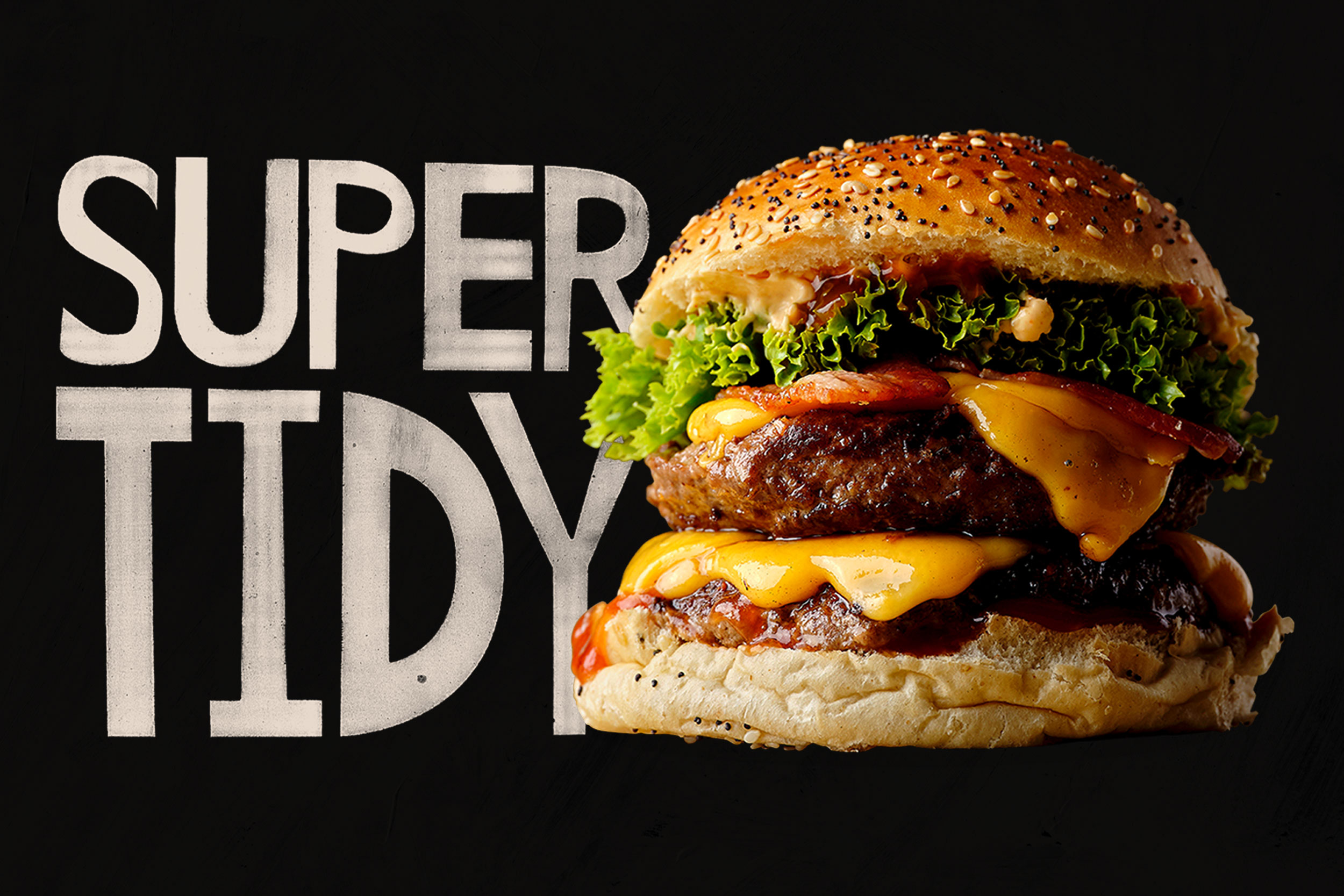
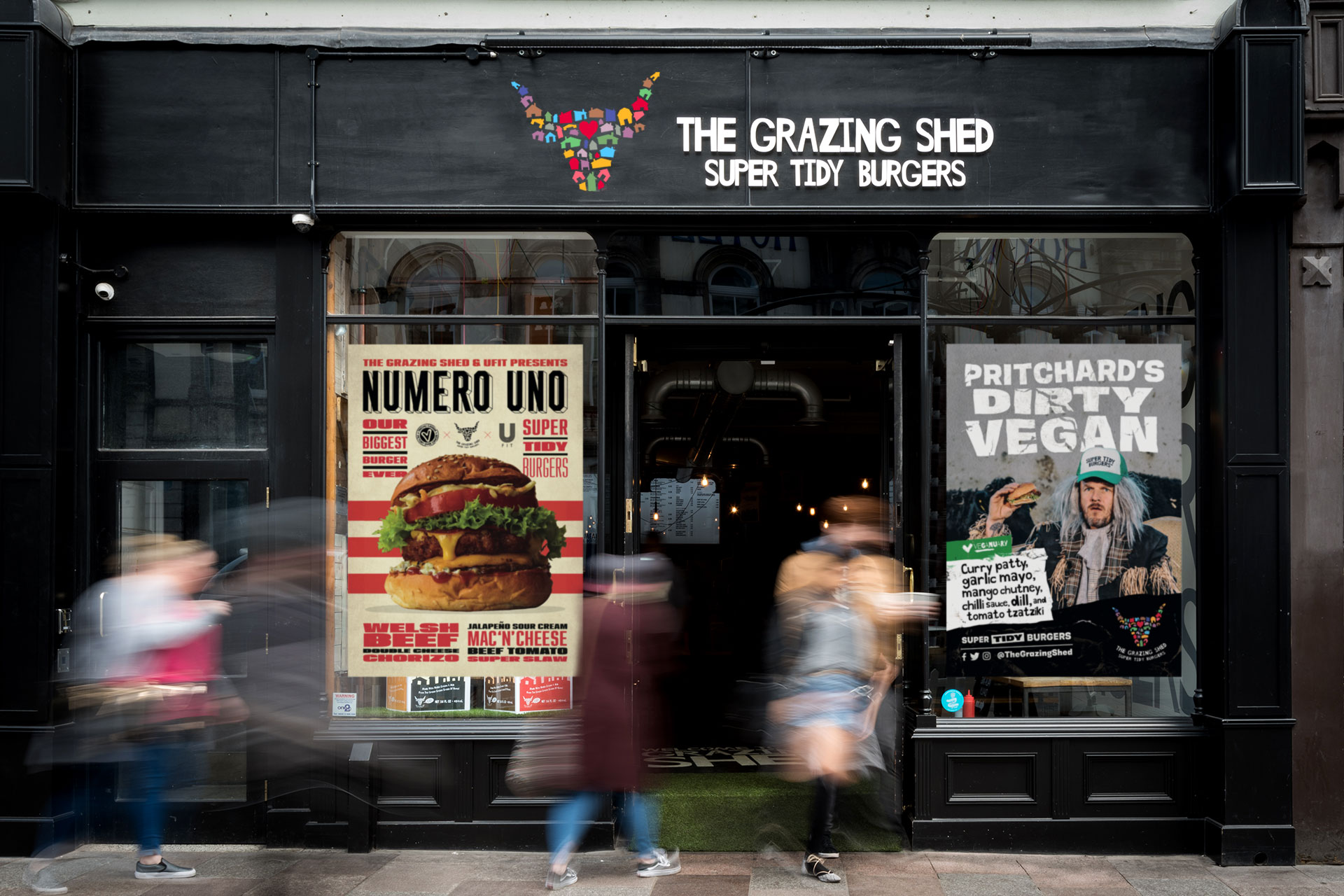
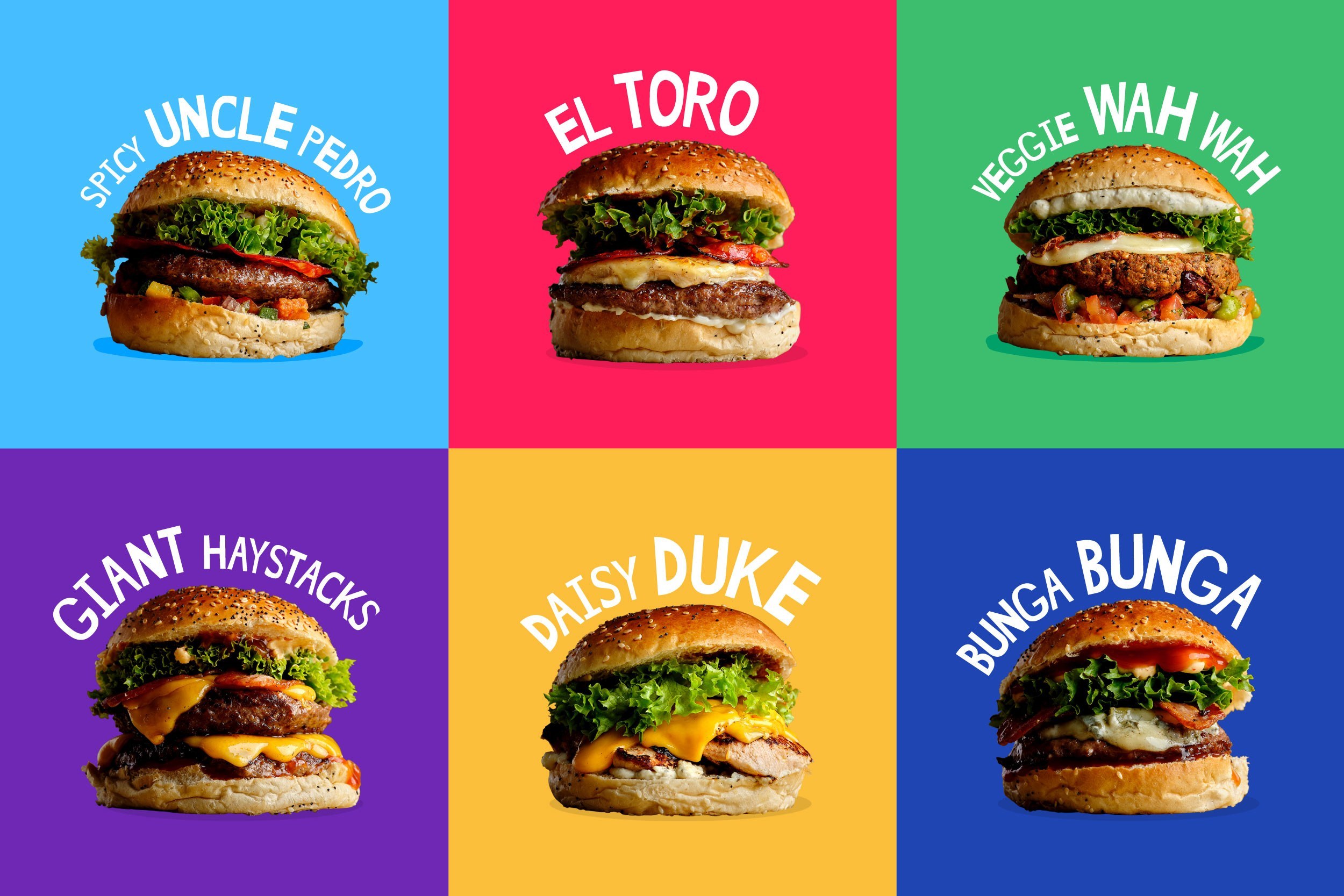
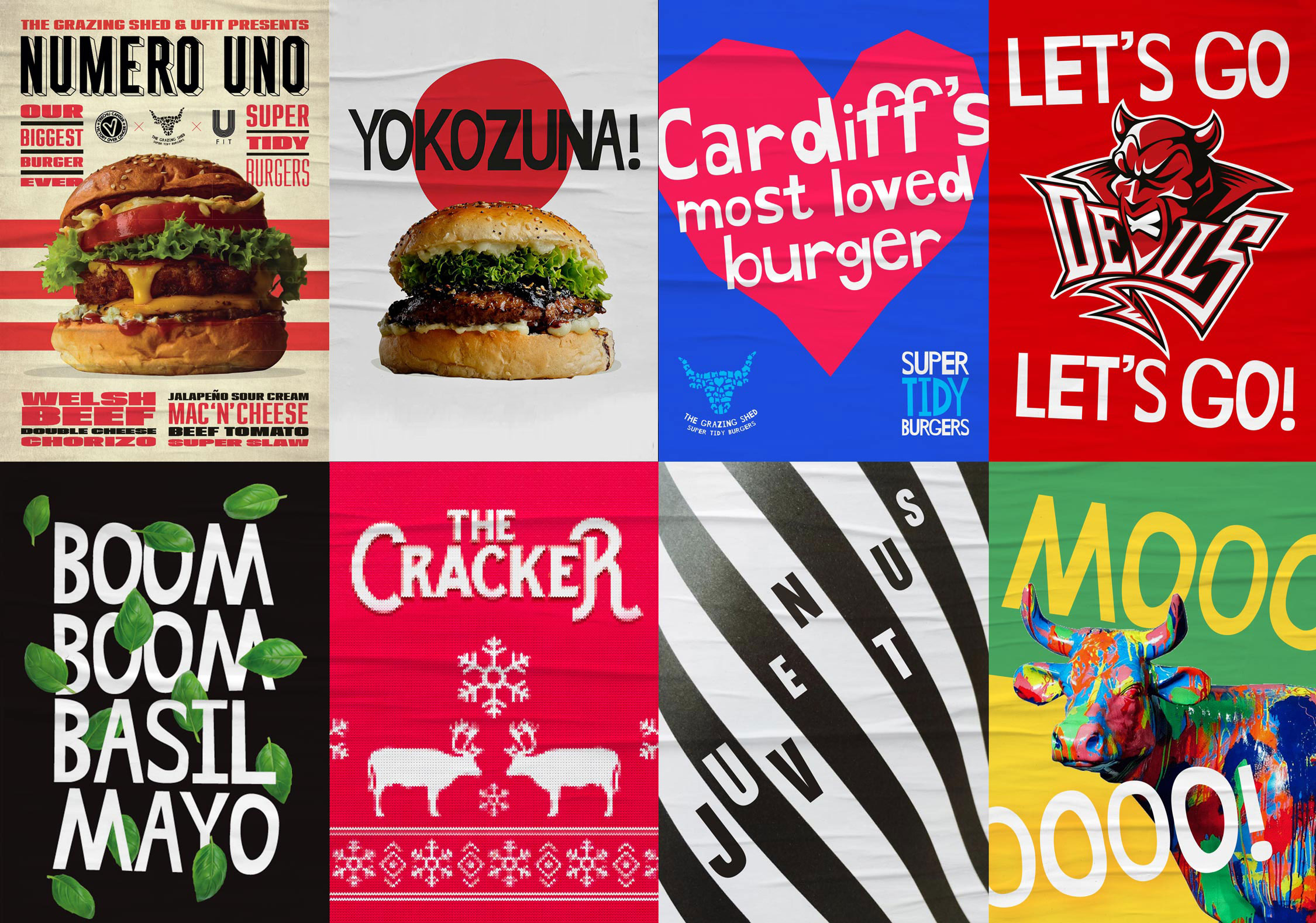
The Grazing Shed brand is bright, bold and at times, a little cheeky with its informal tone of voice and hand-cut font. We gave the colours in the logo a little boost and began using those colours with burger photography and typography. The results were cleaner, whilst capturing their personality with the jonky sizes and layouts. The Grazing Shed has a large and exciting range of burgers, and we wanted to start giving each one an identity and personality of it's own.
#GrazingShared
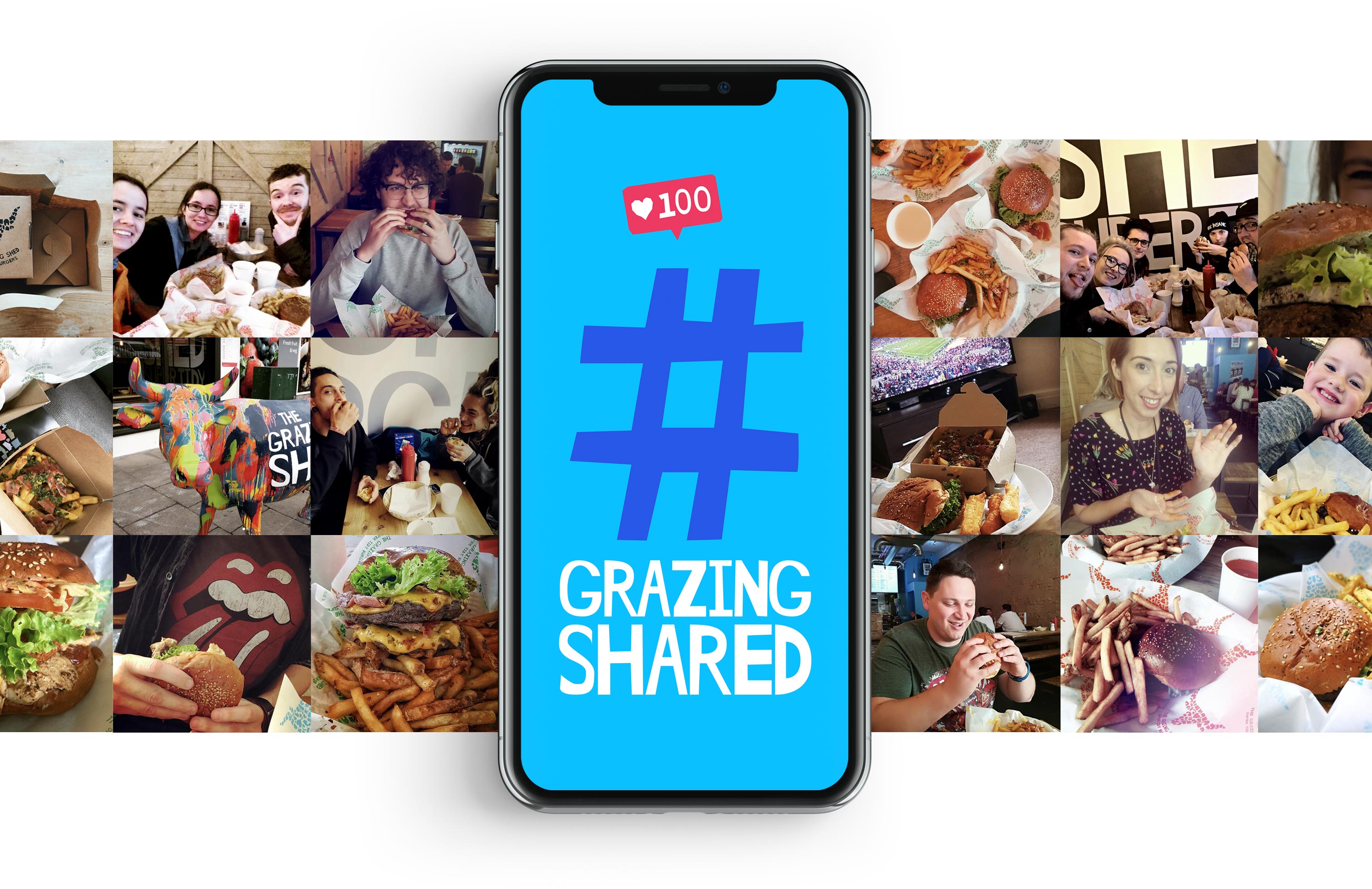
We have worked with The Grazing Shed on many different campaigns and seen incredibly positive results. With today's social trends of sharing stories and photos from your life, we wanted to encourage fans to share photos with their Instagram followers. To do this we kicked off the #GrazingShared campaign which was a little monthly competition that gave people an opportunity to win themselves vouchers. Since the campaign began, there have been some brilliant photos shared, from groups of friends to a little one's first ever burger.
Painting a life-sized cow
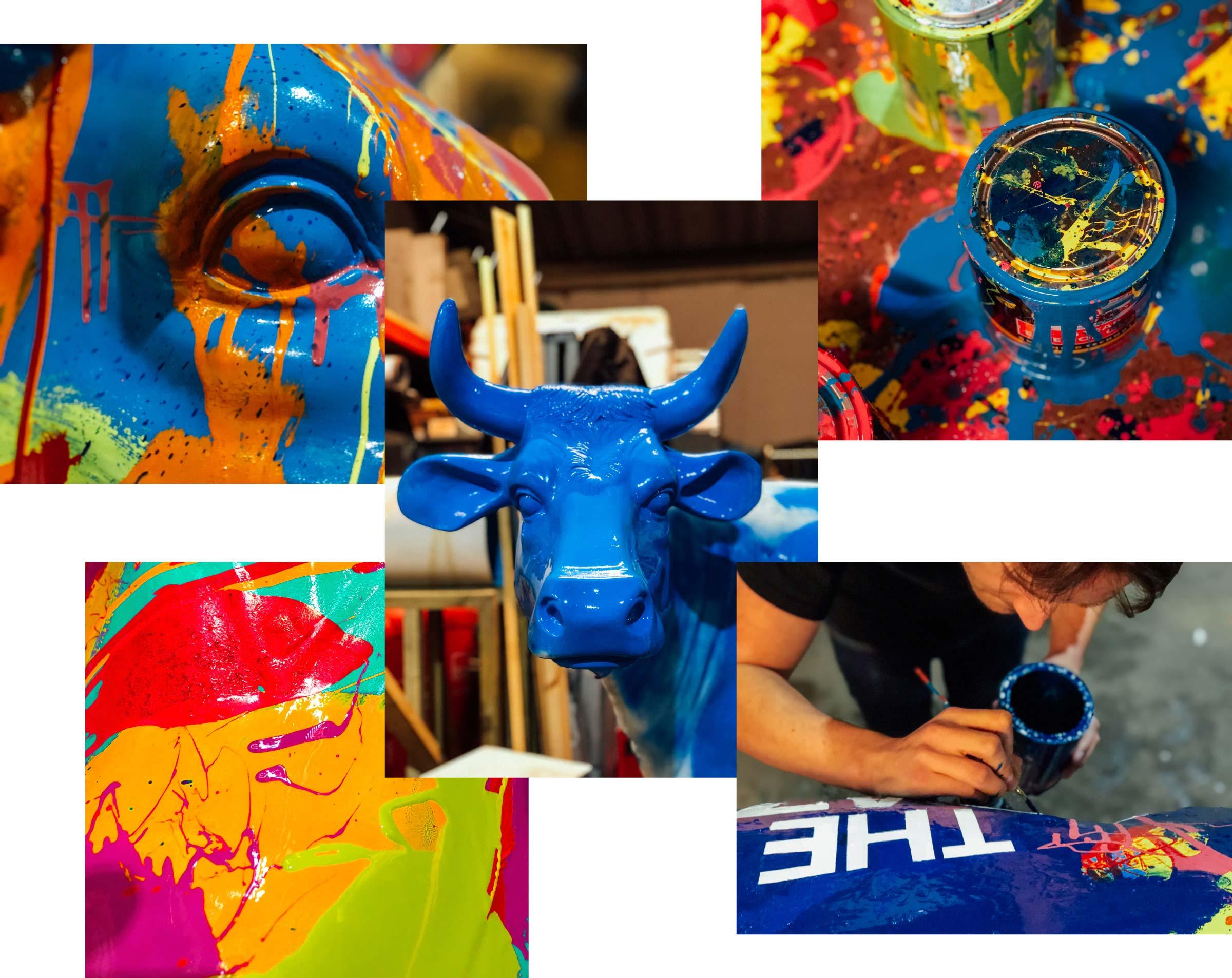
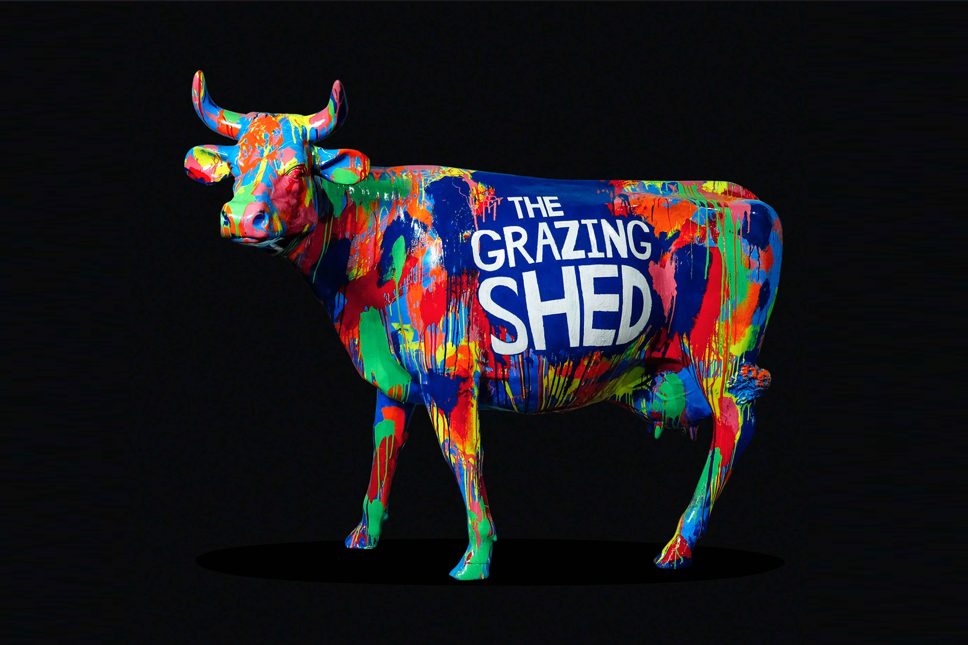
We've mentioned The Grazing Shed have a big personality and we wanted to create something that expressed that, something that could be a centre piece at the sheds or maybe even taken on tour. We managed to get our hands on a life-sized cow that was completely unpainted. Our idea was to use the bright colours from the logo to create a playful and expressive piece of art, we proceeded to slam and throw paint at a cow for a few days until it started look and feel in-line with The Grazing Shed brand. When we were happy, we sign-painted the type onto the side of the cow in large hand-cut letters. This project embodied what it's like to work with The Grazing Shed – colourful, creative and fun.
Super Tidy newsletters
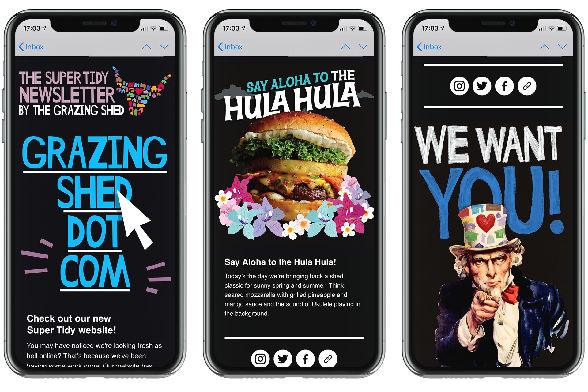
We believe in the power of a really good newsletter, one that contains great content every single time. We have worked to create a Super Tidy Newsletter each month to let fans know about new burgers, events, special offers and other news. We gave the newsletter an on-brand mast which included the iconic cow's head and the words "Super Tidy Newsletter by The Grazing Shed". We help create bold and eye-catching graphics to compliment and communicate the stories. Go and sign up!
Pritchard's Dirty Vegan
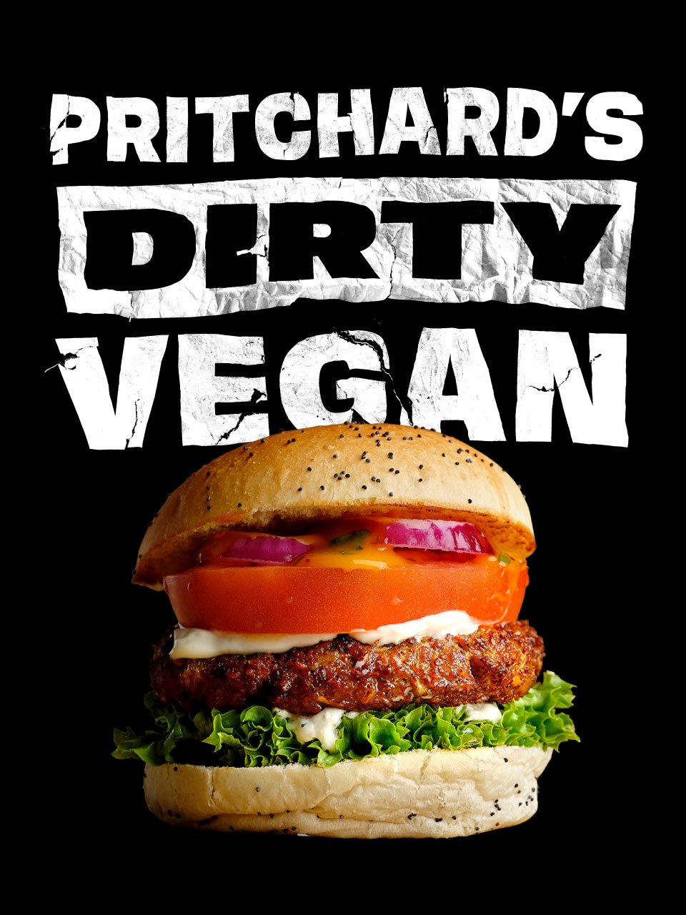
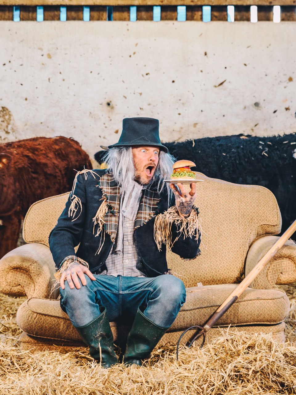
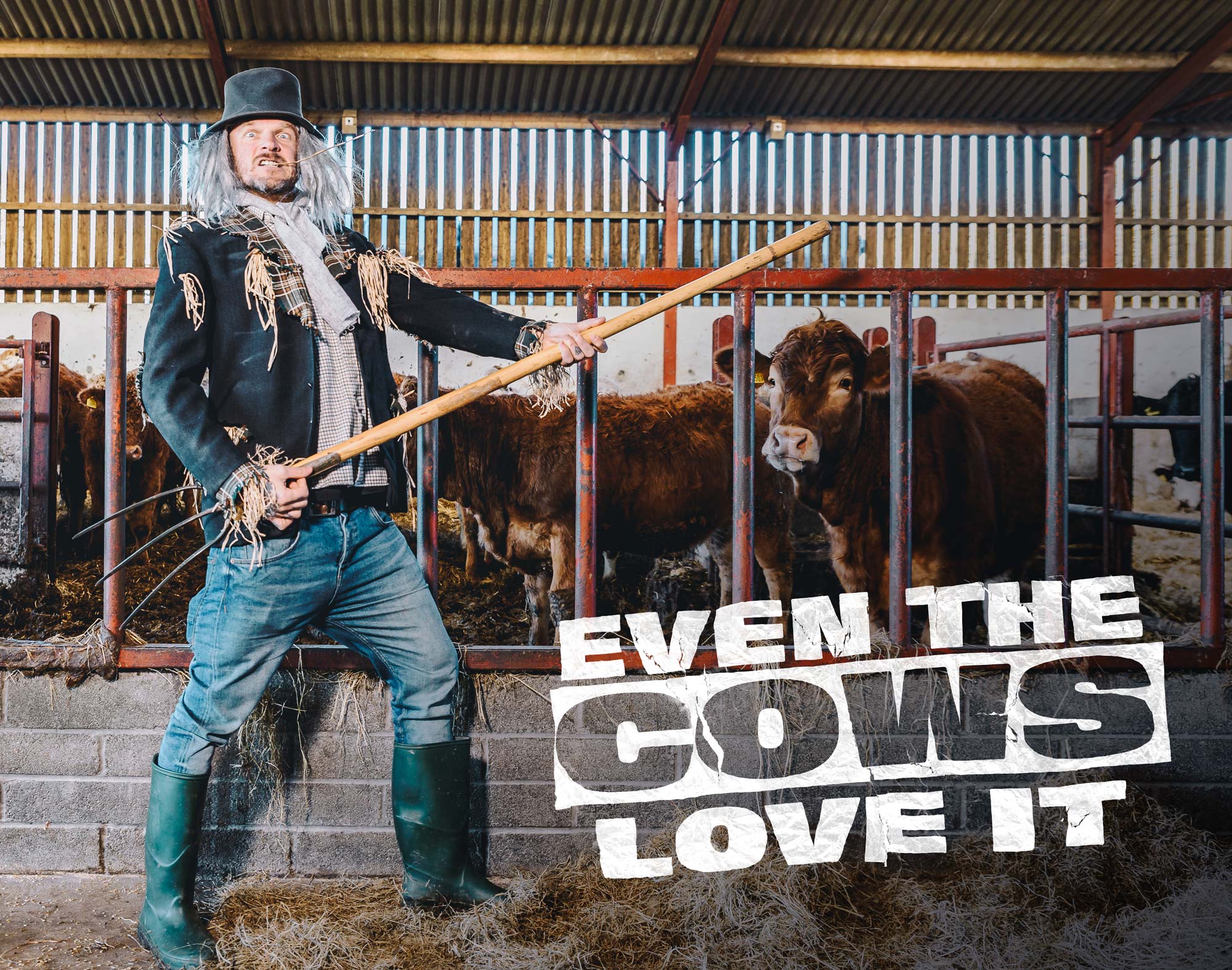
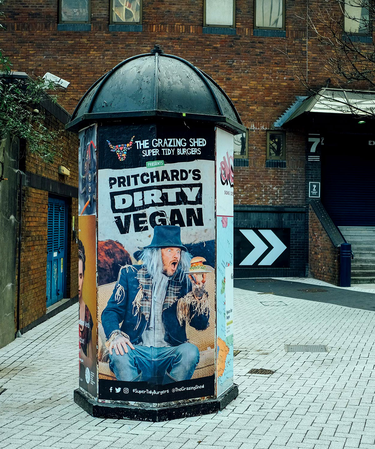
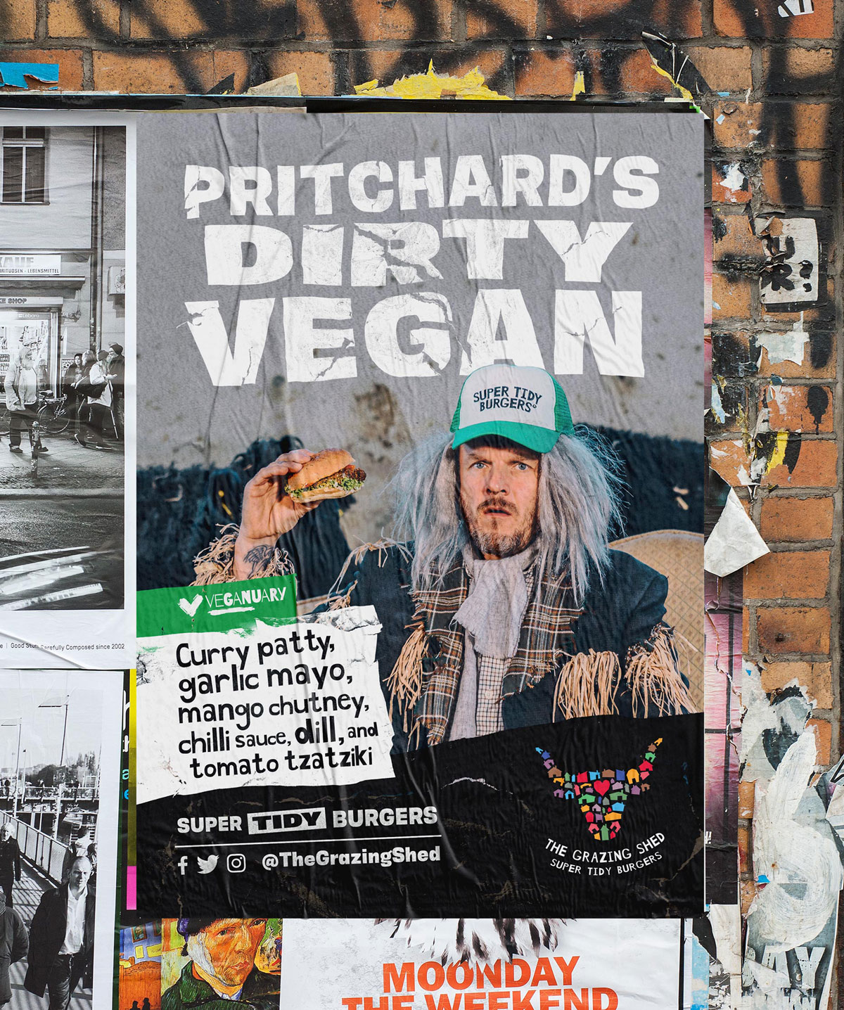
We've created identities, posters and campaigns for many limited edition or special burgers, but our favourite has to be Pritchard's Dirty Vegan. This burger is a collaboration between The Grazing Shed and skateboarding, daredevil, ultra-athlete and vegan chef, Matthew Pritchard. We love it because it's vegan, it has bags of personality but above all, it's delicious! We created an identity that captured Pritchard's personality which was rolled out across social media, print, digital and newsletters.
As we mentioned, there have been many other burgers and menu items that we've created identities and campaigns for, too many to mention! Here's a small selection of designs we've worked on.
The shed online
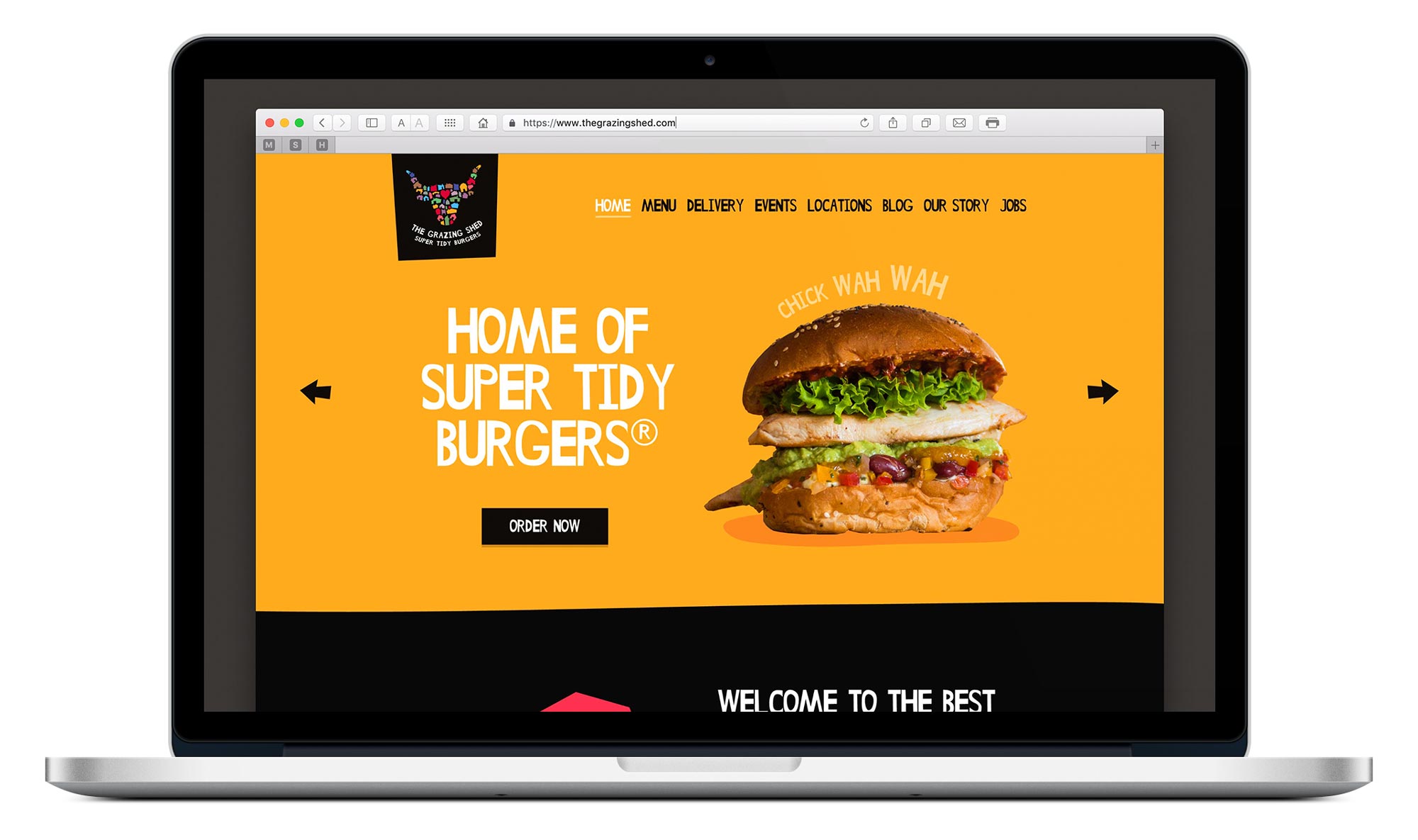
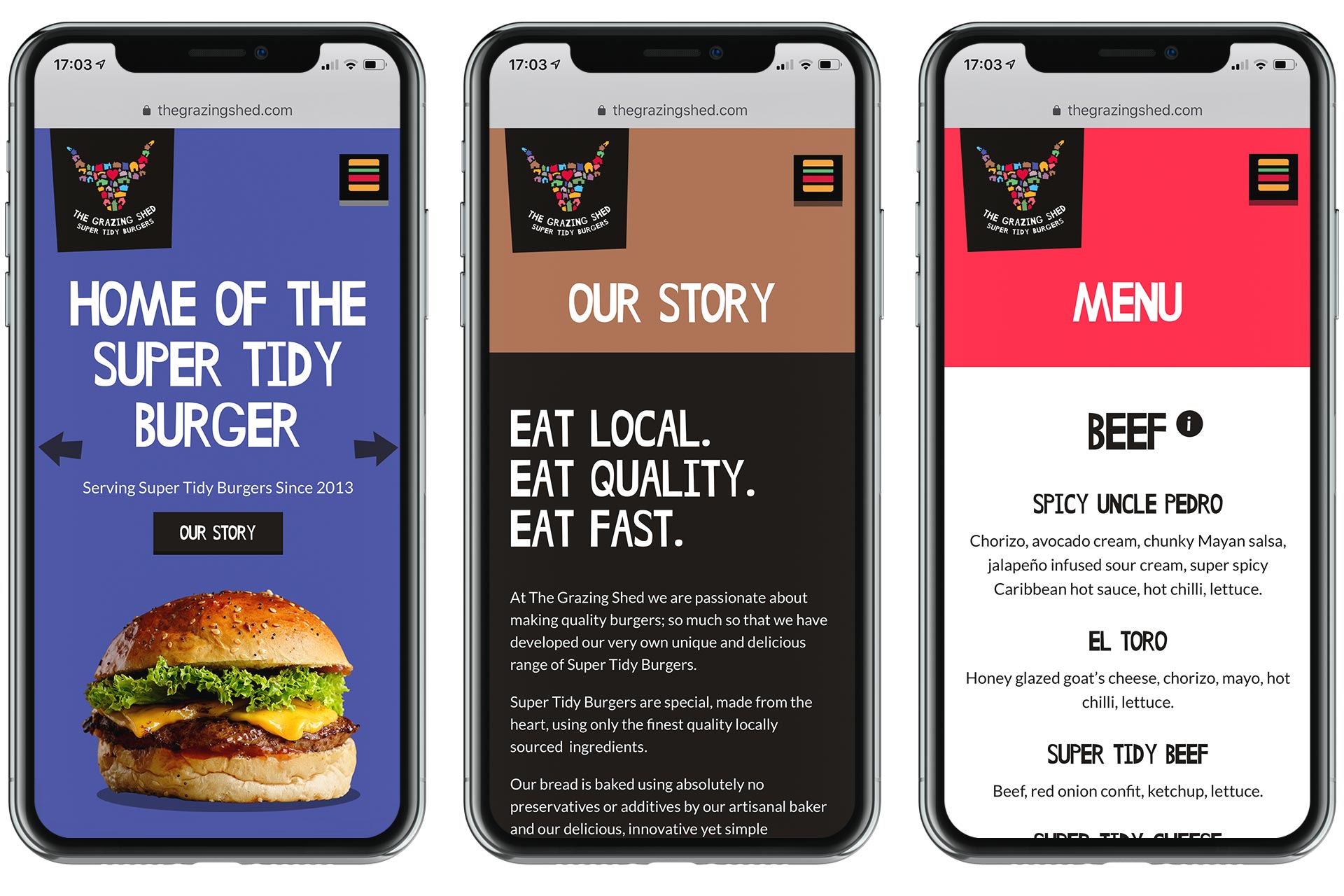
We also recently helped The Grazing Shed with their new website design. It was great to see the visual styles and designs that we've been working on over the last three years come together to help better represent The Grazing Shed online. We particularly liked designing an actual burger menu icon!
We can't wait to see what The Grazing Shed has in store for us next, one thing is for sure, it'll taste damn good.
