Forward Digital Summit
Creating an adaptable brand and design style that has evolved with different locations and changing situations.
Introduction
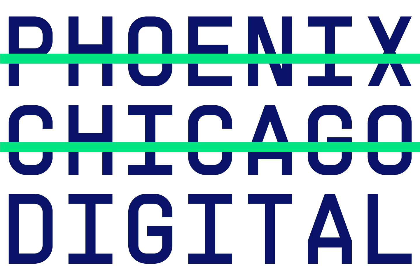
Forward Digital Summit is an online user conference organised by our partner Rubrik. Back in early 2019, we were tasked to create a brand for the new user focussed conference called Forward. This project has proved to be interesting to us for so many reasons. The scale and ambition of the conference was huge, aiming to bring experts from around the globe to one location to inform and inspire whilst creating a unique experience for attendees. That said, with a project of this scale there are always moving parts and with the global pandemic outbreak it has forced Rubrik to swiftly adapt to ensure they can still provide an outstanding event. We're proud to partner with Rubrik and to have helped evolve the Forward brand from its initial location of Phoenix to Chicago and, more recently to transform the conference into a digital summit.
Original venue
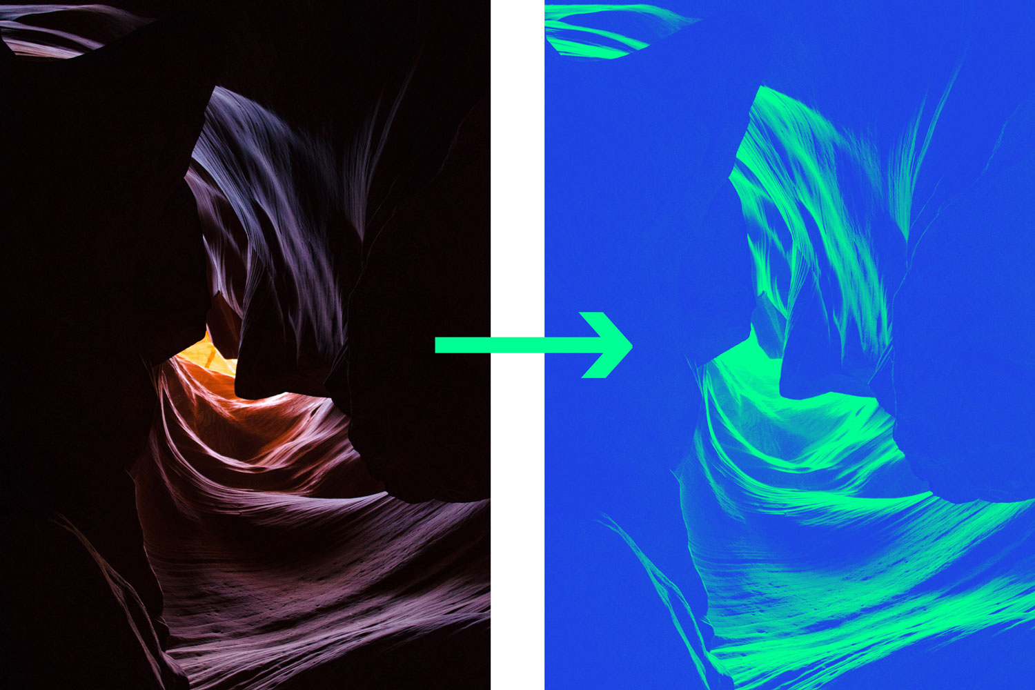
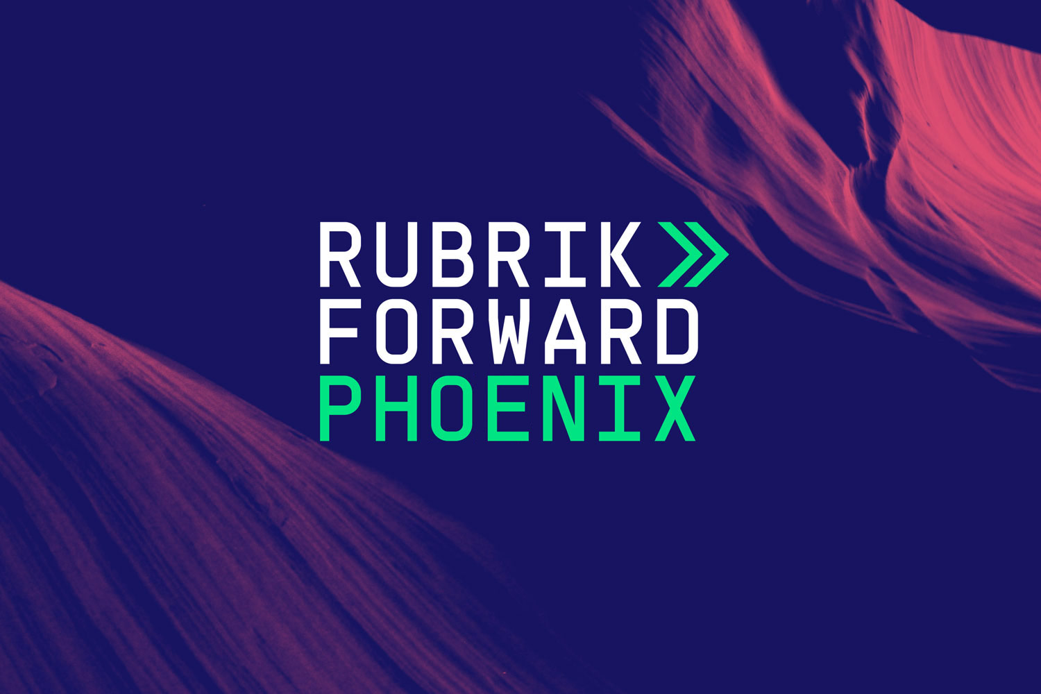
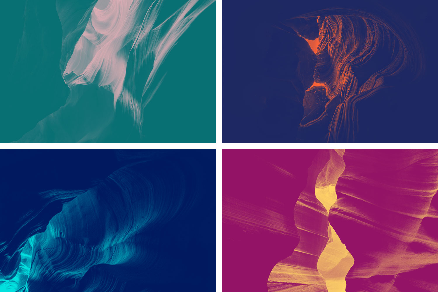
Initially the very first Forward conference was set to take place in Arizona, which inspired us to create a brand and design style around the distinctive and beautiful Antelope Canyon. The unique textures and angles of the caves made for the perfect background imagery as they appear to have movement and flowing lines. We developed and applied a colour palette and effect which created an inclusive and cohesive style for the conference.
We kept the identity simple allowing a mono-spaced typeface to align the three words, Rubrik Forward Phoenix. The arrows filled the empty space and would become the visual icon for the entire event.
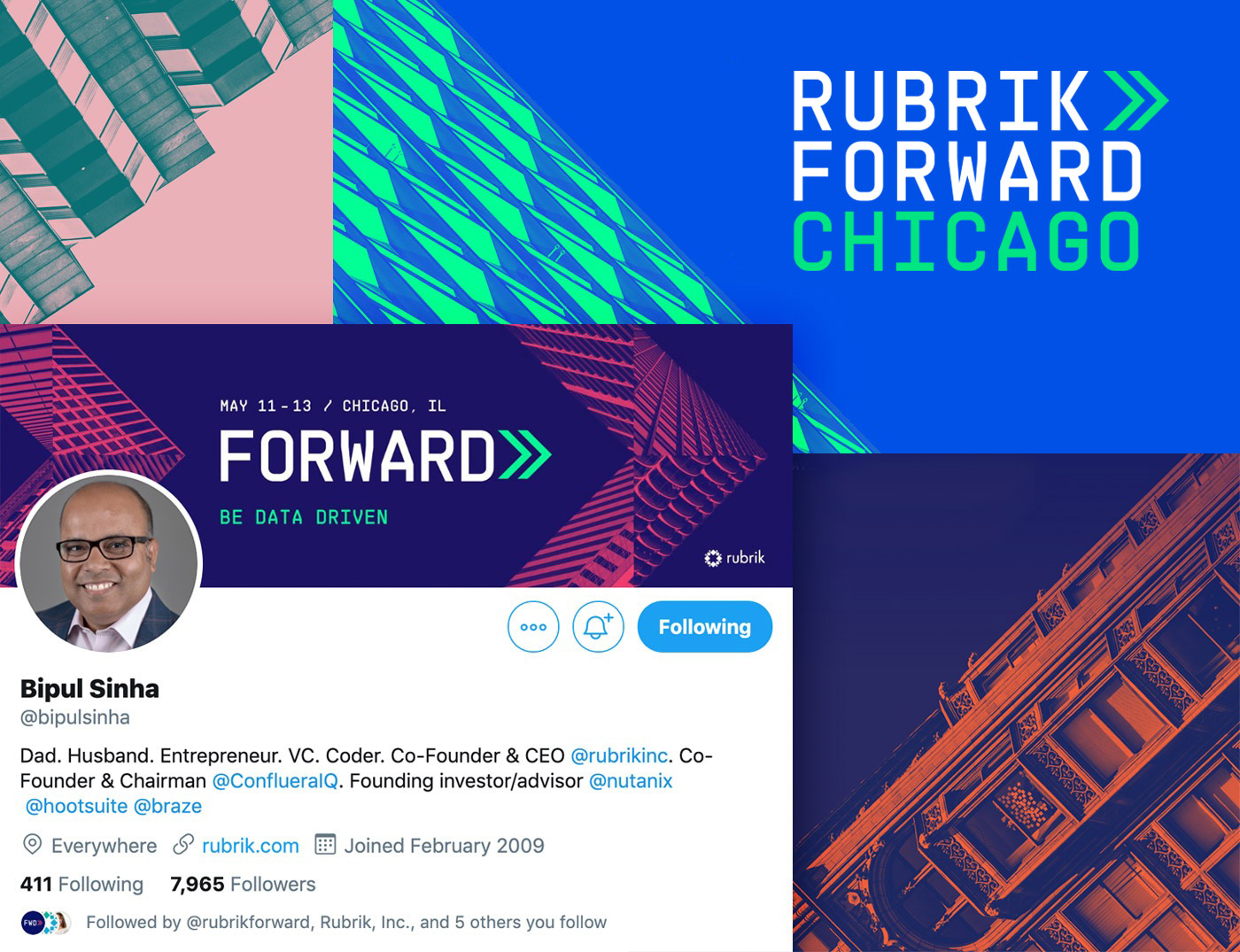
From Phoenix to Chicago
Later in the year and before any announcements were made, the conference switched location to Chicago and all the visual assets needed updating. It didn't make any sense to use imagery of Arizona canyons for a Chicago-based conference, so we looked for a new design solution. The canyons have subtle textures, whereas Chicago is known for its striking and bold architecture meaning there wasn't really a quick fix to be had. Again, we wanted the place to inspire the visuals so we had to take a slightly different approach.
Photography
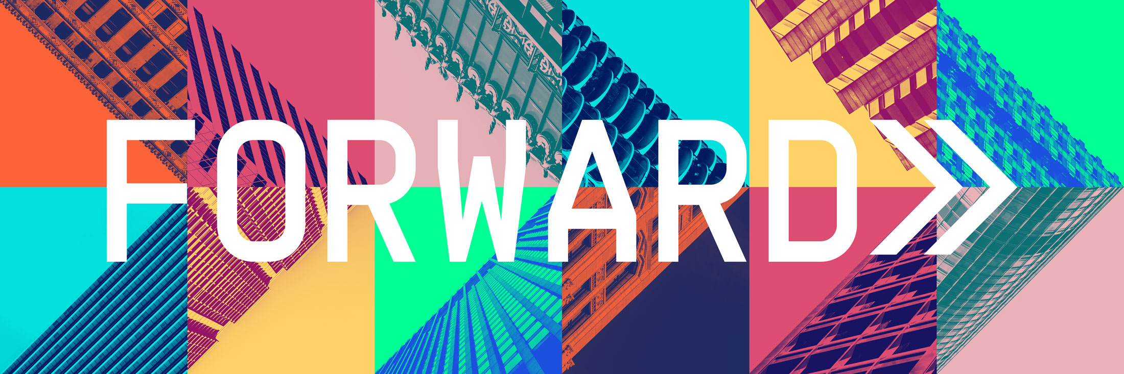
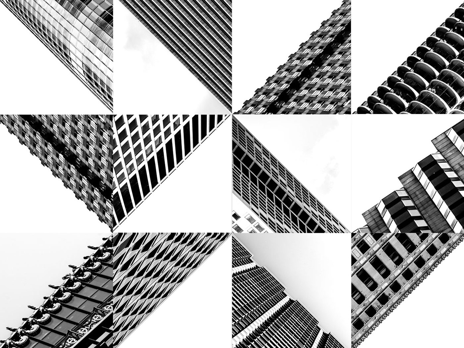
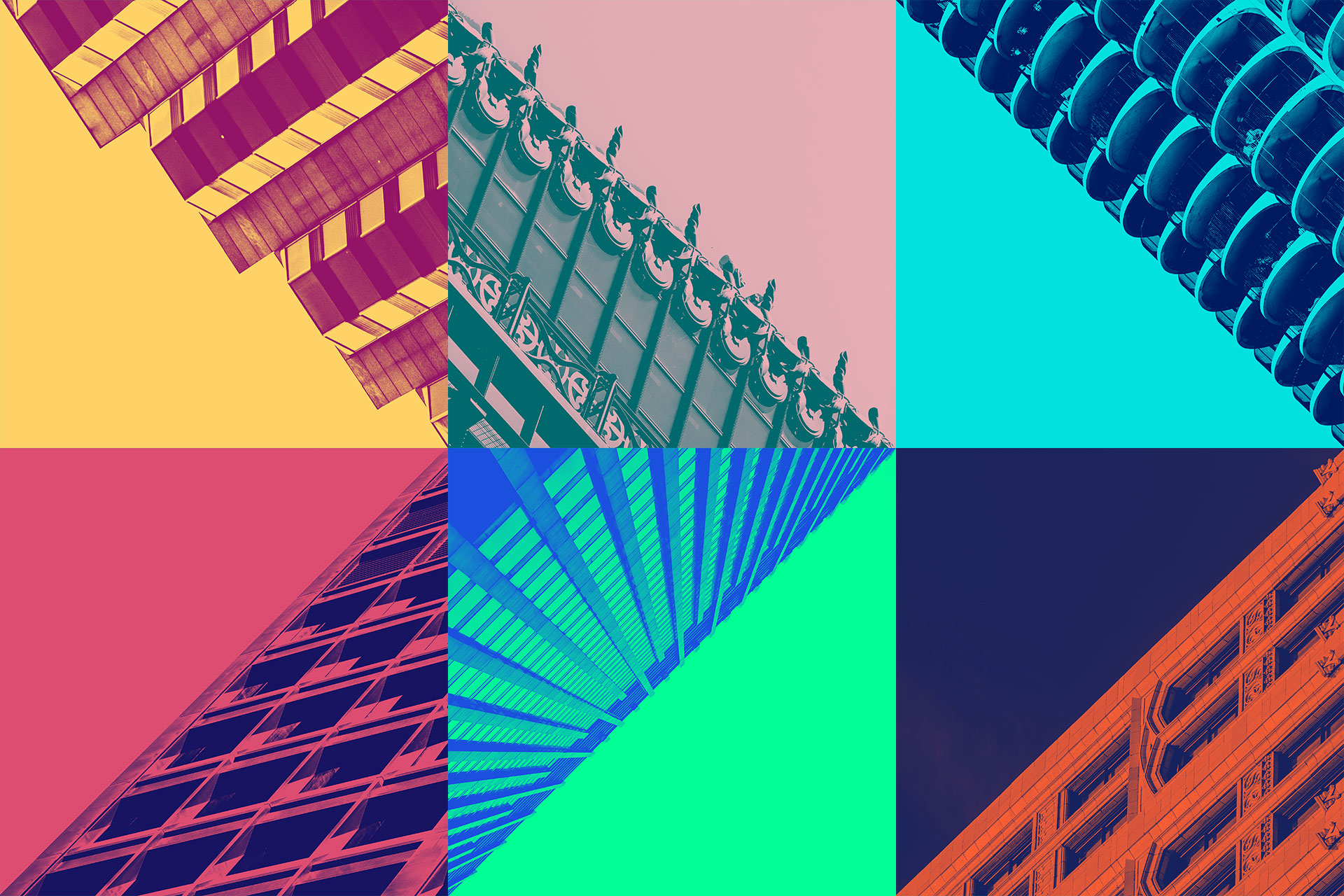
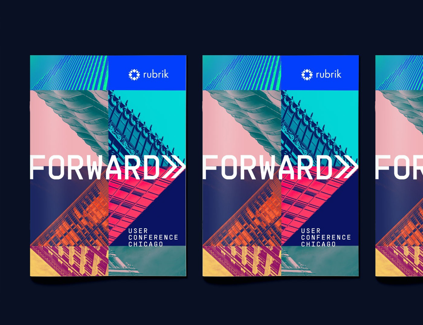
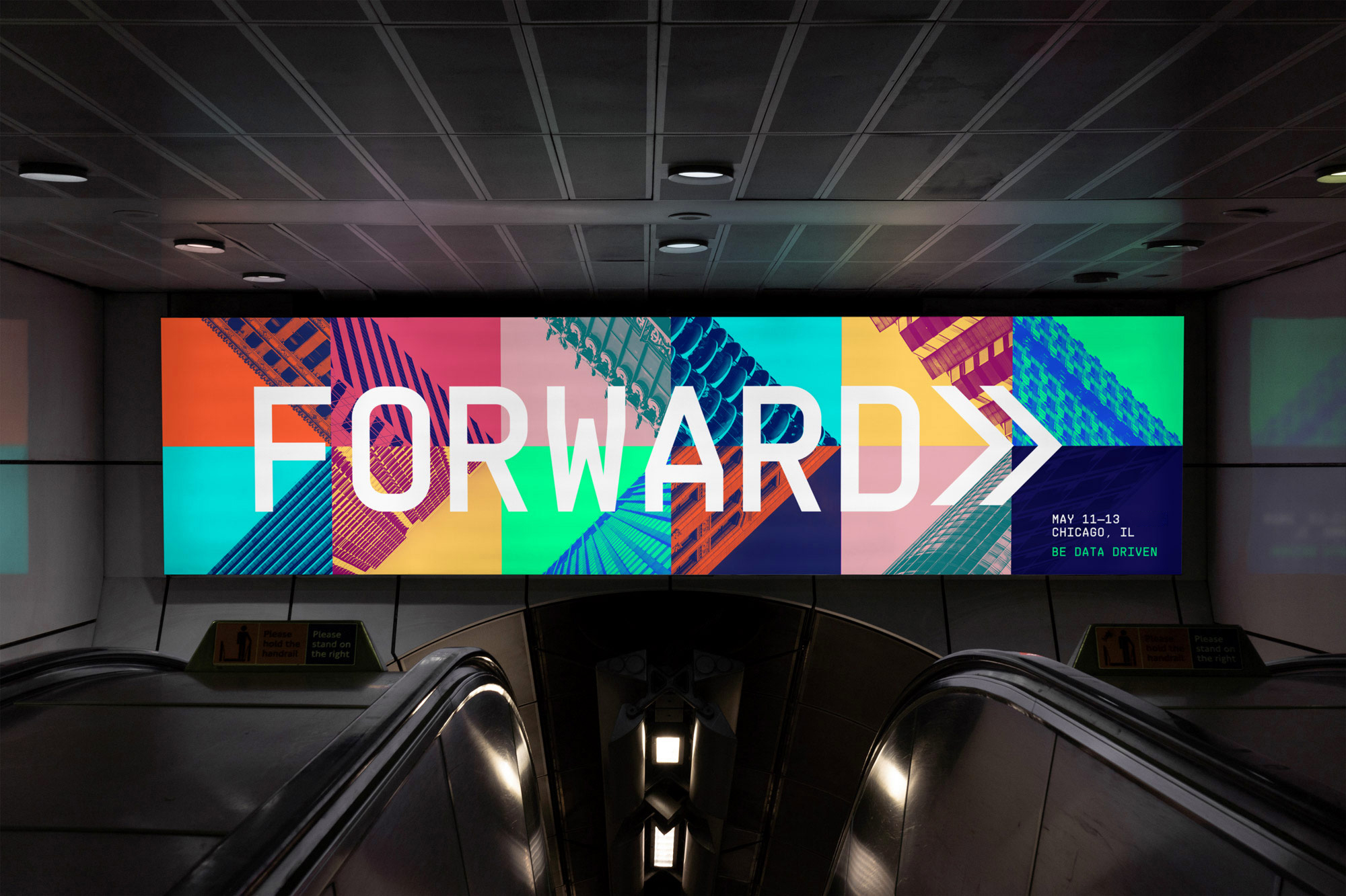
We directed a US photographer to capture a collection of iconic Chicago buildings in a particular style. We wanted the buildings shot at a 45º angle so that we could tile the images together to make meaningful shapes. We had a wide range of imagery to work with and this gave us an eclectic mix of textures and details to make up images of forward facing arrows.
Forward facing
There was no reason to change the colour palette from the original brand, so these colours were applied in the same way. This time around we were using multiple images so it was possible to incorporate a wider palette, subtly suggesting the inclusive nature of the conference. By tiling these architectural photographs together in the correct sequence, we were able to create forward facing arrows in a unique way.
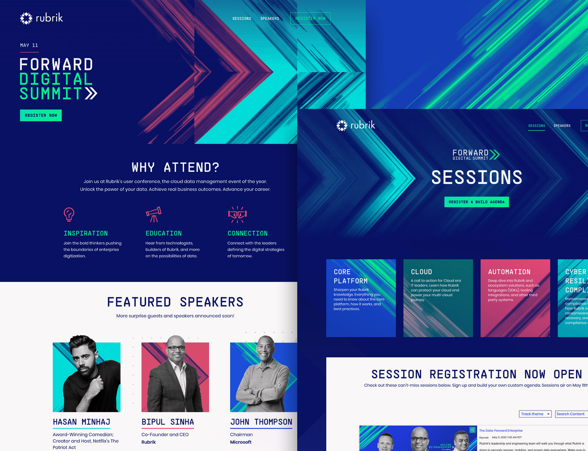
Visually this gave the brand a lot of versatility going forward when it came to applying the brand to the website, social media posts and more. Our brand was taken by the talented Porto-based digital studio Pixelmatters, where they expertly designed and developed the Forward website. It has been a pleasure collaborating with such a skilled team and brilliant to see the brand brought to life online.
Testimonial
"For the past few years now, John&Jane has been Rubrik's go-to design partner for all of our branding projects. Every time we take an idea to them, we are constantly blown away by the quality of work that is produced. No one was more prepared to take on the challenge of branding our first user conference, Forward, more than John&Jane was, and it turned out better than we could have ever expected. Whenever we had to make a change to the event or shift our strategy around, John&Jane was with us every step of the way. Thank you for all the incredible work on this project and for truly bringing Forward to life."
Chris Duke
Senior Manager, Strategic Events
Digital is the way forward
Due to the outbreak of Covid-19, just two months before the event the Forward team were forced to cancel the event in Chicago. We know the time and energy that had been invested in the Forward conference, but in the crisis they saw an opportunity and acted fast.
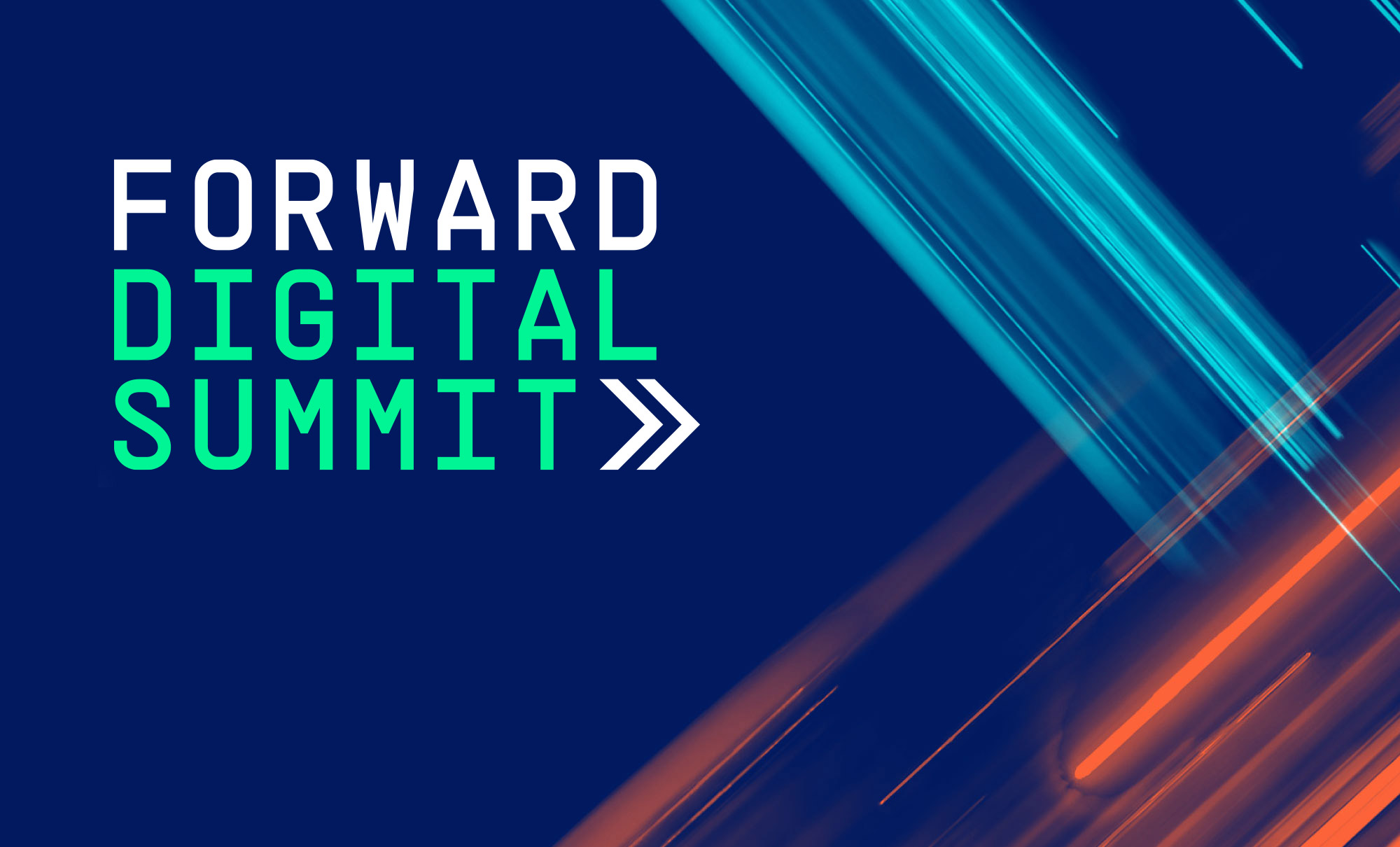
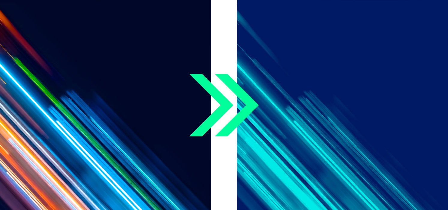
We were briefed to evolve the Forward brand for a second time, this time to Forward Digital Summit. The event was going totally online, opening it up to a much wider audience, and with so many people self-isolating it provides a real opportunity to sharpen skills and inspire the community in the midst of a global pandemic. We now needed to create a new identity to remove any reference to Chicago within the brand style. We opted for abstract beams of light to help represent the digital nature of the conference, positioning them at a 45º angle to replicate the previous grid system. We turned this around within a very short time frame to help ensure that the announcements could be made promptly. Pixelmatters also worked their magic to turn this on-site conference into an online event within a short two month window.
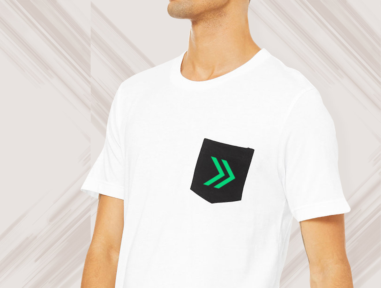
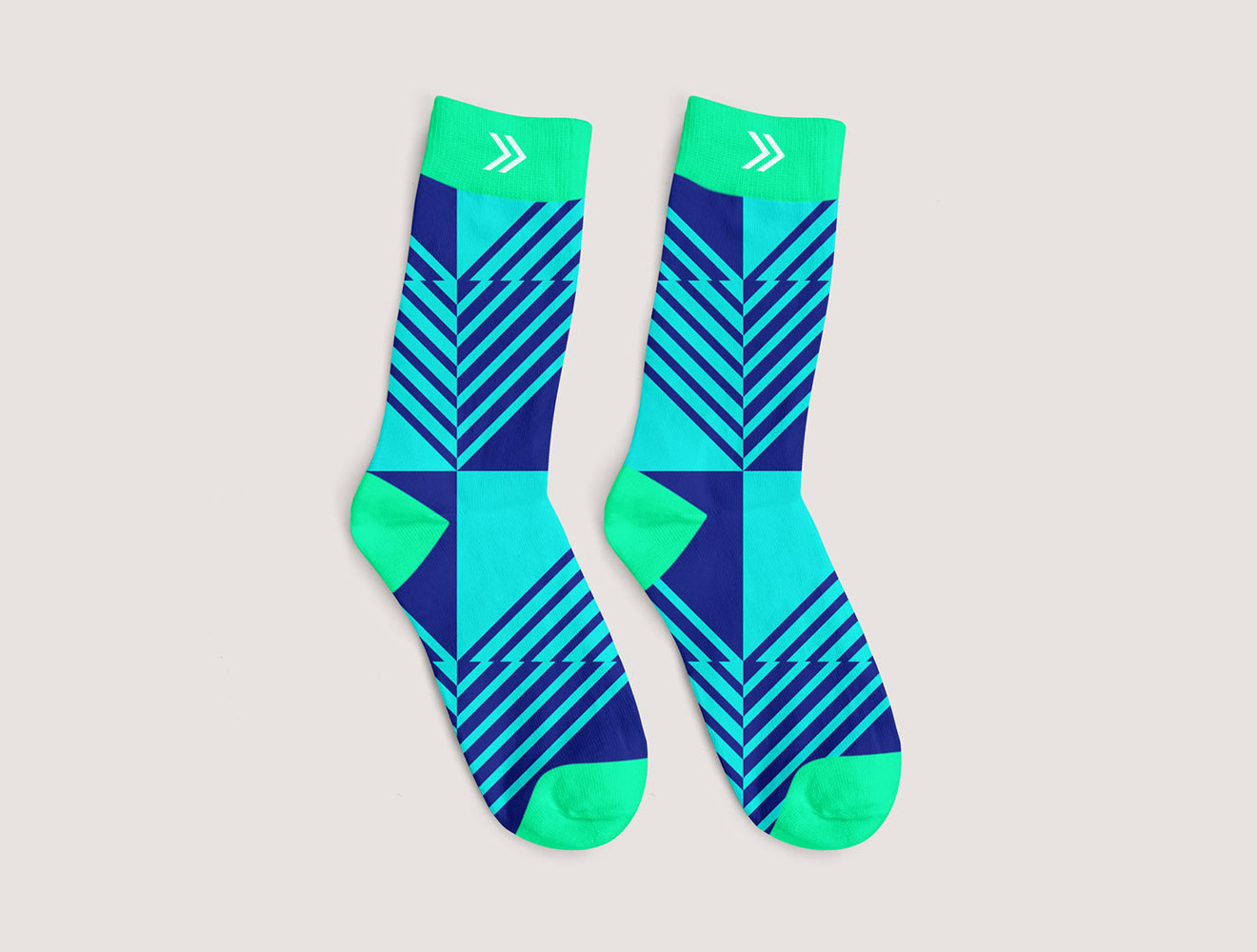
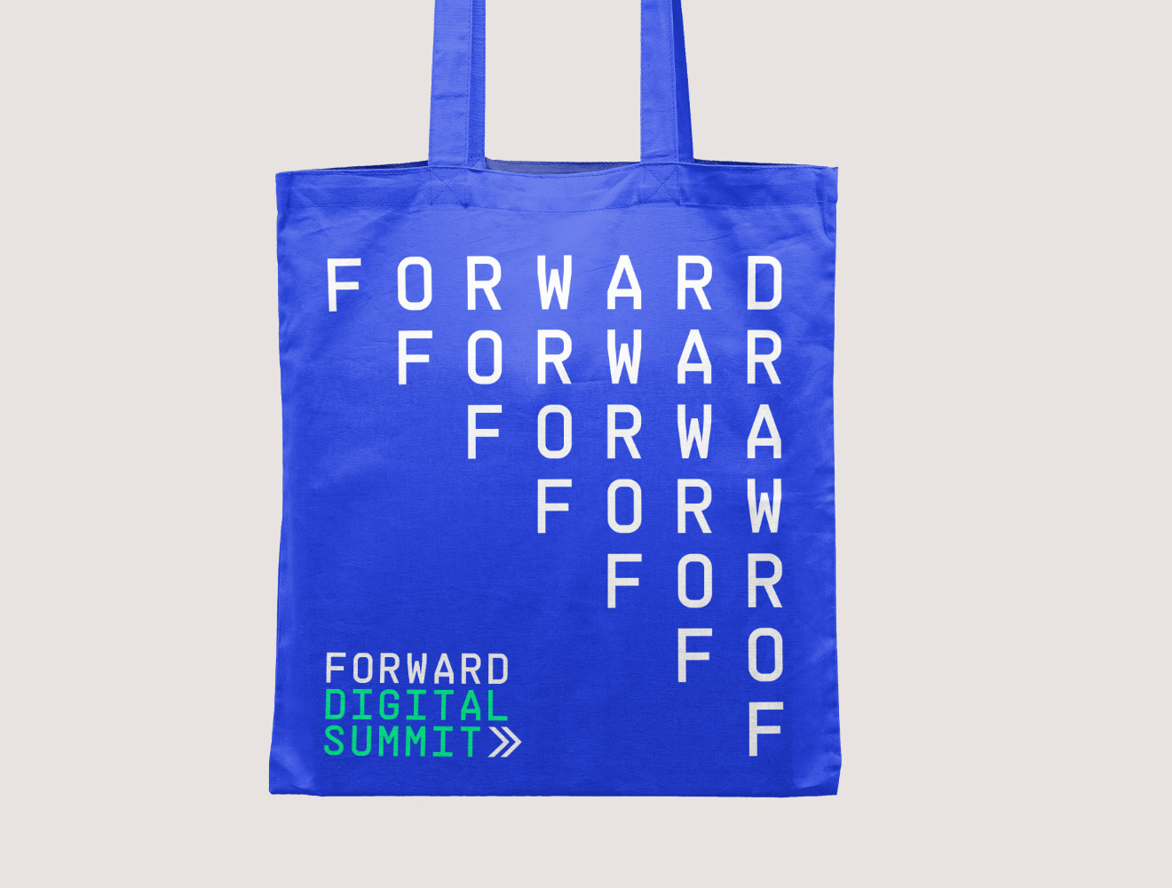
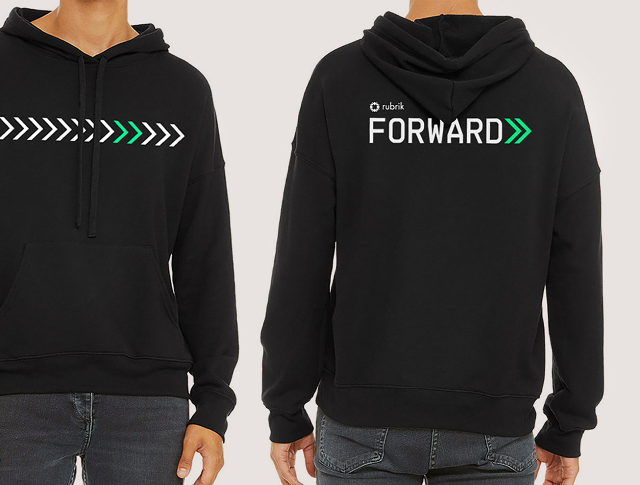
Forward swag
We also created a large range of conference swag, from t-shirts to socks. The full range has now been cut down dramatically, but there are still some lovely, high-quality items available for attendees of the digital summit. We're looking forward to a day of learning and inspiration from a company that never fails to impress us with their enthusiasm and commitment to pushing things forward.