Why places need to think more like brands
Places are just as unique as the people who fill them
Over the last decade or so, there's been an increase in towns, cities and nations taking their place brand more seriously. There are many things that make a place unique, from geographical location, industry and climate to its heritage, over time places develop and begin to carve out an identity for themselves. When we think about London, we may think of fish and chips, Big Ben or the Underground. When we think about The Alps, it may be snowy mountains, skiing and fondue. These perceptions can easily change from person to person depending on personal experience or what someone might have learned, heard or seen in the media.
We all know that a brand is not just a logo, it's so much more, in fact, we believe a brand is everything. Perception of a brand also changes from person to person, and it can be enhanced or damaged at anytime by any touch point. One person may fall in love with a beautiful visual identity that relates and speaks to them, another person may be horribly offended by poor customer service that may symbolise a poorly run business. A negative experience can be more powerful that a positive one, so in a world where everyone has a voice on social media, brands need to be clear on who they are, how they want to communicate and ensure that everyone within the organisation is on the same page. The aim of a brand should be to figure out their purpose and communicate coherently, that way, it will have a better chance of connecting with its audience in a more meaningful and consistent way.
Places are complex and no two places are the same, but local governments are now starting to understand that by having a strong visual identity and a considered strategy it can help them achieve their objectives across many sectors, whether that's in investment, tourism or instilling a sense of pride for its residents. Places are thinking of themselves as brands to help them stand out and share with the world what makes them unique. For us, the key to a good brand is being authentic, having the ability to connect with people and doing things differently. Achieving this isn’t easy, it takes comprehensive discovery and understanding followed by a creative and strategic solution.
Helping to instil pride in where we live
A more cynical take might be – what’s the point in wasting money on a logo when a place often has so many other issues that need addressing? Our opinion is that if a place invests in a strategic brand, it can help instil a fresh sense of pride, unity and vision that could go on to help people solve issues that have existed for decades.
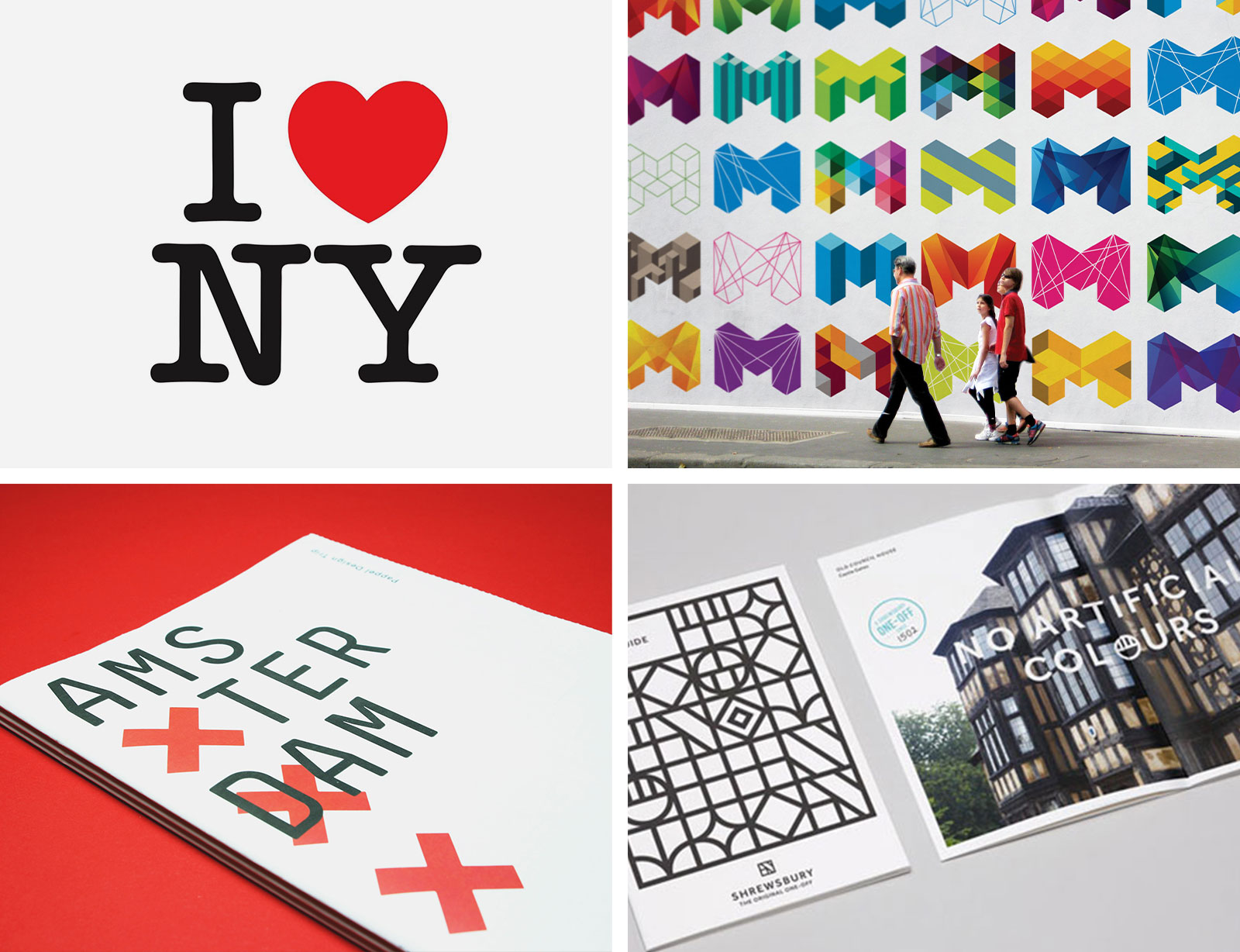
Milton Glaser designed a visual identity for New York City back in 1976, which has stood the test of time and is still very popular today. It was notably redesigned as a symbol of unity for Americans after the 9/11 attacks, stating "I heart NY more than ever". The original identity was simple and communicated the passion that New Yorkers have for their city and the way a tourist might feel after visiting.
In more recent times, there have been some brilliantly executed place brands including Melbourne’s dynamic mark back in 2009, the XXX taken and simplified from Amsterdam’s coat of arms and the one-off original of Shrewsbury. These well thought out brands have something very important in common, they’re authentic. They’re inspired by meaningful heritage and they look to inspire future generations.

Showcasing the Porto place brand
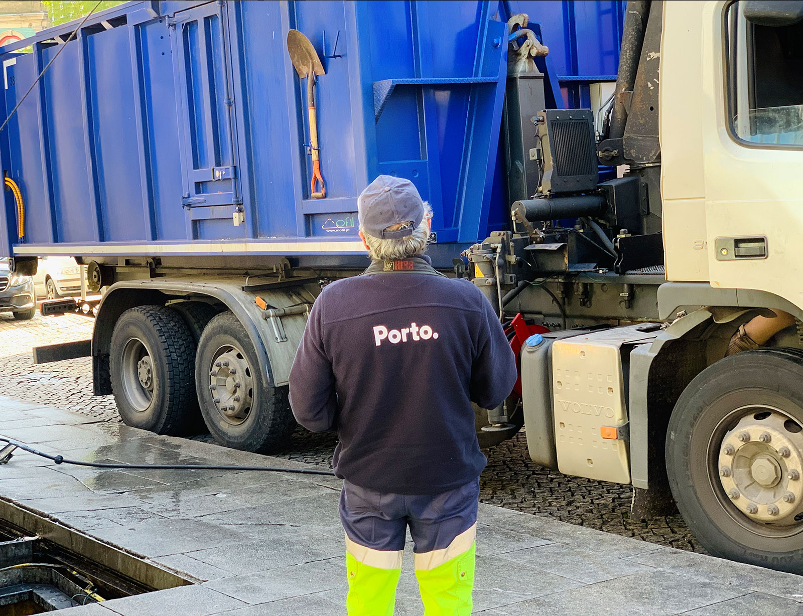
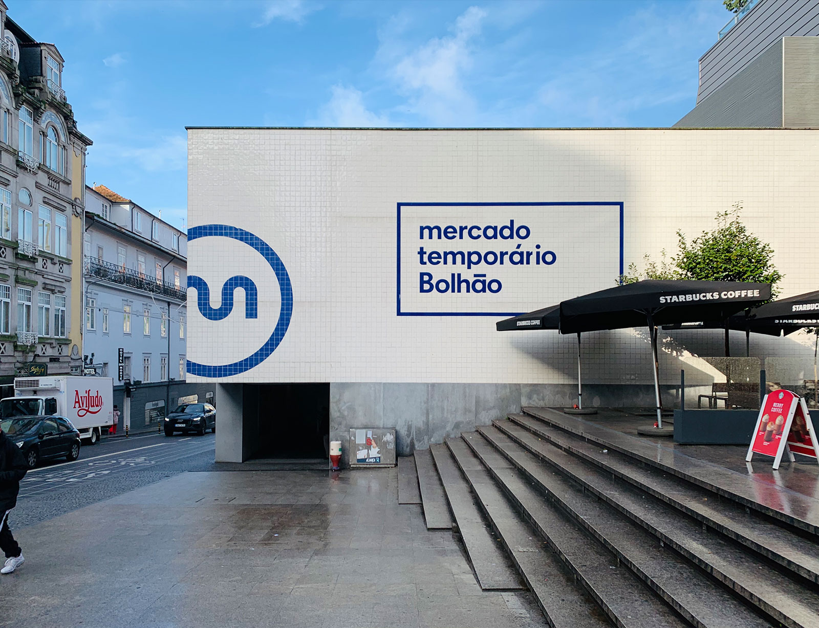
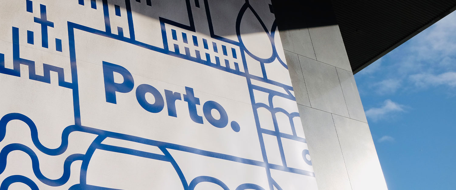
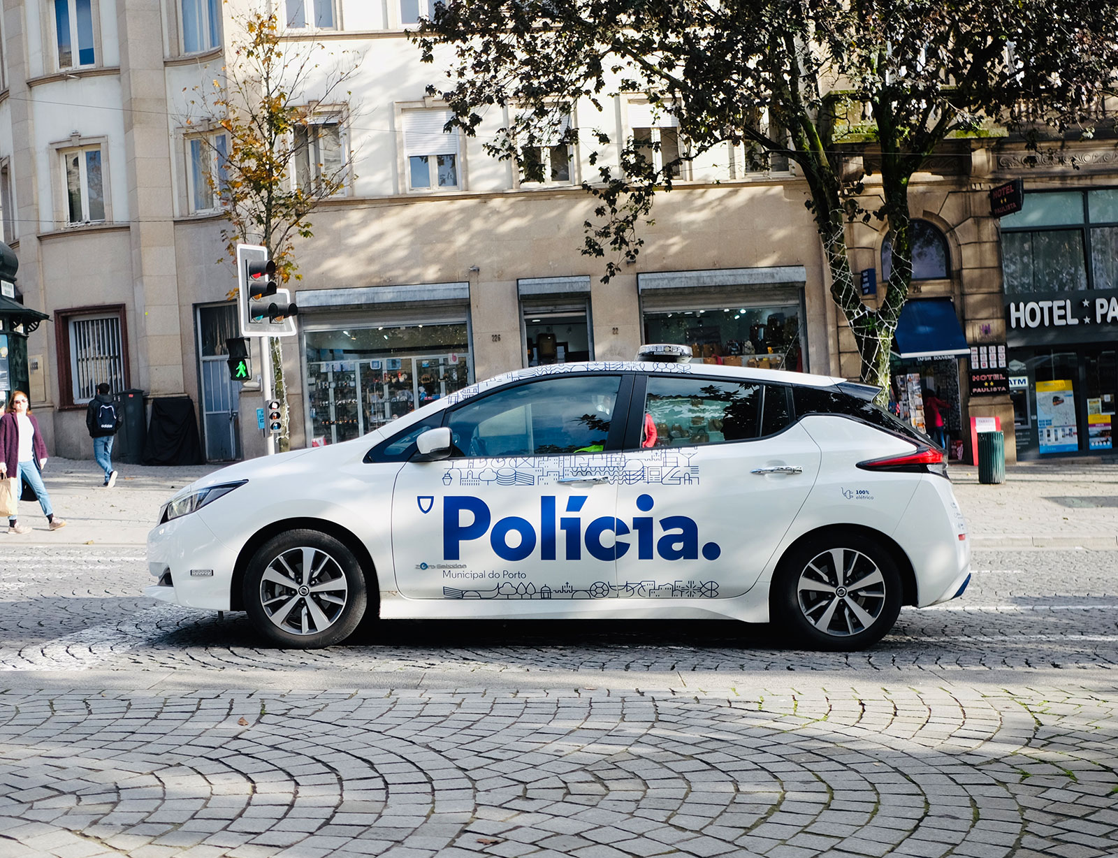
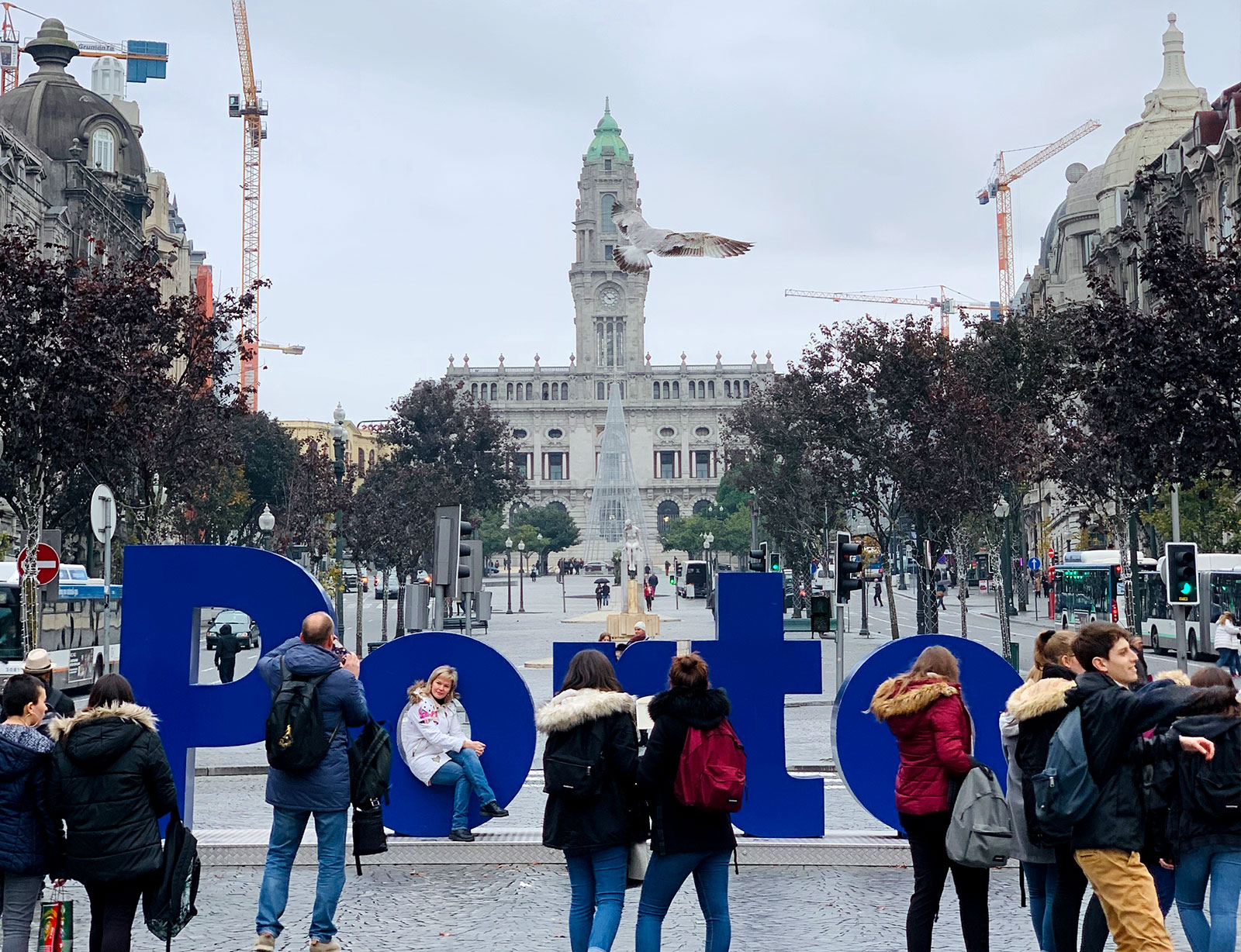
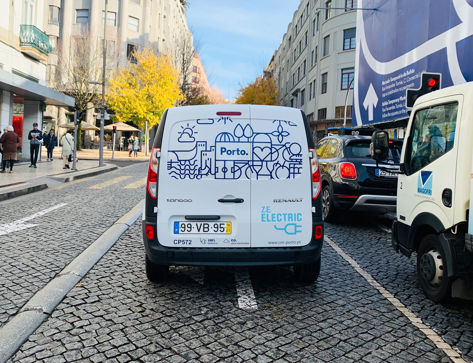
One place brand that has won countless awards for its success is Porto. We recently had the opportunity to visit the city situated in the north-west of Portugal and, being fully aware of the place brand, we were intrigued to see for ourselves how it was applied and how affective it is within the city. The Porto brand is visually simple, modern and authentic, inspired by the iconic blue and white tiles that can be found all around the city, in shops on buildings and most notably on their Cathedrals and central train station. These tiles often depict intricate patterns or complex scenery, which probably wouldn’t be fitting for a forward focussed city. The simple vector illustrations reflect these tiles and depict many of the city’s landmarks, the iconic port bottles and some symbols that represent the people. The identity uses a modern san-serif typeface that simply says Porto.
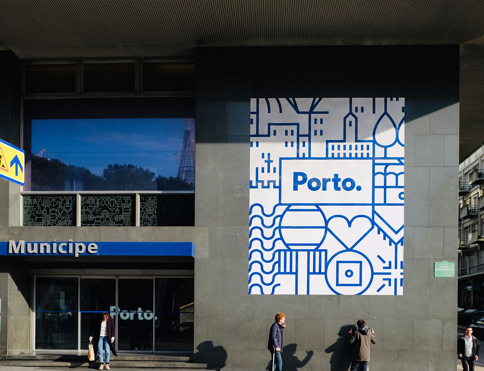
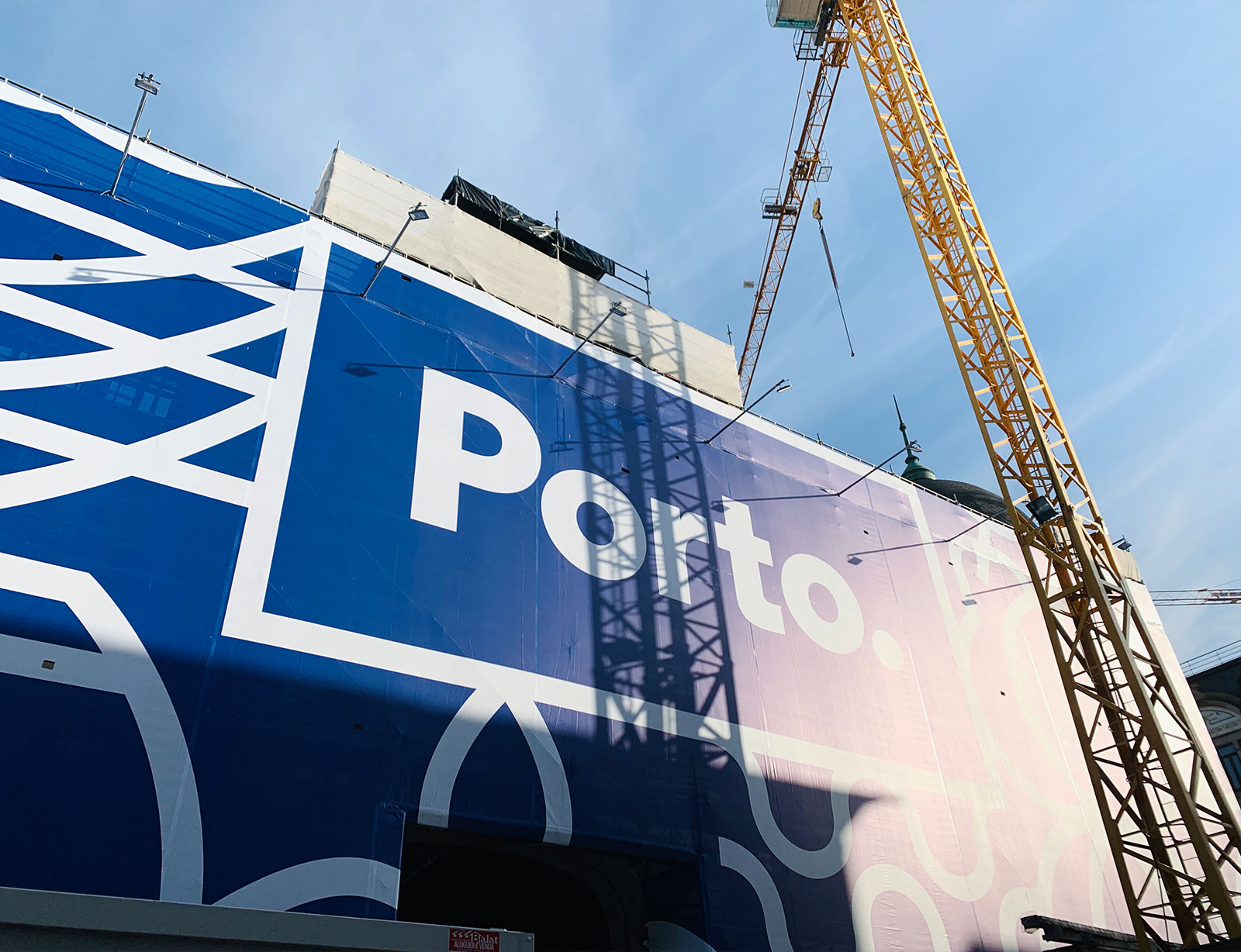

What immediately struck us about Porto was the branding was visible everywhere, there was a clear investment in the application of this brand. It could be seen on large sculptured letters as an Instagram magnet, on large scale hoarding on construction projects, police vehicle livery and even the uniforms of people picking up litter. It tied everything together and gave the place a sense of coherence, like everyone was in it together. We also noticed the sheer amount of development around the city, there were cranes and renovation work going on everywhere. This backs up the authenticity of the modern Porto brand, this is a city that is proud of its history and character but is also very much looking to the future. The colour palette of blue and white is likely to have been inspired by the decorative tiles, but also the home of the FC Porto, one of Portugal’s most successful football teams who won the Champions League back in 2004 with Jose Mourinho at the helm. The colour of their kit is blue and white stripes, again feeding into the consistency of the brand and making it relatable to its residents.
Real results
We were lucky enough to spend some time with local digital product studio Pixelmatters whilst we were in the city, a lovely bunch who introduced us to the incredible local sandwich, a Francesinha, which we can definitely vouch for! They had some great insight into the Porto brand and were rightfully proud of the positive effects it was having on the city. We also had some good conversations with a few Porto residents about the impact of the brand. One shared his pride of the brand, telling us about the council acting independently and making unconventional decisions that have proved to be very positive for the city. He went on to talk about the awards it had won and how it has helped put Porto even more on the map so to speak. On the flip side, one taxi driver in particular told us he thought it looked good, but didn’t understand the need for it or any benefits it's had. Interestingly, he hadn't heard that since Porto revealed their new brand, tourism records have been broken every single year and therefore maybe we wouldn’t be sat in his taxi without it. Overall, we found Porto to be a beautiful, friendly city with an abundance of character and history. Its place brand is fresh, forward-thinking and authentic. A great brand for a great city.