A proper brand for Franks
Inspired by New York City and a love of doing things just right
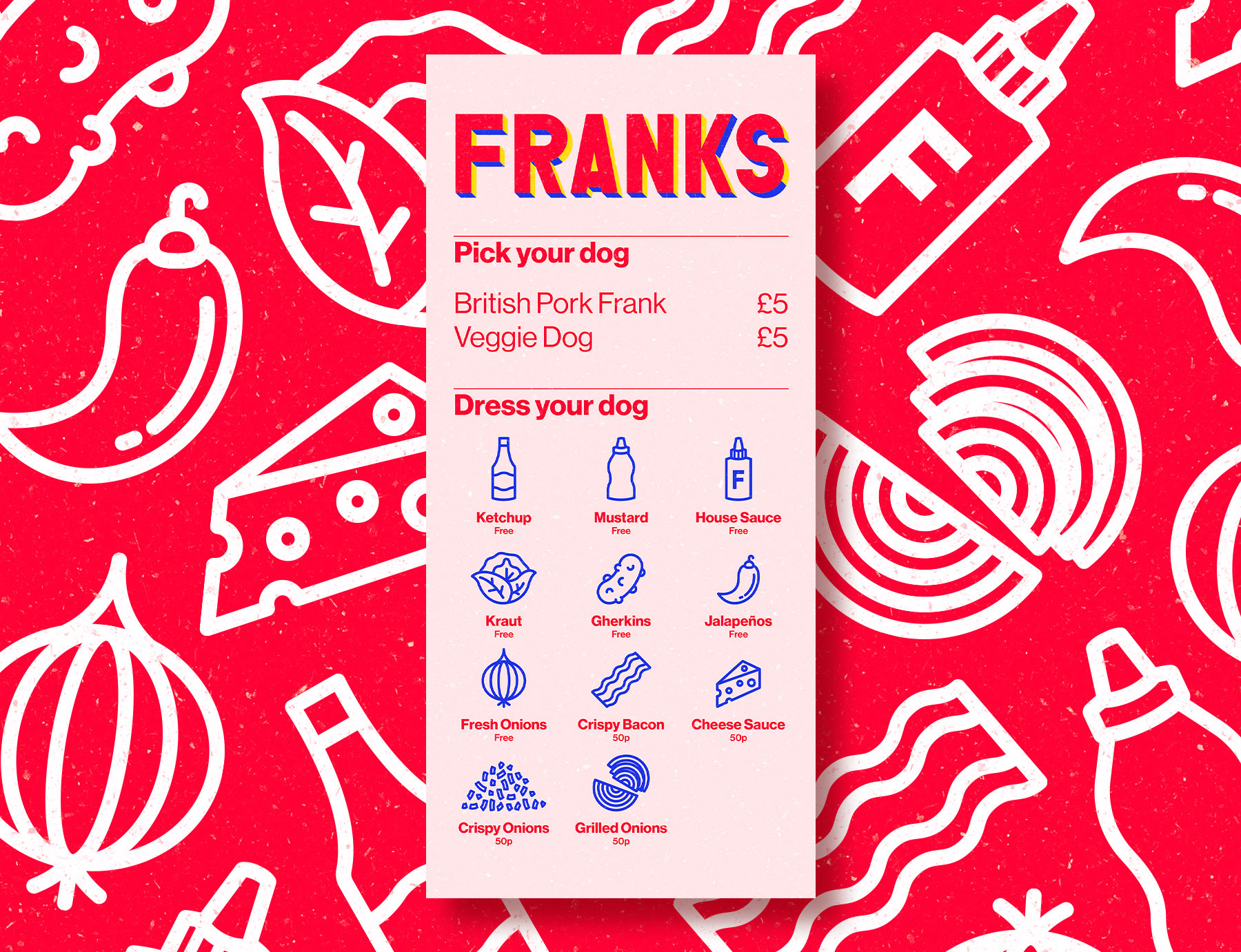
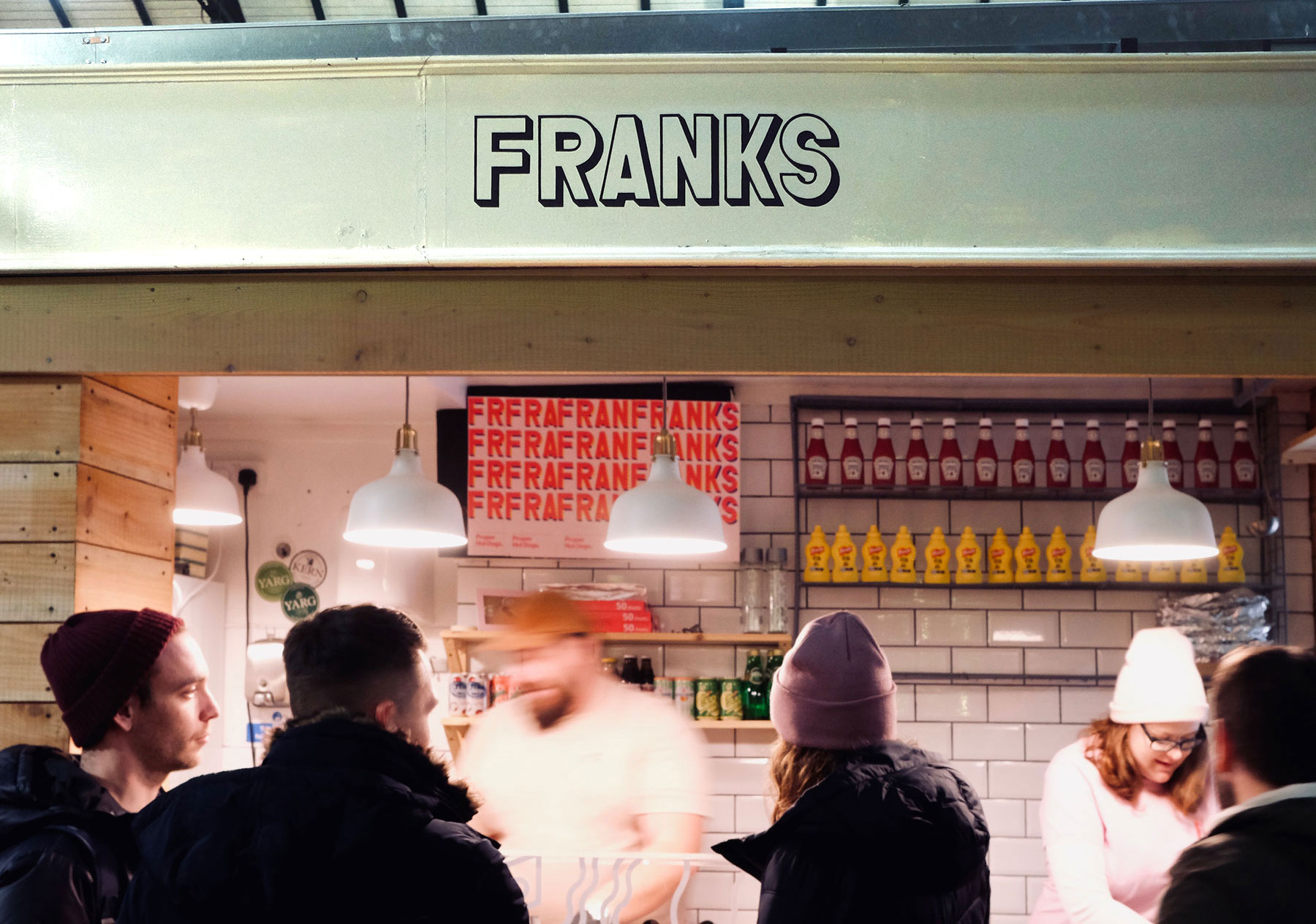
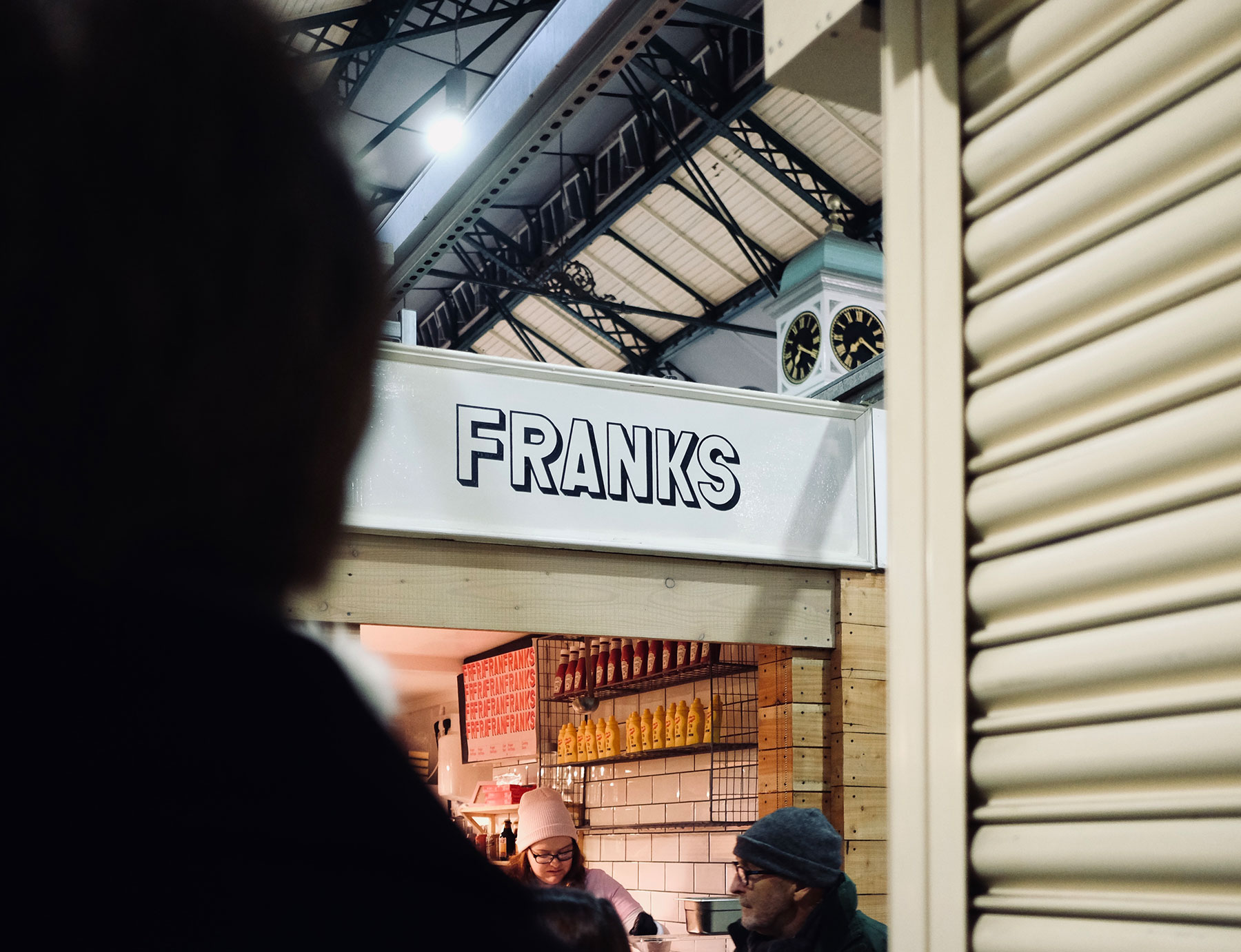
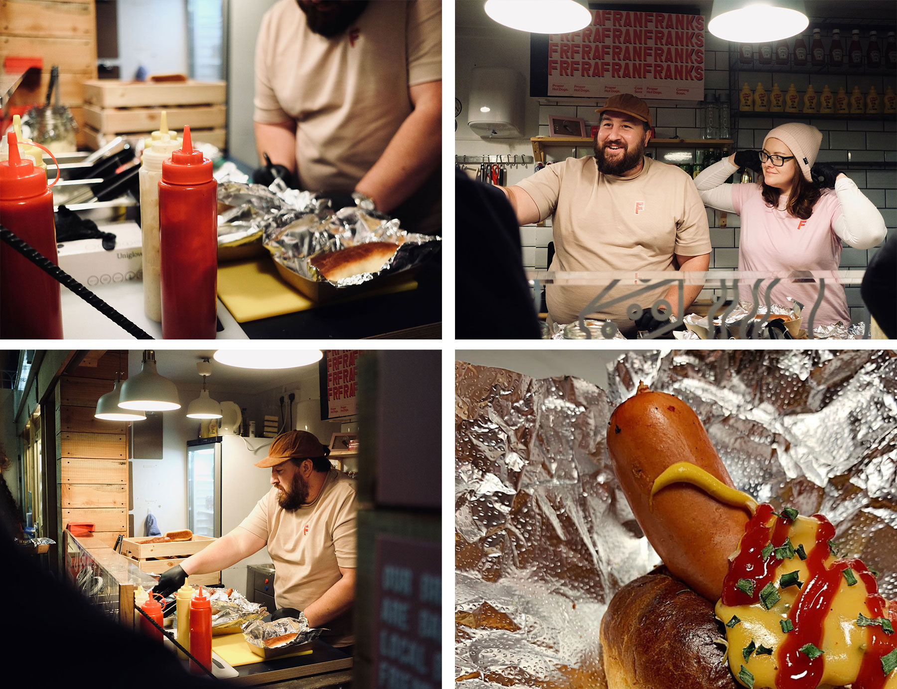
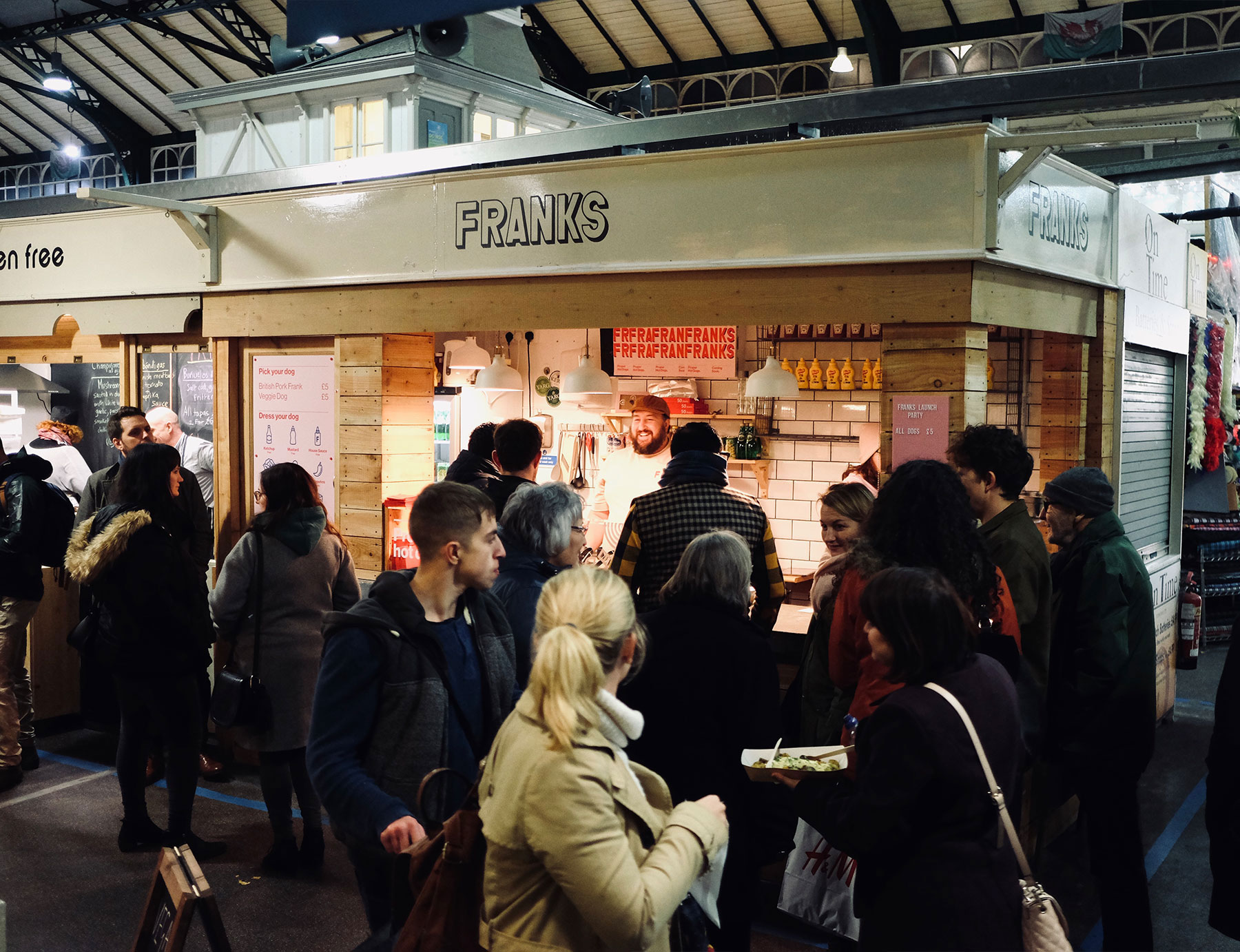
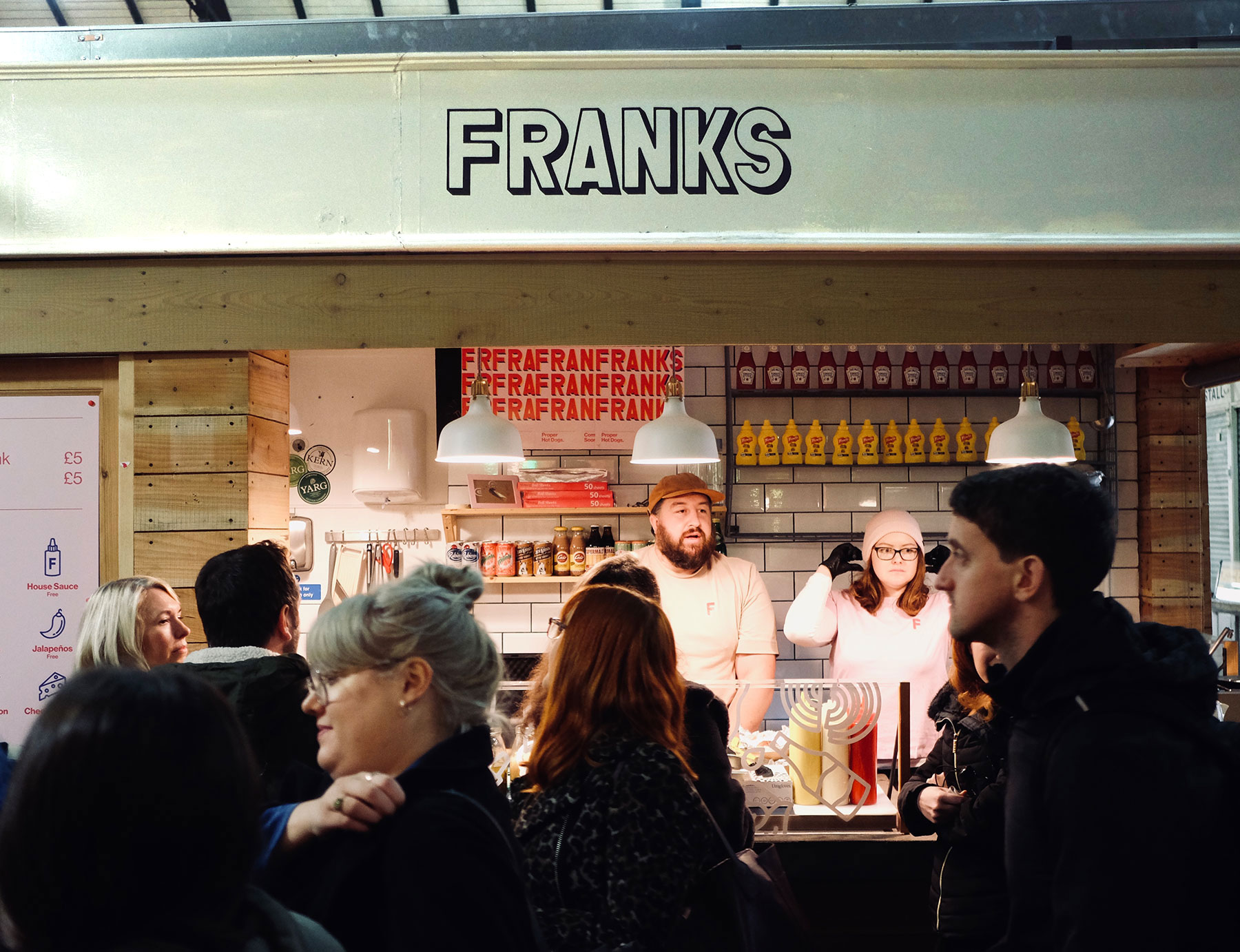
We were so happy to see Rosie and Jon launch their new proper hot dog stand, Franks, in Cardiff Market last night. We’ve been chatting with them about their ideas for this business for a long time and to see it come to life with big queues and even bigger smiles was so great! We love the spirit behind Franks, top quality, tasty food with every last ingredient meticulously considered and researched. And we can vouch for the fact you could tell, everything from the gherkins and house sauce to the handmade bun. Even after all the anticipation, we were impressed.
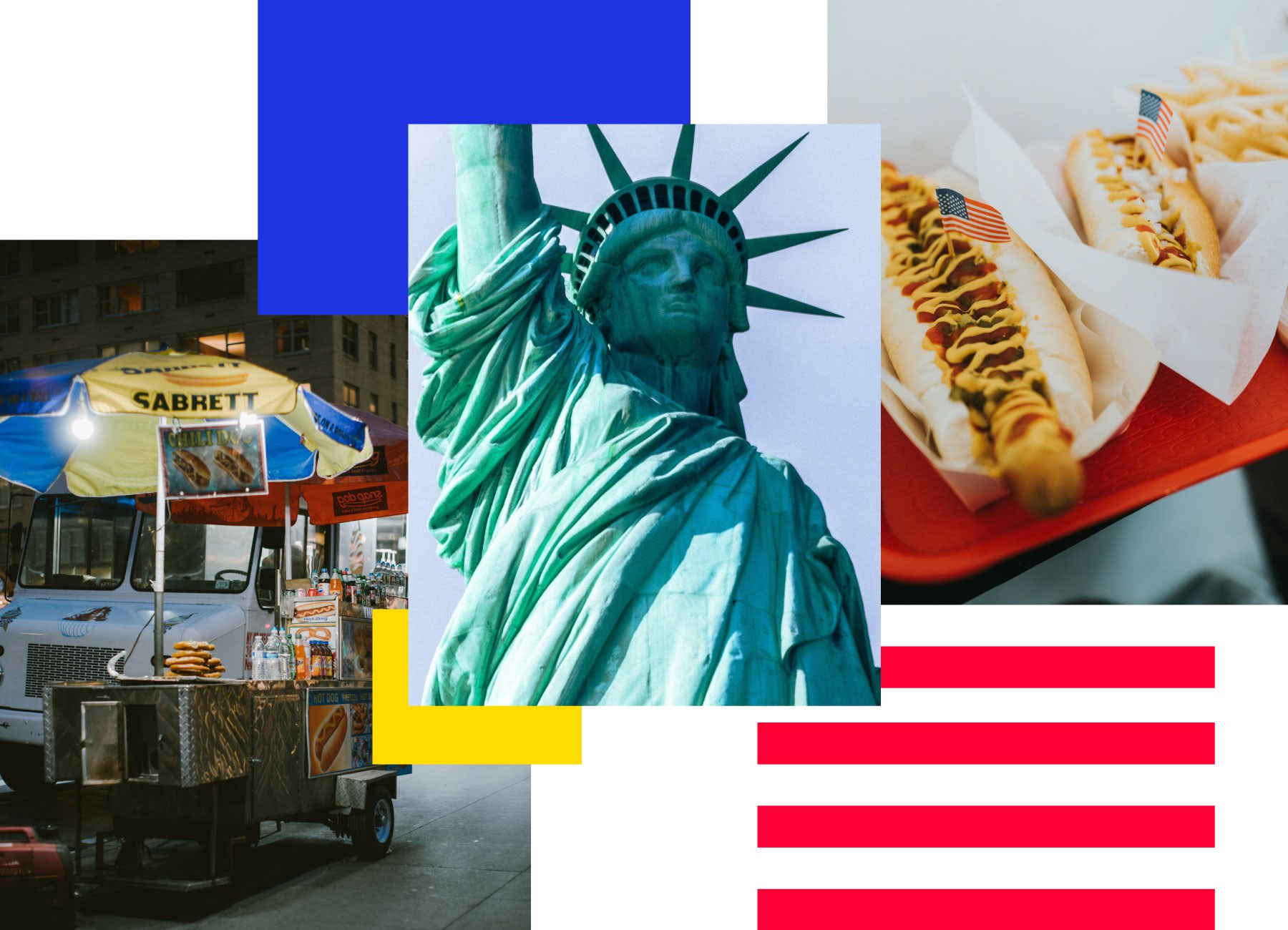
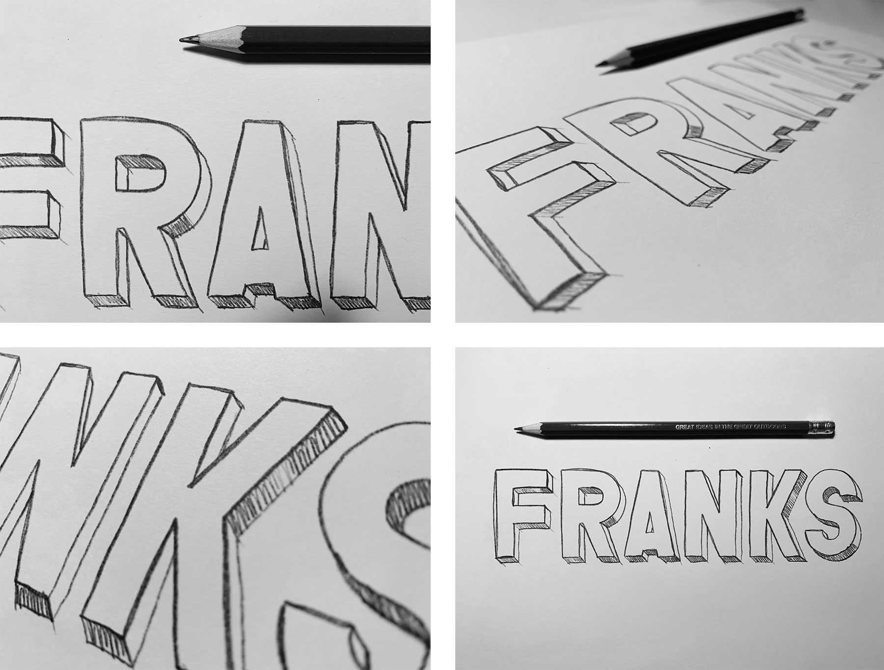
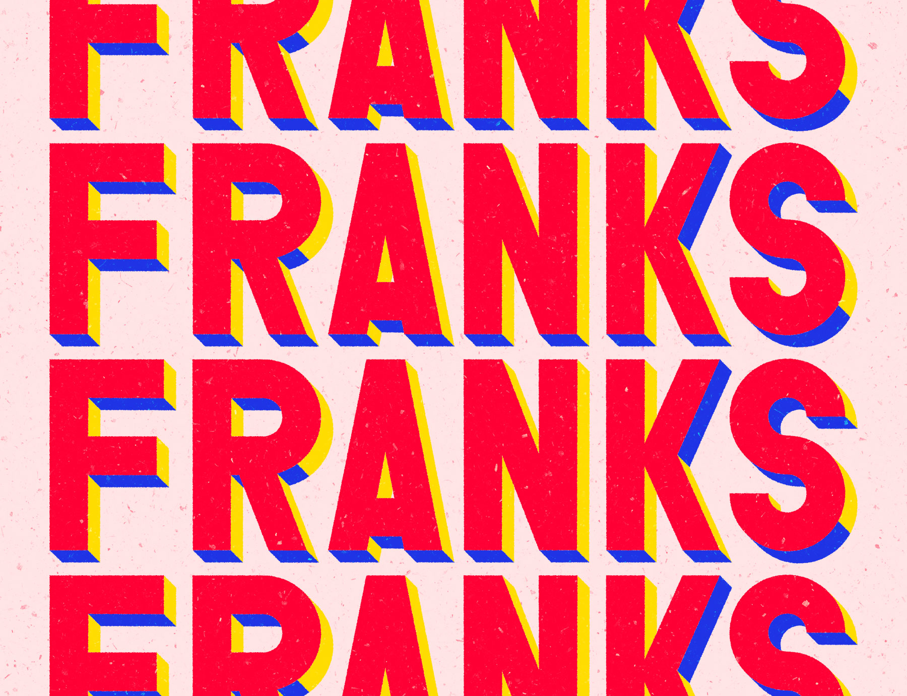
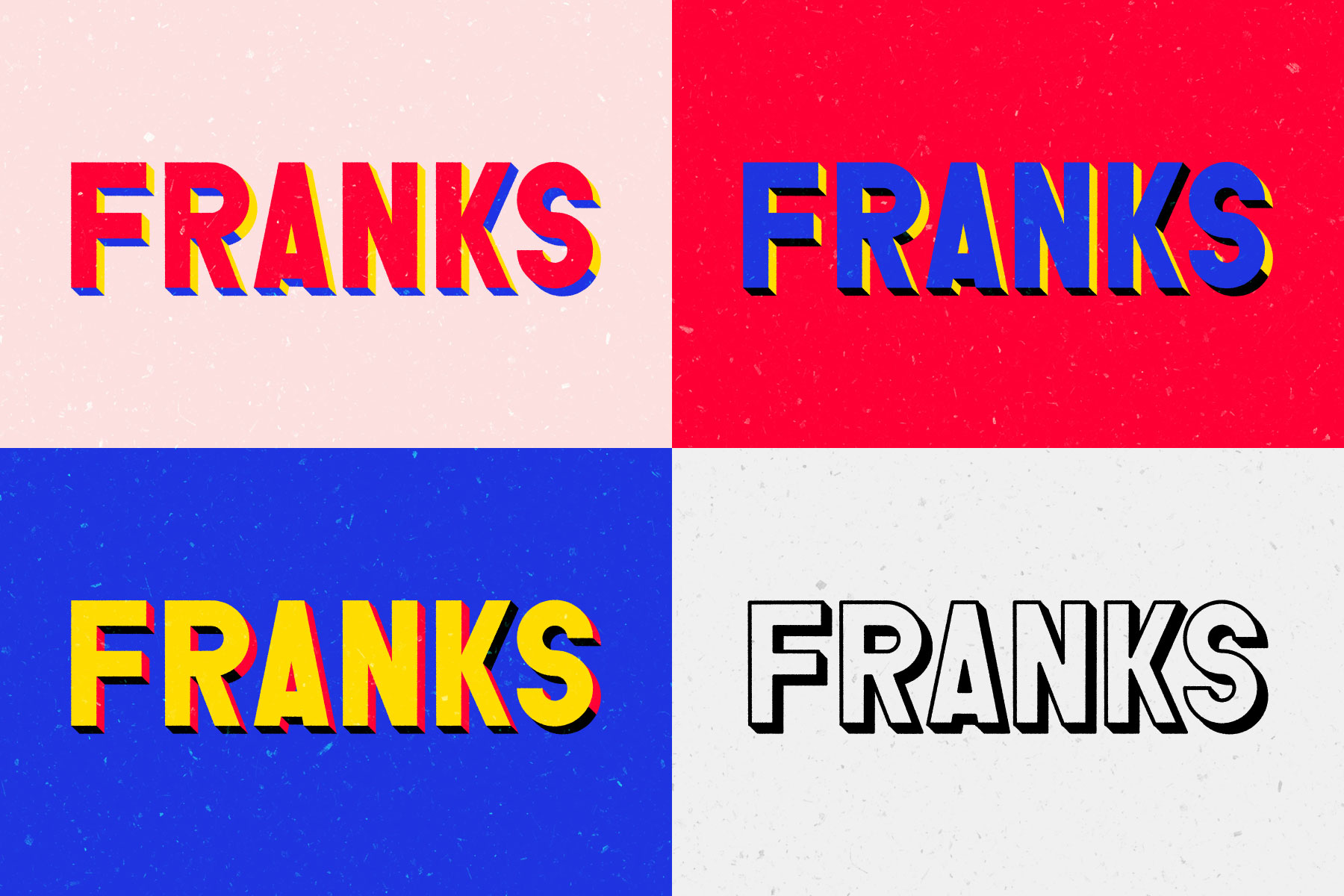
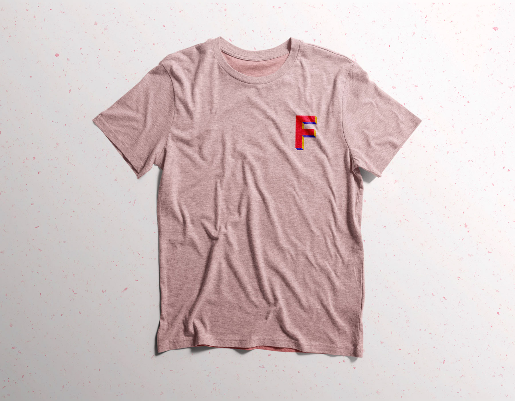
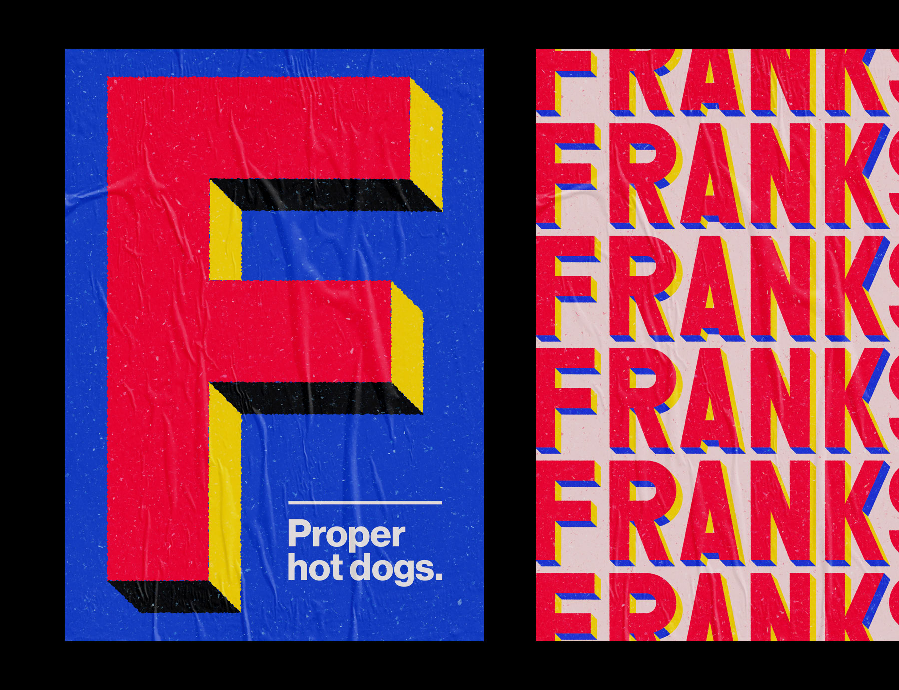
Jon and Rosie approached us last year and got us thinking about a new brand and visual identity for the business. They were set on the name Franks, we loved it too. It’s no nonsense and fun and it inspired our designs from the very start. We went back to the original New York hotdog carts and loved the bold colours and brash style used. We developed an original take on this aesthetic by creating a custom drawn wordmark and using a vibrant colour palette, we wanted it to feel unapologetic and confident. This reflects Frank's approach, what Jon and Rosie don’t know about about making a good hot dog probably isn’t worth knowing!