After you, John.
Last week we couldn't believe our eyes when the John&Jane logo flashed up in our instagram feeds in a post from Stefan Sagmeister. To say we are a fan of Sagmeister is an understatement. We admire people who push things forward, take risks creatively and personally to explore new areas of life and design. He embodies this approach for us.
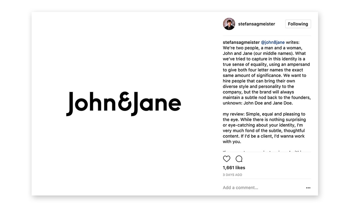
Simple, equal and pleasing to the eye. While there is nothing surprising or eye-catching about your identity, I'm very much fond of the subtle, thoughtful content. If I'd be a client, I'd wanna work with you.
Stefan Sagmeister
Sagmeister included a short review of our logo and yes, he said it wasn’t all that surprising or eye catching but he also said he felt fond of the subtle and thoughtful content. We’ll take that! It was massively reassuring to us for many reasons, not least because that really is what this brand is meant to be all about. Subtle, professional and genuine, it was never meant to take the limelight. The plan is to keep that for the work.
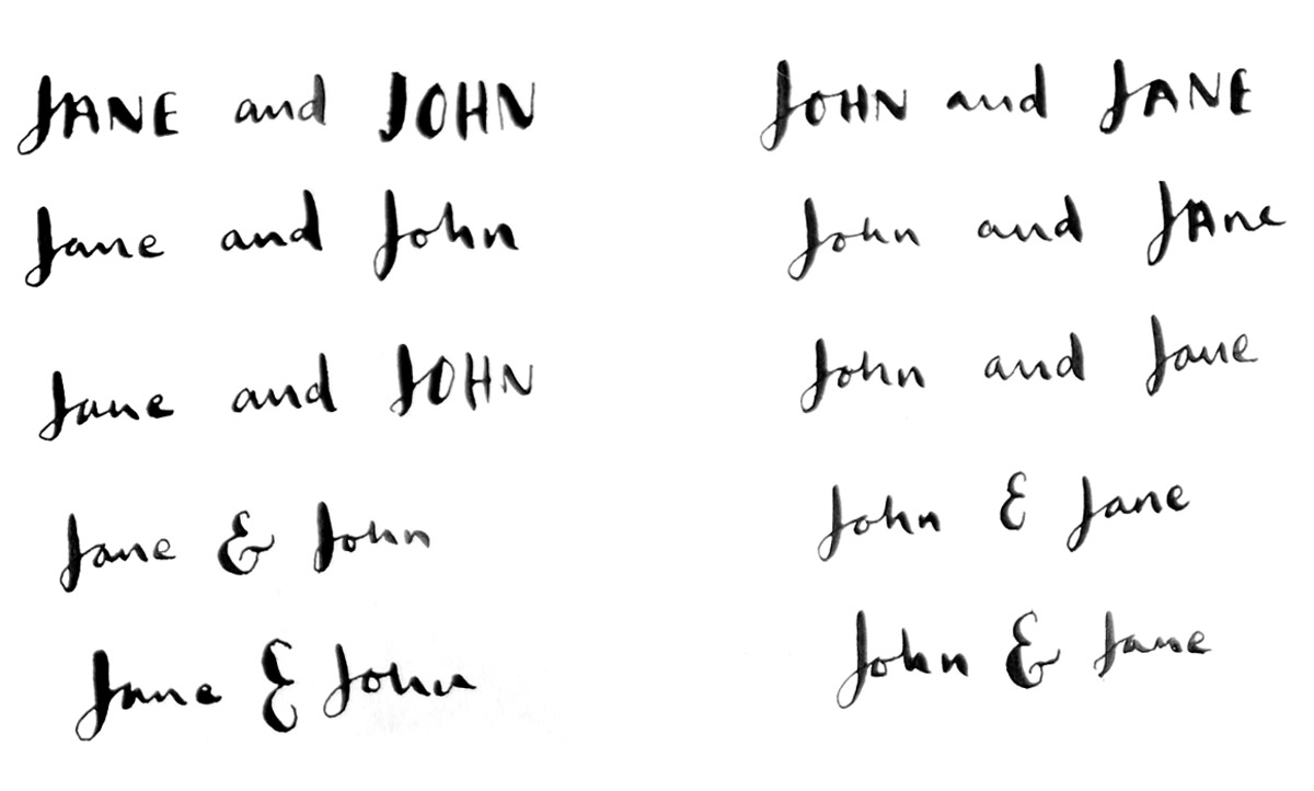
As most of us know, in any industry, sharing your work with your peers invites questions and potentially criticism. So, unless you want to live off the land in a hut in the woods and keep your creative work all to yourself you sometimes need to be able to talk about your rationale. We appreciated all the positive feedback on Instagram in response to the post but we’d also like to take this opportunity to share our thinking and respond to the questions about the order of the names John&Jane.
We never assumed we’d get the opportunity to chat about all the geeky reasons behind what is a very simple looking brand so we’re grateful to be asked because if you scratch beneath the surface, it’s based on a whole heap of thought, insight, personal and professional experience. Our lives are referenced by those two words and the ampersand that hold them together.
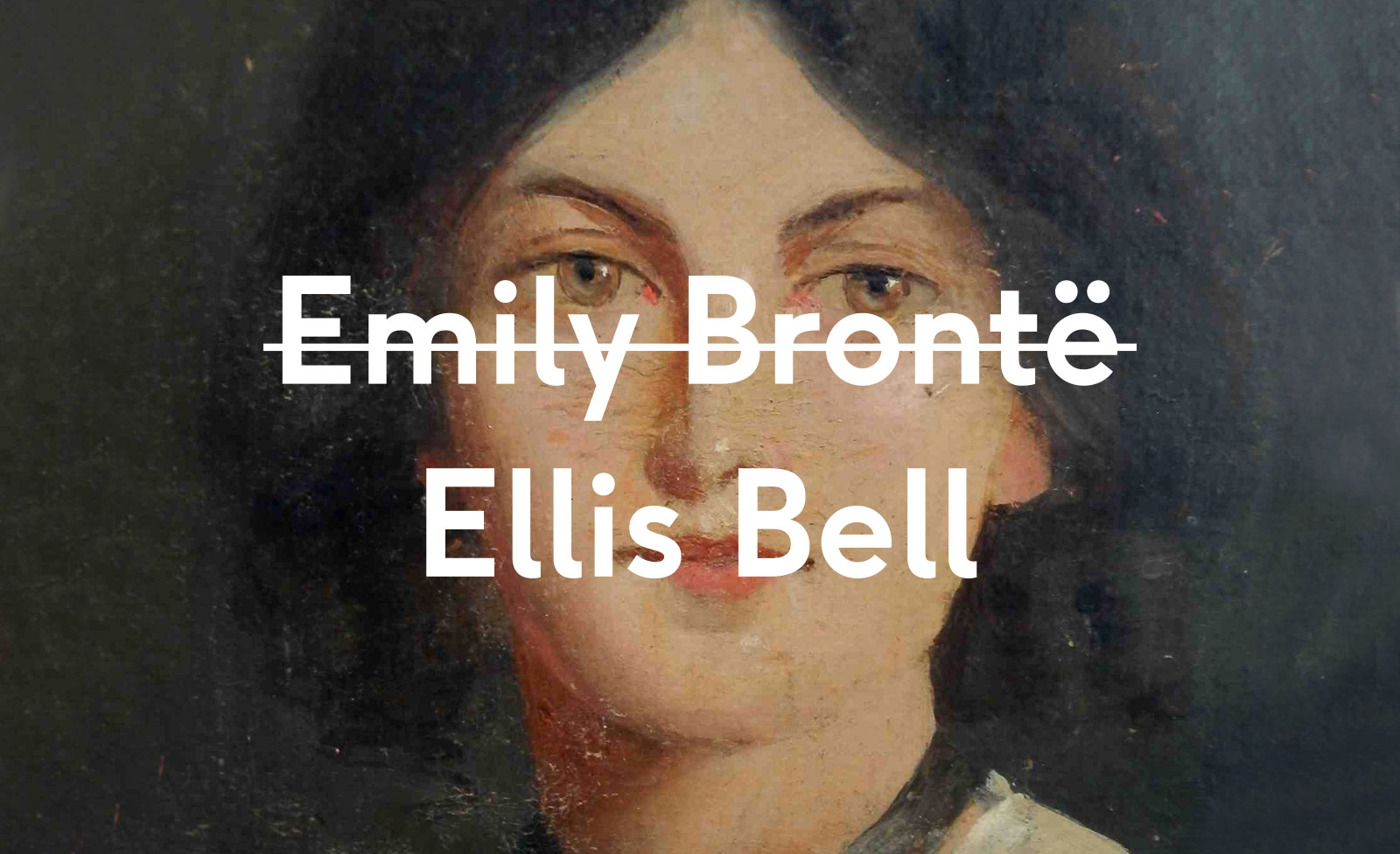
I’ll be honest, the question ‘why not Jane&John then?’ was also my first, and the one thing that many of our friends asked us. The struggle of women to be recognised on an equal footing as men for their creative endeavours is no secret to anyone. One, very obvious example, which sticks in the mind and sums it up for me is female authors using male pseudonyms in an effort to ensure a book's success. The Brontë sisters felt they needed to do this in the mid 1800s and J. K. Rowling still felt she needed to do this nearly two hundred years later.
We don't claim to have the answers when it comes to inequality of the sexes outside of our small studio. People's perceptions of gender are continuously changing and we just hope that we're moving towards a more equal future for all.
The fact that John&Jane sounds so familiar and generic is one of the main reasons we liked it so much. It sounds familiar but in a way that you can’t immediately put your finger on. Like Lilo and Stitch, cookies and cream, Janet and John. We think this is a good feeling to have when first considering a brand name. If it’s a great name it’ll sound familiar but also hold a bunch of meaning for the people behind the brand.
Besides the fact they are our own names, we wanted the brand to be timeless and the names John and Jane Doe are our little nod to tradition. For many years they’ve been used as placeholders, where identities of people involved in any kind of case aren’t known, we like this idea. We like the idea of being non-identifiable because the fact is that the agency is run by people who obviously care about the brand, but who aren’t looking to be the face of it. For the same reasons we like the fact it can disappear within copy, it can be replicated easily by anybody.
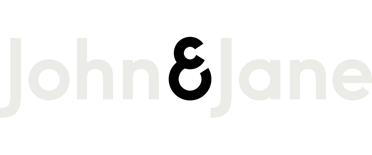
With this brand we wanted the design to do the talking. The four letters of each name balance each other out perfectly and the uniformity of the typeface suggests simplicity and equality.
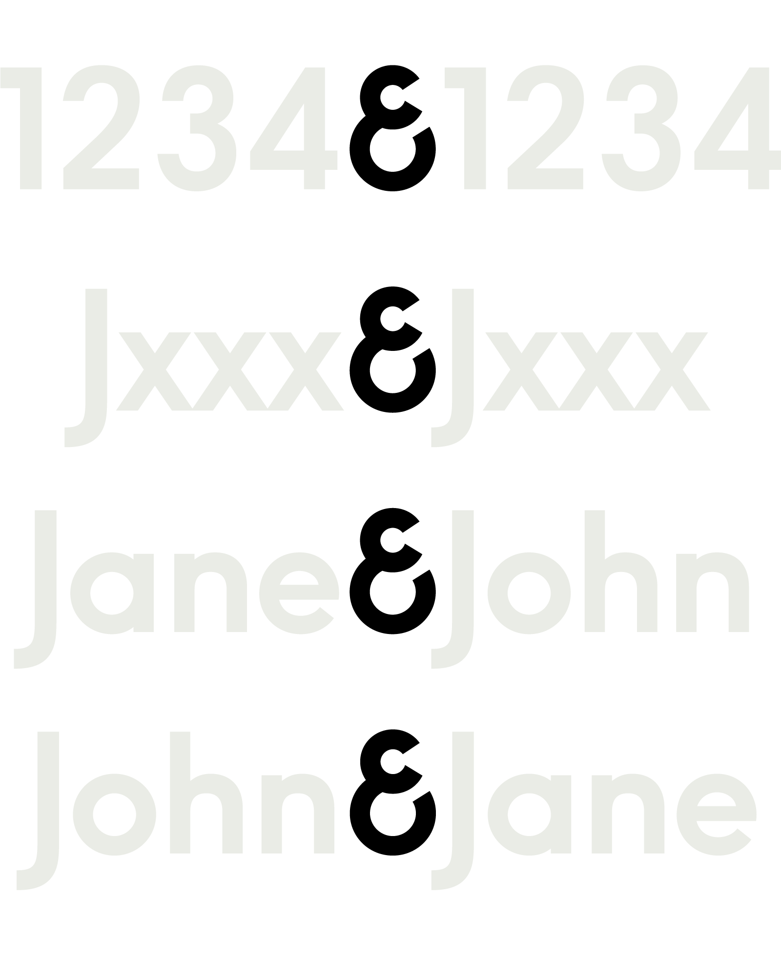
The ampersand is a beautiful glyph and used here we feel it addresses the inequality between the two names. The very meaning of it is that the words either side of it are given equal importance. We don’t see John being ahead of Jane, we see them side by side. Technically then it doesn’t matter who’s name goes first, we know in practice this is a little idealistic but that’s how we see it.
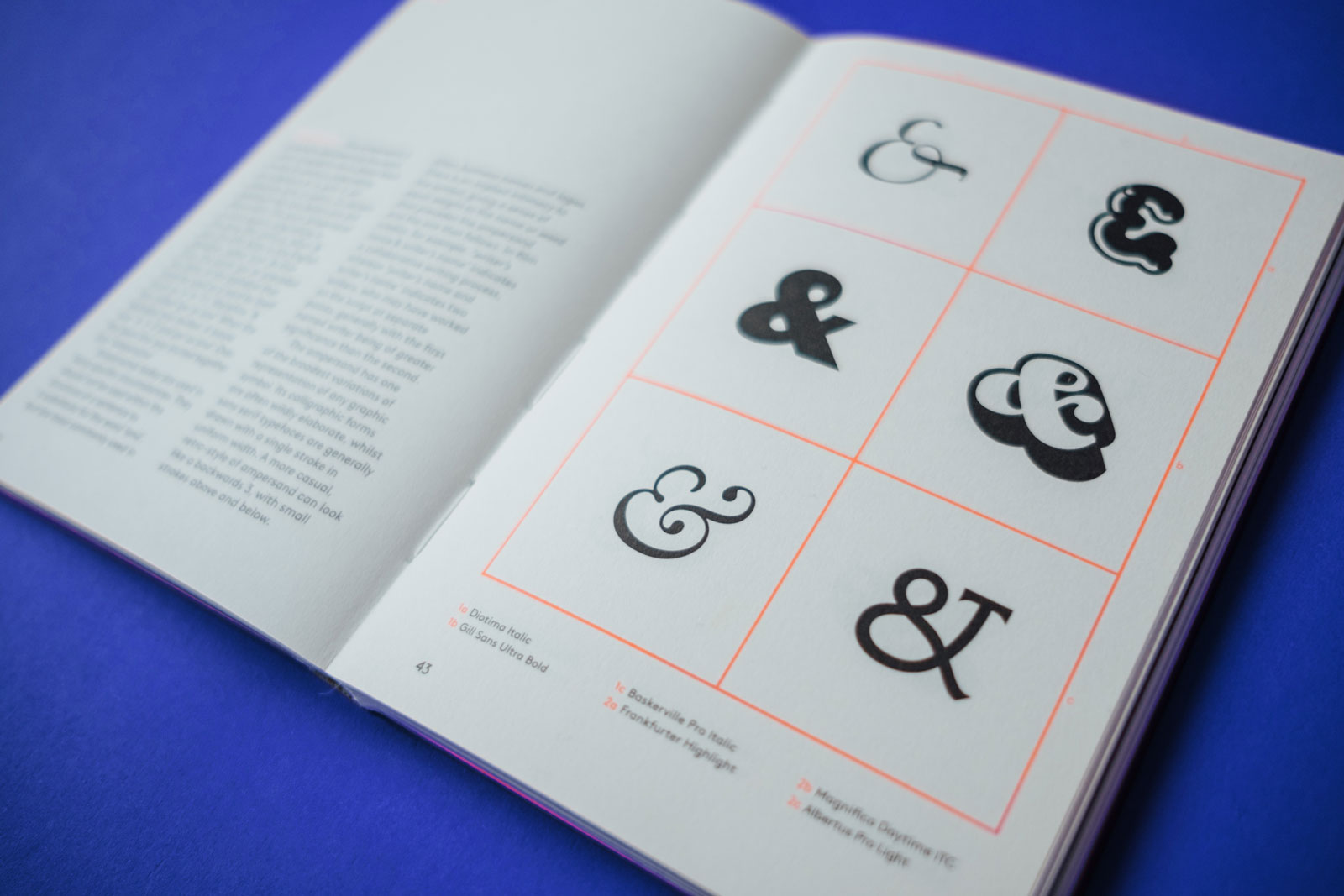
There is an intimacy to the symbol, giving a sense of equal weight to the name or word the precedes the ampersand and the one that follows.
Glyph by Shiro Nishimoto and Adriana Caneva
We feel confident enough in our beliefs that we didn’t feel the need to change up a traditional pairing of names to make a point. By assuming we need to swap the names is to assume that the women’s name needs to be swapped to prevent discrimination, to prevent her from being ignored, to prevent her work from seeming less important. We absolutely know that isn’t the case.
Someone had to go first. That’s just a fact. If a woman goes first is that better? Our dream is that nobody has to jostle and fight to be first and that nobody feels that they have to. We want to be gracious. Equality isn’t fighting for first place, equality is standing side by side.