Eleven things you didn't know about the Stranger Things typeface and it's designer, Ed Benguiat
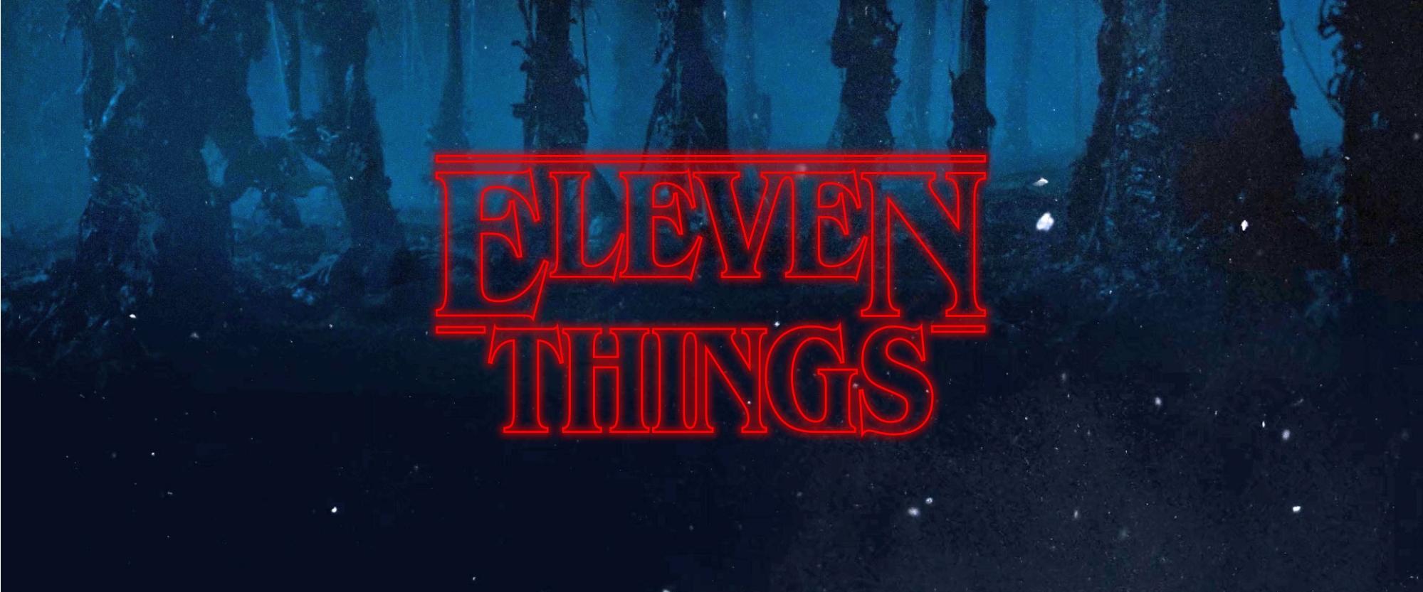
With Stranger Things taking the world by storm we decided it would be a good time to do some research into the famous typeface used by the hit Netflix original.
ITC Benguiat itself has always had a strong connection to horror and has a very interesting life as a niche typeface and so does it's designer, Ed Benguiat. So here are eleven things you didn't know about ITC Benguiat. We chose eleven for obvious reasons.
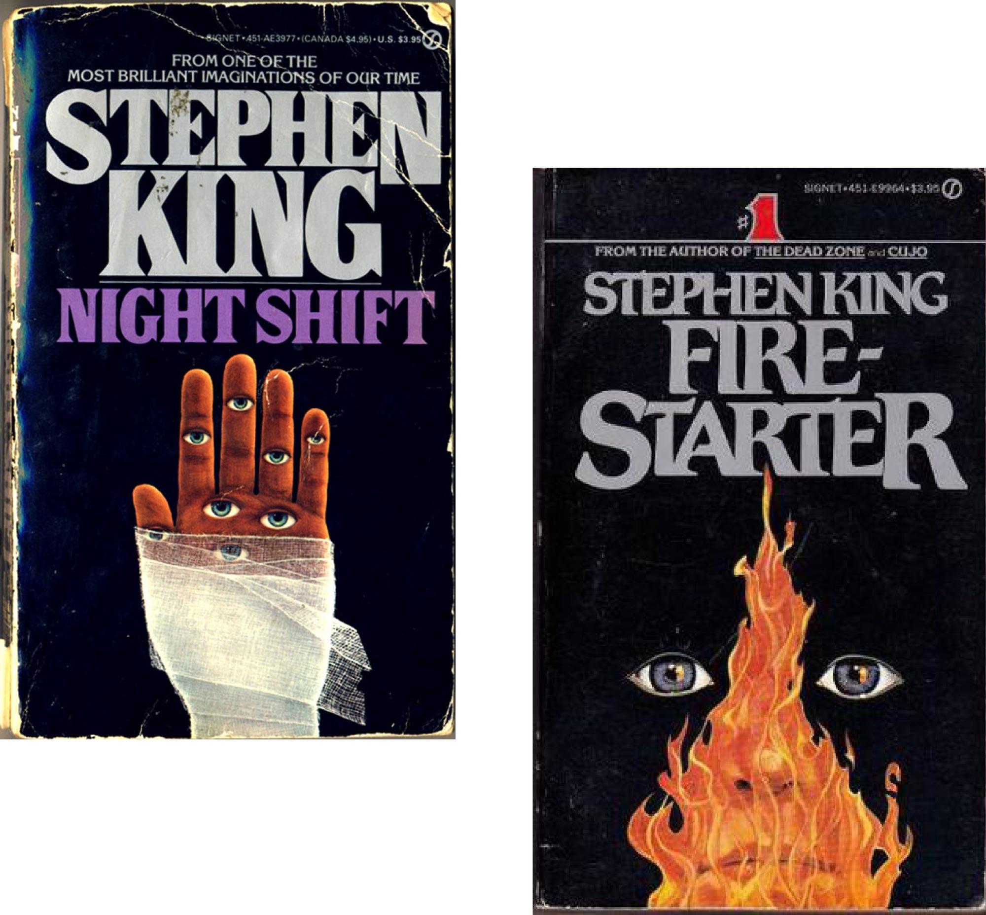
Heavily inspired by Steven King's novels
Before it became as famous as it is today it was quite the hit with the horror genre. Stephen King, writer of acclaimed horror novels such as IT, The Shining and Carrie used Ed Benguiat's self-titled font for many of his classic novel jackets. The design focuses a great deal on the detail of the beautiful typeface and they have even gone as far as to customise some characters.
It's no secret that the team at Imaginary Forces who are behind the creation of the Stranger Things iconic title sequence took inspiration from King's novel jackets, which is a nostalgic nod back to many classic horrors. King was also a huge inspiration for the Duffer brothers when they were writing the acclaimed series.

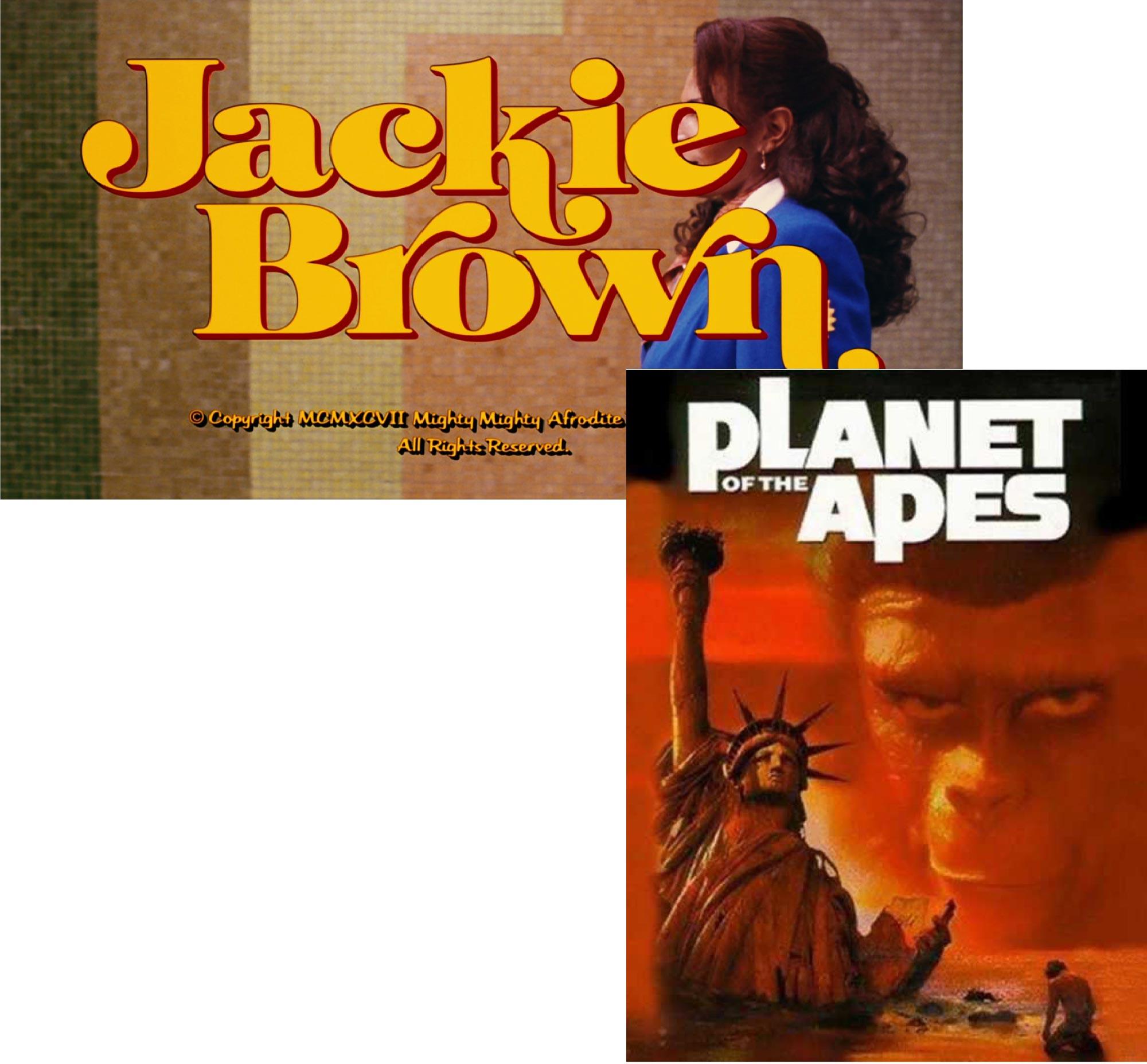
Designer of Jackie Brown and Planet of the Apes titles
When Ed Benguiat wasn't crafting font families he was busy drawing up custom titles for films and shows such as Jackie Brown and even Planet of the Apes. So you could almost say that ITC Benguiat was made for the silver screen without even knowing it. The unique nature of the typefaces Benguiat designed is what makes them so fascinating today. They were designed to be used as large as possible and customised to your hearts content.
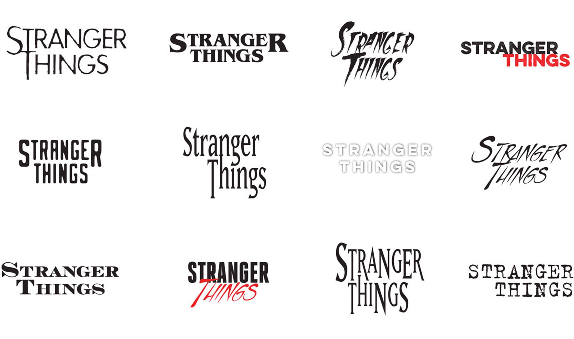
There were several versions of the title sequence that were rejected
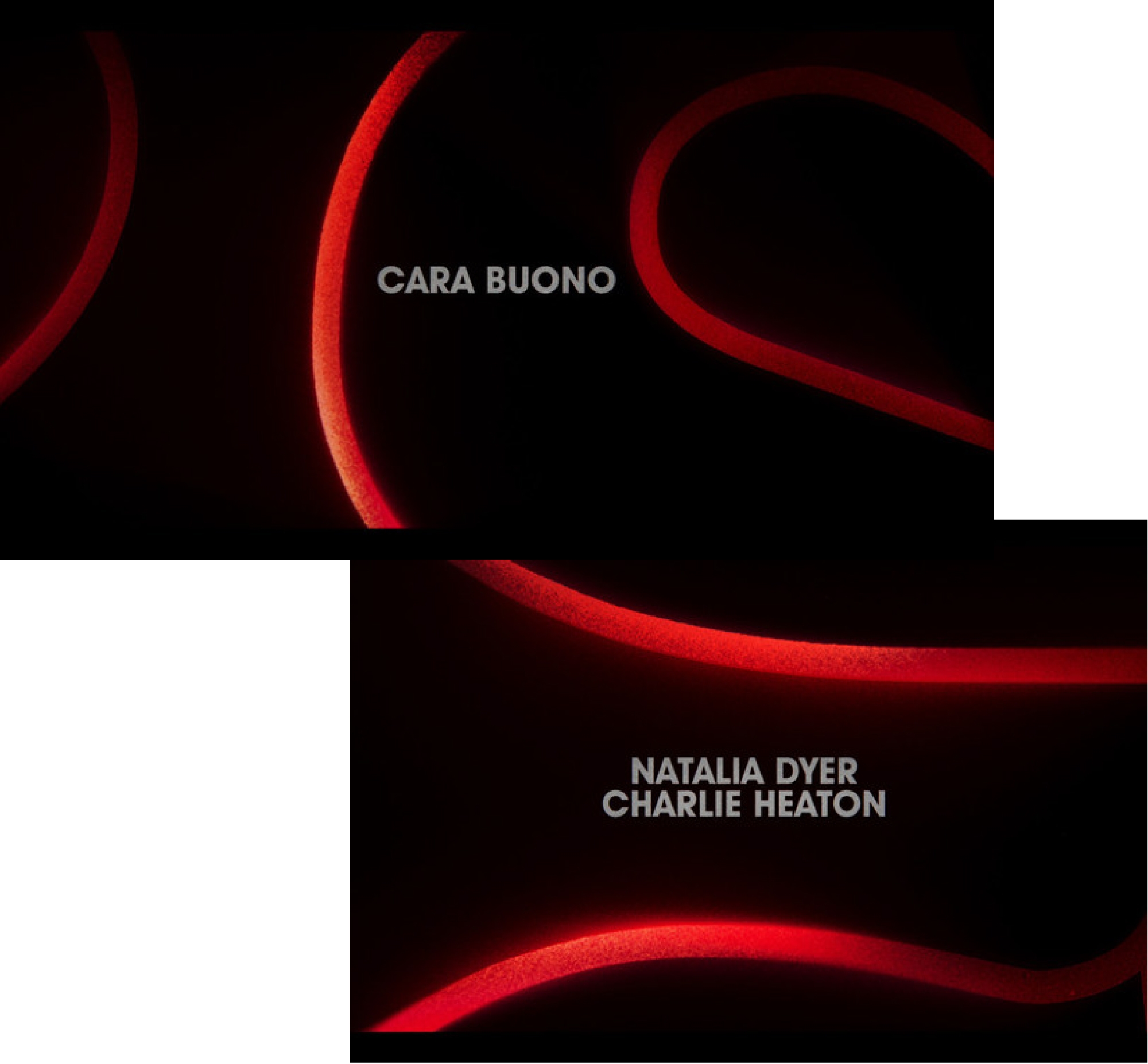
Now, this obviously wasn't their first attempt at creating an iconic title sequence for the show. As many design projects go you have to get through a few ideas before you land on one that hits the spot. These are just some of the many possible styles that the show could've looked like. As you can see the typography is always a throwback to a horror classic which is exactly what the Duffer brothers wanted when it came to the show's design aesthetic.
As you can see the typography is heavily influenced by the style of the Stephen King novels from the scratchy handwritten type to the bold and blocky look of the main title. We can all agree that they really did want this to be the perfect homage to the 1980s, and it was.

Always a Graphic Designer
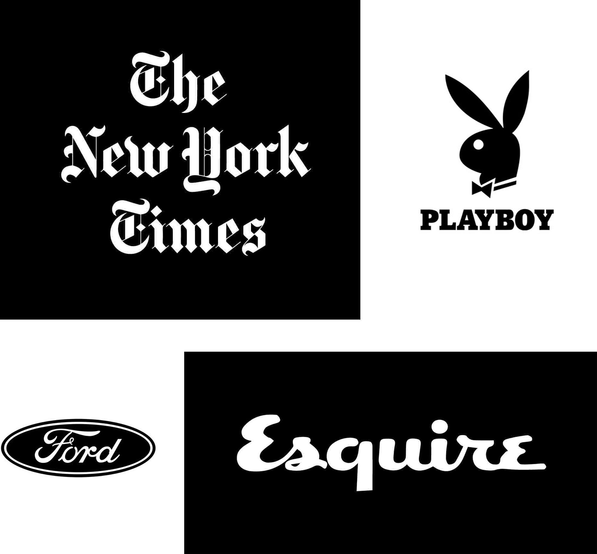
Being one of the greats of the type design world, Benguiat was often approached for graphic design work, mainly logotypes. A logotype is a logo or mark that consists purely of typography. His most famous logotype would be his redesign of The New York Times logo. Instead of changing it completely which is what the client wanted at the time, Benguiat responded by fixing the old logotype and giving it a refresh. He felt like the logo was too iconic to scrap completely and he probably made the best choice.
Amongst Benguiat's other well-known logo designs and redesigns are Ford, Playboy and Esquire. Benguiat describes his logos as his pride and joy, he calls them his keepsakes.
When I see the New York Times on a building on a wall, I can look up and say, ‘That’s my logo.’ So that’s my contribution to society.
Ed Benguiat


A perfect match for the era
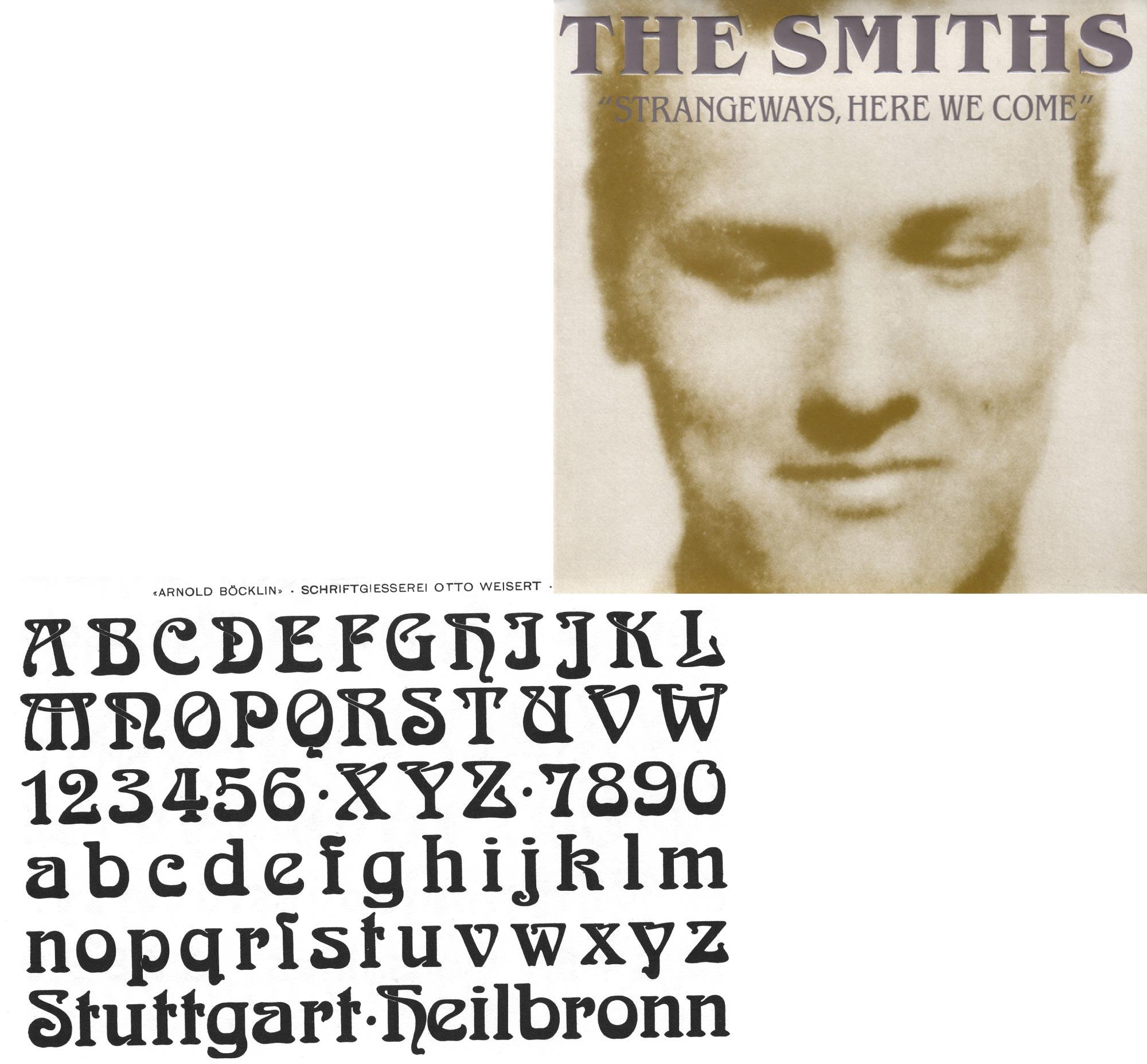
As we all know Stranger Things is based in the 1980s and has been highly praised for it's accuracy to the real world of that time. So much so that ITC Benguiat is perhaps the perfect font for the job. Designed, created and released in the 1980s ITC Benguait was a product of the time and probably the only one of its unique kind. It was even featured on The Smiths' 1987 album 'Strangeways, here we come'.
It takes inspiration from the art nouveau design style which is obvious when you take a closer look at the curves and bowls of certain characters. All in all this typeface was a perfect match and it's almost as if it was made for the Netflix series.


Reunited with an old friend, ITC Avant Garde
ITC Benguiat is not the only star of the shows title sequence, the credits are also set in a font familiar to Ed Benguiat. ITC Avant Garde was designed by Benguiat's long time friend and collaborator Herb Lubalin which makes this title sequence extra special. While Benguiat drew up the characters for Avant Garde, Lubalin designed them for use. It was a typeface which was originally designed for the magazine of the same name but has now had a second rise to fame along side it's creators old friend Benguiat.
They paired it with Avant Garde, which was designed by my old ITC partner, Herb Lubalin, Herb named Benguiat after me, so it’s like old times. We’re back in the driver’s seat together again.
Ed Benguiat


Benguiat was Ed's favourite
Long before Stranger Things, Benguiat used his, now famous font for a lot of projects and even mentioned that it might be his favourite one. It was certainly a unique font for it's time as were many of his fonts. He liked it so much that he decided to create a few more versions including ITC Benguiat Gothic. As you can see above it has a different feel to the original version, however all the unique curves are still in there and this too became a hit with the design world.
Typefaces are like your children. You have one child and you say, “that’s my favourite”, but you don’t let anybody know it. You have to keep it to yourself.
Ed Benguiat


The title sequence contains happy mistakes
When I first saw those beautiful giant letters grace my screen in July 2016 I was in awe. Like many designers I wanted to look into the design and watch the title sequence over and over. Despite Imaginary Forces attracting most of the attention for the work, the Stranger Things identity was originally designed by Jacob Boghosian for Contend.
It's not actually what you would call typographically perfect and there's a reason for that. The creators of the show wanted the titles to take on the nature of 1980s typography—the letter-spacing was generally tight, meaning characters were very close to one another.
The light and colour that shines through the type is another one. Before visual digital effects this glow effect would have been done manually. This could have been done using a torch shining through the back of a canvas that the type was set on. Creators, Imaginary Forces used this method and added the finishing touches digitally. If you look very closely you can see the grain and imperfections, or as Imaginary Forces call them happy mistakes.


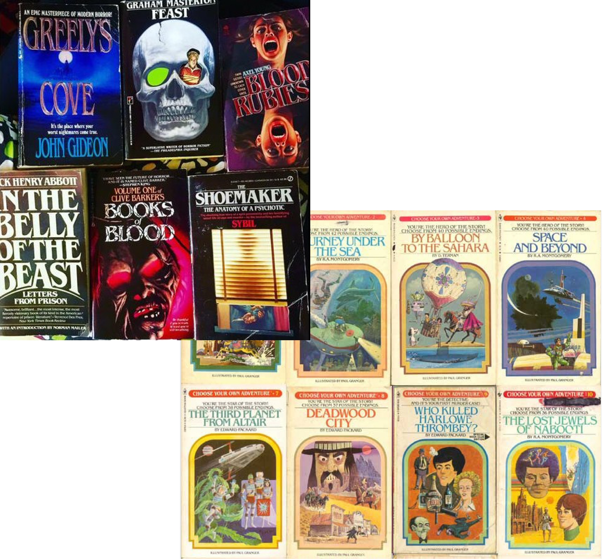
It's been used before, a lot
Back when it was being used for books by acclaimed author Stephen King, ITC Benguiat was being used pretty much everywhere possible. Benguiat describes how it wasn't hard for a typeface to take off back in the 1980s as there were only around 15 system fonts available for use.
Not only did Stephen King use it but so did the book series 'Choose Your Own Adventure', it was used on every single cover as their standard font. Horror and thriller novels used it in different ways and in different styles. There's no denying that this typeface has had a huge impact on the way we design for genres even today.

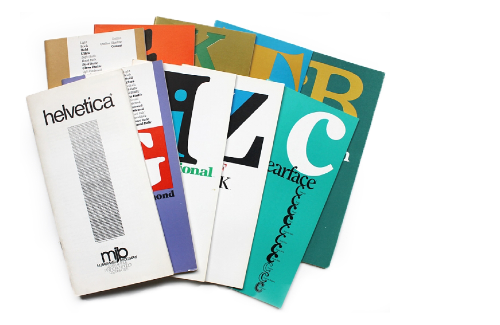
Just one of six hundred fonts
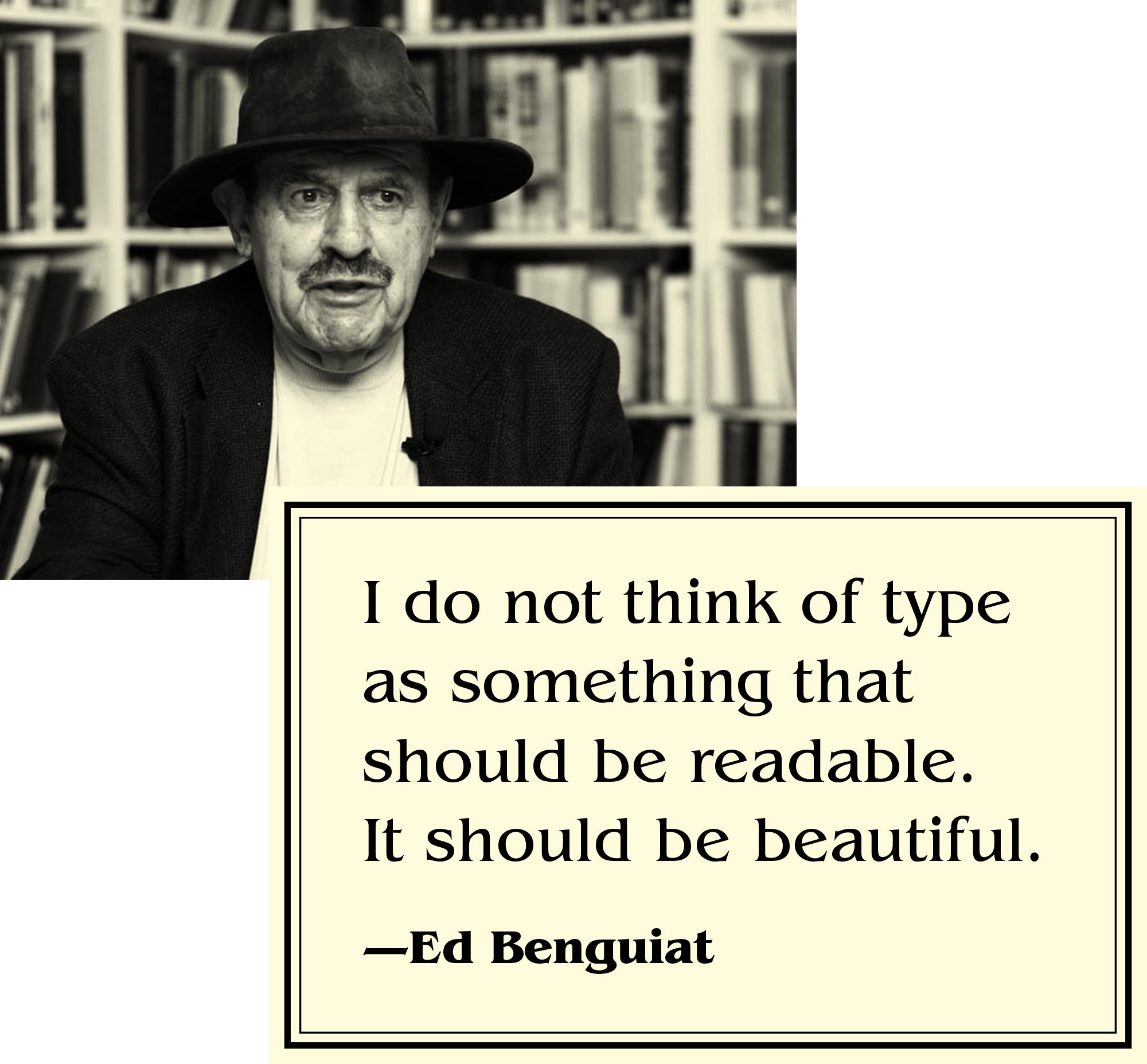
Benguiat is considered to be one of the world's great type designers, and this title did not come easy. Yes, his pride and joy is his beloved ITC Benguiat, however this is one of 600 fonts he has crafted over his lengthy career, you can see some of the specimens below. His typography always takes a unique direction. He always aims to make his work beautiful first and then he moves on to making usable. On that note we have a quote which we'd like to leave you with from the man himself.

Benguiat's controversial quote
The following quote would surely open some very interesting debates in any design studio, and we're no different. On one hand we furiously disagree with it, as type absolutely has to be readable. Then, on other hand we agree that typography should be beautiful. It's very tricky.
We think perhaps what Benguiat is trying to say is, if the type is beautiful, then everything else will fall into place—but who knows. Feel free to message us with your thoughts.