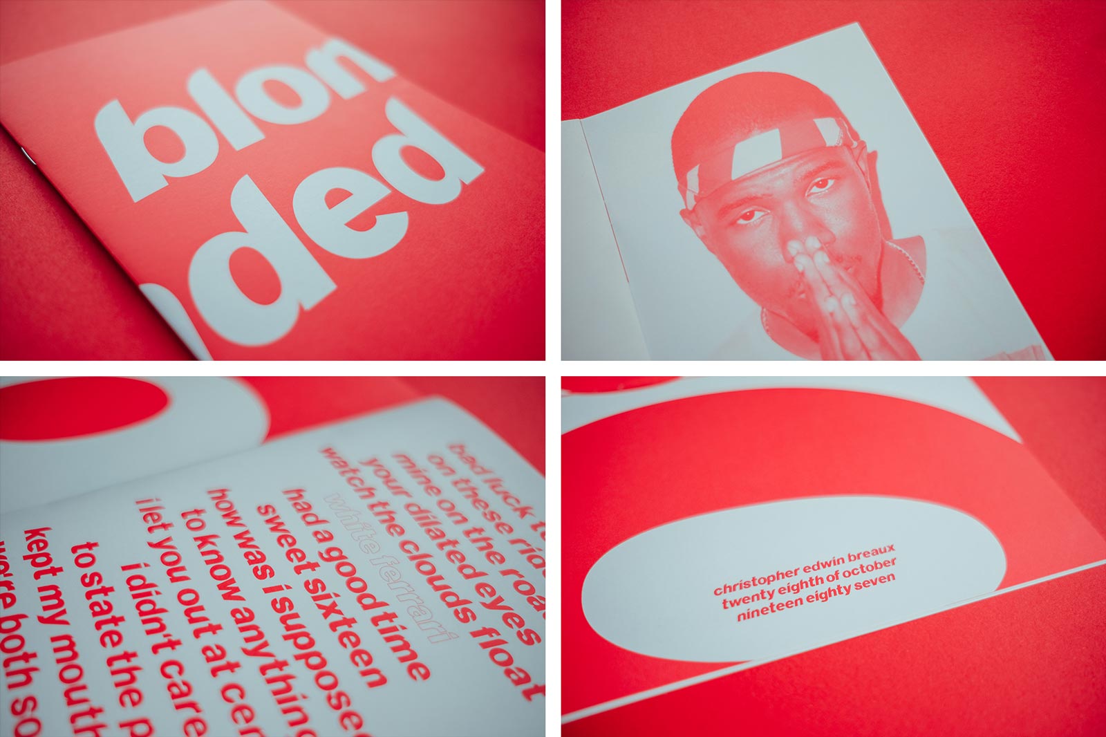
Blonded
Downtime
At John&Jane we like to try to have personal projects on at all times, when we have some time away from client work we can work on something for ourselves. Downtime is part of studio life, but how you spend that time is up to you. We see it as an opportunity to play, experiment and learn new things. Making time to play is an important part of being creative and improving yourself as a designer.
For the love of Frank
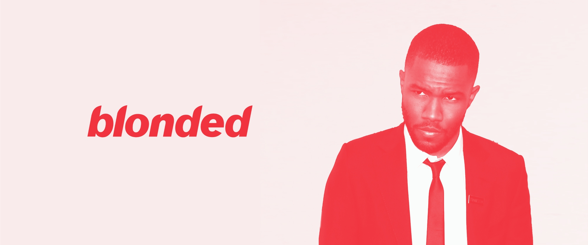
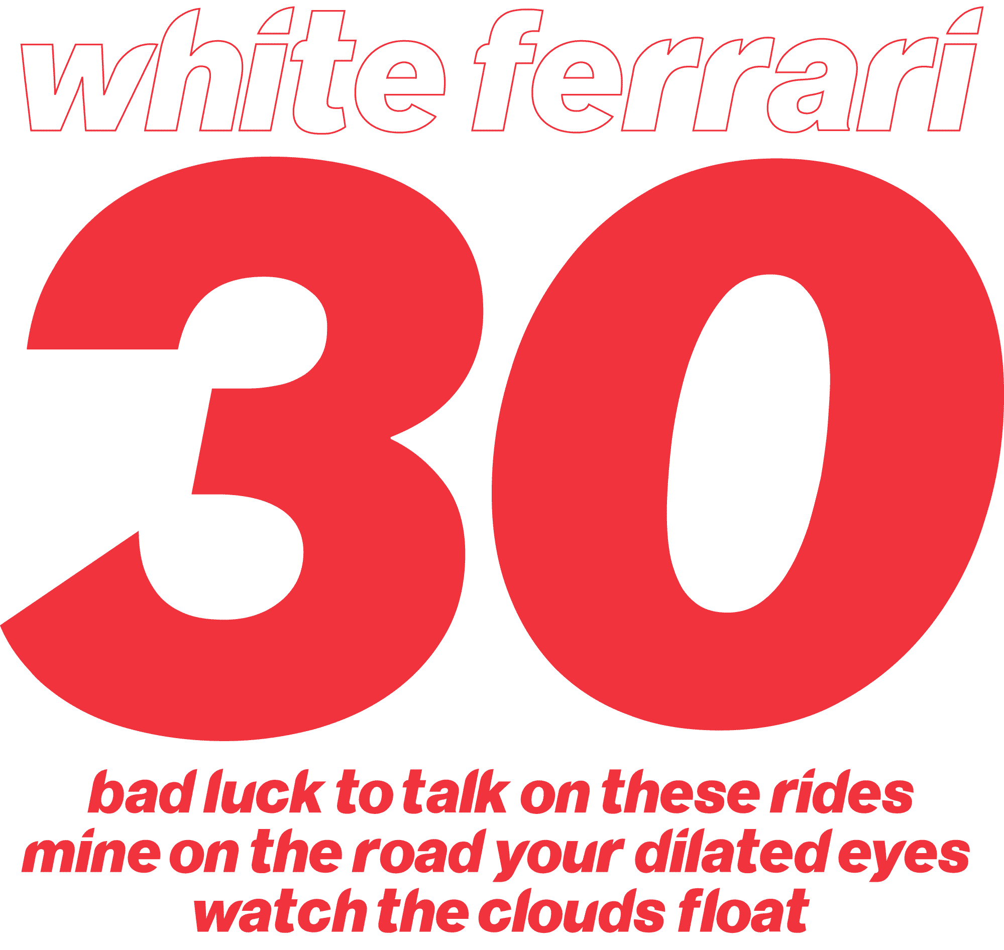
It's Frank Ocean's 30th birthday this weekend, and considering the fact we love his latest album so much we decided we would turn this love into a creative project. When we saw the artwork for Frank Ocean's second studio album entitled "Blonde" we couldn't help but be intrigued by the typography. The artwork uses a customised version of Neue Haas Grotesk but has not been developed into a useable typeface. We decided to take on the challenge and design a full character set.
Blonde typeface
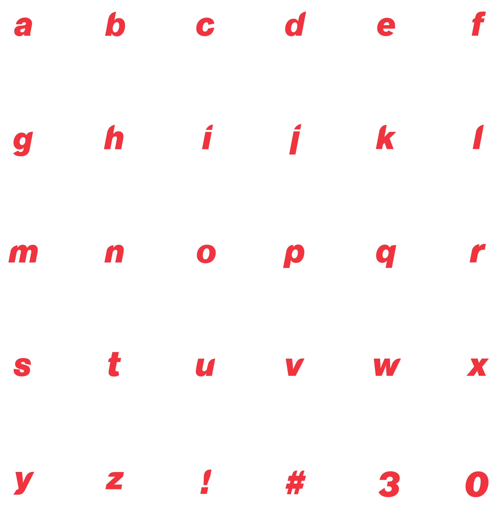
The Blonde typeface has only been used sparingly by Ocean, it's only seen on the album cover and on pop-up shops around the world. We pulled together all the research we could in order to craft each letter and make Blonded—a useable typeface.
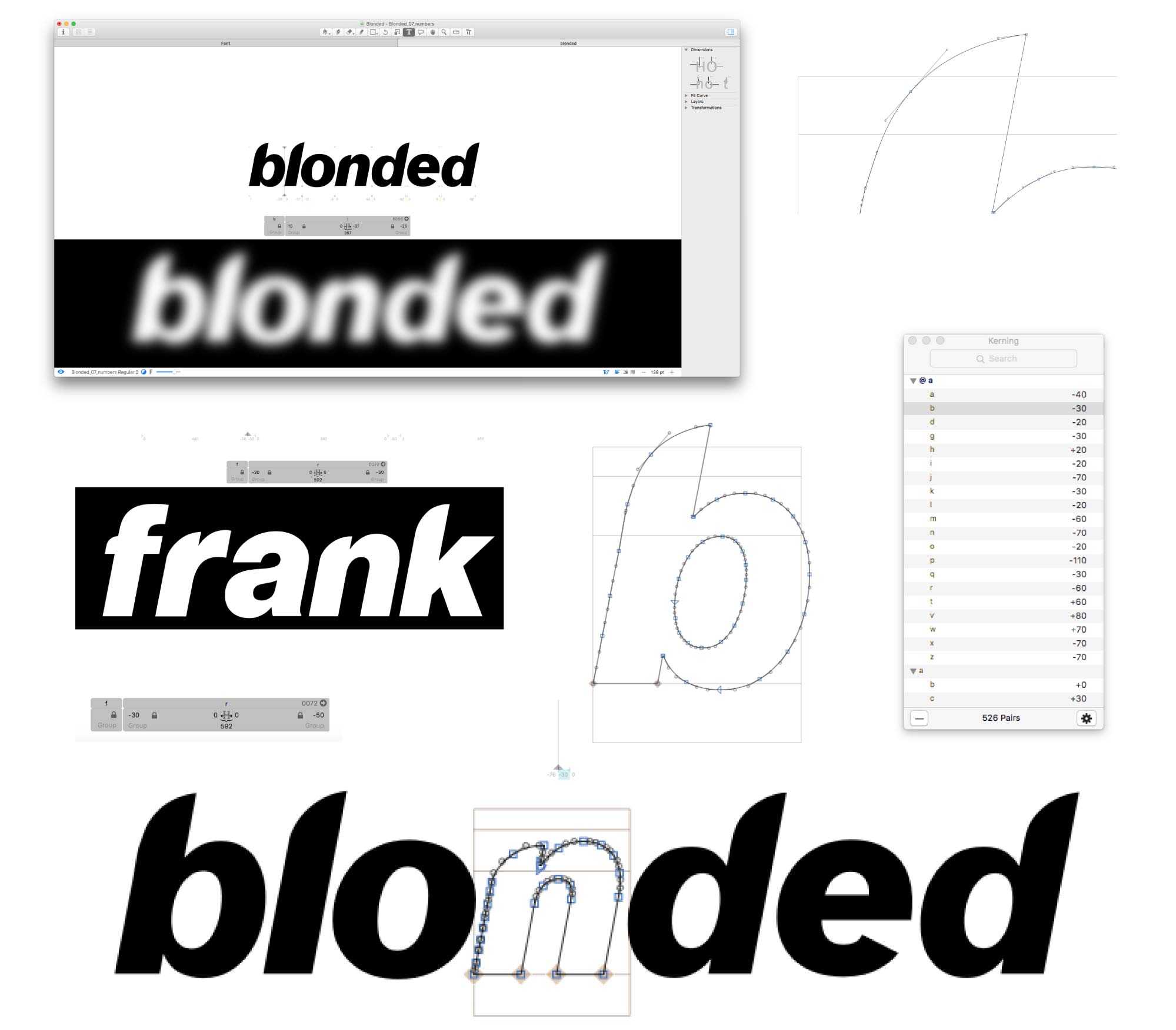
Starting with the font in the classic "Blonde" title we found the typeface that was used and customised. Nueu Haas grotesk has been chopped into a curve style that lets the word flow seamlessly, just like Ocean's album.
The nerdy stuff
To design Blonded we needed to design each letter with the curve feature prominent on every one. To do this we started to reconstruct the album artwork typography in glyphs app, a typeface design tool. We then started to draw each letter with this curve feature. As it got further down the line, we started looking at how the letters would flow when being typed up—kerning each glyph proved to be a lengthy process, but to have a font that typed perfectly at the end felt like a great achievement.
The aim was never for this to be a commercial font, it was more about passion, exploration and learning. The font itself is only likely to be used once, so we wanted to make the most of it by creating it's very own specimen. This legible and fully functional font is simply a homage to Ocean's unique music and following.
Type specimen
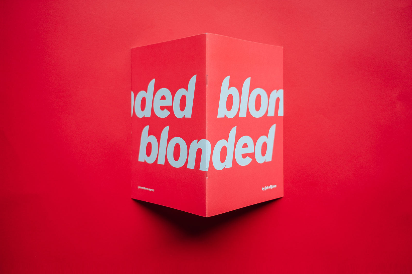
When the typeface was done we decided a type specimen would make a nice addition to the studio so we got it printed, we love a bit of print! We had a handful of specimens printed on uncoated stock with one colour only. We used a red which we felt complimented the trend and also the style that Ocean was going for on his second studio album. It's been great learning how to use some new software and having the chance to develop my skills. And to cap it all off we created a beautifully printed document that we can keep, and I'm pretty proud of that.
We'll be listening to Blonde today to celebrate. Happy 30th Frank!
