Branding, The Woky Way
Evolving the Woky Ko brand
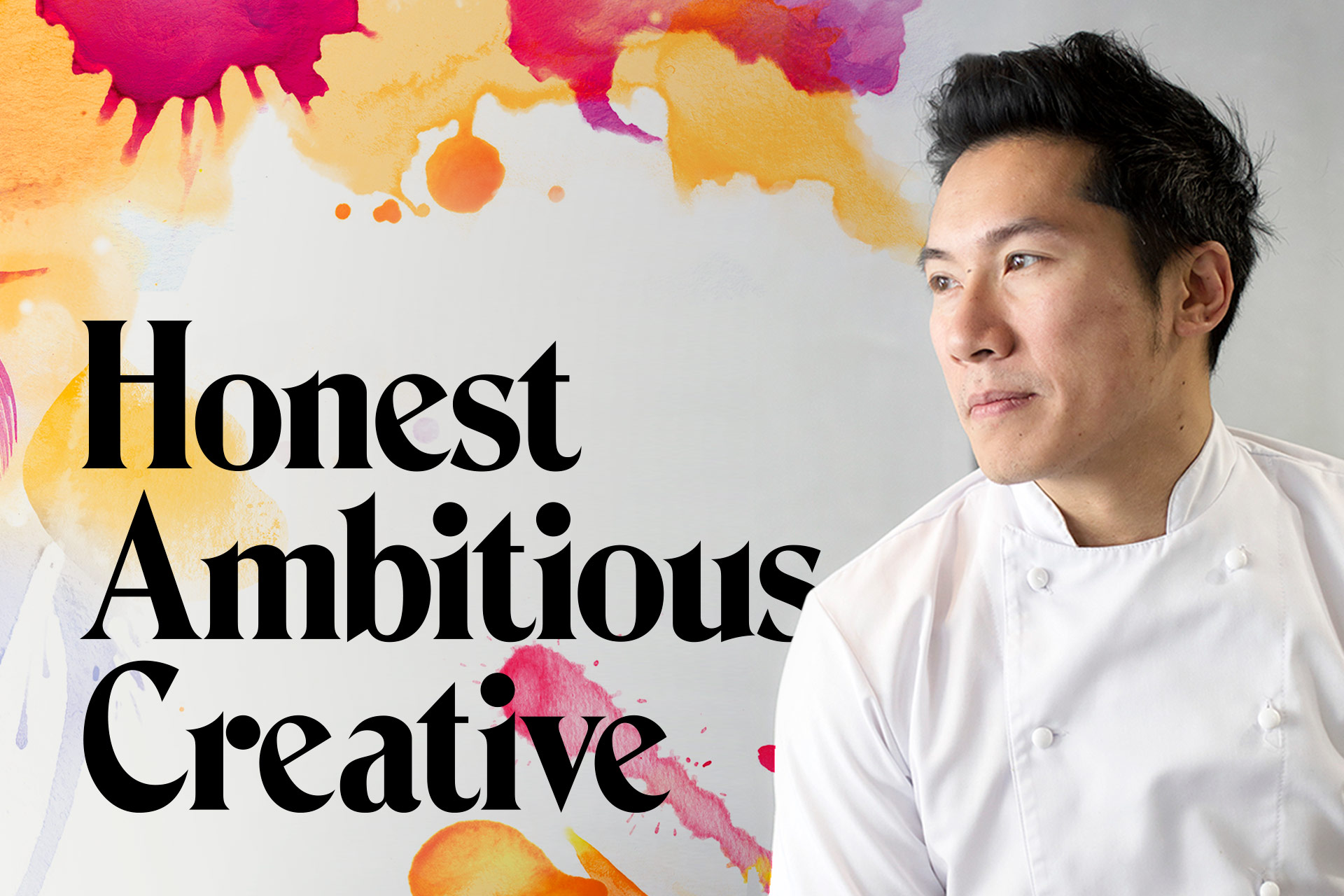
We've recently been working with our old friend, Larkin Cen, to evolve the branding of his chain of Bristol-based restaurants. We wanted to make sure that the passion Larkin has about his food was reflected in his brand and restaurants. His recipes look and taste vibrant, they're so good they're an experience in themselves!
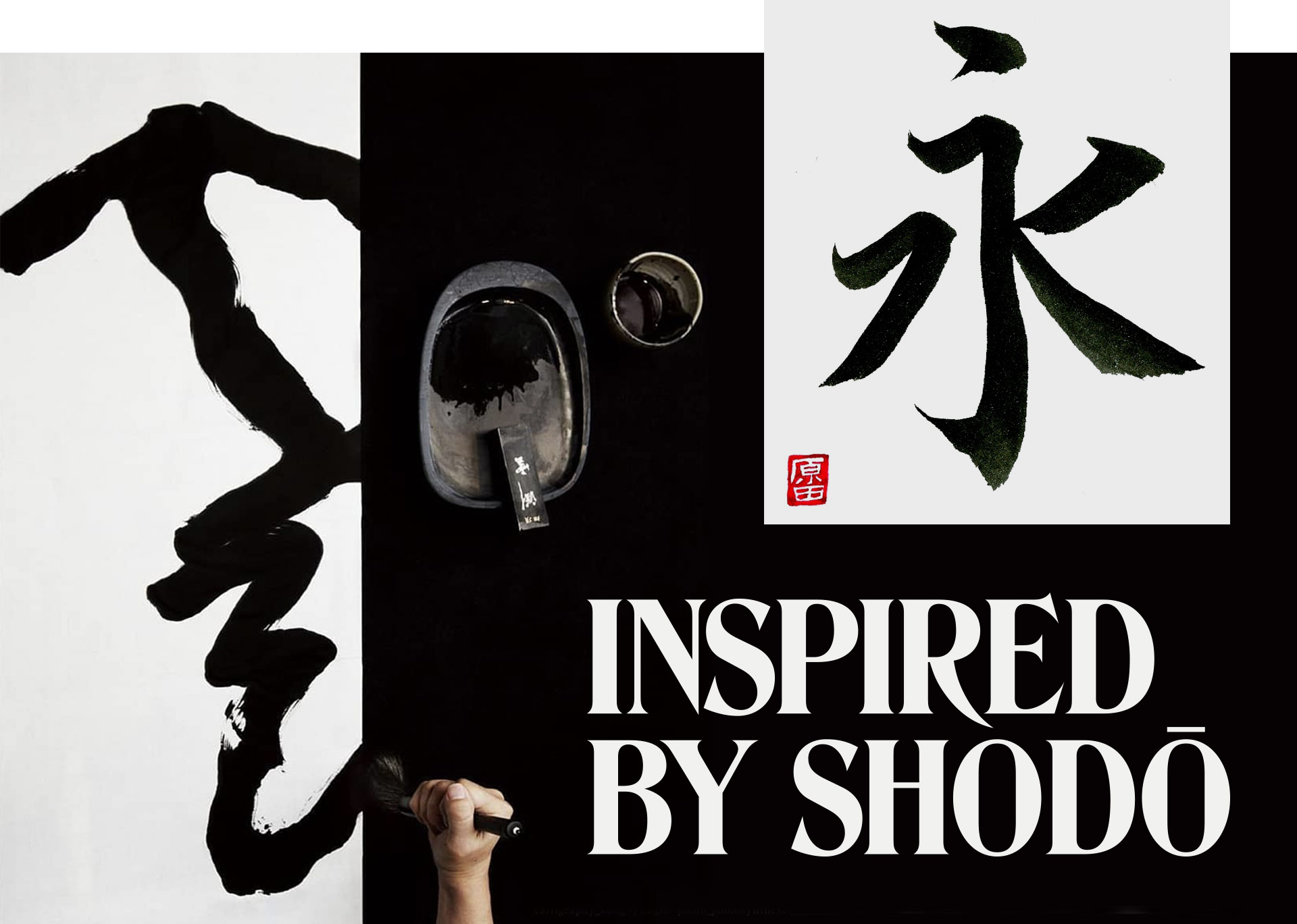
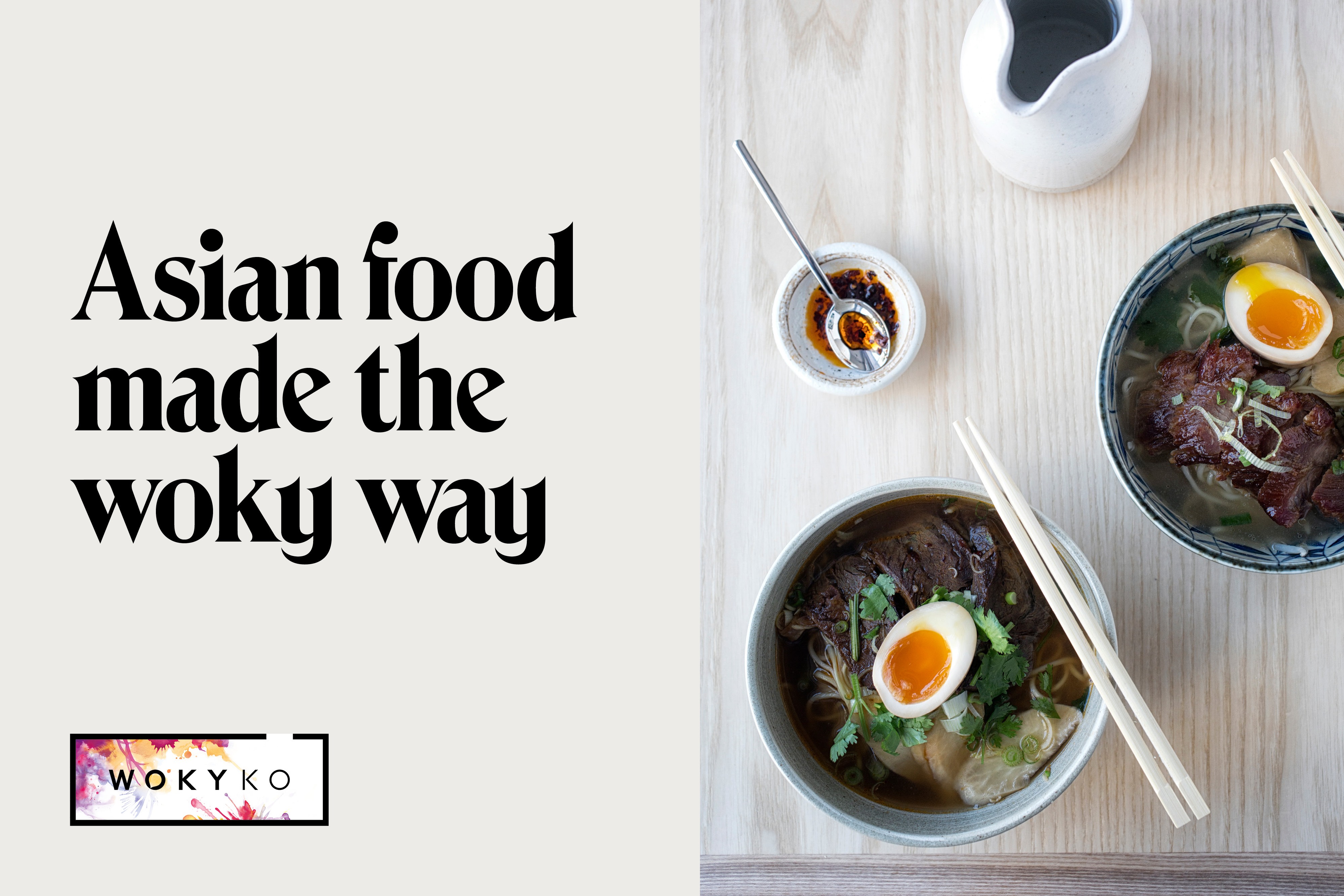
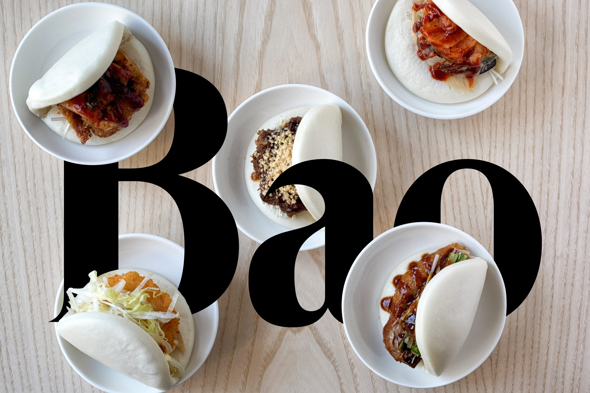
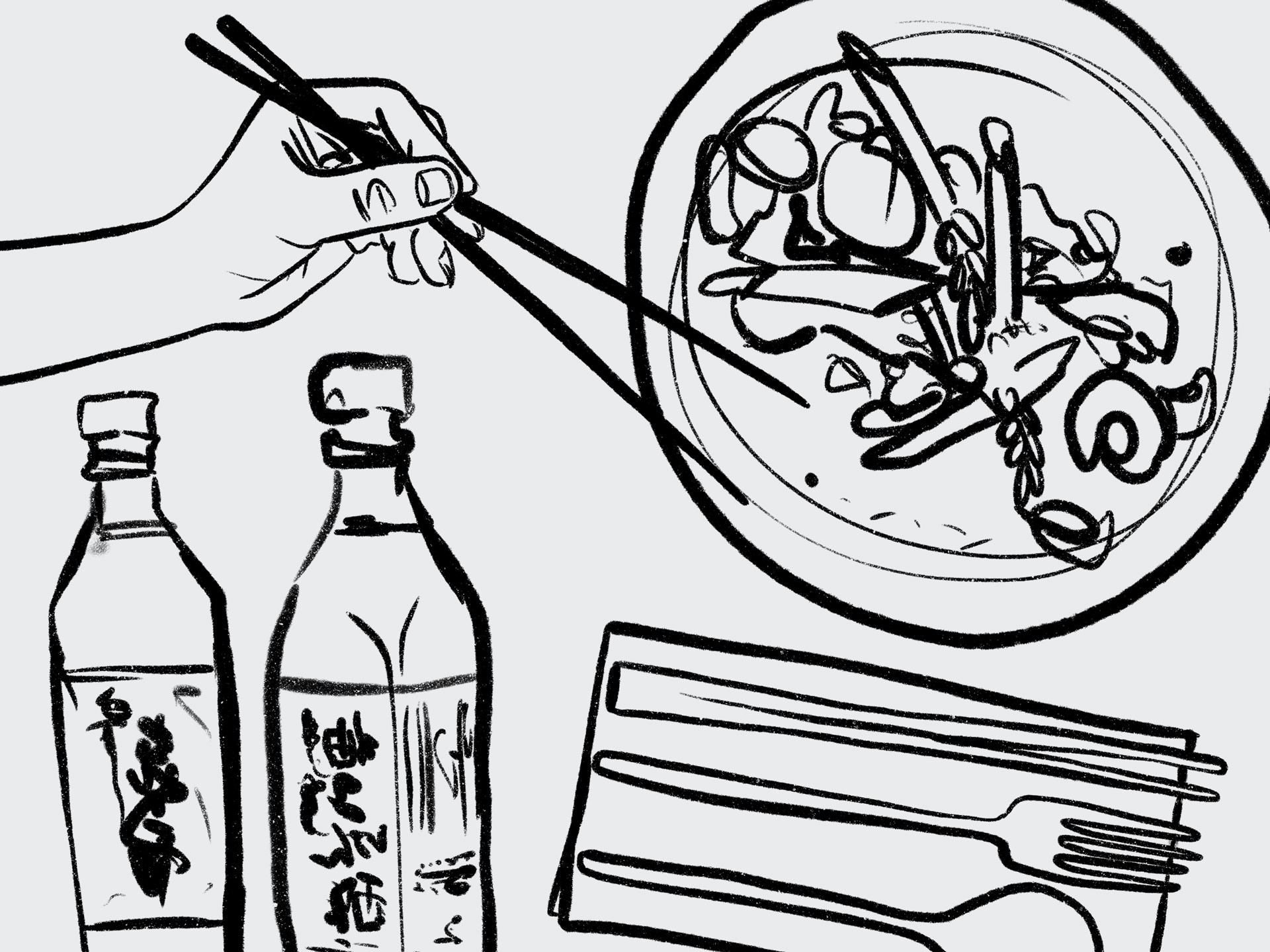
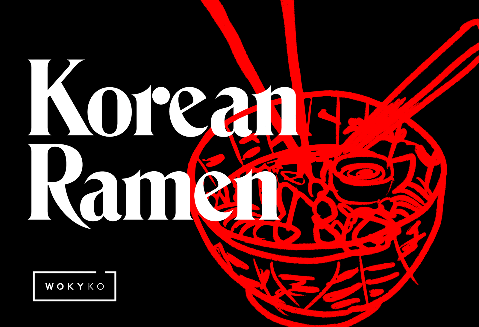
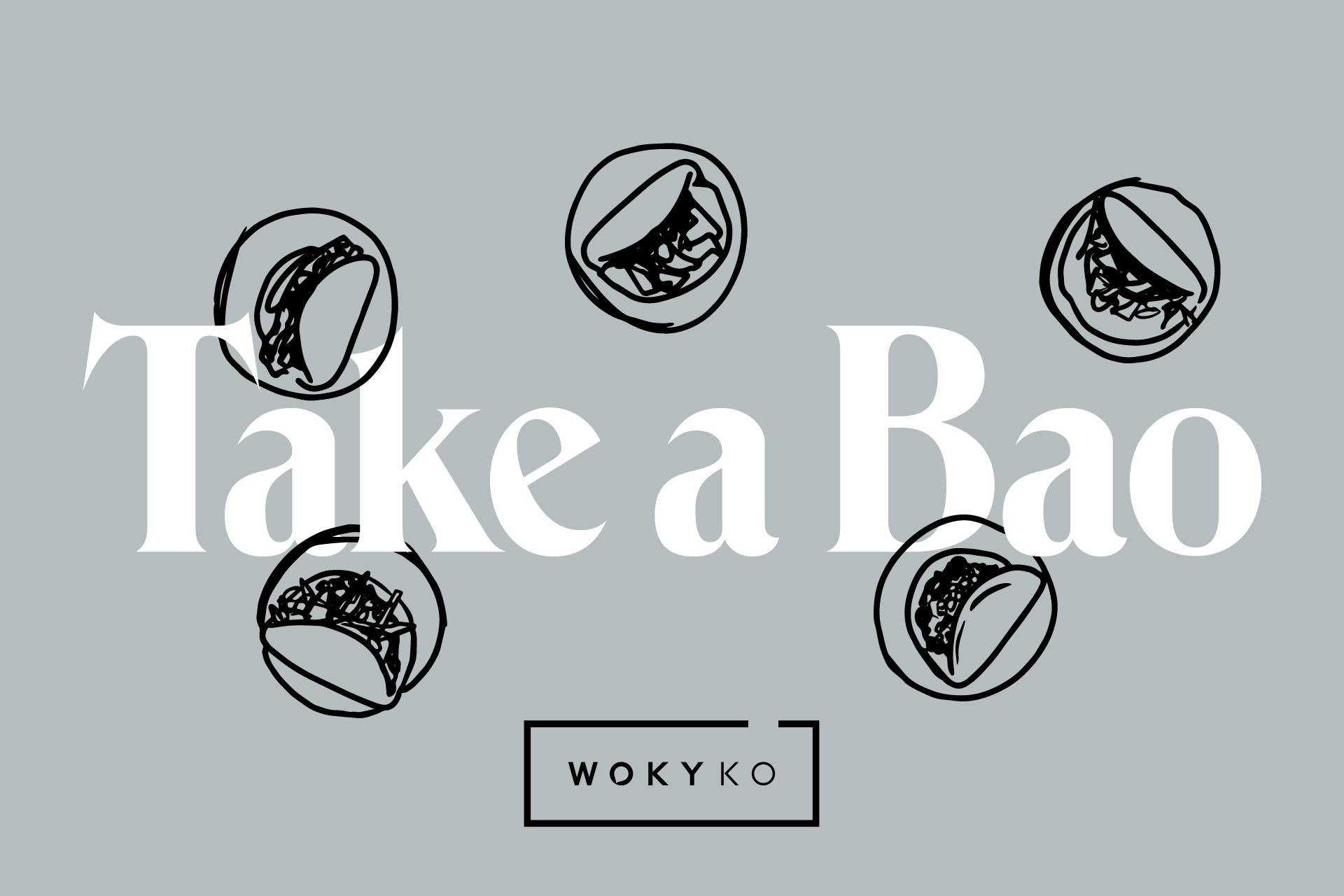
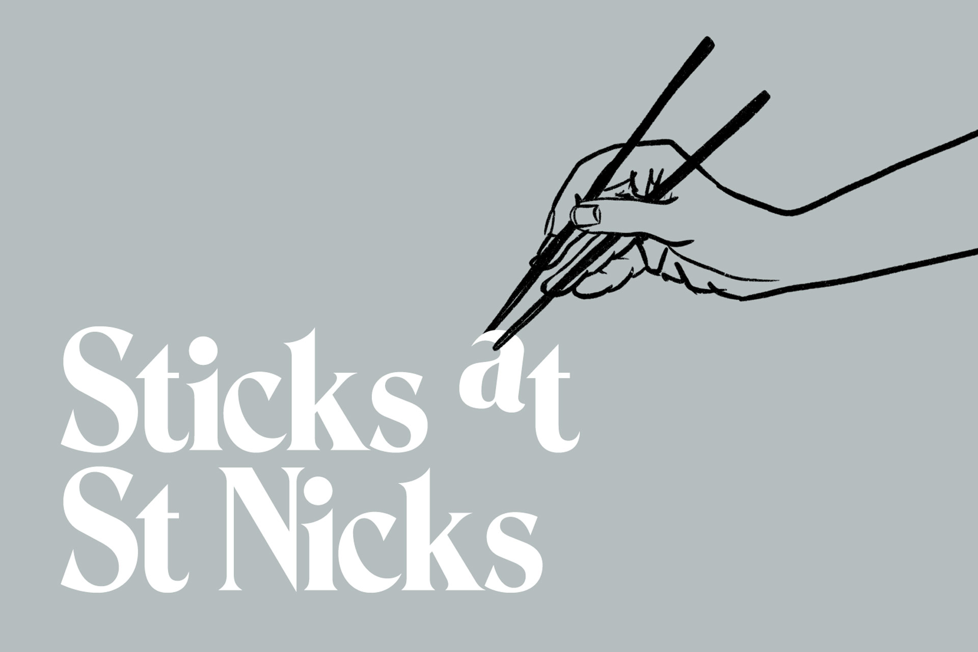
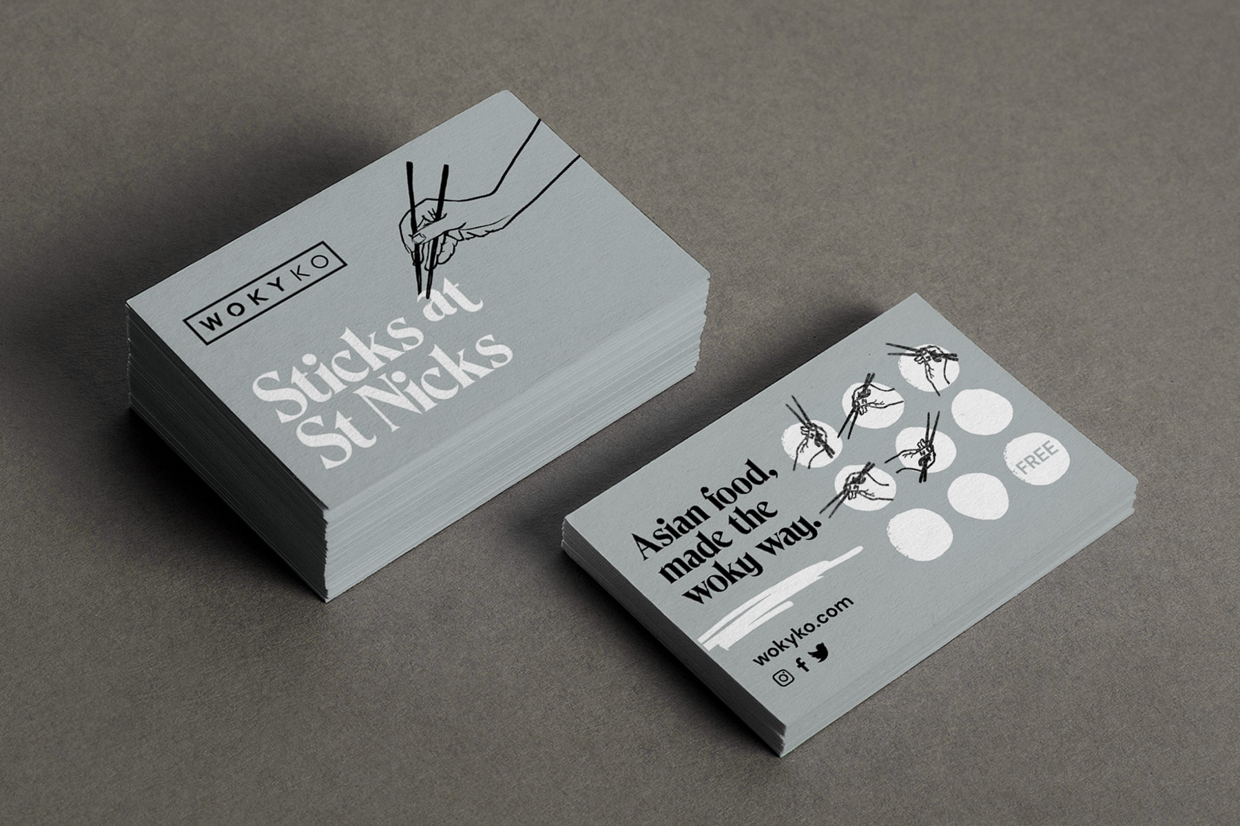
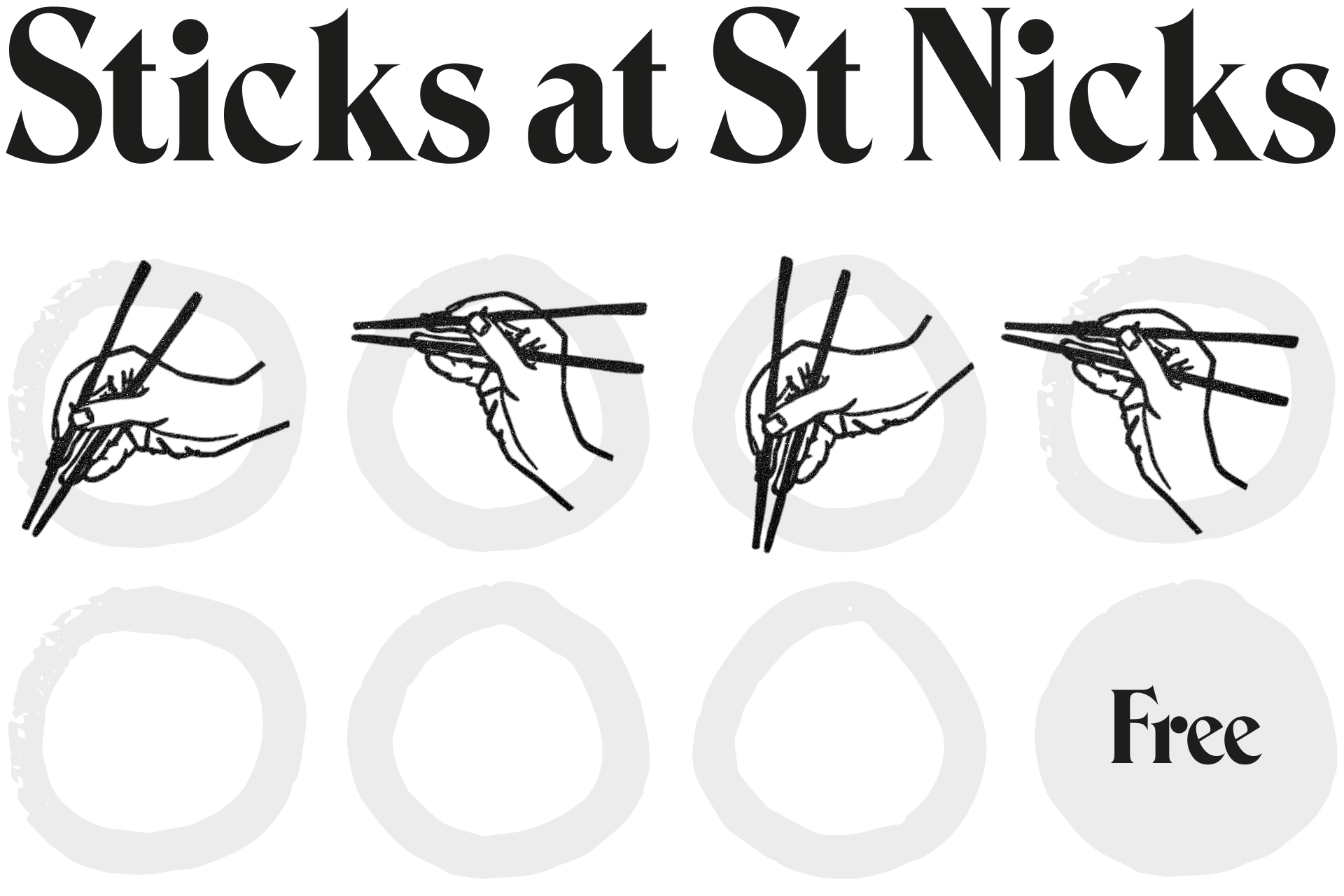
We chose a bold, serif typeface reflective of Woky Ko's Asian heritage, inspired by the ancient Shodo calligraphy paired with stripped back illustrations and a neutral colour palette with a blast of vibrant colour.
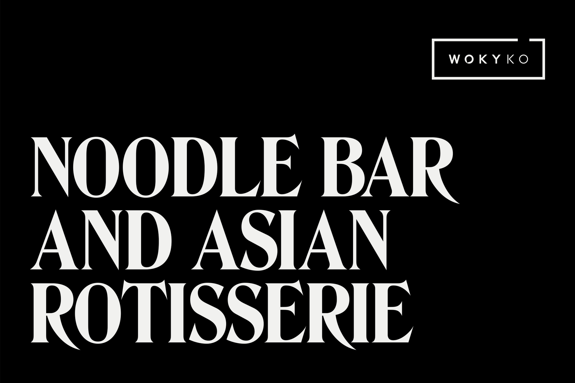
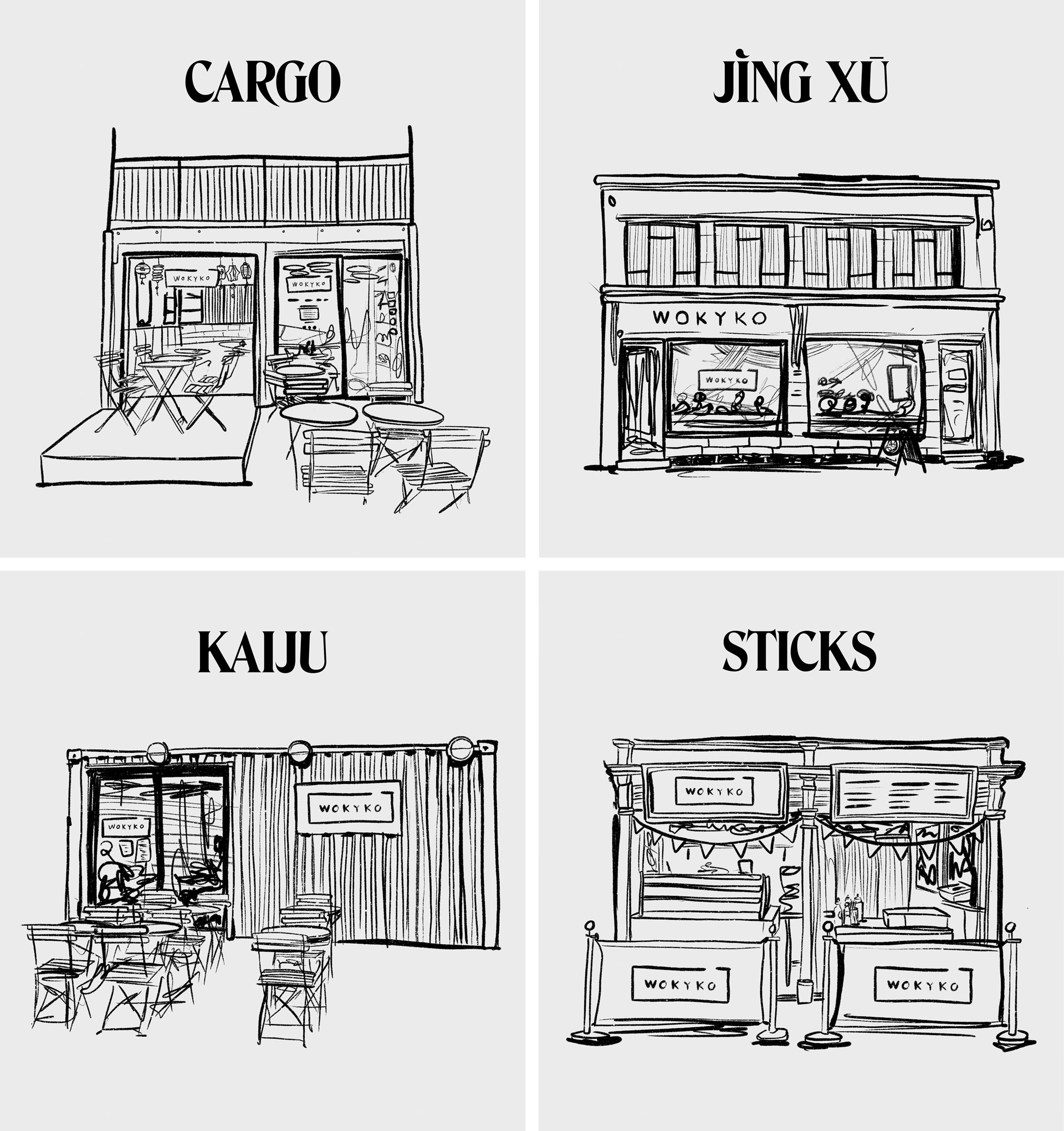
One brand. Four concepts.
Woky Ko has four separate sites in the city, all with a slightly different offering, we needed to ensure our new design style worked to showcase and advertise all locations. We used an illustrative approach paired with the bold type to create striking, warm and welcoming images of each restaurant.
We even had the opportunity to create a striking window display at Jing Xu on Park Street using bright vibrant colours and a larger than life brushstroke effect, we love the result and feel like it represents Larkin's expressive and experimental approach to food well.