Let's give Cardiff a flag to be proud of

I recently watched a TED talk about flags by Roman Mars. He is kind of obsessed with flag design and claims everyone cares about flags, whether they know it or not. I too have been fascinated with flags from a young age, my grandfather has a stack of books about flags and would tell me all about the meanings behind the colours and symbols on national flags. He would also talk me through the history of flags, how and why they’ve changed over the centuries. It’s quite amazing how something so simple can represent millions of people—something people choose to rise and symbolise them at anything from political protests to sporting events.
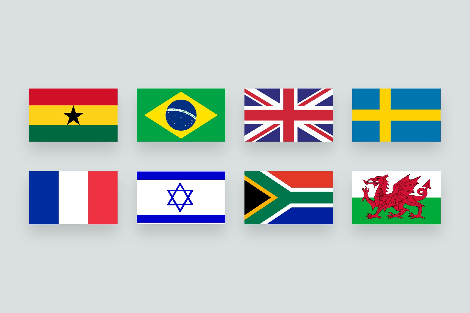
National flags tend to be simple in their design—made up of very few but meaningful colours or symbols which means they can be seen clearly from a distance. They also tend to avoid any text, which may be illegible at small sizes or even lost across different languages. National flags get it right, because there is a lot at stake—they appear on a global stage. They follow the five basic principles of flag design according to the North American Vexillological Association, let’s go through these five principles.
1. Keep it simple
Simpicity is key to the success of a flag, it needs to be striking and memorable. It should be so simple a child could draw it from memory.
2. Use meaningful symbolism
The design of the flag—it's colours, images and patterns should truly symbolise something meaningful about the place it is representing. Something for it's people to take pride in.
3. Use 2-3 basic colours
Less is more. Using too many colours would only dilute the flag's sense of identity and potentially make the flag too complex. The most common colours used are red, blue, green, yellow, black and white.
4. No lettering or seals
A flag should never have lettering or seals. If you need to use any text, it's a sign that your symbolism has failed.
5. Be distinctive
With such simplicity, some flags will inevitably have similarities. When designing a flag, you should aim to be distinctive and avoid looking like any other flags.

So as we can clearly see, national flags tend to follow these principles and there is no mistaking the power of national flags. They give people a sense of identity. When an athlete wins a race, the first thing they often do is find their nation's flag to drape themselves in—as if all the training and sacrifices have been made for their country.
Until I watched this TED talk I wasn't aware of city flags. Having travelled around America, I was only aware of the state flags. In his TED talk, Roman Mars shows examples of some great city flags and some horrendous ones too. Here are some of the best. As you can see they all follow the five principles of flag design.
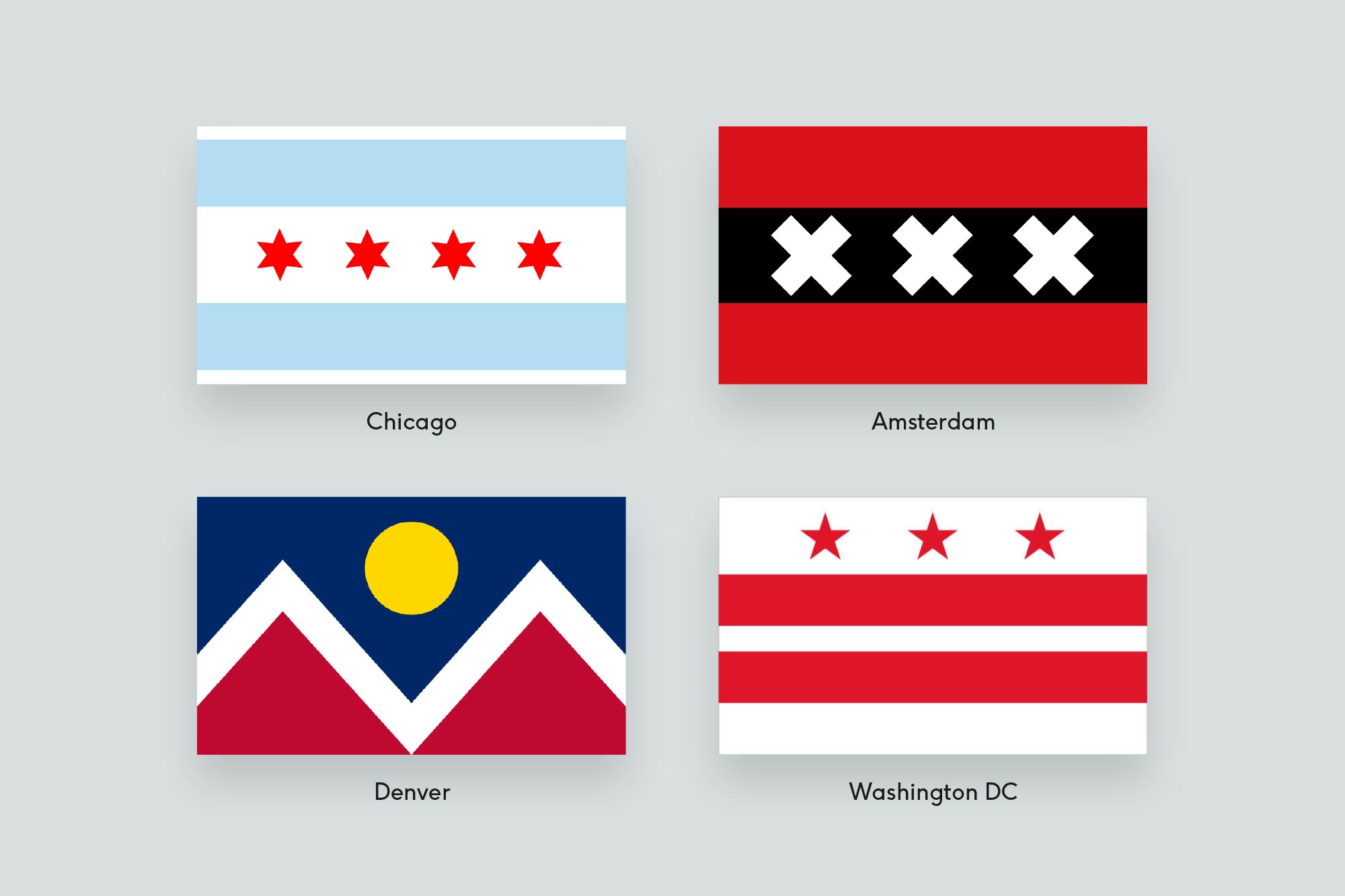
The Chicago flag for example, has a beautiful sense of simplicity. It uses three colours, red, white and light blue. The two blue stripes represent the city's water; the river and the lake, whilst the four 6-pointed red stars represent significant events in Chicago's history. There is absolutely no lettering and is incredibly distinctive.
It isn't just that people love Chicago and therefore love the flag. I also think that people love Chicago more because the flag is so cool.
Roman Mars
Needless to say the people of Chicago love their flag, they use it as a symbol of pride. The flag flies on every block, people wear badges and businesses drape the walls. When a police officer or a firefighter dies in Chicago, they often opt for a Chicago flag on their coffin over an American flag. That's how deep the flag is ingrained in the city's image.
Amsterdam Flag
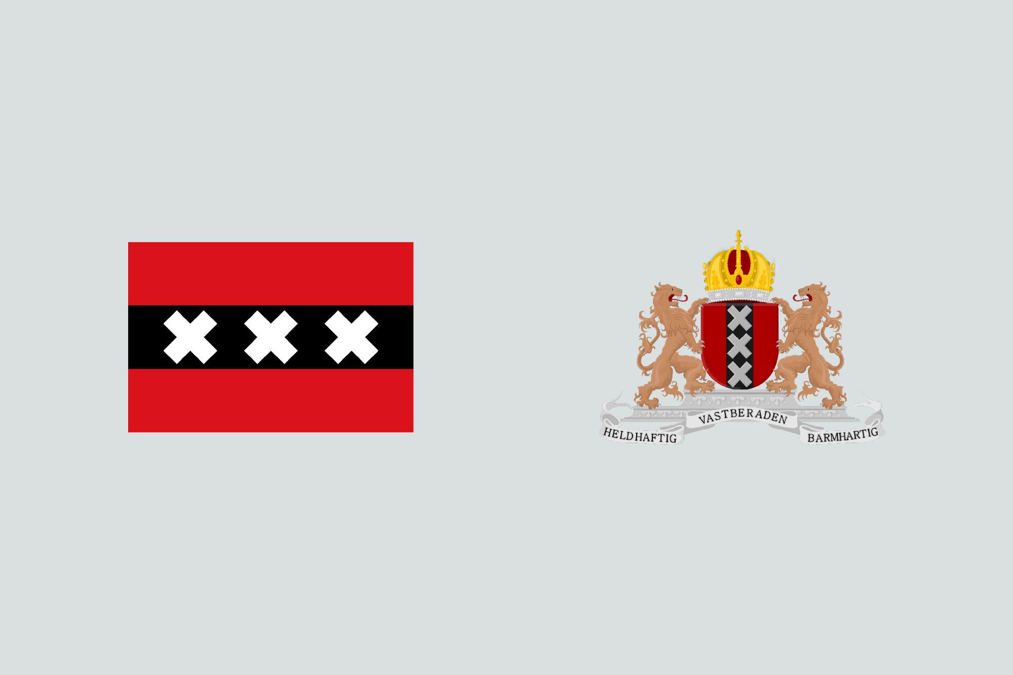
I want to look a bit deeper into the Amsterdam flag. Having visited the city a couple of times, it was near impossible to miss the iconic flag. Like Chicago, it follows the five flag design principles and the end result is a beaut. Undoubtedly one of the strongest and most well-known and loved city flags on the planet.
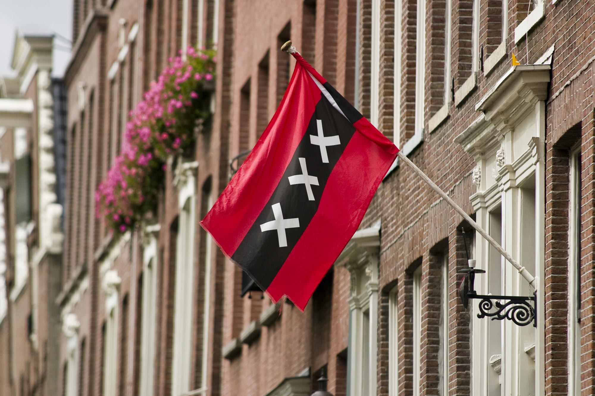
As you walk around the streets of Amsterdam, you notice the residents are hugely proud of their city and they show that pride with their flag. The design depicts three Saint Andrew's crosses and is based on the escutcheon in the coat of arms of Amsterdam. Something meaningful from the city's history. The coat of arms has been simplified into a beautiful flag that works brilliantly and because the residents are so proud of their flag, it is heavily exposed to tourists and the world—which is beneficial for the city.

Tourists in Amsterdam frequently purchase souvenirs with the flag design on it because it is so representative of the city, their trip to the Dutch capital and it looks so damned awesome.
Bringing it back home
The Welsh nation are a patriotic bunch. You'll learn this if you visit any Welsh pub on a rugby day or if you travelled with the Welsh football supporters around France during Euro 2016. The red dragon is always flown with pride. During an interview in 2016 Gareth Bale was asked "Where do you get the motivation to play every game at the highest level?" Bale responded, "The dragon on my shirt. That's all I need."
The flag was used to bring the players, the coaching staff, the fans and the entire nation together, pushing the team forward to unprecedented success of finishing third in the competition. Not bad for one of the smallest nations in the competition.

Wales has a world class brand
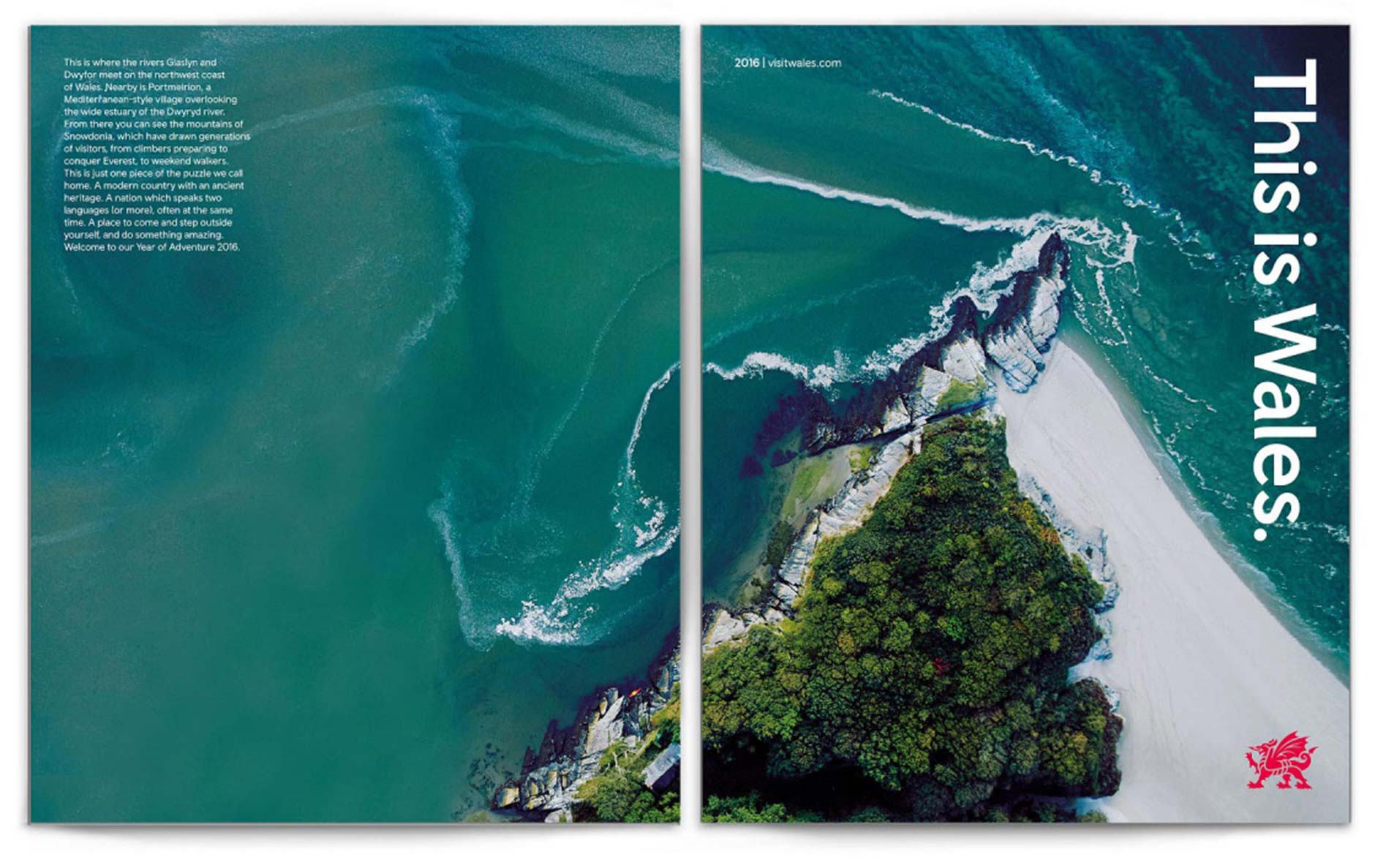
Away from flags and sport, Wales was recently rebranded by Smörgåsbord, who did an outstanding job. They provided a platform for the Welsh nation across a wide range of sectors; seeking to engage, inform, invite, challenge and support in equal measure. Wales is now exposed to the world at a higher standard than ever before and it's getting positive results. Wales is being perceived as a place well worth visiting, as noted in Lonely Planet’s annual ‘Best in Travel’ list—they voted North Wales as the 4th ‘top location’ in the world to visit in 2017.
The brand identity is a beautifully crafted icon of a dragon, based on the dragon from the Welsh flag. The icon has been simplified to look and feel more appealing in the modern world, and undeniably, this is the mark that best represents Wales.

So, how about Cardiff?
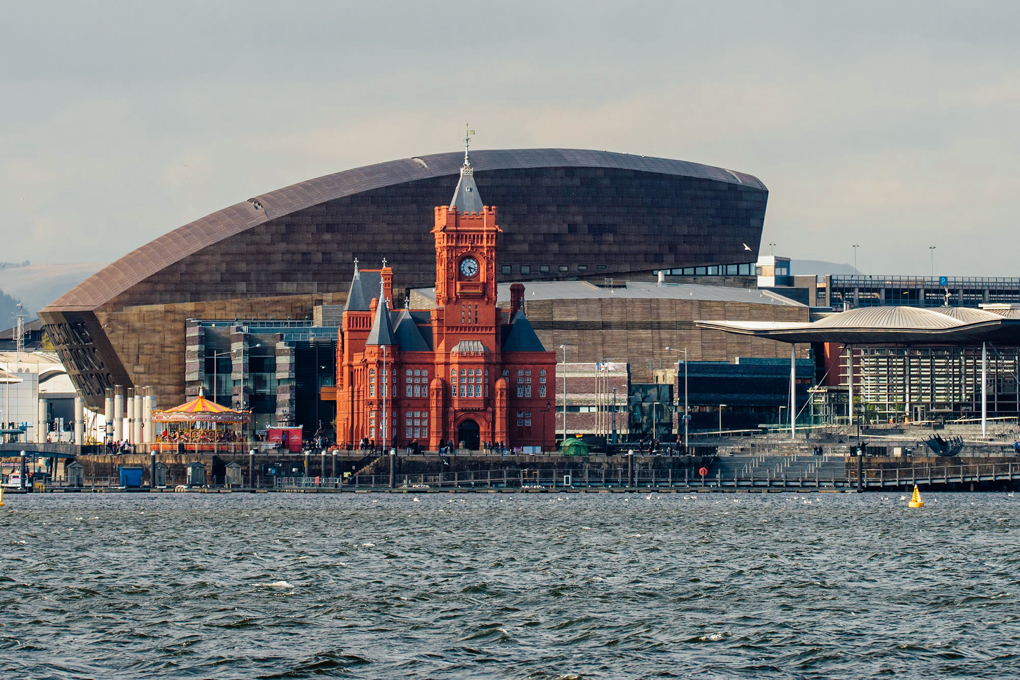
After watching this Roman Mars' TED talk, it immediately made me realise that I have no idea what the Cardiff flag looks like or if they even have one. Cardiff is a small, but rapidly developing city. It's the capital city of Wales. It's a place I am proud to live and work and I know many people who feel the same. Surely we have a great flag, right?
Cardiff's flag
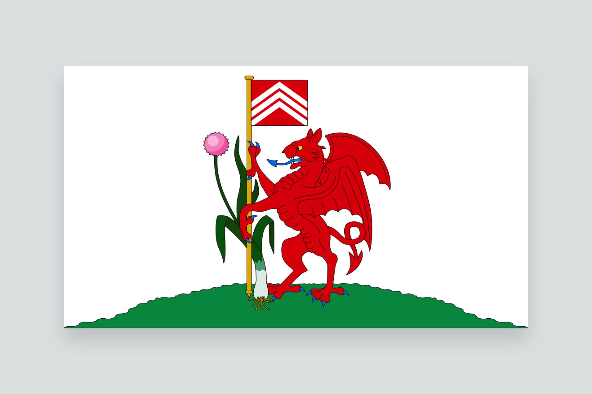
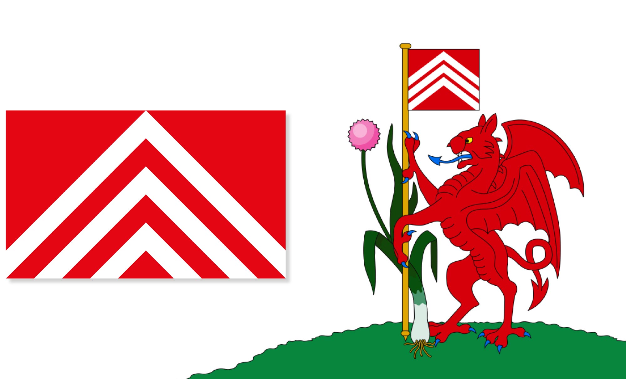
I did a quick search for Cardiff's flag and I honestly could not believe what I found. The first thing I noticed is that aesthetically it's not pleasing on the eye, not one little bit. On reflection of the five principles of flag design, it breaks most of them.
1. Keep it simple. This is one of the most complex flags I have ever seen and I think most adults would struggle to draw this from memory. Also, having a picture of a flag pole on a flag is always a bad idea.
2. Use meaningful symbolism. Ok, so perhaps it does use meaningful symbolism but it's trying to focus on everything all at once. In my opinion, it needs to be stripped back.
3. Use 2-3 basic colours. I count eight colours, but there are various shades of certain colours too.
4. No lettering or seals. Nailed it!
5. Be distinctive. I guess this could be seen as distinctive, but it does look remarkably like the Welsh flag or maybe what you would expect if you asked a child to make the Welsh flag more fun.
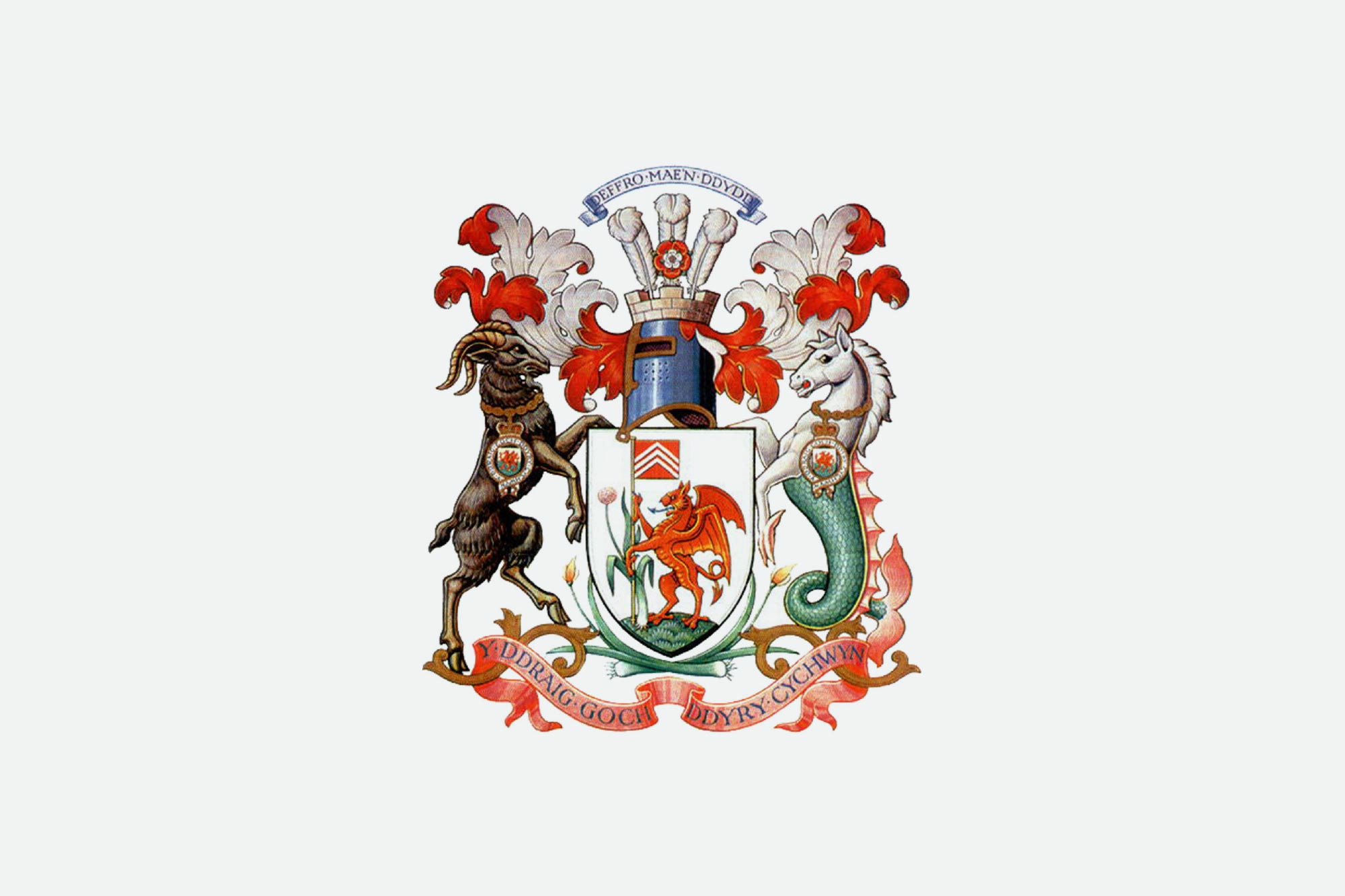
So, there is a reason that we don't see this flag flying high in our city or on t-shirts that tourists buy as a souvenir. It's because the people of Cardiff are not proud of this flag and they never will be. However, as we discovered the flag is actually very meaningful—the design is taken from Cardiff's coat of arms which dates back to 1906. Similar to the process of how Amsterdam arrived at their flag design. Amsterdam simplified their coat of arms much more than Cardiff which I feel is one of the main reasons it's so much more successful.
The detail that Cardiff's flag took from the coat of arms is the Red Dragon upholding a flag which bears three chevrons upon red attributed to Iestin ap Gwrgant, the last Prince of Glamorgan, who lived in Cardiff Castle from 1030-1080. My instant thought was the Cardiff flag shows a dragon holding a meaningful and attractive looking flag. One that ticks all five of the principles. Why don't we just adopt that flag as the city's flag?
Flag of Glamorgan
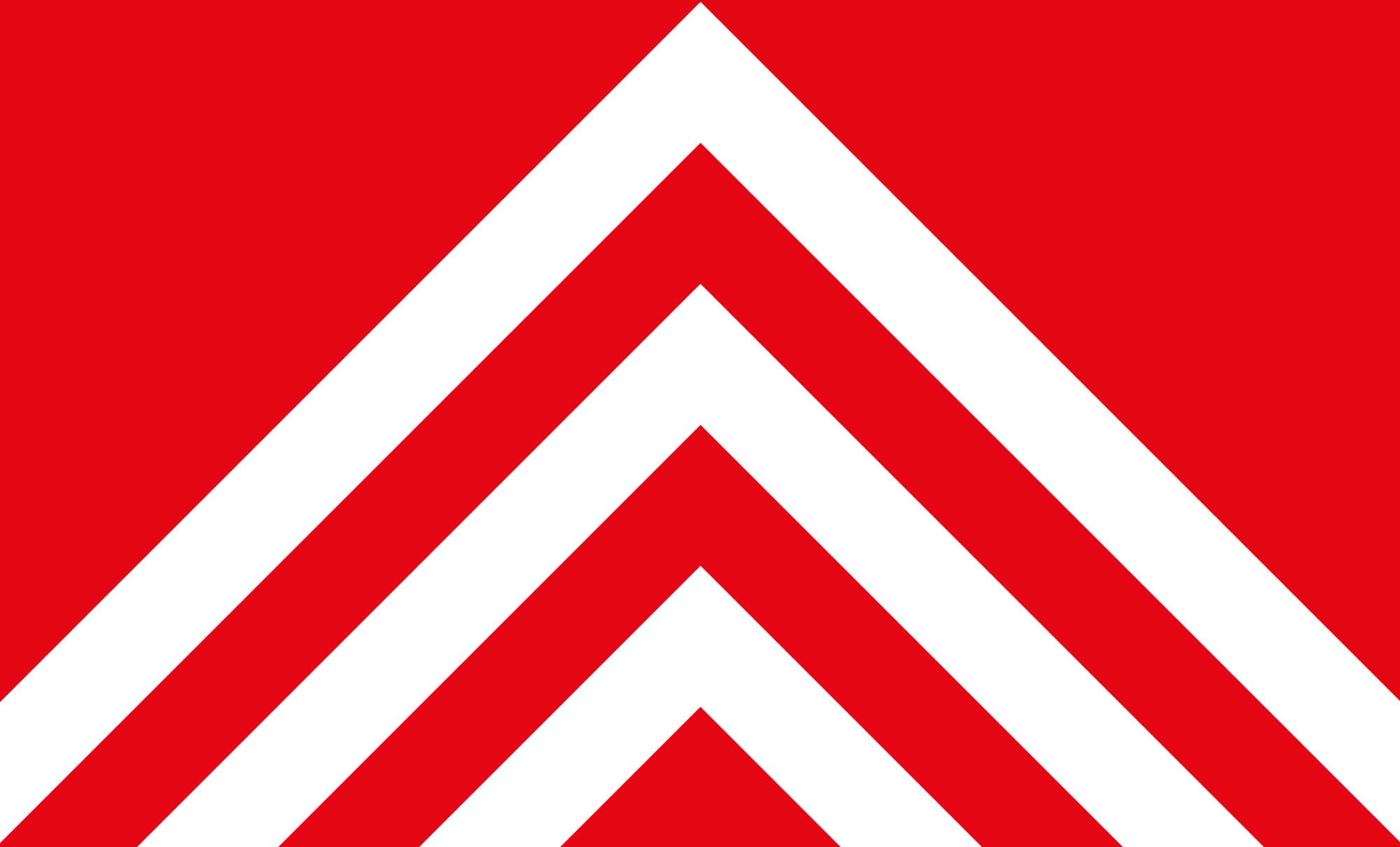
Looking deeper, I discovered that Glamorgan currently use that exact design as their flag. Earlier I talked about flags adapting and developing over time as other things change. Rulers, politics or even the split of counties.
Welsh Counties
I can't claim to be an expert on this topic, but it seems that over the centuries, the Welsh counties have chopped and changed quite a bit. The county of Glamorgan used to span from the edge of the Gower all the way to the city of Cardiff. However, since that time the county of Glamorgan has been split into West, Mid and South Glamorgan—and furthermore South Glamorgan is split into the Vale of Glamorgan and Cardiff.
I can't imagine that someone living in the city of Cardiff would ever describe the place they live as South Glamorgan or Glamorgan. Cardiff has achieved a solid status and reputation for itself—for it's quality of life, opportunities, universities, hosting capabilities and more. People are proud to say they're from Cardiff and I firmly believe they need a flag they're proud of.
Tourists visiting South Wales are highly likely to visit Cardiff, as it's the capital city and rich in culture and things to do. Therefore I think Cardiff would benefit from having a flag people would be proud to rise and tourists would want to purchase.
Blue is the colour?
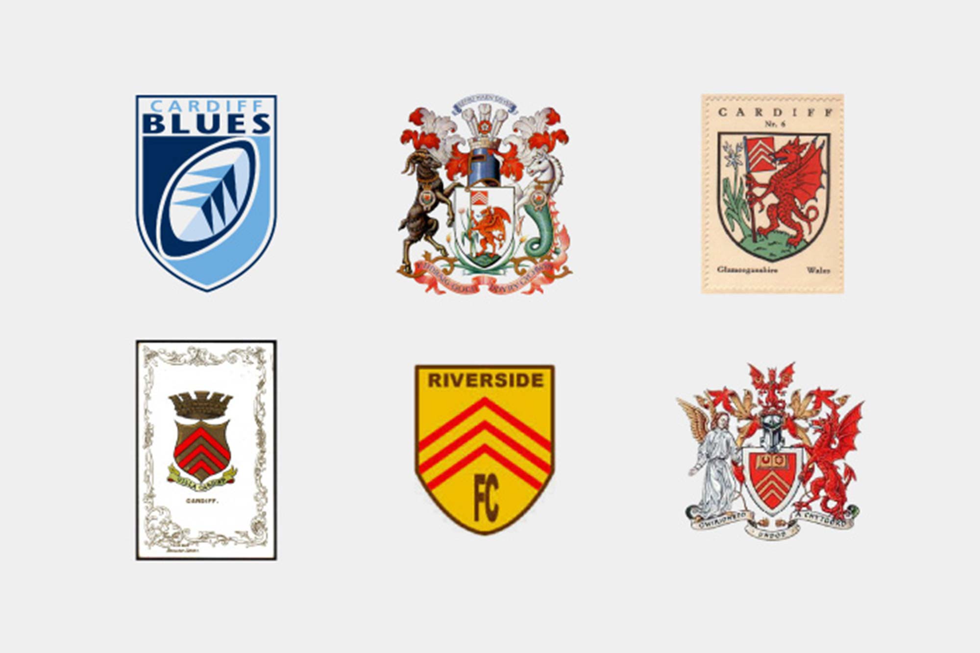
These logos and crests demonstrate just how ingrained the chevrons are in Cardiff's fabric. Everything from the city's coat of arms to the Cardiff Blues logo incorporate the chevrons in some way. The Riverside FC logo that shows the three red chevrons is actually the original logo and colour palette of Cardiff City FC—they changed to their name and strip colours in 1910, adopting the nickname the Bluebirds. In recent years, I think people see blue as the colour of Cardiff, but would that be too drastic of change for the city's flag?

Looking to inspire change
Looking back at the current Cardiff flag, it seems ironic that the flag that I feel suits Cardiff best is literally being upheld by a badly drawn dragon. I would like to start a discussion with Cardiff Council to discover if we could get the ball rolling on designing a flag Cardiff and it's residents could truly be proud of.
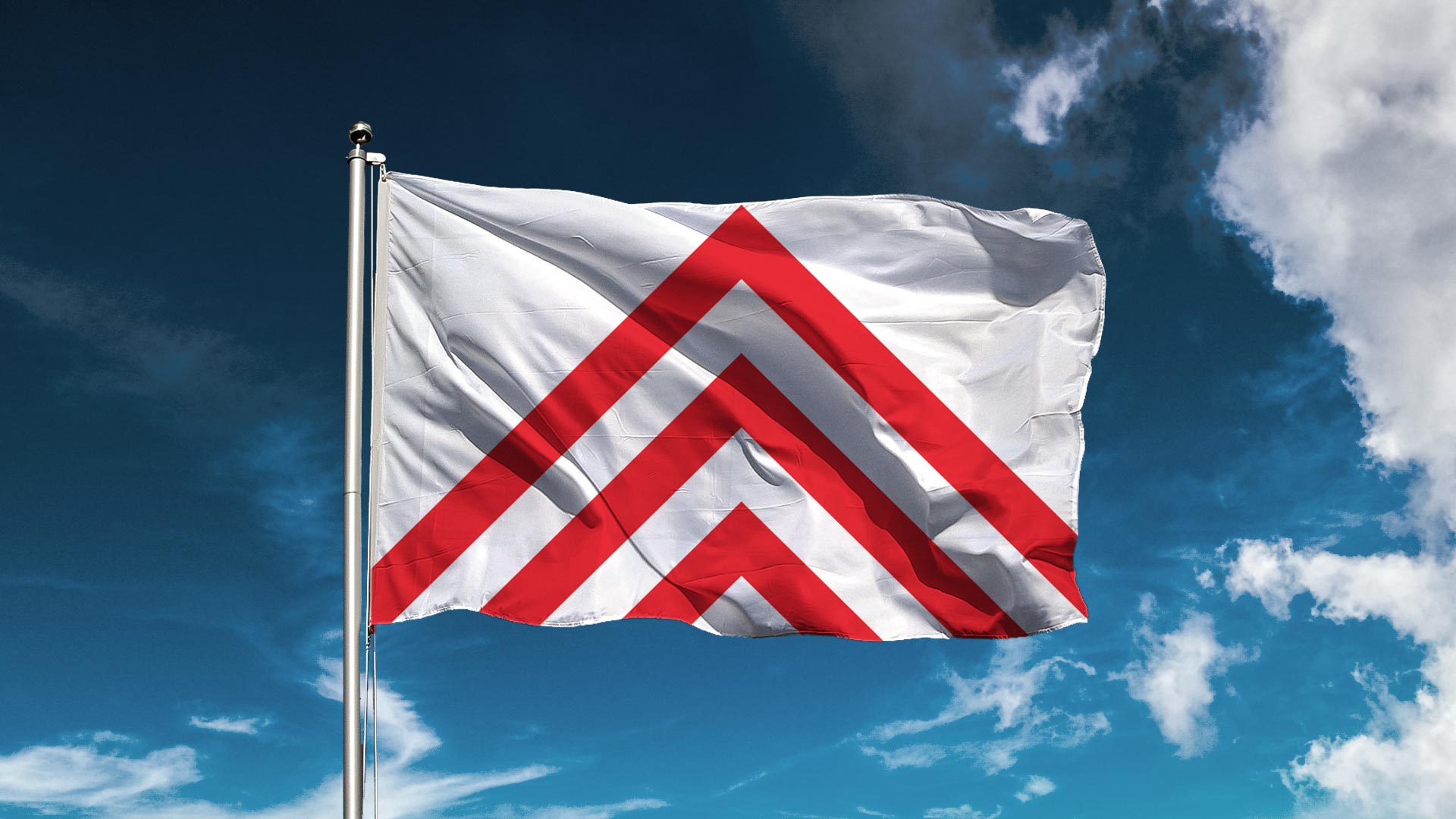
Considering the history of the chevrons, it feels only right that they would represent Cardiff. In the hope of making a new Cardiff flag a reality I have created some designs that are distinct and stand alone from Glamorgan's flag. I'm in no way saying these are final designs, but maybe enough to inspire a change.
Often when city leaders say, "We have more important things to do than worry about a city flag," my response is, "If you had a great city flag, you would have a banner for people to rally under to face those more important things."
Ted Kaye
A modern and inclusive flag
In a modern and diverse city, there would be scope to be playful with the new flag. For example to show support for Cardiff Pride and the LGBT community. Cardiff is an inclusive city and that is something that could be symbolised through an alternative, limited version of the flag. I know, there's too many colours, but sometimes the rules can bend.

Let's talk
If anyone from Cardiff Council would like to grab a coffee and chat further about this topic, please feel free to drop me an email at gareth@johnandjane.agency.